Minggu, 31 Juli 2011

Trading Simulators and Trading Games - Practice Trading Online

A long time ago I stumbled onto a nice little stock trading simulator, played online using a chart, any indicators you choose, and buy/sell buttons.  I went searching for this today and stumbled onto another game.

Try it out, it takes about 3 minutes to play it Futures trading simulator

The better game is called "Chart Game", written by a guy with all kinds of other interesting blog posts such as woodworking projects he has done, and trips he's been on.  This is the game I was looking for... Chart Game.  Maybe a good tool to warm up for a few minutes before you place your first trade of the day.  I played it for an hour today and beat the buy and hold.  I remember playing it a couple of years ago and losing.... consistently.  What a change!!

Chart Game

If you know any other site that offer something online (no need for a download) feel free to add a comment or email the link to me.

Here what this game looks like.

Sabtu, 30 Juli 2011

BSE Sensex and NSE Nifty 50 Index Chart Patterns – Jul 29, ‘11

BSE Sensex Index Chart

Sensex_Jul2911_STweekly

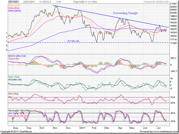
The large descending triangle pattern continues to dominate the BSE Sensex chart, despite substantial FII buying. The reason for the failure to breach the blue down trend line was apparently the unexpected 50 bps interest rate hike by the RBI (as an experienced fund manager claimed). But the Sensex had failed to breach the down trend line in Dec ‘10, Apr ‘11 and earlier in Jul ‘11. Different reasons were put forth at those times as well.

For those who still don’t believe in technical analysis, the blue down trend line on the one year weekly bar chart of the BSE Sensex index is as clear an example as possible of trend line theory: A trend, once established, remains in place till it is convincingly broken. Whatever the fundamental reasons, the index has remained below the down trend line. There is no point in betting against a down trend unless there are clear signals of a trend reversal. No such trend reversal signals are visible at present.

The weekly technical indicators are bearish, which means a likely test of the 17300 support level. If that level is broken – as it should from a descending triangle – the Sensex can go much lower. For the bulls, the silver lining is that the 20 week EMA is still above the 50 week EMA (equivalent to the 200 day EMA on daily charts).

No need to sell in a panic. The Sensex is less than 15% below its Nov ‘10 top. A high-volume breach of 17300 can lead to a ‘shake out’ that may see a resumption of the bull market.

NSE Nifty 50 Index Chart

Nifty_Jul2911

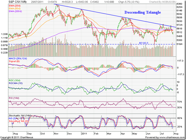
Volumes were heavy as the Nifty 50 index dropped below all three moving averages after another failed attempt at breaching the blue down trend line. The support level at 5190 or so is likely to be tested, and possibly breached. A low volume breach will be considered ‘normal’. A high volume breach may be a ‘bear trap’. So, remain prepared.

The technical indicators are bearish. The MACD is below its signal line, and about to fall into negative territory. The ROC is negative and below its 10 day MA. The RSI is below the 50% level, trying to make up its mind about which way to go. The slow stochastic has entered the oversold zone. Doesn’t look good for the bulls in the near term.

Whether the latest interest rate hike is going to have any effect on rising inflation will not be known for a couple of months. Q1 results declared so far are revealing a pattern of lower profits in spite of growth in sales. A couple more interest rate hikes can’t be ruled out altogether. We are nearing the peak of the high interest rate cycle, and still the Nifty hasn’t really crashed. The turnaround – when it comes, probably around Diwali – should result in a strong rally. Stay invested.

Bottomline? The BSE Sensex and NSE Nifty 50 index chart patterns are consolidating within large descending triangles, after several failed attempts to break out upwards. Tests and possible breaches of the support levels are on the cards. A good time to stay away and spend the time usefully by studying Annual Reports in detail.

Jumat, 29 Juli 2011

Trend - depends on lots of things doesn't it?


The books tell you that are are many ways to determine the current trend and that you should trade in the direction of the trend.  Want an easy way to figure out the trend? 

Look at the chart below and I think it tells you where is it in the trend picture.  The yellow levels are demand and supply zones.  The books tell you that the trend is currently UP.  All you need to do is map out the supply demand levels and see where you are in between these levels.  Drill down to a finer time frame and rip the profits. 

I'm doing this right now with currency futures.  The performance data you see on this blog on forex is my MT4 account, thats only for spot.  I use Amibroker and Interactive Brokers to trade the futures.  I also use Tipster Trendlines AFL code for Amibroker to place and adjust the trades.


How to tackle a ‘panic bottom’

Panic bottoms, which are sharp price drops accompanied by large volumes, frequently occur in stock price and index chart patterns. It is important, therefore, that investors understand and learn how to tackle a panic bottom in a portfolio stock.

This is a follow up to last Friday’s post about the Crompton Greaves price crash after the Q1 results fiasco, which raised quite a few comments and queries from blog readers and investment group members.

The nature of some of the queries and comments mentioned below motivated me to write this post:

I bought at a higher price. What should I do now?’

I bought on the day the stock crashed, and will buy more if it falls further.’

A big fund bought large quantities on the day of the fall. Shouldn’t we buy as well?’

Like promises, technical analysis rules are made to be broken. That doesn’t mean we shouldn’t be aware of the rules before playing the game. So, here are the two basic rules about panic bottoms:

1. Panic bottoms usually occur in the middle (or second) stage of a bear market

2. Panic bottoms seldom hold.

How do we know if a stock is in a bear market? In a post titled: ‘Is this a Bear Market, or a Bull Market correction?’, I had provided four different definitions of a bear market. Let us look at the chart pattern of Crompton Greaves to find out if it was in a bear market when the ‘panic bottom’ occured:

CromptonGreaves_Jul2911

In Jan ‘11, two of the definitions were satisfied: the stock corrected 20% from the Dec ‘10 peak of 349, and fell below the 200 day EMA. In Feb ‘11, the dreaded ‘death cross’ (marked by light blue oval) of the 50 day EMA below the 200 day EMA confirmed the bear market. (The fourth definition – a >50% correction of the previous bull rally – wasn’t checked, since three of the four definitions were met.)

The rally that led to the Apr ‘11 top above the 200 day EMA was a good opportunity to exit the stock. In the next (second) stage of the down move, the ‘panic bottom’ occurred – accompanied by heavy volumes.

An upward bounce from the ‘panic bottom’ – caused by bottom fishing and short covering – was a selling opportunity. Today’s low and close were both lower than the ‘panic bottom’ low of 171. Both rules of the ‘panic bottom’ have been followed.

The lessons?

1) Once a bear market is confirmed, hanging on to a stock – regardless of its fundamentals (or lack of them) – doesn’t make any sense. Use the first bear market rally to exit, and avoid the gut-wrenching experience of a ‘panic bottom’.

2) Don’t try to bottom-fish on a ‘panic bottom’ – because lower prices will be available later. It is safer and prudent to wait for a clear signal of change of trend before entering.

Kamis, 28 Juli 2011

Notes from the USA (Jul 2011) – a guest post

Michael Moore’s hard-hitting documentary, ‘Bowling for Columbine’, made an interesting point. The government and the TV channels do their best to keep Americans in a state of fear – so that they consume more! Remember the Y2K scare? Shelves of department stores were empty of water, canned food, torches, batteries, guns and a myriad other goods required for survival. People bought truck loads of the stuff. On Jan 1 2000 – nothing happened. No crash, no collapse. But a lot of goods consumed.

Following the economic downturn in 2008, a similar fear scenario played out across the USA. It was going to be worse than the 1929 depression. There would be riots on the streets. The US dollar was not going to be worth the paper it was printed on. Stock markets would crash and retirement benefits will vanish into thin air (a la Enron). Yes, unemployment is still high and the housing market is in doldrums. The doomsday theories have only led to a phenomenal rush to buy gold – but Americans are not getting fooled this time. They are tightening their belts – well some are – and digging in for the long haul.

In this month’s guest post, Kiran provides a ‘ground-zero’ report of the US economy.

------------------------------------------------------------------------------------------

Global Growth Slow, But Continues…

The global recovery from 2009-10 has broadened to encompass more enterprises, more countries and more elements that show aggregate demand. Improving labour market conditions in high-income countries and strongly expanding domestic demand in developing countries augurs well for a continued maturity of the recovery that is more than two years old.

The recovery here in the USA has gained strength over the past 8 to 12 months and shows signs of becoming more self-sustaining, although all of it has happened in an atmosphere of disbelief that it is real. Of course, Aug 2nd 2011 deadline for raising the debt limit being around the corner, makes this recovery a huge suspect in the minds of many without a Quantitative Easing – Part 3 (QE3). At this point, QE3 is not being discussed although Bernanke has hinted that he would be ready to pull it off if the situation warrants it. In the US, significant gains in levels of manufacturing and services activity, business re-investment and technology upgrades have helped improve conditions in U.S. labour and professional services markets. Most of the technology upgrades that we see are destined to either reduce labour costs, or reduce the current monthly expenditure (lower powered servers, more automation, VoIP, Telepresence, Call Center automation etc).

The recovery in Europe continues to face substantial uncertainty surrounding sovereign debt in several Eurozone members (code named PIIGS for each of the individual countries in huge debts). Germany and France have shown increasing strength; with unemployment in Germany now well below pre-crisis levels. In many other countries, growth is becoming constrained by fiscal consolidation programs, ongoing banking-sector restructuring and a skepticism regarding the financial sector. Perception is more important than reality, which is why gold is still trending upwards.

The horrible natural disaster and ensuing nuclear challenge in Japan will shape economic and human developments in that country for years to come. More importantly, all of the nuclear power plants in the US that are built similar to the one in Japan are under re-engineering to avoid a similar disaster. Despite the very real human and wealth losses associated with the crisis, its negative impact on GDP growth is expected to be temporary.

Overall, global growth is projected to ease from 3.8 percent in 2010 to 3.2 percent in 2011, before picking up to 3.6 percent in each of 2012 and 2013. The slowdown for high-income countries mainly reflects very weak growth in Japan due to the after-effects of the earthquake and tsunami. Japanese companies doing business worldwide are just starting to turn around and getting the business environment back to normal. Growth in the remaining high-income countries is expected to remain broadly stable at around 2.5 percent through 2013, despite a gradual withdrawal of the substantial fiscal and monetary stimulus introduced following the financial crisis to prevent a more serious downturn.

Contrary to the above, much of the rest of the world, meanwhile, is brimming with energy and hope. Policymakers in China, Brazil, India, and Turkey worry about too much growth, rather than too little. Rate increases in India and China are perfect proofs of efforts to curb inflation. By some measures, China is already the world’s largest economy, and emerging-market and developing countries account for more than half of the world’s output. The consulting firm McKinsey has christened Africa (part of the BRICA with the A standing for Africa), long synonymous with economic failure, as the land of “lions on the move.” That is an amazing turn for an economy – recall the pictures circulating on the Internet of kids who do not have water to drink and food to eat, and are just sitting there on the roadside. Well, a lot of that might be just a memory in Africa in the next decade.

Overall, for the cluster of developing countries growth is projected to decline from 7.3% to 6.2% between 2010 and 2012 before firming somewhat in 2013, reflecting an end to bounce-back factors that served to boost growth in 2010. The BRIC nations might have its own growth factors that are uniquely defined based on the organic growth within. Hence, their economies are more in the 8% to 10% GDP growth range, although inflation is a cause for concern in these hot economies. So, monetary tightening will continue to happen to temper the inflation.

Bringing it to today, perhaps for the first time in modern history, the future of the global economy lies in the hands of developing countries. The United States and Europe struggle on as wounded giants, casualties of the financial excesses and for the next few days, political paralysis. Economies of USA and Europe are shackled by heavy debt burdens with years of stagnation or slow growth in the offing and definitely a widening inequality – although they are not going to crash, contrary to emotional and eye catching dire predictions by some people. Analyzing the profile of family groups, and looking into their financial profiles, clearly shows the excesses in US from an income and asset standpoint. In the next one to two decades we will create ‘the haves’ and ‘the have nots’ even in these developed countries since the poor are getting poorer (with less and less government programs) and the rich will get richer buying more assets at low prices, for an eventual recovery. See below for a couple of interesting graphics:

clip_image002

clip_image002[5]

------------------------------------------------------------------------------------------

KKP (Kiran Patel) is a long time investor in the US, investing in US, Indian and Chinese markets for the last 25 years. Investing is a passion, and most recently he has ventured into real estate in the US and also a bit in India. Running user groups, teaching kids at local high school, moderating a group in the US and running Investment Clubs are his current hobbies. He also works full time for a Fortune 100 corporation.

Rabu, 27 Juli 2011

Stock Index Chart Patterns - BSE Sectoral Indices, Jul 27, '11

During the two months since the previous analysis of the BSE Sectoral Indices chart patterns, both the Sensex and the Nifty have struggled in down trends – failing to move above their down trend lines but not falling below their Feb ‘11 and Jun ‘11 lows.

What is happening in the Sectoral Indices? The separation of the wheat from the chaff is becoming more obvious.

BSE Auto Index

BSE Auto Index

Like the Sensex, the BSE Auto index is forming a large descending triangle – lower tops and a flat bottom at 8115 – that has bearish implications. The technical indicators are looking bearish and another test of the 8115 level seems likely. Hold.

BSE Bankex

BSE BANKEX

The BSE Bankex is forming a pennant pattern – lower tops and higher bottoms – which is a continuation pattern. An upward break out is more likely. But the bearish technical indicators are pointing to another spell below the 200 day EMA. Hold.

BSE Capital Goods Index

BSE Capital Goods Index

The BSE Capital Goods index made a valiant effort to escape the clutches of the bear, and managed to spend several days above the 200 day EMA. But bullish hopes were belied. The index has dropped back into a bear market. The weak technical indicators are suggesting that the correction will continue. Avoid.

BSE Consumer Durables Index

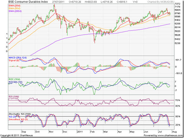
BSE Consumer Durables Index

The BSE Consumer Durables index is in a bull market, receiving good support from its rising 50 day EMA. A test of the Nov ‘10 top is on the cards. Hold.

BSE FMCG Index

BSE FMCG Index

The BSE FMCG sector continues to be the star performer over the past year, touching new highs on a monthly basis. Add on dips.

BSE Healthcare Index

BSE Healthcare Index

The BSE Healthcare index has been in a rising trend since the low of Feb ‘11, and is in a bull market. Add on dips.

BSE IT Index

BSE IT Index

The BSE IT index has slipped into a bear market. The failure of the index to get anywhere close to its down trend line in July ‘11 is bearish. Weaknesses in the Eurozone and US economies are taking a toll on our export-oriented software services companies. Hold.

BSE Metal Index

BSE Metal Index

The BSE Metal index is in a bear market. The technical indicators are suggesting further weakness. Unless infrastructure projects start picking up – which seems unlikely in a high-interest regime – things are not going to improve any time soon. Avoid.

BSE Oil & Gas Index

BSE Oil & Gas Index

The BSE Oil & Gas index is sliding down a slippery slope with very little hope of a turnaround. The government is in the horns of a dilemma about fuel prices. Not raising prices means losses and subsidies. Raising prices means stoking inflation. The poor performance of a heavyweight like Reliance has compounded the problems. The technical indicators are turning bearish. Avoid.

BSE Power Index

BSE Power Index

The BSE Power index is in a bear market, though the downward momentum is slowing. The technical indicators are bearish. Avoid.

BSE Realty Index

BSE Realty Index

The BSE Realty index is also a clear avoid – falling in a bear market with little hope of revival in the near term.

The FMCG index, Consumer Durables index and the Healthcare index are in bull markets. The Auto index and Bankex are struggling to remain in bull markets. These are the five sectors that investors should look to for parking their money. Individual stocks in the other six sectors that are going against the grain can also be considered for investments.

Selasa, 26 Juli 2011

RBI tries a ‘shock and awe’ tactic to tame inflation

In what seems like a last-ditch effort to bring inflation under control, the RBI decided to use a ‘shock and awe’ tactic – even if it meant a slow down in growth in the near term – by raising the repo and reverse repo rates by 50 bps (i.e. 0.5%) each.

That may not seem like much, except that the consensus estimate in the market was a 25 bps hike. Some even hoped for a pause in the rate hike, as there were some signs of slow down in inflation and growth. The 50 bps increase came as a bolt from the blue, and the bears didn’t waste a moment in extracting a heavy toll.

Wikipedia describes the ‘shock and awe’ tactic as follows:

‘Shock and awe (or rapid dominance) is a military doctrine based on the use of overwhelming power, dominant battlefield awareness, dominant maneuvers, and spectacular displays of force to paralyze an adversary's perception of the battlefield and destroy its will to fight.’

Whether inflation will get tamed or not remains to be seen. But a 100 point drop in the Nifty and a 350 point fall in the Sensex may seriously hamper the bulls’ will to fight. However, the rate increase should not have come as a big surprise to readers of this blog. After the previous rate hike in June ‘11, this was my cautionary statement:

‘… without appropriate fiscal and policy measures to support the RBI's monetary tightening, inflation is not going to come down any time soon. … Which means more tightening and further increase in repo and reverse repo rates in future, while the governments 'addiction' remains uncured.’

I paid Rs 50 a kg for fresh ‘bhindi’ yesterday. People living in Mumbai and Delhi may laugh at such ‘cheap’ rates, but it is the maximum I have ever paid for a non-exotic vegetable in Kolkata. Now there is talk of allowing only 6 LPG cylinders per family per year at the ‘subsidised’ rate of Rs 405. Any additional cylinders will be billed at Rs 700 to mitigate under-recoveries of the oil marketing companies.

Even the current slightly moderated inflation rate – which the RBI is trying to bring down further with the 50 bps rate hike – is actually an artificially lower rate due to subsidised prices of diesel, kerosene and LPG. The actual rate is way higher.

So, be prepared for more rate hikes, more EMI payments, slower growth in the economy and a sliding stock market. The press conference of bank CEOs following the RBI announcement made one thing crystal clear. Things will get a little worse, before they get any better.

But there is a silver lining to every dark cloud. Shorter-term fixed deposit rates are likely to be raised soon. Time to take some profits off the table, and reallocate to fixed income. Looks like a very testing time for the bulls till Diwali.

Senin, 25 Juli 2011

Stock Index Chart Patterns – S&P 500 and FTSE 100 – Jul 22, ‘11

S&P 500 Index Chart

image

Last week, I had mentioned the possibility of the S&P 500 index dropping below the 50 day EMA, and a probable test of support from the 200 day EMA. On Mon. Jul 18 ‘11, the index did drop below the 50 day EMA, but staged a remarkable turnaround during the rest of the week – thanks to good corporate earnings and news of the Greek bailout plan. The S&P 500 had a weekly gain of 2.2%.

That was the good news. The bad news is that the index failed to reach a new high, and remains in a sideways trading range with an upward bias. As long as the index keeps trading above a rising 200 day EMA, the bulls need not worry.

The technical indicators are looking bullish. The slow stochastic is rising above its 50% level. The MACD is above the signal line, and moving up in positive territory. The RSI isn’t looking that convincing, treading water just above the 50% level.

The US economy is in a listless state – neither cracking, nor really growing. New unemployment claims rose by 10,000 to 418,000 – the 15th straight week above the 400,000 mark. Thanks to the noise generated by the political brinkmanship playing out in DC over raising the debt limit, consumer sentiment is plunging.

No need to place fresh bets, just hold on.

FTSE 100 Index Chart

image

In last week’s analysis, the technical indicators had hinted at another drop below the 200 day EMA for the FTSE 100 index. Sure enough, the index spent a couple of days below its long-term moving average before a rally riding on the Greek bailout news took the FTSE 100 above all its three EMAs.

The index managed a 1.5% higher weekly close, but failed to regain the 6000 level. Friday’s (Jul 22 ‘11) low volumes indicate that the bullish fervour may be fading. The negative divergences in the technical indicators aren’t holding out much hopes for a continuation of the rally either.

The slow stochastic and RSI have both slipped below their 50% levels. The MACD just managed to turn positive after spending three days in the negative zone. The FTSE 100 is in a sideways trading range for more than 6 months now, and the bull market is showing signs of stalling.

Bottomline? The chart patterns of S&P 500 and FTSE 100 indices are back in bull market territory, but the bulls are beginning to look tired. Faltering economies in the USA and the Eurozone has sent gold prices soaring again. Remain invested, but no fresh buying is recommended at this stage.

Sabtu, 23 Juli 2011

BSE Sensex and NSE Nifty 50 Index Chart Patterns – Jul 22, ‘11

BSE Sensex Index Chart

SENSEX_Jul2211

Not much has changed from the previous week on the daily closing chart pattern of the BSE Sensex index. The stock market is dancing to the tune of the FIIs – falling when they sell and rising when they turn net buyers. All the three EMAs have become bunched close together, and when that happens, there is usually a sharp move.

In which direction? The large descending triangle pattern is intact, and till the down trend line is not breached, the outlook has to remain bearish. Any breach of the down trend line should be accompanied by a spike up in volumes, otherwise the breach may turn out to be a ‘false’ one – as it happened earlier in the month.

As long as the support level of 17460 holds, the bullish hopes will be alive. The technical indicators are showing signs of a turnaround, but are not quite bullish yet. The MACD is positive but below the signal line. The ROC is about to cross above its falling 10 day MA but is still negative. The RSI is trying to climb above the 50% level. The slow stochastic stopped falling, just above its oversold zone.

Bulls may attempt to test and breach the down trend line. Bears will try to thwart such an attempt. An interesting fight is on the cards in settlement week.

NSE Nifty 50 Index Chart

Nifty_Jul2211

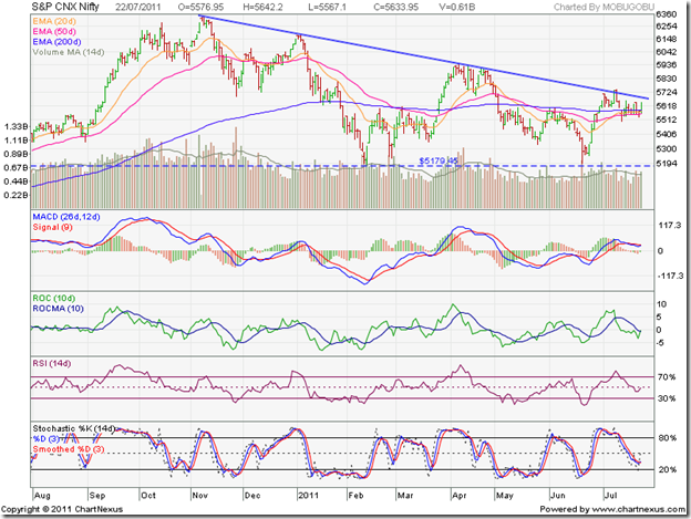
The point to note in the NSE Nifty 50 index chart pattern is the volume bars. Wednesday’s (July 20 ‘11) volumes on a down day were the highest. That is not a good sign for bulls. A 14 day Moving Average of the volume bars show gradually declining tops and bottoms since Oct ‘10. That is to be expected in a down trend.

Inflation is showing signs of moderation – a combination of the ‘base effect’ and the impact of the several interest rate hikes in succession. But it still remains high. Will the RBI resort to another rate hike next week? The market is expecting a 25 bps hike. If a hike does not come about, the index will rally.

Another potential rallying point could be a decision on opening up of multi-brand retail to FDI – something that has been discussed threadbare without reaching any conclusion. Q1 results have been a mixed bag so far – failing to provide a direction to the market. The Greece bailout has come as a temporary reprieve, which global markets are celebrating with a renewed rally.

Bottomline? The BSE Sensex and NSE Nifty 50 index chart patterns are just below an important resistance. Another failure to breach the down trend line could lead to tests of the June lows. A good time to stay on the sidelines and watch the action unfold.

Jumat, 22 Juli 2011

The curious case of Crompton Greaves

This is not a post about a court-room thriller, even though the title may sound like one of Erle Stanley Gardner’s page turners. That doesn’t mean that the process of discovery of the real cause behind the serious hammering of the stock price of Crompton Greaves may not be an exciting one.

First, the facts. A less than stellar Q1 result due to significant reduction in the consumer business (mainly electrical appliances) was a shock. That was followed by the revelation that the erstwhile CEO had dumped his entire stock holdings of 180000 shares earlier in the month.

The former CEO took pains to explain that:

(a) he doesn’t like to invest in the stock market but had received the shares as part of his compensation some 11 years back; at that time he had resolved to sell the shares immediately after retirement

(b) he retired on June 1, 2011 and sold the shares within a month of retirement after following due process of informing SEBI and the stock exchanges.

Doubts remained in the minds of investors because of three reasons:

1. Insider selling of large quantity of shares is considered a warning sign

2. Though he retired on June 1, 2011 Mr Trehan is still associated with the company though he doesn’t draw a salary. That means, he had insider’s knowledge about the poor Q1 performance of the company

3. The timing of the sale seemed a bit fortuitous. What if the stock market was in a deeper correction? Would he have sold his shares at lower prices? Alternatively, if the market was in the midst of a strong bull run, would he have waited a little longer to sell at a higher price?

Only Mr Trehan can answer those questions. Bottom line is that a lot of small investors were shaken by the severity of the stock price crash. Since such a crash didn’t occur when the ex-CEO actually sold his shares three weeks back, fingers are being pointed towards a bear cartel that used the fact of the insider sale as an excuse to hammer down the stock price. A fit case for SEBI to look into.

The Joint Managing Director of Havell’s – a competitor of Crompton in the consumer appliances space – does not believe that there is any cause of worry. Retail prices were hiked some time back due to increase in input costs. That may have led to consumers delaying their buying decisions. Another explanation is that distributors picked up more inventory in Q4 to avail of the then lower prices. That is why they lifted less inventory in Q1.

What should small investors do? On a TTM EPS of 10.61, the P/E at today’s closing price of 182.55 is 17.2. Not mouth-watering valuation by any means, but not hugely expensive either. If you are planning to enter, you may want to wait for Q2 results and then decide.

If you are holding the stock and are in profits, use the short-covering bounce up to book a part of it, and hold on to the rest. Remember the old stock market adage: When in doubt, stay out.

Kamis, 21 Juli 2011

How to read an Annual Report

It is that time of the year when Annual Reports start hitting the mailboxes of investors. There are three things you can do with the Annual Reports you receive:

1. Toss it into the recycling pile with the old newspapers and beer bottles without even opening the envelope

2. Check the Profit & Loss statement and the dividend amount before tossing it into the recycling pile

3. Actually take the trouble of going through the Annual Report in detail to find out whether the company whose stocks you are holding is growing, stagnating or flying kites.

In the wild west days in the USA, there used to be a saying: The only good Indian is a dead Indian. Of course they didn’t mean people from India (though Columbus thought he had reached the East Indies – the islands of South East Asia - when he landed up on the shores of the Bahamas).

If you believe that the only good Annual Report is the one lying ‘dead’ in the recycling pile, then this post isn’t for you. If you think otherwise, please read on.

First, go to the Cash Flow Statement to find out if the company is generating enough cash from its business to finance part or most of its expenditure for growth. If you don’t know how to read a Cash Flow Statement, please read my posts of  Mar 22 2011, Mar 24 2011, Mar 29 2011 and Apr 5 2011.

Next, check out the Profit & Loss statement and the Balance Sheet. Of particular interest should be inventory and accounts receivable (if percentage increases are more than the sales percentage increase, they are warning signs); increase in equity capital and loans (not a good sign if these increase frequently); cash in hand/banks should tally with the figure in the Cash Flow Statement (so that a Satyam-like situation doesn’t recur).

Next comes the Directors’ Report and Management Discussion and Analysis. Read through these even though there will be hardly any negative feedback in them. They will give an idea about the industry and the company’s growth plans and (rosy) prospects.

Last, but not the least, are the Notes on Accounts. However boring these notes may seem – particularly to non-accountants like me – they contain a wealth of information that usually have adverse implications on profits. If a company suddenly announces a surprising turnaround or spectacular recovery in results, chance are that they have ‘cooked their books’ (a Punj Lloyd speciality). Look for changes in depreciation calculation and inventory valuation, which can significantly alter profits without an actual improvement in performance.

Also look at the court cases – usually with various tax authorities regarding disputed demands. Prudent managements will make at least part provisions against likely future liabilities. For companies that provide stock options to their employees, use the diluted EPS to calculate P/E ratios. For companies that have several subsidiaries – listed or otherwise – use the consolidated results for analysis.

There are many other things to look for in an Annual Report – but these are the broad areas for a first-cut analysis to ensure that business and growth are on track.

(Note: Thanks to reader Jalal for suggesting this topic.)

Rabu, 20 Juli 2011

Stock Chart Pattern - Carborundum Universal (An Update)

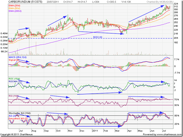
In the previous update to the analysis of the stock chart pattern of Carborundum Universal, I had observed negative divergences in the technical indicators after the stock had reached a new high of 231 on Jul 27 ‘10. Volumes were massive that day, which some times indicates buying exhaustion.

Accordingly, investors were cautioned about a possible correction down to the 200 day EMA (at 180), or even lower to the support level of 165. The stock did correct, dropping below its 20 day and 50 day EMAs, but found support at the long-term support-resistance level of 204 in end-Aug ‘10. The dip of 12.5% from the top of 231 was a healthy bull market correction.

Let us see how the chart pattern shaped up from the one year bar chart pattern of Carborundum Universal:

Carborundum_Jul2011

The stock bounced up sharply, backed by good volumes, and embarked on a strong rally during Sep and Oct ‘10 – reaching a new high of 279.50 on Nov 1 ‘10. But the RSI and slow stochastic failed to reach new highs (marked by blue arrows) – a warning about a possible correction.

The correction coincided with the ones taking place in the Sensex and Nifty. The stock price dropped to 224 on Nov 29 ‘10 – a 20% correction that underperformed the Sensex – and then went into a sideways consolidation with a downward bias that breached the 200 day EMA on Mar 14 ‘11.

A double-bottom at 217 ended the correction. Note that the stock price spent 12 straight trading days below the long-term moving average – raising the spectre of a bear market. But neither the 20 day EMA, nor the 50 day EMA dropped below the 200 day EMA – keeping the bull market intact.

The end to the correction was confirmed by the positive divergences in the ROC (which made a higher bottom) and slow stochastic (which made a flat bottom), as the stock price made a lower bottom at 217 (marked by blue arrows).

A spectacular 3 months long rally that outperformed the Sensex, culminated in a new high of 320 on Jul 11 ‘11. But the ROC and RSI reached lower tops and the slow stochastic made a flat top (marked again by blue arrows).

The technical indicators have started weakening as the stock has started a sideways consolidation. The MACD is positive, but has crossed below its signal line. The ROC is also positive, but has fallen below its 10 day MA. Both the RSI and slow stochastic have dropped from their overbought zones, and are headed downwards.

A correction down to the rising 50 day EMA is a possibility. The stock is in a bull market, and dips can be used to add. The company is fundamentally strong, investor friendly, with prudent financial management and steady growth. The stock can make an excellent addition to a small investor’s portfolio.

Bottomline? The stock chart pattern of Carborundum Universal is consolidating after a strong rally. Existing holders can book partial profits. New entrants can add on the likely dip.

Selasa, 19 Juli 2011

Gold and Silver Chart Patterns: an update

The chart patterns of gold and silver have made significant bullish breakouts since my earlier post two weeks back. As often happens with bullish breakouts, investor interest has risen proportionately. I received quite a few queries whether this is a good time to enter.

Gold Chart Pattern

image

Gold’s price rose almost vertically to pierce the psychological 1600 mark intra-day. I had mentioned about the price consolidation within a rectangle between 1480 and 1550, from which an upward breakout was likely. Accordingly, buying on a breakout above the 1550 level was advised.

Note that gold’s price spurt has been too fast. It has risen far away from its 14 day, 30 day, 60 day, and 200 day SMAs. A pullback towards the 1550 level is a possibility. That may be a better price point to enter.

Silver Chart Pattern

image

Silver’s price was consolidating within a symmetrical triangle from which an expected downward break did occur. But the 34 level provided good support. The previous low of 32.50 wasn’t tested.

The bulls managed a spirited recovery that took silver’s price above the 14 day, 30 day and 60 day SMAs – as well as the 40 mark. The rise has been a bit steep, and a dip down to 38 is possible. The dip can be a good point to enter.

Till the growth uncertainties in the Eurozone and US economies recede, the precious metals will continue to be safe havens for jittery investors.

Senin, 18 Juli 2011

Stock Index Chart Patterns – S&P 500 and FTSE 100 – Jul 15, ‘11

S&P 500 Index Chart

image

Last week, I had questioned the technical validity of the upward break out in the S&P 500 index chart pattern. The volumes were not significantly higher, and the technical indicators were looking overbought. The conclusion from those two observations were: ‘A pullback to the 50 day EMA … at 1310 is a possibility.’

The index slipped below the 50 day EMA and the 1310 level on Thu. July 14 ‘11 before closing the week at 1316 – a 2% loss on a weekly basis. Note that volumes picked up as the index slid down last week. That should be a concern for the bulls.

The technical indicators have weakened considerably without turning outright bearish. The slow stochastic dropped down from its overbought zone, but remains above the 50% level. The MACD is still positive and above the signal line. The RSI turned around after touching the edge of its overbought zone, and is treading water above the 50% level.

If the index drops below the 50 day EMA – and there is every possibility of its doing so – it could go down to seek support from the still rising 200 day EMA. Technically, the S&P 500 is in a bull market – so dips can be used to buy, but with a strict stop-loss at 1250.

The economy continues to make slow progress. Retail sales have been better than expected, with a 8% YoY increase in sales in June ‘11 – the best in six years. Initial unemployment claims were 405,000 – a decrease of 22,000 from the previous week, but the 14th straight week above the 400,000 level. 

FTSE 100 Index Chart

image

The ‘reversal day’ pattern on Fri. Jul 8 ‘11 and the overbought conditions of the technical indicators were the reasons why I had mentioned in last week’s analysis that the FTSE 100 index chart may drop to the 50 day EMA or even the 200 day EMA.

The index dropped below the 50 day EMA to the 200 day EMA intra-day on Tue. Jul 12 ‘11 on strong volumes. The subsequent upward bounce took the index above the 50 day EMA for a day. But the bullish fervour petered out on sliding volumes.

The technical indicators are hinting at another move below the 200 day EMA. The slow stochastic has fallen to the 50% level from its overbought zone, and is heading down. The MACD is barely positive, and below its signal line. The RSI slipped down after nearly touching its overbought zone, and is trying to make up its mind whether to drop below the 50% level or not. If you use the dip to buy, maintain a strict stop-loss at 5600.

As per this article, the Eurozone economy has been in muddle-through mode ever since the Greek debt crisis broke. Muddle-through, but not collapse by any means. That should be music to the ears of the bulls.

Bottomline? The chart patterns of S&P 500 and FTSE 100 indices are still in corrective moods and can remain so a bit longer. The dips can be used to buy for short-term trading opportunities. Both indices have been moving sideways for 6 months without a clear trend emerging.

Minggu, 17 Juli 2011

BSE Sensex and NSE Nifty 50 Index Chart Patterns – Jul 15, ‘11

BSE Sensex Index Chart

Sensex_Jul1511

In last week’s analysis of the BSE Sensex index chart pattern, weakening signs were clearly visible in the technical indicators (marked with light blue ovals), which led me to make the following observations:

‘The EMAs may support any down moves. The technical indicators are suggesting that any such support may be temporary.’

The index dropped below all three EMAs, bounced up to find resistance from the 200 day EMA on a closing basis, only to turn down and seek support from the 20 day EMA. Another effort by the bulls to break above the down-trend line has come to nought.

The technical indicators are beginning to look bearish. The MACD is positive, but has dropped down to touch its signal line. The ROC has fallen well below its 10 day MA into negative territory. After a brief sojourn into its overbought zone, the RSI is plunging towards its 50% level. The slow stochastic has slipped below the 50% level.

Despite net buying by FIIs (though the identity of these so-called FIIs are questionable at best – as per a recent investigation by a business TV channel), the bulls have not been able to make much headway. A test, and a possible break, of the 17460 support level is likely.

NSE Nifty 50 Index Chart

Nifty_Jul1511

The NSE Nifty 50 index chart pattern fared marginally better than the Sensex – probably due to the greater weightage of the oil stocks in the index. After sliding below all three EMAs, the Nifty bounced up above them and is currently getting support from the 200 day EMA on a closing basis.

That is a small consolation, as the technical indicators are looking just as bearish as those of the Sensex. Cash volumes have started slipping after the brief rally, and the Nifty is likely to test the 5180 support level sooner or later. A break below will have very bearish implications.

The macro environment is not improving. The government is getting pushed into a corner due to the various scandals and scams. A less-than-impressive cabinet reshuffle has not convinced anyone that tough decisions will be taken soon – notwithstanding the talk about allowing FDI in retail. The reform process seems to be on the back burner. Inflation refuses to be controlled, and another 25 basis points interest rate hike is becoming inevitable. Auto sales are suffering. Q1 results declared so far isn’t encouraging.

The corrective move from the Nov ‘10 top has entered the 9th month, and may continue for some more time.

Bottomline? The BSE Sensex and NSE Nifty 50 index chart patterns are in danger of dropping below important support levels. This is a time to be cautious, and away from the ‘action’. Remain invested but maintain appropriate stop-losses.

Jumat, 15 Juli 2011

How many shares of each company should I buy?

A common question vexing many small investors is how many shares of each company to buy. A young investor friend did quite a detailed analysis of a particular company, and took some inputs from me to fine-tune his analysis process.

After a few iterations to arrive at a proper valuation, he decided that the current price had enough ‘Margin of Safety’ and decided to buy the shares of the company. How many shares did he buy? 100. Nothing wrong with that. Small investors can’t always spare a lot of cash.

What happened next? Within a short time, the stock spurted on large volumes and doubled in price. My friend was left ruing the fact that he didn’t buy more shares even though he had spare cash. Shortly thereafter, the company announced a bonus issue, and the stock spurted even higher.

In spite of doing due diligence, a big money-making opportunity was lost because a sufficient quantity of shares were not purchased to start with. Such opportunities don’t come often. So, how do you decide what is a ‘sufficient quantity’?

In last Tueday’s post: How many stocks should I buy?, I had outlined how a Rs 5 lakh portfolio can be allocated to large caps, mid caps and small caps. The suggestion was: 8 large caps worth Rs 50,000 each, plus two mid caps and two small caps worth Rs 25,000 each.

While the money allocation to each category of stocks would automatically limit how many shares of each company you can buy, it won’t eliminate the risk factor. Different investors have different risk tolerance levels, and that should be built into the allocation.

Here is a simple example. Suppose you decide that the maximum loss you can afford in the large cap stocks is 5%, and 10% in the mid and small cap stocks. Your large cap allocation is Rs 50,000 to each of 8 companies. Your mid and small cap allocation is Rs 25,000 to each of 4 companies. A 5% loss in the large caps and a 10% loss in the mid and small caps would limit the loss to Rs 2500 per stock.

(If all your picks fail to perform and hit the respective stop-loss levels, your total loss will be limited to Rs 30,000; i.e. 6% of your Rs 5 Lakh portfolio.)

If you decide to buy a large cap with a current price of Rs 100, you can buy 500 shares with a Rs 5 stop-loss to ensure that you limit your loss to Rs 2500. What if a mid cap is trading at Rs 100? Should you buy 500 shares in that case?

Since mid caps tend to fluctuate more, you had chosen a 10% loss as your limit. That would mean buying a Rs 100 stock with a Rs 10 stop-loss. Buying 500 shares may incur a loss of Rs 5000 if your stop-loss is hit. So, you need to buy only 250 shares with a Rs 10 stop-loss.

The example is simplistic to make a point. You need to adjust stop-loss levels for each stock that you buy according to your comfort level and the beta value (i.e. the amount by which a stock fluctuates with respect to an index) of each stock.

Kamis, 14 Juli 2011

Stock Chart Pattern - Hero Honda Ltd (An Update)

The previous update of the stock chart pattern of Hero Honda was posted back in Nov ‘09. The stock was a sterling performer during the bear market – moving up from 630 in Jul ‘08 to 1100 in Mar ‘09 – while the Sensex and most other stocks were hitting their 52 week lows.

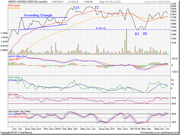
The strong performance continued for another year - right up to Apr ‘10 – when the stock price crossed the 2000 level and closed at 2057 (marked as T1) in the week ending Apr 9 ‘10. A gain of 225% from its Jul ‘08 low.

Let us look at the two years weekly closing chart pattern of Hero Honda and find out what happened after that excellent up move:

HeroHonda_Jul1411

During Jun ‘09, the 1465 level had provided good resistance to the up move. Once the stock broke the resistance in Jul ‘09, it quickly reached a new closing high of 1736 in the week ending Jul 24 ‘09.

The subsequent correction found support from the previous resistance level of 1465 – another instance of a resistance turning into a support. Volumes were quite strong during the resistance and support.

A 7 months long consolidation followed within a bullish ‘ascending triangle’ pattern, from which the expected upward break out occurred in Feb ‘10. Note the volume bars in Feb ‘10 – they should have been substantially higher to technically validate the upward break out. That was the first warning about an impending correction or reversal.

Though the stock price rose sharply to close at 2057 in Apr ‘10, the MACD, ROC and RSI reached lower tops and the slow stochastic just managed to reach its previous top. The combined negative divergences of all four technical indicators was the second warning about a possible correction/reversal.

The stock price corrected down to 1858 in the week ending May 21 ‘10, only to rise to 2050 (marked as T2) in the week ending Jun 25 ‘10 – falling short of the Apr ‘10 top of 2057. The lower volumes during the Jun ‘10 top opened the door for a bearish ‘double-top’ reversal pattern. That was the third warning about a correction/reversal.

The stock price crashed through the 20 week EMA in Jul ‘10 and dropped below 1858 (the May ‘10 low), which confirmed the ‘double-top’ reversal pattern. The stock price consolidated sideways till Dec ‘10. There was a sharp drop below the 50 week EMA (equivalent to the 200 day EMA on daily charts) to 1679 on strong volumes, followed by an equally sharp 300 points spike to 1986 on higher volumes.

That seemed to exhaust the bullish fervour. The rumours about Japan’s Honda Motors pulling out of the joint venture with the Munjals of Hero group were confirmed. The stock price fell more than 500 points to the support level of 1465 in Feb ‘11. The 20 week EMA crossed below the 50 week EMA – the dreaded ‘death cross’ that confirmed a bear market.

But you just can’t keep a good stock down for long. A bullish double-bottom pattern (marked as B1 and B2) formed in Mar ‘11, and the stock recovered quickly above both the EMAs in Apr ‘11. It has been trying to move up for the past two months, but without much success. The low volumes haven’t helped. But the 50 week EMA has provided good support, and the 20 week EMA has crossed above the 50 week EMA.

The technical indicators are weakening. The MACD is above the signal line, but the upward momentum is slowing. The ROC is still positive, but has dropped below its 10 week MA and touched a lower top. The RSI has dropped below its overbought zone. The slow stochastic is threatening to do likewise. Another test of support from the 50 week EMA is likely.

The company is fundamentally very strong, with strong operating cash flows, negligible debt, huge reserves, a regular dividend payer and the leader in the two-wheeler segment. The uncertainty about future technology inputs and entry of Honda in the two-wheelers segment are the negative overhangs.

Bottomline? The stock chart pattern of Hero Honda shows that technically the worst may be over. Some fundamental concerns remain. The main competitor, Bajaj Auto, is di’worse’ifying into four wheelers. That could be just the opportunity for Hero Honda to consolidate its leadership position. Investors can use dips to accumulate.

Rabu, 13 Juli 2011

How to use Covered Calls – a guest post

Last month, Nishit wrote about the Short Strangle strategy to make money in a sideways market. Not too much has changed since then. The Nifty is still trading within a range - not giving a clear direction.

Individual stocks in your portfolio may be going nowhere also. Can you generate some profits without selling your stocks and losing out on dividends or bonus issues? Covered Call writing may be just the strategy for you, suggests Nishit.

----------------------------------------------------------------------------------------------------------

We continue with our series of F&O with an article on Covered Calls. Covered Calls basically mean we already own an underlying asset and sell Calls.

The Wikipedia definition is:

A covered call is a financial market transaction in which the seller of call options owns the corresponding amount of the underlying instrument, such as shares of a stock or other securities. If the trader buys the underlying instrument at the same time as he sells the call, the strategy is often called a "buy-write" strategy. In equilibrium, the strategy has the same payoffs as writing a put option.

Let us take an example of Infosys. Infy has been rallying from 2700 to 2950 from the June Series. That’s roughly a rise of 10% for the past past 3-4 weeks. Logic states that if a stock rallies before results, then any good news is discounted in its price. Same logic if it falls before results. This is based on the principle that markets discount all news in advance.

Assuming I have Infy shares constituting 1 lot in F&O, which is 125 shares. If I had written 1 lot Rs 3000 strike price Option of Infy on Tuesday, then I would have got Tuesday’s price of 52. This would entail a premium inflow of Rs 6500 (=125x52).

I have 125 shares of Infy in my account. Now, if my trade goes right and Infy falls, then I get to keep the shares as well as pocket the premium of Rs 6500.

Now if Infy rises, till Rs 3000, I don’t pay anything. This is because Option strike price is Rs 3000. At Rs 3050, I have to pay Rs 50. My inflow is Rs 50 from writing, so no loss no profit.

Above Rs 3050, I start having to pay up. This also means that when market price was Rs 2950, I was covered till Rs 3050 for losses and above that, I sell my shares which I hold and pocket the money. Suppose, Infy hits Rs 3100, then I sell off at a rally of Rs 350 from the bottom which translates to 13% gain in a span of 4 weeks.

A stock like Infy moves max 20% in a year in a range. Like from Aug ’10 to Jan ’11, Infy moved from Rs 2700 to Rs 3500. Not a bad deal.

This strategy is recommended for Long Term Investors who have shares in their demat accounts and want to earn some money on the side, without losing out on dividends or bonus.

Before entering any trade, one should have a clear idea of reward, risk and max loss and max profit.

Note: The figures at some times may be indicative or rounded off for example’s sake. The idea of this article is to try and explain the fundamental principle. True students of Option Strategies should try and grasp the basic principle. The strategy works best for stocks in which you are long-term bullish, but which may not be moving much in the near term.

----------------------------------------------------------------------------------------------------------

(Nishit Vadhavkar is a Quality Manager working at an IT MNC. Deciphering economics, equity markets and piercing the jargon to make it understandable to all is his passion. "We work hard for our money, our money should work even harder for us" is his motto.

Nishit blogs at Money Manthan.)

Selasa, 12 Juli 2011

Video on Tipster Trendlines for Amibroker

I thought I would offer an update on this code.  The code might be "old" but it sstill works and I still use it.

This code allows you to place trades and modify trades right from the Amibroker chart.  It has much more functionality than the current version of Amibrokers trading off the chart feature.  Watch the video and see for yourself.

Here is the link to read more about this and get the code.  Tipster Trendlines 3

Tipster Trendlines 3 from Another Brian on Vimeo.

This AFL code for Amibroker allows you to place trades right from the Amibroker chart. Once the order is place (transmitted) you can change it just by moving the 3 lines on the chart and pressing the button on the chart window. Once the order is filled, you can move the target and stop lines and press a button the change them too! All you have to do is draw 3 horizontal lines on your chart and you're ready to trade. Watch the video to see how it works.

http://blog.tipster.ca/p/tipster-trendlines-3.html

How many stocks should I buy?

From the emails I receive from readers and newsletter subscribers, this is a common question faced by many small investors. Due to limited resources, investors tend to swing from one end of the buying pendulum to the other. They either buy 30 shares of a fundamentally strong stock trading at Rs 500; or, they buy 500 shares of some unknown small-cap trading at Rs 30.

Both can be counterproductive for the growth of your portfolio. With the costlier stock, a sudden spurt to Rs 600 may tempt you to sell out quickly and miss a bigger profit opportunity. The alternative strategy of booking partial profits and holding the rest with a trailing stop-loss may not work too well with only 30 shares to play with.

For the less expensive stock, a 20% gain from 30 to 36 may not seem enough to do any profit booking. So you hold on with the hope of selling only if the stock reaches 50 – which it may never do. In fact, the cheaper stock is more likely to drop to 15.

What is the solution? Firstly, you need a decent amount of capital to build a portfolio of individual stocks. I recommend a minimum of Rs 5 lakhs – preferably Rs 10 lakhs. What if you have only 1 or 2 lakhs? You may be better off investing in mutual funds and fixed income instruments to build up your capital.

What if you do have Rs 5 lakhs? How do you decide how many stocks to buy? The thumb rule in buying individual stocks is: More is not merrier. Keeping regular track of any more than 10-12 stocks can become a full-time activity. You have to remain informed about the overall economy – local and global, individual sectors to which your stocks belong, quarterly performance of individual stocks as well as news flows about them; read Annual Reports; check if dividends are getting credited; apply for rights shares, and a myriad other things.

If you settle on 12 stocks for your portfolio, how will you allocate to large, medium and small-caps? A thumb rule for getting steady returns, protecting downside during bear attacks, plus having a growth ‘kicker’ is to allocate 80% of your capital into stalwart large-caps, and 20% to good mid-caps and small-caps.

How many stocks in each category? Say, 8 large-caps, 2 mid-caps and 2 small-caps. Allocating Rs 50000 for each large-cap, and Rs 25000 to each mid-cap and small-cap stock will complete your portfolio. This is a suggested portfolio. You can tweak it to suit your own style and risk tolerance.

Once you limit yourself in terms of the number of stocks and the allocation of capital to each stock, a funny thing will happen. You will be forced to be very selective about the stocks you pick. That will, in turn, make you more disciplined about choosing the very best stocks – and waiting to buy them only after a significant price correction.

The same Rs 500 stock mentioned earlier was probably trading at Rs 200 two years back, and may drop to 350 after the next correction. Instead of buying 30 shares now, buy only 10 (to help you to track it regularly). When (and if) it drops to 350, buy 130. You will end up with 140 shares and complete your Rs 50000 allocation to the stock.

Related Posts

Learn the Art of Partial Profit Booking
Why building a stock portfolio is like buying a car

Senin, 11 Juli 2011

Stock Index Chart Patterns – S&P 500 and FTSE 100 – Jul 08, ‘11

S&P 500 Index Chart

image

In last week’s analysis of the S&P 500 index chart pattern, the widening Bollinger Bands had hinted at the possibility of volatile trading. The technical indicators were beginning to look overbought – a harbinger of a correction.

In a trading week shortened by the July 4 holiday, the S&P 500 displayed volatility and the start of a correction. After two days of sideways move, a spurt on Thursday, July 7 ‘11, probably caused by an improvement in employment data, took the index to a close above the 1350 level after almost 2 months.

In between, the index made a rounding-bottom bullish pattern that received good support from the rising 200 day EMA. (The rounding-bottom is also visible in the 20 day EMA and the MACD.)

The down-trend line (not drawn on chart) connecting the May 2 ‘11 and Jun 1 ‘11 tops, was breached on Jul 1 ‘11. But there was no significant increase in volume – in fact volumes began sliding before the breach. That makes the breach technically suspect.

The technical indicators are looking overbought. The slow stochastic is in its overbought zone, and seems ready to turn down. The MACD is positive, but has risen too fast above the signal line. The RSI is at the edge of its overbought zone. A pullback to the 50 day EMA (and the top of the down-trend line) at 1310 is a possibility.

FTSE 100 Index Chart

image

The FTSE 100 index chart treaded water around the 6000 level for three days before a sharp up move on Thu. July 7 ‘11, followed by a ‘reversal day’ pattern (higher high, lower close) on Fri. July 8 ‘11. The index closed flat on a weekly basis – just below the psychological 6000 level.

The index is above all three EMAs, which means a bull market technically. The technical indicators are reacting from overbought conditions. A fall to the 50 day EMA, or even the 200 day EMA, will not be surprising.

The slow stochastic is about to drop from its overbought zone. The MACD is positive, and above its signal line but turning down. The RSI is at the edge of its overbought zone – not a place it visits often.

Bottomline? The chart patterns of S&P 500 and FTSE 100 indices are showing signs of correcting a sharp rally. The bull markets are still intact, but the economies are weakening. Both indices are moving in broad sideways channels for 6 months, giving trading opportunities.

Sabtu, 09 Juli 2011

BSE Sensex and S&P CNX 500 Index Chart Patterns – Jul 08, ‘11

In last week’s analysis of the chart patterns of the BSE Sensex and NSE Nifty 50 indices, I had made the following comments:

‘If (the FIIs) continue their buying spree, the down-trend line may get breached next week. But if it isn’t a high-volume break out, the index may pull back into the descending triangle.’

As is apparent from the closing chart pattern of the BSE Sensex (and also of the Nifty 50 – though not shown here), both indices behaved exactly as expected, as the FIIs continued their net buying through the week.

BSE Sensex Index Chart

Sensex_Jul0811

The blue down-trend line was breached on Thursday, July 7 ‘11. But the breach wasn’t technically valid, though the Sensex managed to close above the down-trend line. Why?

Firstly, because all breaches of supports and resistances should follow the 3% ‘whipsaw’ lee-way rule. In other words, if an index or stock remains within 3% of a breached support or resistance level, then more often than not, there is a ‘whipsaw’ (i.e. a sudden change of direction) – as marked by the blue circle on the Sensex chart).

Also, though not shown in the chart, volumes were not significantly higher during the break out above the down-trend line. That is another technical ‘rule’ for valid upward break outs. (Note that the ‘rule’ doesn’t apply for downward breaks; i.e. volumes need not be higher – though they some times are.)

Though the index is back inside the large descending triangle, it is above all the three EMAs. The EMAs may support any down moves. The technical indicators are suggesting that any such support may be temporary.

The MACD is in positive territory, and rising above its signal line. The ROC is also positive, but has crossed below its 10 day MA. The RSI has entered overbought territory, where it doesn’t stay very long. The slow stochastic is in its overbought zone, but made a lower high as the index rose higher to breach the down-trend line – a negative divergence.

In spite of the FII buying spree, the bears managed to stall the rally.

S&P CNX 500 Index Chart

S&P CNX 500_Jul0811

For a different perspective, I have included the one year closing chart pattern of the broader S&P CNX 500 index instead of the Nifty 50. The Nifty 50 chart is very similar to that of the Sensex. But the broader index has a couple of very interesting differences – both of which have bullish implications.

First, the 200 day EMA and the down-trend line were breached ahead of the Nifty a week ago. The long-term support-resistance level of 4550 was also breached, and is now providing support. However, the CNX 500 didn’t quite get past the 3% ‘whipsaw’ lee-way.

The June ‘11 low was higher - by almost 100 points - than the Feb ‘11 low. That makes the large triangle on the CNX 500 a ‘pennant’ rather than bearish descending triangles on the Nifty and Sensex charts. The upward break out may turn out to be valid – but possibly after a pullback to the down-trend line.

Bottomline? The chart patterns of the BSE Sensex and the S&P CNX 500 indices show that the bears are in no mood to give up their 8 months long strangle-hold on the Indian stock market. Thanks to a surge in FII (round-tripping ‘hot’ money?) inflows, the bulls have regained some lost ground. Be very stock specific in your buying, and set tight stop-losses. Things can get worse in a hurry if Q1 results belie expectations. Better to watch the fight from the sidelines. 

Jumat, 08 Juli 2011

Stock Index Chart Patterns – Hang Seng, Singapore Straits Times, Malaysia KLCI – Jul 08 ‘11

The wheat is getting separated from the chaff in the chart patterns of the Asian stock indices. The Hang Seng index is in real danger of falling into a bear market. The Straits Times index has averted a bear market so far, but is still struggling in a down trend. The KLCI index has broken above its down trend line, as was expected in last month’s post.

Hang Seng Index Chart

HangSeng_Jul0811

The Hang Seng index seems to be in trouble. The index not only dropped below the 200 day EMA last month, but broke below the 8 months long downward-sloping channel. The subsequent sharp bounce re-entered the channel and climbed up to the 200 day EMA, where it is facing resistance.

The bad news for the bulls is that the 50 day EMA has slipped below the 200 day EMA – the dreaded ‘death cross’ that signals a bear market. The technical indicators are looking bullish and showing positive divergences. The MACD is negative, but has risen above the signal line. The ROC is positive and above its 10 day MA. RSI and slow stochastic have entered their overbought zones. ROC, RSI and slow stochastic have reached higher tops, while the index has reached a lower one.

The Hang Seng may make an effort to cross the 200 day EMA next week, which can be an opportunity to book some profits. The drop below the channel is not a good sign for bulls.

Singapore Straits Times Index Chart

Straits Times_Jul0811

A deeper correction and a test of the Mar ‘11 low was expected in last month’s analysis. But the Straits Times index recovered quickly to climb above all three EMAs, before encountering strong resistance form the blue down trend line.

Technical indicators are looking bullish and all four are showing positive divergences – reaching higher tops while the index reached a lower one. Today’s volume uptick is a sign that the index may break above the down trend line next week. Buy on the break out, and add more on any pullback.

Malaysia KLCI Index Chart

KLCI Malaysia_Jul0811

The KLCI index tried for several days in June ‘11 before breaking above the blue down trend line. It has reached a new all-time high, but there are some dark clouds on the horizon.

Volumes were not all that great during the break out and the subsequent climb to a new high. A bull market without volume support is suspect. Also note the negative divergences in all four technical indicators, which reached flat or lower tops even as the index rose higher (marked by blue arrows).

A correction down to the blue down-trend line can be expected. That may be a buying opportunity.

Bottomline? The bears are still active in the chart patterns of the Hang Seng and Straits Times indices. The bulls have regained full control of the KLCI index. Buying is not advised till the down-trend lines in the Hang Seng and Straits Times indices are convincingly breached.

Kamis, 07 Juli 2011

Some strategies about buying stocks

In a post last week, I had discussed strategies for selling stocks. Most small investors know how to buy stocks, but they rarely have proper strategies for selling. So why am I writing about buying strategies?

From the spate of questions I have recently received about when and how much to buy, it seems that discussing some buying strategies may be useful after all. I had mentioned about using the ‘Margin of Safety’ concept and P/E bands to decide entry points in last week’s post.

The importance of those two concepts can’t be over-emphasised. Too many young investors follow the wild west policy of ‘Shoot first, and ask questions later’. Just switch on any business TV channel (just for entertainment) during the day when they take reader queries. 99% of the questions are: ‘I have bought thus and such stock at this price; should I hold or sell.’

It is apparent from the questions that the stock was bought near a top, and the investor is already sitting on a loss. The question – or rather, a plea – is to find out if the TV expert knows some magical formula by which the loss can be quickly turned into a profit, or, at worst, break-even with no loss.

All one has to do before placing a buy order, is to first check whether the current E/P (i.e. inverse of the P/E ratio) is higher than the long-term bank fixed deposit rate, leaving a ‘Margin of Safety’ . Also check that the debt/equity ratio is less than 1, and that the cash flow from operating activities is positive for 4 of the last 5 years.

If E/P is lower than the bank FD rate, then check the P/E band within which the stock normally trades, and buy only if it is available near the middle of the P/E band or lower. These are basic precautions, and will help prevent losses – even if you don’t have the time or inclination to do a detailed fundamental analysis.

If you are like most small investors, the stock price will fall just after you’ve bought it (and, it rises soon after you sell)!! What should you do? Do not, repeat, do not average down. That is the single cause for turning a small loss into a much bigger one. Instead, keep a stop-loss – and sell if the stop-loss is hit on a closing basis (i.e. take intra-day movements out of the equation).

You will make much more money by averaging up. When should you do that? Buy 20-25% of your intended quantity at the beginning. Add more every time the stock dips or corrects on the way up. Follow a ‘pyramid’ strategy – i.e. buy less and less quantity on the dips as a stock keeps moving up in price – till you acquire your intended quantity.

Such a strategy will prevent impulsive buying of 2000 or 5000 shares in one go, in the hope of becoming a Warren Buffett within a month. Talking of Buffett, I love his quote: ‘You can’t make a baby in one month by getting nine women pregnant!’

Wealth-building takes time. If you hone your buying and selling strategies, you have a chance of becoming wealthy in 15-20 years – but not in 15-20 months.

Related Posts Plugin for WordPress, Blogger...