Tampilkan postingan dengan label ascending triangle. Tampilkan semua postingan

Kamis, 14 Juli 2011

Stock Chart Pattern - Hero Honda Ltd (An Update)

The previous update of the stock chart pattern of Hero Honda was posted back in Nov ‘09. The stock was a sterling performer during the bear market – moving up from 630 in Jul ‘08 to 1100 in Mar ‘09 – while the Sensex and most other stocks were hitting their 52 week lows.

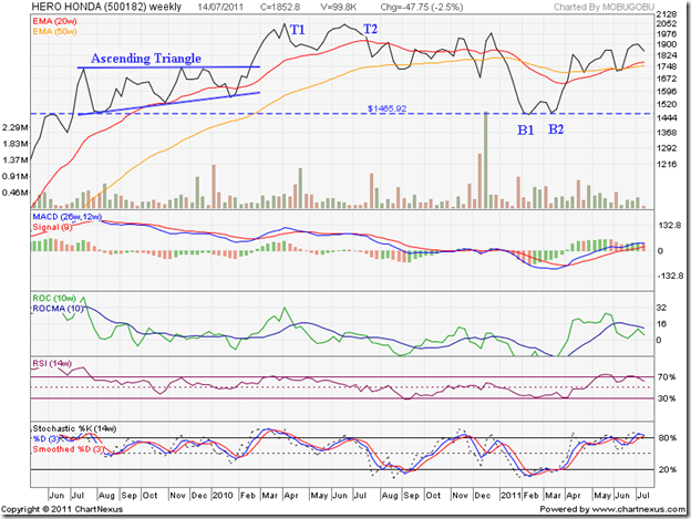
The strong performance continued for another year - right up to Apr ‘10 – when the stock price crossed the 2000 level and closed at 2057 (marked as T1) in the week ending Apr 9 ‘10. A gain of 225% from its Jul ‘08 low.

Let us look at the two years weekly closing chart pattern of Hero Honda and find out what happened after that excellent up move:

HeroHonda_Jul1411

During Jun ‘09, the 1465 level had provided good resistance to the up move. Once the stock broke the resistance in Jul ‘09, it quickly reached a new closing high of 1736 in the week ending Jul 24 ‘09.

The subsequent correction found support from the previous resistance level of 1465 – another instance of a resistance turning into a support. Volumes were quite strong during the resistance and support.

A 7 months long consolidation followed within a bullish ‘ascending triangle’ pattern, from which the expected upward break out occurred in Feb ‘10. Note the volume bars in Feb ‘10 – they should have been substantially higher to technically validate the upward break out. That was the first warning about an impending correction or reversal.

Though the stock price rose sharply to close at 2057 in Apr ‘10, the MACD, ROC and RSI reached lower tops and the slow stochastic just managed to reach its previous top. The combined negative divergences of all four technical indicators was the second warning about a possible correction/reversal.

The stock price corrected down to 1858 in the week ending May 21 ‘10, only to rise to 2050 (marked as T2) in the week ending Jun 25 ‘10 – falling short of the Apr ‘10 top of 2057. The lower volumes during the Jun ‘10 top opened the door for a bearish ‘double-top’ reversal pattern. That was the third warning about a correction/reversal.

The stock price crashed through the 20 week EMA in Jul ‘10 and dropped below 1858 (the May ‘10 low), which confirmed the ‘double-top’ reversal pattern. The stock price consolidated sideways till Dec ‘10. There was a sharp drop below the 50 week EMA (equivalent to the 200 day EMA on daily charts) to 1679 on strong volumes, followed by an equally sharp 300 points spike to 1986 on higher volumes.

That seemed to exhaust the bullish fervour. The rumours about Japan’s Honda Motors pulling out of the joint venture with the Munjals of Hero group were confirmed. The stock price fell more than 500 points to the support level of 1465 in Feb ‘11. The 20 week EMA crossed below the 50 week EMA – the dreaded ‘death cross’ that confirmed a bear market.

But you just can’t keep a good stock down for long. A bullish double-bottom pattern (marked as B1 and B2) formed in Mar ‘11, and the stock recovered quickly above both the EMAs in Apr ‘11. It has been trying to move up for the past two months, but without much success. The low volumes haven’t helped. But the 50 week EMA has provided good support, and the 20 week EMA has crossed above the 50 week EMA.

The technical indicators are weakening. The MACD is above the signal line, but the upward momentum is slowing. The ROC is still positive, but has dropped below its 10 week MA and touched a lower top. The RSI has dropped below its overbought zone. The slow stochastic is threatening to do likewise. Another test of support from the 50 week EMA is likely.

The company is fundamentally very strong, with strong operating cash flows, negligible debt, huge reserves, a regular dividend payer and the leader in the two-wheeler segment. The uncertainty about future technology inputs and entry of Honda in the two-wheelers segment are the negative overhangs.

Bottomline? The stock chart pattern of Hero Honda shows that technically the worst may be over. Some fundamental concerns remain. The main competitor, Bajaj Auto, is di’worse’ifying into four wheelers. That could be just the opportunity for Hero Honda to consolidate its leadership position. Investors can use dips to accumulate.
Selasa, 05 Juli 2011

Gold and Silver Chart Patterns: trying to find bottoms

Gold Chart Pattern

image

In the previous post, I had mentioned about a possible bullish ascending triangle pattern formation on gold’s chart - from which an upward break out was likely. Ascending triangles tend to be fairly reliable. But not so this time. An attempted upward break out was thwarted by the bears.

Selling pressure pushed down gold’s price below its 14 day and 30 day SMAs. However, the previous low of 1480, touched in May ‘11, seems to be providing support. If the support holds, gold’s price will form a rectangular consolidation pattern – within 1480 and 1550. Rectangles  are usually continuation patterns – which means an upward break out is likely.

What should investors do? The earlier suggestion stands: buy on a break out above 1550. An analyst friend, whose bold views I admire, believes that gold’s price can double by the end of 2011 – because current demand is far outstripping supply. Apparently, a detailed report by Standard Chartered has echoed his bullish views.

Caveat Emptor. 

Silver Chart Pattern

image

Silver’s chart pattern had been consolidating within a symmetrical triangle, after dropping from its peak of 48.70. Symmetrical triangles tend to be continuation patterns, and I had expected a downward break below the triangle, followed by a test of support from the rising 200 day SMA.

Silver’s price did break below the triangle, but is trying to find a bottom at the support level of 34. Will the support hold? May be not. A test of the previous low of 32.50 and the 200 day SMA can’t be ruled out yet.

The white metal is trading below its 14 day, 30 day and 60 day SMAs after making a series of lower tops and lower bottoms. The short-term and medium-term views are bearish. Bulls should not lose heart – as long as silver trades above its rising 200 day SMA.

Minggu, 19 Juni 2011

Gold and Silver Chart Patterns: an update

In my previous post on Gold and Silver Chart Patterns, I had mentioned about a pair-trading opportunity. Going through that post, I realised that instead of recommending 'long gold, short silver', I had written the exact opposite.
For any one who had read through the entire post, it would have been clear that I was bullish about the gold chart and bearish about the silver chart. However, as a penance for the error, I'm going to refrain from making any more trading recommendations.
Gold Chart Pattern 
Gold's price dipped below the rising 14 day SMA, but was well supported by the 30 day SMA. By Fri. Jun 17 '11, gold's price managed to close above the 14 day SMA - indicating that investors are using all dips to buy.
As long as the recent high of 1565.70 - touched in Apr '11 - is not surpassed, the bears will try to make life difficult for the bulls. But may not be for long. A bullish ascending triangle appears to be forming on the gold chart, from which a likely upward break out can easily take gold's price past the 1600 mark.
Stay invested with a trailing stop-loss. Buy on a break out above 1550.
Silver Chart Pattern 
Silver's price chart continues its consolidation within a symmetrical triangle, and is now trading below the 14 day, 30 day and 60 day SMAs. Triangles tend to be unreliable, but are usually continuation patterns. Since silver's price entered the triangle from above, it is likely to break below the triangle and test support from the still rising 200 day SMA.
Buy if there is a sharp upward bounce from the 200 day SMA.

Sabtu, 30 April 2011

BSE Sensex and NSE Nifty 50 Index Chart Patterns – Apr 29, ‘11

Several bullish arguments were put forth in last week’s analysis of the BSE Sensex and NSE Nifty 50 weekly closing chart patterns. All attempts by the bulls to breach the down trend lines came to nought, as the FIIs remained net sellers last week. DII buying could not prevent both indices from dropping down to their 50 day EMAs.

BSE Sensex Index Chart

Sensex_Apr2911_ST

To get a better sense of Sensex movements, an ascending triangle with 18700 level as the flat top has been drawn. The zone between 18700 and 19000 is a support/resistance area. The Sensex has received support last week from the 50 day EMA, which coincides with the 19000 level.

The technical indicators are looking quite bearish. The MACD is falling below its signal line, though both are still positive. The ROC touched its 10 day MA, then dropped like a stone into negative territory. Both the RSI and slow stochastic are below their 50% levels, and heading down. The down trend that started from the Nov ‘10 top is intact.

The 200 day EMA is a little above the 18700 level. The two together may provide strong resistance if the Sensex falls further. Below that, the upward sloping trend line of the ascending triangle is another likely support. If the FII selling continues, the Sensex can drop to the longer-term support level of 17600.

The down trend line needs to be breached on strong volumes for the bulls to regain control.

Nifty 50 Index Chart

Nifty_Apr2911

The break out from the ascending triangle pattern was accompanied by rising volumes, indicating that the break out was a valid one. But the upside target of 6020 could not be met, as the Nifty ran into strong resistance from the down trend line.

The zone between 5600 and 5700 should provide good support, in case the Nifty falls further. Below that, the upward sloping trend line of the ascending triangle may provide support. If the Nifty drops more – continued FII selling could trigger that – it may test the long-term support at 5300.

High volumes on down-days during April ‘11 is a sign of distribution. Since retail participation has dwindled, the logical assumption is that stocks are moving from FII accounts to DII accounts. The markets have already discounted a likely 25 bps interest rate hike by the RBI next week. If the actual hike is 50 bps, there can be more selling. Q4 results have been mixed so far. Higher commodity prices and interest rates appear to be taking a toll on margins. But sales growth seems to be on track.

Bottomline? The BSE Sensex and Nifty 50 index chart patterns are struggling to avoid another drop into bear markets. Caution should be the watch word. If you are in profits, book some of it and stash it away in a bank fixed deposit. That will enable you to buy another day.

Senin, 21 Februari 2011

Stock Index Chart Patterns – S&P 500 and FTSE 100 – Feb 18, ‘11

S&P 500 Index Chart

image

There is not much to add from last week’s post about the S&P 500 chart. The index has continued its steady rise away from the 50 day EMA, which in turn is rising away from the 200 day EMA.

The technical indicators look very bullish. The MACD is above its signal line, and both are rising in positive territory. The slow stochastic remains well inside the overbought territory. The RSI has moved up sharply into the overbought zone.

The S&P 500 index chart looks overbought and ripe for a correction. But the way every dip is being used by the bulls to buy, any correction may be a short one. The economy shows signs of slow growth. Likewise for inflation. Interest rates remain negligible. There doesn’t seem to be any chance of the bears coming out of their hibernation.

Maintain trailing stop-losses and enjoy the ride.

FTSE 100 Index Chart

image

The FTSE 100 chart has failed in several recent attempts at moving above the 6100 level. That is no reason for bears to feel excited. The index has formed a bullish ‘ascending triangle’ pattern (flat top, rising bottoms) during Feb ‘11. The likely break out is upwards, with a target of close to 6400. The upward break out should be accompanied by a significant increase in volumes – otherwise the break out may turn out to be ‘false’.

The technical indicators are bullish. The MACD is above the signal line and rising in positive territory. The slow stochastic is rising inside its overbought zone. The RSI is moving up towards its overbought zone. Looks like the FTSE 100 will soon reach greater heights.

The news is not so good for public sector employees who have lost their jobs due to the financial tightening. Private sector companies are not particularly keen to hire them.

Bottomline? The chart patterns of the S&P 500 and FTSE 100 indices are in strong bull markets. Money is moving out of emerging markets into the US and European markets. That is fuelling the bull rally. Stay invested with trailing stop-losses.

Related Posts Plugin for WordPress, Blogger...