Tampilkan postingan dengan label triangle. Tampilkan semua postingan

Jumat, 06 Januari 2012

Stock Index Chart Patterns – Hang Seng, Singapore Straits Times, Malaysia KLCI – Jan 6 ‘12

The chart patterns of the Asian indices, last analysed three weeks back, are showing clearly diverging moves. The Hang Seng index is moving sideways in a bear market; the Straits Times index is sliding down in a bear market; the KLCI Malaysia index is climbing up in a bull market.

Hang Seng Index Chart

HangSeng_Jan0612

Since touching an intermediate top at 20173 in Nov ‘11, the Hang Seng index has been consolidating sideways within a symmetrical triangle pattern. The index is trading well below its falling 200 day EMA, so the logical break out of the triangle should be downwards. But triangles can be unpredictable. The index may break out upwards or continue to trade sideways.

The technical indicators are bullish, but showing signs of weakness. The MACD is above its signal line and trying to enter the positive zone. The ROC is positive and above its 10 day MA, but turning down. The RSI is above its 50% level, but its upward movement has stalled. The slow stochastic has dropped down from its overbought zone.

A break below the triangle could lead to a test of the Oct ‘11 low.

Singapore Straits Times Index Chart

Straits Times_Jan0612

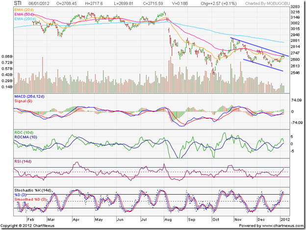
The Singapore Straits Times index is in a bear market, and has been trading within a downward-sloping channel for the past couple of months. Note the falling volumes, which is typical in down trends.

The technical indicators are giving contrasting signals. The MACD is rising above its isgnal line, but is still in negative territory. The ROC is positive and above its 10 day MA, but has turned around sharply. The RSI has climbed towards its overbought zone. The slow stochastic has already entered its overbought zone.

The index may make another attempt to cross above the downward channel. Whether it will be successful or not is a moot point.

Malaysia KLCI Index Chart

KLCI Malaysia_Jan0612

The KLCI Malaysia index appears to have shaken off the bears as it climbed above all three EMAs. The index is trading within an upward-sloping channel. The 20 day EMA has crossed above the 200 day EMA. The 50 day EMA is all set to follow suit – the ‘golden cross’ will confirm a return to a bull market.

The bears have not been vanquished yet. Note the progressively lower volume peaks as the index has moved up. There are negative divergences visible in the MACD and ROC, which failed to touch higher tops with the index. The technical indicators are correcting from overbought conditions.

A drop to the lower edge of the channel is a possibility, but the up trend may not get reversed.

Bottomline? The three Asian index chart patterns are moving in three different directions. The Hang Seng index is consolidating within a triangle; await the break out. The Singapore Straits Times index is in a down trend; sell the rallies. The KLCI Malaysia index is in an up trend; buy the dips.

Senin, 05 Desember 2011

Stock Index Chart Patterns – S&P 500 and FTSE 100 – Dec 2, ‘11

S&P 500 Index Chart

Microsoft Word - Document1

The downward break from a symmetrical triangle pattern (in yellow) observed on the chart of the S&P 500 index last week, met its downward target of 1160. Instead of falling deeper into a bear market, the index made a surprising turn around to climb above all three EMAs in another attempt to return to a bull market.

Note that the S&P 500 is facing resistance from a horizontal dotted line drawn from the apex of the symmetrical triangle. The index did cross above the dotted line on an intra-day basis but has failed to close above it convincingly. Except for a volume spike on Wed. Nov 30 ‘11, when the index climbed above all three EMAs, the volumes during the latest rally hasn’t been great. Rallies need volume support to sustain.

The technical indicators are looking mildly bullish. The slow stochastic has climbed above its 50% level. But the RSI dropped back on to the 50% level after briefly crossing it. The MACD has moved above its signal line, but is still negative. The ROC reached its ‘0’ line, but has slipped back into negative territory. Expect a bit of consolidation before the index makes up its mind about the next move.

The trigger for the sharp rally was the joint decision by six central banks - including the US, Canada, Japan, UK, Swiss and ECB - to make dollar liquidity swaps cheaper by 50 bps to provide more liquidity to global money markets. China simultaneously lowered its liquidity reserve requirements. The steps won’t solve the sovereign debt problems by any means, but will provide some breathing room. The positive US employment data (drop in unemployment rate and increase in non-farm payrolls) and increase in consumer confidence helped the bullish cause.

The economic growth in the US remains painfully slow, and it will take a long time for a full recovery. A good time to be cautiously optimistic – not wildly bullish. 

FTSE 100 Index Chart

Microsoft Word - Document1

The FTSE 100 chart had broken down below the descending triangle pattern (in yellow) last week, but the break turned out to be a ‘false’ one. Some times, break outs turn out to be ‘false’ if the volumes accompanying the break out on the downside are unusually large. That wasn’t the case here. Triangles tend to be unreliable in giving hints about the direction of the eventual break. These are challenges faced in technical analysis.

The FTSE 100 closed the week just above its 200 day EMA, and the technical indicators are pointing to a continuation of the rally. The slow stochastic has risen above its 50% level. The ROC has entered positive territory. The MACD is above its signal line, and about to enter the positive zone. But the RSI has dropped below its 50% level.

Despite the bullishness in the index, the ground realities remain grim. The UK unemployment rate rose to its highest level in 15 years. British factories are facing sharp slowdowns. Consumer confidence is falling. Inflation is up to 5%. The UK economy is showing all signs of dipping into another recession.

Bottomline? The chart patterns of the S&P 500 and FTSE 100 indices have turned around after ‘false’ break downs from triangle patterns. Both indices may be preparing for a year-end rally – thanks to the action by central banks to flood the money markets with more liquidity. Enjoy the ride while it lasts – eventually some one will have to pay the piper.

Sabtu, 03 Desember 2011

Stock Index Chart Patterns - BSE Sectoral Indices, Dec 2, '11

The BSE Sectoral index charts were looking down and out when I had looked at them three months back. The Sensex rally in Oct ‘11 was led by the auto and FMCG sectors. The other sectors failed to make much progress.

BSE Auto Index

BSE Auto Index

The BSE Auto index chart has been redrawn from a bearish descending triangle to a more neutral rectangular consolidation pattern. The Oct ‘11 rally propelled the index above its blue down trend line, and all the way up to the 9770 support-resistance level. The index subsequently dropped back inside the triangle to the 8115 level (the lower edge of the rectangle), only to jump up above the down trend line last week.

The technical indicators are correcting the oversold condition but haven’t turned bullish yet. The 200 day EMA is moving sideways with the index oscillating around it. A break below 8115 will push the Auto index into a bear market. Hold.

BSE Bankex

BSE BANKEX

The BSE Bankex had broken below the support level of 11400 in Aug ‘11. The support level turned into a strong resistance level and effectively thwarted all subsequent up moves. The ‘death cross’ in Aug  ‘11 had confirmed a bear market, and the index is falling deeper inside bear territory. Q3 results may be worse. Stay away.

BSE Capital Goods Index

BSE Capital Goods Index

The BSE Capital Goods index struggled vainly to cling on to the support level of 12160 in Sep ‘11, failed to cross above the falling 50 day EMA, and has been sliding down ever since. The sector has been hard-hit by the slow down in infrastructure projects due to the high interest rate regime. It may take a couple more quarters before the sector shows some signs of life. Avoid.

BSE Consumer Durables Index

BSE Consumer Durables Index

The BSE Consumer Durables sector tried valiantly to remain in a bull market. The lower top formed in Oct ‘11 seemed to be the last straw that broke the sector’s back, as it plunged into a bear market.

Technically interesting are the three fan lines drawn on the chart. Note how the index kept rising in Sep ‘11 but stopped short of the first fan line. The failure to move above the first fan line was a sign of weakness. The index got good support from the second fan line before breaking below it. A break below the third fan line (where it is currently receiving support) may push the sector deeper into a bear market. Sell.

BSE FMCG Index

BSE FMCG Index

The BSE FMCG index is still in a bull market, despite its failure to cross above the first fan line. The 200 day EMA is rising; the 20 day and 50 day EMAs as well as the index are trading above the 200 day EMA. The second fan line is acting as the revised up trend line.

It is the only sector still in a bull market and has prevented the Sensex from collapsing. Now you know why it is my favourite sector. It saves your portfolio during bear markets. Accumulate.

BSE Healthcare Index

BSE Healthcare Index

The BSE Healthcare index has been trading within a large triangle pattern. In spite of the ‘death cross’ (of the 50 day EMA below the 200 day EMA) in Sep ‘11, the index hasn’t fallen much. It may continue to consolidate within the triangle for some more time before finally breaking out.

Logically, the break out should be upwards, since consolidations tend to be continuation patterns. But triangles are unreliable, so be prepared for a downward break. Hold.

BSE IT Index

BSE IT Index

The BSE IT index collapsed into a bear market in Aug ‘11. The recovery has been quite stunning. The index rallied for three straight months before stalling at the upper edge of the downward sloping channel. It has been trading within the channel for the past month.

The technical indicators are showing some bullish signs. Unless the Eurozone debt problems get resolved satisfactorily, the IT sector will continue to face headwinds. The good news is that the US economy is finally showing some signs of improvement. Hold.

BSE Metal Index

BSE Metal Index

The BSE Metals index had dropped below its downward sloping channel in Aug ‘11, and has stayed below it – making a series of lower tops and lower bottoms as it falls deeper inside a bear market. Unless the metals sector and the capital goods sector turn around, the Sensex will not be able to come out of the bear’s grip. Avoid.

BSE Oil & Gas Index

BSE Oil & Gas Index

The BSE Oil & Gas index is falling within a broad downward sloping channel in a bear market. The government continuous meddling and failing to take tough decisions of decontrolling diesel and kerosene prices is pushing the sector into huge losses and increasing the subsidy burden.

Reliance, the market favourite, is under all kinds of threats and pressures. The company has been an acknowledged expert not just in backward and forward integration of its businesses, but in bending every rule in the book. Thanks to Anna Hazare’s anti-corruption campaign, government officials are now seeing snakes under every rock. Without the support of ONGC and Reliance, the sector will remain in the doldrums. Avoid.

BSE Power Index

BSE Power Index

The BSE Power index failed to rise above the support-resistance level of 2250 during the Oct ‘11 rally. After breaking down below the downward sloping channel, it is attempting a pullback towards the channel. If it fails to do so, the index may fall much lower. The great hype about the power sector has fizzled out. Avoid.

BSE Realty Index

BSE Realty Index

The BSE Realty sector continues to be the worst performer among the BSE Sectoral indices. After three months of sideways consolidation between 1625 and 1900 the index broke down below the rectangular zone. It is attempting to re-enter the rectangular band but facing resistance from the falling 20 day EMA. Avoid.

(Note: I have suggested a few ‘Hold’s and an ‘Accumulate’. The rest are ‘Avoid’s. That doesn’t mean individual stocks in the sectors should be avoided. One or two may be good contrarian buys. It may be better to avoid basket buying in the underperforming sectors.)

Selasa, 09 Agustus 2011

Gold and Silver Chart Patterns: divergent directions

In my previous update of gold and silver chart patterns, both precious metals had bullish upward breakouts. Gold broke out from a rectangular consolidation pattern to touch the 1600 mark. Silver broke out from a symmetrical triangle pattern to reach the 40 level. However prices have taken divergent routes in the past three weeks.

Gold Chart Pattern

image

Gold’s price had risen almost vertically to the 1600 level, and I had expected a pullback to 1550 (the top of the rectangular pattern). The price did dip, but only to 1580, before resuming its rally. It has once again climbed almost vertically past its 14 day, 30 day, 60 day and 200 day SMAs to 1717 and is looking overbought.

The debt ceiling wrangle followed by S&P’s downgrade of US credit rating has caused a flight of safety to the yellow metal. According to data from the Commodity Futures Trading Commission, gold purchases leaped to more than 18 million ounces over the past month - from 8.4 million for the entire year up to July. Is it too late for investors to enter now?

Yes and no. No, if you believe the US and Eurozone economies will take a long time to recover, and the US dollar will continue to lose its value. Yes, if you think stock prices have come down to reasonable valuations can provide better percentage returns in the long-term.

If you are paralysed by fear because of the sudden, sharp fall in global equity markets, hold on to your cash. You are not in the correct mental frame to take rational buy/sell decisions. If gold forms only 5-10% of your portfolio allocation, past three week’s rise in price coupled with the fall in equities has probably pushed your gold allocation above the limit. Book part profits. If you are a new entrant enticed by the prolonged bull rally, wait for a dip below the 14 day SMA to buy.

Silver Chart Pattern

image

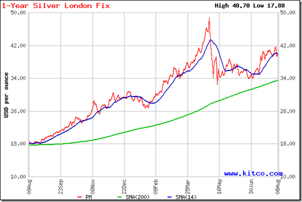
Silver’s sharp price rise was followed by a sideways consolidation during which it touched a high of 42 but slipped below the 14 day SMA to a low of 39. It is struggling to cross above the 14 day SMA, and may correct some more.

The dip may be used to buy. Conservative investors can wait for a convincing cross above the 42 level. The rising 200 day SMA indicates that the bull market is intact.

Selasa, 19 Juli 2011

Gold and Silver Chart Patterns: an update

The chart patterns of gold and silver have made significant bullish breakouts since my earlier post two weeks back. As often happens with bullish breakouts, investor interest has risen proportionately. I received quite a few queries whether this is a good time to enter.

Gold Chart Pattern

image

Gold’s price rose almost vertically to pierce the psychological 1600 mark intra-day. I had mentioned about the price consolidation within a rectangle between 1480 and 1550, from which an upward breakout was likely. Accordingly, buying on a breakout above the 1550 level was advised.

Note that gold’s price spurt has been too fast. It has risen far away from its 14 day, 30 day, 60 day, and 200 day SMAs. A pullback towards the 1550 level is a possibility. That may be a better price point to enter.

Silver Chart Pattern

image

Silver’s price was consolidating within a symmetrical triangle from which an expected downward break did occur. But the 34 level provided good support. The previous low of 32.50 wasn’t tested.

The bulls managed a spirited recovery that took silver’s price above the 14 day, 30 day and 60 day SMAs – as well as the 40 mark. The rise has been a bit steep, and a dip down to 38 is possible. The dip can be a good point to enter.

Till the growth uncertainties in the Eurozone and US economies recede, the precious metals will continue to be safe havens for jittery investors.

Sabtu, 09 Juli 2011

BSE Sensex and S&P CNX 500 Index Chart Patterns – Jul 08, ‘11

In last week’s analysis of the chart patterns of the BSE Sensex and NSE Nifty 50 indices, I had made the following comments:

‘If (the FIIs) continue their buying spree, the down-trend line may get breached next week. But if it isn’t a high-volume break out, the index may pull back into the descending triangle.’

As is apparent from the closing chart pattern of the BSE Sensex (and also of the Nifty 50 – though not shown here), both indices behaved exactly as expected, as the FIIs continued their net buying through the week.

BSE Sensex Index Chart

Sensex_Jul0811

The blue down-trend line was breached on Thursday, July 7 ‘11. But the breach wasn’t technically valid, though the Sensex managed to close above the down-trend line. Why?

Firstly, because all breaches of supports and resistances should follow the 3% ‘whipsaw’ lee-way rule. In other words, if an index or stock remains within 3% of a breached support or resistance level, then more often than not, there is a ‘whipsaw’ (i.e. a sudden change of direction) – as marked by the blue circle on the Sensex chart).

Also, though not shown in the chart, volumes were not significantly higher during the break out above the down-trend line. That is another technical ‘rule’ for valid upward break outs. (Note that the ‘rule’ doesn’t apply for downward breaks; i.e. volumes need not be higher – though they some times are.)

Though the index is back inside the large descending triangle, it is above all the three EMAs. The EMAs may support any down moves. The technical indicators are suggesting that any such support may be temporary.

The MACD is in positive territory, and rising above its signal line. The ROC is also positive, but has crossed below its 10 day MA. The RSI has entered overbought territory, where it doesn’t stay very long. The slow stochastic is in its overbought zone, but made a lower high as the index rose higher to breach the down-trend line – a negative divergence.

In spite of the FII buying spree, the bears managed to stall the rally.

S&P CNX 500 Index Chart

S&P CNX 500_Jul0811

For a different perspective, I have included the one year closing chart pattern of the broader S&P CNX 500 index instead of the Nifty 50. The Nifty 50 chart is very similar to that of the Sensex. But the broader index has a couple of very interesting differences – both of which have bullish implications.

First, the 200 day EMA and the down-trend line were breached ahead of the Nifty a week ago. The long-term support-resistance level of 4550 was also breached, and is now providing support. However, the CNX 500 didn’t quite get past the 3% ‘whipsaw’ lee-way.

The June ‘11 low was higher - by almost 100 points - than the Feb ‘11 low. That makes the large triangle on the CNX 500 a ‘pennant’ rather than bearish descending triangles on the Nifty and Sensex charts. The upward break out may turn out to be valid – but possibly after a pullback to the down-trend line.

Bottomline? The chart patterns of the BSE Sensex and the S&P CNX 500 indices show that the bears are in no mood to give up their 8 months long strangle-hold on the Indian stock market. Thanks to a surge in FII (round-tripping ‘hot’ money?) inflows, the bulls have regained some lost ground. Be very stock specific in your buying, and set tight stop-losses. Things can get worse in a hurry if Q1 results belie expectations. Better to watch the fight from the sidelines. 

Rabu, 22 Juni 2011

Stock Chart Pattern - Container Corporation of India (an update)

My previous post about the stock chart pattern of Container Corporation is almost two years old. The stock was consolidating within a symmetrical triangle after a strong rally that touched a peak of 1149 in July ‘09.

I had expected a correction down to the 50 day EMA or 200 day EMA because the stock was trading well above the 50 day EMA, and the gap between the 50 day EMA and 200 day EMA had become large (which precedes a correction or reversal). The technical indicators were also looking weak.

A trend reversal was ruled out because a symmetrical triangle is usually a continuation pattern. The logical break out was upwards, and a test of the all-time high of 1222 (reached in June ‘07) was on the cards before the correction. Let us take a look at the two years closing chart pattern of Container Corporation and observe what transpired over the past two years:

ContainerCorp_Jun2211

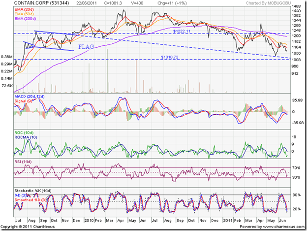
Several interesting patterns have formed on the chart, and I will take them up one by one. The expected upward break out from the triangle pattern took the stock’s price to 1235 on Aug 24 ‘09, just above the all-time high of 1222, before a correction ensued – or rather a consolidation within a flag (which is also a continuation pattern).

Note that the first down leg of consolidation within the flag was supported by the 50 day EMA in Sep ‘09. The upward bounce found resistance at 1222 in Oct ‘09. The next down leg pierced the 50 day EMA but stopped well short of the 200 day EMA.

The upward break out from the flag was not accompanied by a volume surge. No wonder the stock price consolidated sideways between 1222 – 1235 during the better part of Dec ‘09 before a high volume surge propelled the stock to a new high of 1321 in Jan ‘10.

The subsequent correction dropped below 1222, but found support twice on the line projected from the upper boundary of the flag pattern. Another volume surge in Mar ‘10 pushed the stock to a new all-time intra-day high of 1500 on Apr 22 ‘10. It turned out to be a ‘reversal day’ (higher high, lower close) – warning of a reversal of the up trend.

The first leg of correction found support from the rising 200 day EMA in May ‘10 and then again from the 1222 level, before rising to 1429 in Jul ‘10 – forming a bearish double-top pattern and confirming the trend reversal.

The stock has been on a down trend since then, preceding the correction in the broader markets. Except for a brief rally from Feb ‘11 to Apr ‘11, the downward slide has been unabated. Note that the bottoms in Feb ‘11 and May ‘11 occurred on the projected line from the top boundary of the flag formation!

The stock price has made a bearish ‘rounding-top’ pattern, which is clearly visible in the 200 day EMA. All four technical indicators are bearish, so the 15 months correction hasn’t ended yet. There is long-term support at 1010, and below that, stronger support is at 900.

The zero-debt company is fundamentally strong – practically a monopoly business that generates a ton of cash from operations, and pays regular dividends (twice a year since 2005). For the past few quarters, growth has been tepid and profits have been flat. That doesn’t really justify the 32.7% correction from the Apr ‘10 intra-day high of 1500 to the May ‘11 intra-day low of 1010.

Bottomline? The stock chart pattern of Container Corporation has undergone a significant correction. While another 10% correction can not be ruled out from current level, small investors would do well to start accumulating slowly instead of chasing after ‘cheap’ stocks.

Selasa, 07 Juni 2011

Gold & Silver Chart Patterns: pair trading opportunity?

Regular readers of this blog know that I’m not a great fan of investing in precious metals. Neither do I trade for the short-term, nor do I recommend that small investors should indulge in trading. But sometimes an opportunity stares you in the face – as the one year gold and silver closing chart patterns seem to be doing now.

Gold Chart Pattern

image

The technical headwinds that the gold chart was facing last month led to a decent correction below the 14 day SMA. Such corrections restore the health of the bull market and provide good entry points.

Isn’t gold’s price near an all-time high, and shouldn’t one be cautious? The current investor interest in gold has been largely due to the weaknesses in the dollar and the euro. The currency weaknesses aren’t going away any time soon. Gold’s bull market is likely to test and surpass its recent peak of 1565.70.

But it is a good idea to be careful – more so because gold’s price and its 14 day SMA have both risen far away from the rising 200 day SMA. A deeper correction may be around the corner. Stay invested with a trailing stop-loss.

Silver Chart Pattern

image

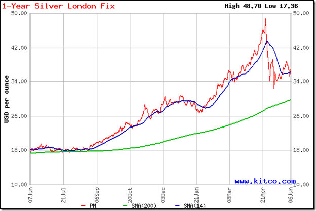
The technical headwinds turned into a full-blown hurricane in silver’s chart pattern. A 33% correction from the peak of 48.70 to a trough of 32.50 has shaken off the speculators.

Silver’s price has been consolidating within a triangle pattern and has edged above the 14 day SMA, but remains below the falling 30 day SMA. The possibility of a breakdown below the previous low and a test of support from the rising 200 day SMA can’t be ruled out.

The pair trade? Long silver, short gold. But remember – I have no skin in this game!

Related Posts Plugin for WordPress, Blogger...