Tampilkan postingan dengan label correction. Tampilkan semua postingan

Selasa, 08 November 2011

Gold and Silver Chart Patterns: rallies reviving?

The sharp corrections seen on gold and silver chart patterns appear to be over, and the bull rallies are all set to resume. Gold’s price never dropped below the 200 day SMA, so technically it was just a bull market correction following a double-top reversal pattern. Silver’s price dropped below the 200 day SMA and has stayed below the long-term moving average for more than a month, raising the spectre of a bear market. However, there are signs of revival of late.

Gold Chart Pattern

image

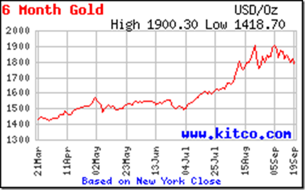
Gold’s price is trading above its 14 day, 30 day, 60 day and 200 day SMAs, and all four moving averages are rising – which is the sign of a bull market. More importantly, the price has climbed above the 1750 level – the ‘valley’ level between the two tops at 1900.

Note that the 1750 level acted as a resistance during the recent up move, and once the resistance was overcome, the resistance level has turned into a support level. Gold’s price should start moving up towards its previous top of 1900, and eventually test and overcome the 1900 level to touch a new high.

A satisfactory resolution of the Eurozone debt problems may cause a renewed interest in risky assets and slow down the up move in gold’s price. But the bull market in gold is very much alive, and price dips can be used to add.

Silver Chart Pattern

image

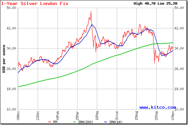
Silver’s price is on a gradual recovery path, though it is still trading below the 200 day SMA. The fact that the white metal is trading above its 14 day and 30 day SMAs, and the 200 day SMA has started rising again point to a revival of interest in buying silver.

Intrepid investors can start accumulating slowly at current prices. The more prudent action will be to wait for a convincing cross above the 200 day SMA before buying. As with all purchases, a strict stop-loss should be maintained – say, at 32.

Rabu, 21 September 2011

Stock Chart Pattern - Hindustan Unilever (An Update)

In the previous update to the technical analysis of the chart pattern of Hindustan Unilever, way back in Jan ‘10, the stock had been in a correction after climbing to an intra-day peak of 306 in Jul ‘09. The stock fell down to an intra-day low of 218 in Mar ‘10, a 29% drop from the peak.

The 8 months of correction broke the three years long up-trend line; the ‘death cross’ of the 50 day EMA below the 200 day EMA in Feb ‘10 confirmed a bear market. There were growth and margin pressures on the company, which were reflected in the stock’s price.

A look at the 2 years closing chart pattern of Hindustan Unilever should convince investors of different experiences and propensities why this is a must-have stock among the several thousand being traded on the BSE and NSE.

HUL_Sep2111

There is an old saying: “You can’t keep a good man down.” That expression could just as well describe the HUL stock. Note that when the stock dropped to its new closing low of 220 in Mar ‘10, all four technical indicators reached higher bottoms (marked by blue arrows). The positive divergences signalled the end of the bear period.

The stock embarked on a fresh bull rally within an upward-sloping channel that is still intact. From Sep ‘10 through Jan ‘11, the stock reached three closing tops – each a little higher than the previous one. This time, the technical indicators all touched lower tops. The negative divergences led to a sharp drop below the 200 day EMA, followed by a triple-bottom reversal pattern from Feb to May ‘11.

Once again, positive divergences from all four technical indicators that touched higher bottoms, hinted at a resumption of the rally. The stock reached a new closing high of 343 in Jun ‘11 at the upper-end of the upward-sloping channel. Negative divergences in the technical indicators warned of a correction.

There are two points of interest here. The first is that the stock’s price movements provide long-term trading opportunities, as it swings up and down within the upward-sloping channel. The second, more important one, is that between Nov ‘10 and Sep ‘11 the stock has gone up to touch new highs, and is in a bull market - even as the Sensex and Nifty are in clear down trends.

All three EMAs are rising and the stock is trading above them – a sign of a bull market. The strategy should be to use dips towards the lower end of the upward-sloping channel to add. All four technical indicators – MACD, ROC, RSI and slow stochastic are correcting an overbought situation. The correction from the new closing high of 353 may continue a bit longer.

Bottomline? The stock chart pattern of Hindustan Unilever is in a bull market, making steady rather than spectacular progress. Growth and margins are back on the upswing. Valuations are not cheap, but the stock is worth its weight in gold. Regular dividends are an added attraction. Use dips to accumulate.

Selasa, 20 September 2011

Gold and Silver Chart Patterns: an update

Gold Chart Pattern

image

On a closing basis, gold’s chart appears to be forming a bearish ‘double-top’ reversal pattern, with two tops at 1900. The ‘double-top’ will get confirmed only on a drop below the ‘valley’ between the two tops. That means a drop below 1750. At the time of writing this post, gold’s price is at 1780.

In case of a convincing drop below 1750, gold’s price can move down to 1600. There is also the likelihood of a bounce up from the 1750 level, in which case the ‘double-top’ will be negated and instead, a rectangular consolidation pattern will get formed.

Gold’s price is still trading way above its 200 day moving average (not shown on chart), which means the bull market is very much intact. The present correction/consolidation – whatever it may turn out to be – should restore the technical health of gold’s chart for the next up move.

Silver Chart Pattern

image

Silver’s price chart hasn’t made much headway since my previous post two weeks back. A slightly lower top at 43.50 has been followed by a steady slide below the 40 mark. Looks like the price is headed down towards the support level of 38.

That level coincides with that of the 60 day MA (not shown in chart), so silver’s price is likely to bounce up and provide an entry opportunity. A break below 38 should find good support from the rising 200 day moving average - currently at 35.

Selasa, 06 September 2011

Gold and Silver Chart Patterns: up, up and away?

In an update of the technical chart patterns of gold and silver posted two weeks back, I had mentioned about the possibility of a sharp correction in gold’s price due to the extremely overbought condition, and advised investors to use the dip to buy. Silver’s price was expected to pull back a bit after a quick rise above the 14 day SMA, and provide a good buying opportunity.

Gold Chart Pattern

image

A sharp correction was expected – and what a sharp correction it was! Gold’s price was shaved off by almost $200 in the space of two days of trading. The 14 day SMA was easily breached and the price headed down towards the 30 day SMA. The bounce back was equally sharp.

Before the overbought condition could be properly rectified, gold’s price shot up above the $1900 mark. The volatility continues in today’s trading. Price touched a new peak of $1920, only to correct by more than $50 within a couple of hours! At the time of writing this post, gold’s price seems to be stabilising around $1900.

Such volatility is a sign of growing uncertainty, probably caused by the bleak outlook of the US and Eurozone economies. Uncertainty usually precedes a correction. That doesn’t mean that gold’s price may not rise some more. But one should be very cautious about entering near all-time highs – regardless of what you may hear or read.

Technically, the ever widening distance between the 14 day SMA as well as the 30 day SMA (not shown in the chart above) and the 200 day SMA is a harbinger of a big price meltdown. If you are invested in gold, maintain a strict stop-loss at 1820 – which is the level of the 14 day SMA.

Regular readers know that I am not a fan of buying gold because it provides no returns. If you are interested about a view based on historical analysis of gold and stock investment performance, read this article.

Silver Chart Pattern

image

Silver’s price chart shows a short and sharp correction, from $44 to $40, and a quick dip below the 14 day SMA. A pull back to $42 was expected. It provided a good entry opportunity. The quick recovery did not affect the upward momentum of the 14 day SMA or the 200 day SMA. The bull market in silver is intact, which is confirmed by the bullish pattern of rising tops and rising bottoms.

During today’s trading, silver’s price faced a sharp $2 drop before stabilising near the $42.50 mark. Technically, there isn’t any immediate threat of a big price correction. Dips can be used to accumulate. A convincing move above $49 will restore control to the bulls.

Selasa, 23 Agustus 2011

Gold and Silver Chart Patterns: an update

There is an old stock market saying: When in doubt, stay out. But in current politically and economically turbulent times, investors appear to have created a new maxim: When in doubt, buy gold (and silver).

Gold Chart Pattern

image

Gold is being bought as if the financial world is going to collapse tomorrow, or latest by next week. What else can explain a vertical $200 surge from 1700 to 1900 in the two weeks since my previous post?

Admittedly, there is sovereign gold buying, and Venezuela created a flutter by planning to repatriate $11 Billion worth of gold held in overseas banks. The sorry state of Eurozone banks is a major concern. But ask yourself: Is the global economy in a worse situation than it was in 2009?

One can debate the state of the global economy till the cows come home. The bottomline is that the parabolic rise in gold’s price over the past couple of months is unsustainable. The chart is looking extremely overbought, with the 14 day SMA (as well as the 30 day and 60 day SMAs – not shown in the chart above) climbing away from the rising 200 day SMA. A sharp correction, if not a crash, is around the corner.

If you are an investor who would rather buy gold (instead of Colgate or ITC shares), use the likely dip to buy gold ETFs. My preference is for the hefty dividends that Colgate and ITC shareholders receive – not to forget the occasional bonus shares.

Silver Chart Pattern

image

After a four month lull, during which silver’s price went through a decent correction, prices have risen sharply to touch the 44 mark. I had recommended that investors use the recent dip to buy, or to wait till the 42 level is crossed convincingly.

If you missed out on the buying opportunities, wait for a likely pullback towards 42 to enter. The 14 day SMA is turning upwards. The 200 day SMA didn’t stop rising right through the four months of price correction. The bull market in silver is alive and well.

Senin, 27 Juni 2011

Stock Index Chart Patterns – S&P 500 and FTSE 100 – Jun 24, ‘11

S&P 500 Index Chart

image

The S&P 500 index chart spent another week of gyrations without making much headway. It rose a bit higher only to face resistance from the 1300 level, and closed marginally lower. Bulls may feel relieved that the index closed the entire week above the 200 day EMA.

Bears will point out that a higher high and a lower close means it was a bearish ‘reversal week’. The index has spent 18 straight trading sessions below the falling 50 day EMA. The down trend that began from the May 2 ‘11 top of 1371 remains firmly in place. The bearish pattern of lower tops and lower bottoms continues.

The technical indicators are weakening after showing some signs of life. The MACD is negative and about to cross below the signal line. The slow stochastic rose sharply to the 60% level, but the %K line has dropped below the %D line and the 50% level. The RSI is moving sideways, and is also below the 50% level. The bears are getting ready to take control.

There isn’t much good news on the economic front. The GDP growth has been downgraded to 2.7% from the earlier estimate of 2.9%. Unemployment claims increased by 9000 to 429000 – the 11th straight week above the 400000 mark. Sales of new and existing homes dipped in May ‘11. Oil prices have fallen – but that isn’t necessarily good news for the stock market.

FTSE 100 Index Chart

image

The FTSE 100 made a futile effort at an up move that was quickly stalled by the bears. The long-term moving average has now turned down and the ‘death cross’ of the rapidly sliding 50 day EMA below the 200 day EMA appears imminent. The index spent the second week in a row below the long-term moving average.

The technical indicators are bearish and not holding out much cheer for the bulls. The MACD is below its signal line, and both are falling in negative territory. The slow stochastic and RSI are both below their 50% levels. A test of the Mar ‘11 low of 5592 is on the cards.

Greece’s bailout is like using chewing gum to plug holes in a leaking boat – postponing the inevitable. The severe repercussions to European and UK banking systems have not been fully revealed yet.

Bottomline? The chart patterns of S&P 500 and FTSE 100 indices may face deeper corrections. If you are still invested, keep strict stop-losses at 1260 for the S&P 500 and 5650 for the FTSE 100. Things may get worse before they can get better.

Senin, 20 Juni 2011

Stock Index Chart Patterns – S&P 500 and FTSE 100 – Jun 17, ‘11

S&P 500 Index Chart 
Last week, I had speculated whether the S&P 500 chart will be able to bounce up from its 200 day EMA or not. The index dropped below the 200 day EMA on Wednesday and Thursday (Jun 15, 16 '11), but managed to close above the long-term moving average on both days. By Friday, the S&P 500 chart bounced up a bit to close absolutely flat on a weekly basis.
The good news is that the index halted its six weeks long downward slide. The bad news is that the halt may be temporary. As the Grateful Dead sang many years ago, there is 'trouble ahead, trouble behind, and you know that notion just crossed my mind'.
The technical indicators are bearish. The MACD has stopped falling, but remains negative and below its falling signal line. The slow stochastic's feeble effort to emerge from its oversold zone failed miserably. The RSI's up move stalled at the 40% level and it is heading down towards its oversold zone. Looks like the correction isn't over yet.
Economic indicators weren't great either. The index of small business optimism declined for the third month in a row. The Conference Board's Leading Economic Index rose by less than 1% after declining in April '11. The Weekly Leading Index growth indicator of the Economic Cycle Research Institute declined for the eighth straight week. The University of Michigan Consumer Sentiment Index was down to 71.8 from 74.3 in May '11.
FTSE 100 Index Chart 
The bears are beginning to take control of the FTSE 100 index chart. The Mar '11 low of 5592 was not tested, but the index closed the entire week below the 200 day EMA. In the process, the lower Bollinger Band was pierced. An up move may follow.

The technical indicators are bearish. The MACD is below its signal line and sliding deeper into negative territory. The slow stochastic is well inside its oversold zone. The RSI is falling towards its oversold zone. The FTSE 100 chart has formed a bearish rounding-top pattern - pointing to a deeper correction.

The UK economy remains in the doldrums, as GDP growth has remained flat in the past six months. Unemployment has decreased but consumer sentiment remains low. Retail sales declined by 1.4%. Greece's bailout is casting a pall of gloom over European indices, and the FTSE 100 is suffering from its ill effects.
Bottomline? The chart patterns of S&P 500 and FTSE 100 indices show that this is likely to be a summer of discontent. Sit back and let the corrections play out. Lower entry points are likely to be available in the not-too-distant future.

Related Posts Plugin for WordPress, Blogger...