Tampilkan postingan dengan label Bull market. Tampilkan semua postingan

Rabu, 08 Februari 2012

Nifty mid-week update: bears defend 5400

The bulls seem to be facing a ‘last mile problem’ on the Nifty 50 chart – as the 5400 level is being well-defended by the bears. What is so great about the 5400 level? Quite a bit – if you are a regular follower of the technical analysis posts on this blog.

Nifty_Feb0812

For starters, 5400 was a previous top in Apr ‘10 (and again in Oct ‘11). Previous tops have a tendency to act as support/resistance levels. In last Friday’s post, four technical definitions of a bull market were discussed. Two of them are of interest in the context of the 5400 level.

One, a 20% rise from the Dec ‘11 low of 4531 gives a level of 5437 – close enough to 5400. Two, a 50% Fibonacci retracement of the entire fall from the Nov ‘10 peak of 6338 to 4531 gives a level of 5434. To satisfy the technical definition of a bull market, the Nifty has to close above these two levels.

There is another point of technical interest mentioned in last Sunday’s post. Note the blue down trend line that dominated the Nifty chart for the past 15 months, and got breached on the upside during the recent rally. An upward breach of any resistance level is technically valid provided it closes at least 3% above the point of breach.

The down trend line was breached on Feb 1 ‘12, and the point of breach came at about 5220. A 3% higher close means a level of about 5370. In technical analysis, exact levels are not important. Approximately, 5370 is close enough to 5400.

Despite an intra-day breach of 5400 on Feb 7 ‘12, the Nifty has so far failed to close above 5370. Obviously, the bears understand and follow technical analysis and are putting up a fight to defend the 5400 level.

Who will win the battle? Will the bulls propel the Nifty above 5400 soon, or will the bears push the Nifty back into its down trend? What do readers think?

Jumat, 03 Februari 2012

Are the Sensex and Nifty back in bull markets?

Relentless buying by the FIIs have changed stock market sentiments from extremely negative to almost celebratorily positive. Have the Sensex and Nifty returned to bull markets? Is it time to change strategy from ‘selling the rallies’ to ‘buying the dips’?

Technically, there are four criteria that define a bull market. They are:

1. A 20% rise from the bottom.

For the Sensex, the recent bottom was 15136 (touched on Dec 20 ‘11). A 20% rise means a level of 18163. Still a little more than 500 points to get there. For the Nifty, the recent bottom was 4531 (also touched on Dec 20 ‘11). A 20% rise means a level of 5437. A bit more than 100 points away.

2. Index (or stock) trading above its 200 day EMA.

Both Sensex and Nifty are trading above their 200 day EMAs – so this definition has been met.

3. The ‘golden cross’ of the 50 day EMA above the 200 day EMA.

The 50 day EMA of the Sensex is rising, but is still 500 points below its 200 day EMA. The 50 day EMA of the Nifty is also rising but is more than 150 points below the 200 day EMA.

4. Index (or stock) retracing more than 50% of its fall.

The Sensex peaked at 21109 on Nov 5 ‘10, and dropped 5973 points to its low of 15136. A 50% retracement of the entire fall would mean a level of 18122 – almost 500 points away from today’s intra-day high. The Nifty hit a high of 6338 on Nov 5 ‘10, and dropped 1807 points to its low of 4531. A 50% retracement of the entire fall would take the index to 5434 – still about 100 points further than today’s intra-day high. (Now you know why technical experts are talking about the 5400 level.)

Only one (2 above) out of the four criteria that define a bull market has been met so far. Does that mean that both indices haven’t entered a bull market yet? Technically, the answer is in the affirmative. Ideally, meeting three out of the four criteria should leave no doubt that the bulls are on top. For that to happen, another 500 points on the Sensex and 100 points on the Nifty are left to cover. The way the FIIs are buying, that could happen in the very near future.

Related post

Are we in a Bear Market or a Bull Market?

Rabu, 18 Januari 2012

Should you invest in large-cap or mid-cap stocks?

The stock market has been in a down trend for more than a year – losing 25% from its Nov ‘10 peak. Experts suggest that such falls provide excellent opportunities to accumulate strong large-cap stocks. Large-cap stocks are less risky and offer steady rather than spectacular returns.

Most small investors have a penchant for seeking out small and mid-cap stocks in the hope of making multi-bagger returns. But high returns are usually accompanied by high risks. What should small investors do? How to contain risk without missing out on returns?

In this month’s guest post, Nishit looks at the pros and cons, and comes up with an alternative approach.

----------------------------------------------------------------------------------

The argument will always continue whether to invest in large-cap or mid-cap stocks. One of my friends was asking me this morning whether it would be a good idea to invest in mid-cap IT stocks. It was the trigger for this post.

Mid-caps have several advantages. They are the real multi-baggers. Microsoft and Infosys were mid-caps once upon a time. Mid-caps can be a 10-bagger or even a 100-bagger. Mid-cap stocks carry a greater amount of risk as compared to large-cap stocks. In a bear market, a large-cap may lose 50% of its value whereas a mid-cap can lose as much as 90-95% of its value.

So, how does one address this conundrum? Every portfolio needs to be garnished by a sprinkling of mid-cap stocks, just like our food needs a sprinkling of salt to add to the taste. Just as too salty food is not good for health or taste, too many mid-caps is not good for the health of your portfolio, which leans towards risk.

How does one identify good mid-cap stocks? There are several criteria one must keep in mind.

  1. They should have sound business models.
  2. They should be generating real profits.
  3. They should have good management. This is a very tricky question. How does one see a management to be good? A small investor cannot go and meet the management of a company he likes. One must look through the annual reports and notifications of the stock exchanges. The promoters should not have a shady reputation, or indulge in activities that harm shareholders – such as pledging of shares or dazzling announcements aimed at TV and newspapers.
  4. The companies should be generating positive cash flows and providing steady dividends. Steady dividends can be ignored if the business is growing and the promoters are not investing the money in unrelated activities.

Now that we have looked at what criteria to use in selecting a good mid-cap company, the next question is when to invest. In bear markets, mid-caps are battered beyond recognition. Hence, one can follow this strategy. Keep accumulating large-cap stocks on every dip.

For mid-caps, buy only if the Nifty sustains above its 200 day Moving Average for a week or more. 200 day Moving Average is considered the dividing line between bear and bull markets.

Also, depending on one’s risk profile, the allocation has to be done between large-cap and mid-cap ideas. A conservative portfolio can have a 80:20 ratio between large and mid-caps. A more aggressive portfolio can have 60:40 ratio between large and mid-caps.

----------------------------------------------------------------------------------

(Nishit Vadhavkar is a Quality Manager working at an IT MNC. Deciphering economics, equity markets and piercing the jargon to make it understandable to all is his passion. "We work hard for our money, our money should work even harder for us" is his motto.

Nishit blogs at Money Manthan.)

Selasa, 17 Januari 2012

Gold and Silver Chart Patterns: an update

Gold Chart Pattern

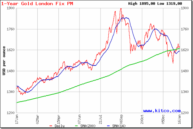
Gold_Jan1712

Two weeks back, gold’s price was making a second attempt at a pullback towards its 200 day SMA from below. It was expected that the bears would resort to selling and push the price down once more. But after a bit of a struggle, the price crossed above the still-rising 200 day SMA and has stayed above it since then.

Technically, the support at 1550 was not broken – gold’s price only had a day’s close below the support level. So, the drop from 1900 to 1550 should be treated as a bull market correction. The 30 day and 60 day SMAs (not shown in chart) did not fall below the 200 day SMA. Once the 14 day SMA crosses above the long-term moving average, the bulls will regain control.

Gold’s chart appears to be forming a bullish ‘falling wedge’ pattern, which is a ‘continuation’ pattern from which the likely break out should be upwards. Please remember that technical analysis is not a science, and patterns don’t always play out as expected. Buy on a convincing rise above 1700.

Silver Chart Pattern

Silver_Jan1712

Despite a smart pullback above the 14 day SMA, silver’s price is trading below its 30 day and 60 day SMAs (not shown in chart) and well below the 200 day SMA – the hallmark of a bear market.

The white metal is falling within a downward-sloping channel, making a bearish pattern of lower tops and lower bottoms. The 200 day SMA is forming a ‘rounding top’ pattern, hinting at a further fall in silver’s price.

Selasa, 06 Desember 2011

Gold and Silver Chart Patterns: consolidating

Gold Chart Pattern

Microsoft Word - Document1

Gold’s chart has been consolidating within a symmetrical triangle pattern (in yellow) for the past 10 weeks or so, and is ripe for a break out of the triangle. In which direction? Knowing the answer can make some one seriously rich! Triangles are quite unreliable and the break out can occur in either direction.

On an upward break out – which should be accompanied by heavy volumes for the break out to be valid – gold’s price can reach 2000. On a downward break, the price can fall to 1450. There is a third possibility. Gold’s price can continue to consolidate and move sideways through the apex of the triangle (at around 1725). In the latter case, the triangle pattern would fail.

Since gold’s price chart is in a bull market – it is trading well above its rising 200 day SMA – an upward break out has greater probability. But technically, the chart is showing some weakness. Note that the recent rally faced resistance from the 1750 level and failed to reach the upper edge of the triangle. That may be a prelude to a break below the triangle.

Await the break out before taking a decision to buy or sell.

Silver Chart Pattern

Microsoft Word - Document1

Ever since the steep drop below the 200 day SMA about 10 weeks back, silver’s price has been in a sideways consolidation between 28 and 36. The 200 day SMA is beginning to flatten out and should start falling – confirming a bear market.

In my previous post, I had mentioned that silver’s price has been trading within a downward-sloping channel (in yellow). The trend is down, and will remain so till the upper end of the channel is convincingly breached. With manufacturing activities contracting in Europe and the emerging markets, there is little likelihood of a boost in silver’s price any time soon.

Stay away till clarity emerges about a resolution of the Eurozone debt problems.

Selasa, 22 November 2011

Gold and Silver Chart Patterns: an update

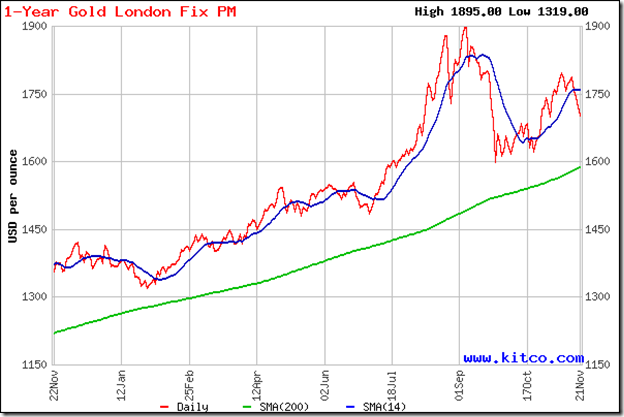
A few months of correction, and all the chatter about a return to the gold standard and the dollar no longer being a reserve currency is off the table! The signs of revival seen on the chart patterns of gold and silver two weeks back proved to be illusory.

Both precious metals are now trading below their 14 day, 30 day and 60 day SMAs, and may drop down to test their Sep ‘11 lows. Will that provide a buying opportunity?

Gold Chart Pattern

image

The answer should be ‘Yes’ for gold, because it is trading well above a rising 200 day SMA and is in a bull market. Note that the 1750 level provided good support till gold’s price chart formed a small ‘double-top’ reversal pattern and suddenly dived on Thu. Nov 17 ‘11.

A test of the 1600 support level is on the cards. The support should hold since the 200 day EMA is also near 1600. Just in case 1600 gets broken – nothing is certain in technical analysis – 1530 should be a stronger support due to the multiple tops formed near that level during Apr – Jun ‘11.

The downside to a bounce up from 1600 is that a bearish ‘descending triangle’ will get formed, from which gold’s price may fall all the way to 1300. This is a hypothetical possibility as of now, so no need to be alarmed. Let the chart pattern unfold. But it may be prudent not to be gung-ho bullish about buying the likely bounce up from 1600.

Silver Chart Pattern

image

The answer to the question is ‘Not yet’ for silver, because the white metal and all three of its moving averages (only the 14 day SMA is shown on the chart) are trading below the 200 day SMA – which indicates a bear market. The Sep ‘11 low of 28 may be tested and broken.

Note that silver’s price was consolidating within a small symmetrical triangle formed near the support level of 34, before breaking down sharply on Thu. Nov 17 ‘11. Drawing lines through tops formed in Apr ‘11 and Aug ‘11, and bottoms formed in May ‘11 and Sep ‘11 will form a broad downward-sloping channel pattern with its lower end currently at 26. That is a level which provided support in Nov ‘10 and Jan ‘11 – so an upward bounce can be expected from 26.

Bravehearts may try to bottom-fish at 26. Conservative investors should buy only on a convincing break out above the downward-sloping channel.

Selasa, 04 Oktober 2011

Gold and Silver Chart Patterns: end of long bull rallies?

Gold Chart Pattern

image

In an update to gold’s chart pattern two weeks ago, the following conclusion was drawn:

‘The present correction/consolidation – whatever it may turn out to be – should restore the technical health of gold’s chart for the next up move.’

The expected drop to 1600 from the double-top at 1900 happened quickly, and gold’s price has been consolidating in a narrow range of $50 since then. It is beginning to look like the next up move may take a while, and gold’s price may dip further – possibly to the 200 day SMA (at about 1520) - before a sustained rise can begin again.

Note that the 200 day SMA is still rising, with gold’s price trading above the long-term moving average. Technically, gold is still in a bull market. But extreme caution is advised about entering at this stage – since the yellow metal is trading below its 14 day, 30 day and 60 day SMAs. All three are likely to act as resistances on any up moves. Not to forget the valley level of 1750 (between the two tops at 1900), which should provide strong resistance to a price rally.

A fall below the 200 day SMA will also mean a 20% drop from its peak, and a likely trend reversal from bull to bear. If you are still holding and in profit, maintain a strict stop-loss at 1520.

Silver Chart Pattern

image

There are no doubts about the state of silver’s price chart pattern – it is in a bear market. It has dropped more than 20% from its peak and is trading below the 200 day SMA. The 14 day SMA has slipped below the long-term moving average. The 30 day and the 60 day SMAs have turned down and may cross below the 200 day SMA in the near future.

Why is silver faring worse than gold? The answer probably lies in the fact that silver is not something you just buy and lock up in a bank vault. It has several industrial uses as well. With global manufacturing in clear de-growth, industrial demand for silver is declining. (The fall in copper prices are also due to this same reason.)

If you are still holding, use any price rise to exit. On the down side, the next supports are at 24 and 20.

Kamis, 22 September 2011

To make money in the stock market, avoid these three buying mistakes

Stock markets have trading days or holidays. Using stock market jargon, trading days can be either ‘bullish’ or ‘bearish’. But if you follow the so-called experts on business channels or the pink papers, stock markets have ‘good’ days or ‘bad’ days. On ‘good’ days, the Sensex gains. On ‘bad’ days, the Nifty falls.

What happens when both the Nifty and the Sensex drop by 4% – like they did today? It is a ‘terrible’ day! For whom? Obviously for the brokers and the business channels, because their business thrives on ‘good’ days. When the market moves up, more viewers tune in, and more investors place ‘buy’ orders. For investors, who were lucky or prudent to sell at higher levels, ‘panic’ days offer a great opportunity to cover back the stocks sold earlier.

So, are ‘panic’ days great opportunities to buy? The short answer is: No. In an earlier post, ‘How to tackle a ‘panic bottom’, I had explained that panic bottoms seldom hold. Technically, today’s heavy FII selling didn’t create a bottom in the Sensex or the Nifty. But it is a sign that the lower level of the last six weeks’ trading range may get tested, and possibly broken.

If you ever watch a tennis match between a top 10 player and a player ranked much lower, you will notice that there may not be much difference in their respective skill levels. The big difference lies in their ‘unforced errors’ stats. The better player makes fewer ‘unforced errors’.

In stock market investments, there are three such ‘unforced errors’ that you must learn to eliminate to enjoy greater success. These are common buying mistakes that many investors make:-

  1. Buying near a top
  2. Buying during a down trend
  3. Buying before a bottom is formed

The buying mistakes in 1 and 3 are caused mainly due to inexperience with technical analysis. In the majority of bull and bear markets, a top or a bottom just do not happen out of the blue. There is a process, usually accompanied by a clearly identifiable reversal pattern, through which a top or a bottom gets formed. Such reversal patterns may take a few weeks, or a few months to form.

In both the Sensex and the Nifty, the Nov ‘10 peaks were part of ‘diamond’ reversal patterns, which transformed into large ‘descending triangle’ reversal patterns. So, we actually had two reversal patterns to indicate a change of trend from bull to bear.

The 2008 bear market ended with a 5 months long rectangular reversal pattern. It is expected that the current bear market will also form an identifiable pattern before the next bull phase can start. No such pattern is visible yet.

It is easier to identify reversal patterns after the pattern is fully formed. But there are prior signals given by various technical indicators that help to ascertain whether a reversal pattern is in progress. It is better to err on the side of caution when stock markets are rising or falling fast.

Buying during a down trend is acceptable only if you are covering up an earlier sale at a higher price. Not otherwise. Unlike tops and bottoms, which are tougher to identify, a simple trend line or the 200 day EMA can show whether a stock or an index is in a down trend. The biggest mistake you can make is to think that ‘it can’t fall any lower’. Learn to be patient and stay away during down trends. Buy only after an up trend is re-established.

Rabu, 21 September 2011

Stock Chart Pattern - Hindustan Unilever (An Update)

In the previous update to the technical analysis of the chart pattern of Hindustan Unilever, way back in Jan ‘10, the stock had been in a correction after climbing to an intra-day peak of 306 in Jul ‘09. The stock fell down to an intra-day low of 218 in Mar ‘10, a 29% drop from the peak.

The 8 months of correction broke the three years long up-trend line; the ‘death cross’ of the 50 day EMA below the 200 day EMA in Feb ‘10 confirmed a bear market. There were growth and margin pressures on the company, which were reflected in the stock’s price.

A look at the 2 years closing chart pattern of Hindustan Unilever should convince investors of different experiences and propensities why this is a must-have stock among the several thousand being traded on the BSE and NSE.

HUL_Sep2111

There is an old saying: “You can’t keep a good man down.” That expression could just as well describe the HUL stock. Note that when the stock dropped to its new closing low of 220 in Mar ‘10, all four technical indicators reached higher bottoms (marked by blue arrows). The positive divergences signalled the end of the bear period.

The stock embarked on a fresh bull rally within an upward-sloping channel that is still intact. From Sep ‘10 through Jan ‘11, the stock reached three closing tops – each a little higher than the previous one. This time, the technical indicators all touched lower tops. The negative divergences led to a sharp drop below the 200 day EMA, followed by a triple-bottom reversal pattern from Feb to May ‘11.

Once again, positive divergences from all four technical indicators that touched higher bottoms, hinted at a resumption of the rally. The stock reached a new closing high of 343 in Jun ‘11 at the upper-end of the upward-sloping channel. Negative divergences in the technical indicators warned of a correction.

There are two points of interest here. The first is that the stock’s price movements provide long-term trading opportunities, as it swings up and down within the upward-sloping channel. The second, more important one, is that between Nov ‘10 and Sep ‘11 the stock has gone up to touch new highs, and is in a bull market - even as the Sensex and Nifty are in clear down trends.

All three EMAs are rising and the stock is trading above them – a sign of a bull market. The strategy should be to use dips towards the lower end of the upward-sloping channel to add. All four technical indicators – MACD, ROC, RSI and slow stochastic are correcting an overbought situation. The correction from the new closing high of 353 may continue a bit longer.

Bottomline? The stock chart pattern of Hindustan Unilever is in a bull market, making steady rather than spectacular progress. Growth and margins are back on the upswing. Valuations are not cheap, but the stock is worth its weight in gold. Regular dividends are an added attraction. Use dips to accumulate.

Selasa, 13 September 2011

Is the recent stock market volatility unusual?

Before I answer that question, let me try and explain what volatility in the stock market really means. To the ordinary investor, volatility may mean sudden and unexpected changes in a stock’s price (or an index level).

But aren’t fluctuations in stock prices and index levels the norm rather than the exception? That’s an easier question to answer. Yes, stock prices and index levels do fluctuate all the time. But some times, the fluctuations are tolerable and ‘normal’. Those are periods of low volatility, which are conducive for trading and investments.

At other times, there are extraordinary and nerve-wracking fluctuations in stock prices and index levels that send traders and investors scurrying for cover. Such periods of high volatility increases risk and decreases returns.

For the mathematically inclined, volatility is a statistical measure of the uncertainty or risk associated with changes in a stock’s price (or an index level). It can be measured by using the standard deviation or variance (i.e. two standard deviations) of the returns from a stock or index.

A measure of the overall volatility of a stock’s return benchmarked against an index is called ‘Beta’. A Beta value of 1.0 means the stock’s return is the same as that of the index. In other words, if the index gains 100%, the stock will gain 100%. A Beta value of 1.5 means a stock will gain 50% more than the index during bull periods, but lose 50% more during bear periods; a value of 0.8 means the stock will gain 20% less than the index in a bull market, and lose 20% less in a bear market. The higher the Beta value, the more volatile the stock.

For the technically inclined, the Nifty VIX chart indicates the implied volatility (IV) of a basket of Nifty put and call options. A high VIX level (above 30) indicates high volatility; a low VIX value (below 20) indicates low volatility. Typically, when the VIX rises, the Nifty falls. The VIX can be used as a contra-indicator. Low values give an opportunity to sell, and high values provide opportunities to buy.

What causes high volatility? Unexpected changes - in interest rates (repo, reverse repo) or oil prices; a war or terrorist attack or earthquake; a change of government - can lead to wide fluctuations in stock prices and index levels.

What can small investors do? Understand this simple thumb-rule. Volatility declines when stock markets rise, and increases when stock markets fall. In a bear market – like now – high volatility is not unusual.

That is one reason why small investors may be better off staying away instead of trying to make a few bucks on counter-trend rallies; and avoid averaging-down during bear markets.

That was the long answer. The short answer to the question is: No.

Related Post

What is causing the volatility in the Sensex?

Jumat, 26 Agustus 2011

Which stocks are dragging the Sensex down?

The Sensex closed well below its May ‘10 low today, and the talking heads in the business channels had grim looks on their faces and kept saying “It’s a very bad day”, and “It’s a terrible start to the Sep series”! They should have said: “What a great day for the bears”, or, “What an opportunity for those who sold at higher prices”. Guess they are pre-programmed to feel sad when the market falls.

I took a quick look at the weekly charts of the Sensex constituents (except Coal India, which is a recent listing and doesn’t have adequate trading data).

Only seven stocks are trading above their rising 50 week EMAs (equivalent to the 200 day EMA on daily charts) indicating bull markets. These seven have prevented the Sensex from falling much lower. Here are the ‘Magnificient Seven’ (you can check out a terrific Western of the same name featuring Yul Brynner, Steve McQueen, Charles Bronson, over the weekend; the movie is based on a Kurosawa classic: ‘Seven Samurai’).

Stocks trading above rising 50 week EMAs

  1. Bajaj Auto
  2. Bharti Airtel
  3. Hero Motocorp
  4. Hind. Unilever
  5. ITC
  6. Mahindra and Mahindra
  7. Sun Pharma

The balance twenty-two stocks are trading below their 50 week EMAs indicating bear markets. These are the stocks that are dragging the Sensex down.

Stocks trading below 50 week EMAs

  1. BHEL – at level of Apr ‘09
  2. Cipla – at level of Oct ‘09
  3. DLF – at level of Mar ‘09
  4. HDFC – still above Feb ‘11 low
  5. HDFC Bank – still above Feb ‘11 low
  6. Hindalco – near Jun ‘10 low
  7. ICICI Bank – at level of May ‘10
  8. Infosys – at level of Oct ‘09
  9. Jaiprakash – at level of Mar ‘09
  10. Jindal St. and Power – at level of Jul ‘09
  11. L and T – still above Feb ‘11 low
  12. Maruti – at level of Jul ‘09
  13. NTPC – at level of Dec ‘08
  14. ONGC – still above Feb ‘11 low
  15. Reliance – at level of Mar ‘09
  16. SBI – at level of Feb ‘10
  17. Sterlite – at level of May ‘09
  18. TCS – at level of Sep ‘10
  19. Tata Motors – at level of May ‘10
  20. Tata Power – at level of May ‘09
  21. Tata Steel – at level of Aug ‘09
  22. Wipro – at level of Aug ‘09

What conclusions can be drawn from the above two lists? The seven that are still in bull markets will probably be the next target for the bears. The ones that have fallen the most, can give bigger percentage rises when the market turns eventually. Provided of course, that their fundamentals haven’t worsened. It does not mean that they can’t fall even further from current levels.

Small investors who do not own large-cap stocks can use the lists to short-list the fundamentally stronger ones and start accumulating slowly. But have a two-three years time-frame in mind. Please do not expect to get rich quick.

Rabu, 27 Juli 2011

Stock Index Chart Patterns - BSE Sectoral Indices, Jul 27, '11

During the two months since the previous analysis of the BSE Sectoral Indices chart patterns, both the Sensex and the Nifty have struggled in down trends – failing to move above their down trend lines but not falling below their Feb ‘11 and Jun ‘11 lows.

What is happening in the Sectoral Indices? The separation of the wheat from the chaff is becoming more obvious.

BSE Auto Index

BSE Auto Index

Like the Sensex, the BSE Auto index is forming a large descending triangle – lower tops and a flat bottom at 8115 – that has bearish implications. The technical indicators are looking bearish and another test of the 8115 level seems likely. Hold.

BSE Bankex

BSE BANKEX

The BSE Bankex is forming a pennant pattern – lower tops and higher bottoms – which is a continuation pattern. An upward break out is more likely. But the bearish technical indicators are pointing to another spell below the 200 day EMA. Hold.

BSE Capital Goods Index

BSE Capital Goods Index

The BSE Capital Goods index made a valiant effort to escape the clutches of the bear, and managed to spend several days above the 200 day EMA. But bullish hopes were belied. The index has dropped back into a bear market. The weak technical indicators are suggesting that the correction will continue. Avoid.

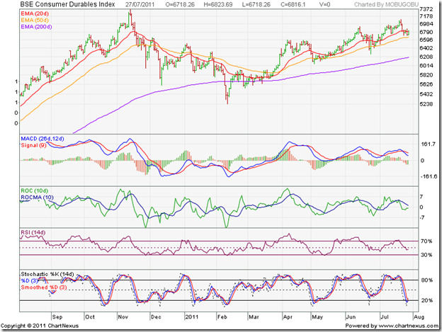
BSE Consumer Durables Index

BSE Consumer Durables Index

The BSE Consumer Durables index is in a bull market, receiving good support from its rising 50 day EMA. A test of the Nov ‘10 top is on the cards. Hold.

BSE FMCG Index

BSE FMCG Index

The BSE FMCG sector continues to be the star performer over the past year, touching new highs on a monthly basis. Add on dips.

BSE Healthcare Index

BSE Healthcare Index

The BSE Healthcare index has been in a rising trend since the low of Feb ‘11, and is in a bull market. Add on dips.

BSE IT Index

BSE IT Index

The BSE IT index has slipped into a bear market. The failure of the index to get anywhere close to its down trend line in July ‘11 is bearish. Weaknesses in the Eurozone and US economies are taking a toll on our export-oriented software services companies. Hold.

BSE Metal Index

BSE Metal Index

The BSE Metal index is in a bear market. The technical indicators are suggesting further weakness. Unless infrastructure projects start picking up – which seems unlikely in a high-interest regime – things are not going to improve any time soon. Avoid.

BSE Oil & Gas Index

BSE Oil & Gas Index

The BSE Oil & Gas index is sliding down a slippery slope with very little hope of a turnaround. The government is in the horns of a dilemma about fuel prices. Not raising prices means losses and subsidies. Raising prices means stoking inflation. The poor performance of a heavyweight like Reliance has compounded the problems. The technical indicators are turning bearish. Avoid.

BSE Power Index

BSE Power Index

The BSE Power index is in a bear market, though the downward momentum is slowing. The technical indicators are bearish. Avoid.

BSE Realty Index

BSE Realty Index

The BSE Realty index is also a clear avoid – falling in a bear market with little hope of revival in the near term.

The FMCG index, Consumer Durables index and the Healthcare index are in bull markets. The Auto index and Bankex are struggling to remain in bull markets. These are the five sectors that investors should look to for parking their money. Individual stocks in the other six sectors that are going against the grain can also be considered for investments.

Selasa, 07 Juni 2011

Gold & Silver Chart Patterns: pair trading opportunity?

Regular readers of this blog know that I’m not a great fan of investing in precious metals. Neither do I trade for the short-term, nor do I recommend that small investors should indulge in trading. But sometimes an opportunity stares you in the face – as the one year gold and silver closing chart patterns seem to be doing now.

Gold Chart Pattern

image

The technical headwinds that the gold chart was facing last month led to a decent correction below the 14 day SMA. Such corrections restore the health of the bull market and provide good entry points.

Isn’t gold’s price near an all-time high, and shouldn’t one be cautious? The current investor interest in gold has been largely due to the weaknesses in the dollar and the euro. The currency weaknesses aren’t going away any time soon. Gold’s bull market is likely to test and surpass its recent peak of 1565.70.

But it is a good idea to be careful – more so because gold’s price and its 14 day SMA have both risen far away from the rising 200 day SMA. A deeper correction may be around the corner. Stay invested with a trailing stop-loss.

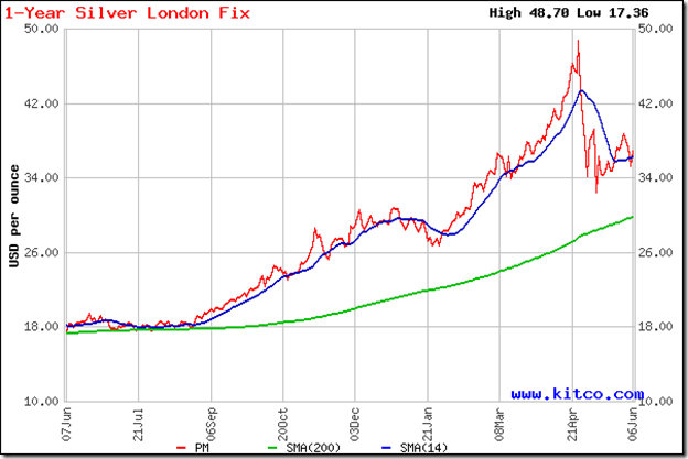
Silver Chart Pattern

image

The technical headwinds turned into a full-blown hurricane in silver’s chart pattern. A 33% correction from the peak of 48.70 to a trough of 32.50 has shaken off the speculators.

Silver’s price has been consolidating within a triangle pattern and has edged above the 14 day SMA, but remains below the falling 30 day SMA. The possibility of a breakdown below the previous low and a test of support from the rising 200 day SMA can’t be ruled out.

The pair trade? Long silver, short gold. But remember – I have no skin in this game!

Kamis, 05 Mei 2011

Gold & Silver Chart Patterns: technical headwinds

Last month, chart patterns of gold and silver were in strong bull markets. The yellow metal seemed unstoppable and my advice to investors was to enjoy the ride by maintaining trailing stop-losses. Silver’s rise had appeared a bit too sharp, and the possibility of a correction below the 14 day SMA was mentioned.

Gold Chart Pattern

image

After touching another new high of 1565.70, gold’s price faced some selling pressure and closed below 1520 on May 4 ‘11. At the time of writing this post, gold’s price further dipped to the 14 day SMA and is hovering near it. Such corrections are good for the longer-term health of the bull market.

As long as the US dollar keeps weakening against most major currencies, the bull market in gold is likely to charge along without facing too many hurdles. Continue to remain invested with trailing stop-losses and use dips to add. The only concern is that every one else seems to be following the same strategy. And the herd is usually wrong.

Silver Chart Pattern

image

The near-vertical rise in the price of silver hit a brick wall after touching a new high of 48.70, and started dropping like a stone - slicing through expected support from the 14 day SMA like a hot knife through butter. The closing price on May 4 ‘11 was just below 40, and the sharp correction continues today. At the time of writing this post, silver’s price has fallen below 37 to the 60 day SMA, and may correct further.

The next support level is at 34. If that support doesn’t hold, the next support is at 30. As long as silver’s price stays above the rising 200 day SMA, the bull market will not be under threat. But don’t rush in to buy yet. No point trying to catch a falling knife. Wait for it to hit the table, where it should vibrate a bit. That is the time to grab it.

Sudden and gut-wrenching drops in silver’s price – a 25% correction in a week – isn’t unusual, as can be verified from longer term charts. It is for this very reason that one should strictly maintain a trailing stop-loss to protect profits.

Selasa, 19 April 2011

Are acquisitions beneficial for small investors?

The short answer is: ‘No’ (for small investors of the acquiring company), and ‘Maybe’ (for shareholders of the acquired company). The acquiring company ends up paying too high a price – usually financed through debt – which adds downward pressure to the stock’s price.

Integrating the business of a different company with a different set of values is not an easy task. More so if the business of the acquired company has little or no synergy with its own. If the integration fails, the acquiring company may be forced to divest its acquisition at a loss.

Shareholders of the acquired company typically end up with a smaller number of shares in the acquiring company, and some times get a monetary compensation instead of any shares if their original holdings were small. However, if several acquirers start a bidding war to acquire a company, thereby giving a boost to the company’s share price, then small shareholders can use the opportunity to book out with a tidy profit.

What happens when a company decides to sell one of its divisions, instead of the entire company? This happened recently when Aditya Birla Chemicals (formerly Bihar Caustic, and a subsidiary of Hindalco) acquired the Chloro-Chemicals division of Kanoria Chemicals. It was a win-win situation for both companies. Small investors in both companies have already seen their holdings increase in value, as share prices of both companies have moved up subsequent to the announcement of the acquisition.

Kanoria Chemicals had sales of Rs 421 Crores in 2009-10 with a PBIT of Rs 51 Crores. Its Chloro-Chemicals division (CCD) had sales of Rs 303 Crores with a PBIT of Rs 47 Crores. Obviously, the rest of their businesses are neither large nor very profitable. So, how do they benefit by selling off their largest and most profitable division?

Kanoria Chemicals will receive Rs 830 Crores in cash for CCD – valuing it at nearly 2.75 times its sales. Though there was talk of using the cash for acquisitions and expansions, the plain fact is that at 9% rate of interest in a bank fixed deposit Kanoria Chemicals can earn more money every year than they have ever earned running their company!

No wonder the share price has doubled in a month! Looking at the chart pattern, there are clear signs of insider buying, since the stock made a bullish rounding bottom pattern and started rising well before the acquisition announcement. The stock is looking extremely overbought, and existing investors should use the opportunity to sell. A special dividend offer is likely, but there doesn’t seem to be great future opportunities for the company.

Will small investors of Aditya Birla Chemicals benefit? It appears so, even though a high price was paid for the acquisition (which will be funded through debt and internal accruals). CCD will more than double the caustic soda production capacity of Aditya Birla Chemicals, and is located near Hindalco’s Renukoot factory, which will add to the synergy. Hindalco is significantly increasing its own production capacity, and this acquisition gets rid of a competitor plus doubles the capacity of an essential input for aluminium production.

Aditya Birla Chemicals has an excellent balance sheet, and has assured business from its parent company. The stock is in a bull market, and can be added on dips.

Related Post

About advantages and disadvantages of mergers and acquisitions (M&A) and demergers

Kamis, 07 April 2011

Gold & Silver Chart Patterns: in strong bull markets

I have been writing about gold’s chart pattern for more than a year. There has been a few requests of late to write about silver. So, here is my first shot at silver’s chart pattern. I must confess that I’m not a great fan of investing in precious metals because there are no returns other than capital gains.

Part of the ‘fun’ in stock market investing is being able to analyse Annual Reports to uncover what businesses have been doing to stay ahead, and discover ‘below the radar’ small companies that can become future stars. Buying precious metals is as exciting as investing in a cumulative fixed deposit in a bank – only riskier.

If an investor is looking for diversification, allocating 5-10% of one’s portfolio to gold and silver may not be a bad idea. More so now, because investments in both precious metals have been performing phenomenally well.

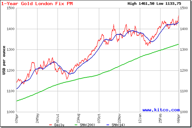
Gold Chart Pattern

image

Last month, profit booking caused gold’s price to fall below the rising 14 day SMA and the triple top at 1421. I had expected a drop to the support level of 1400, and advised investors to buy the dip. The chart pattern played out exactly as per expectations.

The upward bounce from the 1400 level reached a new high of 1440, followed by a brief consolidation within a symmetrical triangle pattern. The break out from the triangle touched another new high of 1461.50 in quick time. The yellow metal seems to be on an unstoppable ride. Fasten your seat belts, maintain trailing stop-losses, and enjoy. Buy only on dips below the 14 day SMA.

Silver Chart Pattern

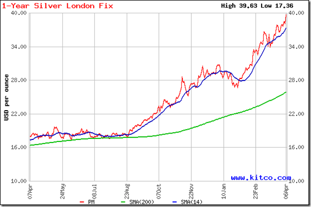
image

Silver’s gains have been more spectacular. While gold gained nearly 4.4% from its recent low of 1400, silver rose 16.5% from its recent low of 34 to a new high of 39.63. The rise has been too sharp too soon, as can be seen from the rapidly widening gap between the 14 day and 200 day SMAs. Both moving averages are rising, which is the sign of a strong bull market.

A correction down to the rising 14 day SMA, or even lower, can occur at any time. 37 should be a good support level, and an upward bounce can be expected there. Stay invested, and use any dips to add.

Jumat, 11 Maret 2011

Gold Chart Pattern: another buying opportunity?

Last month, gold’s 2 years price chart was struggling to move above the 30 day SMA after recovering from a drop to 1315 from its earlier peak of 1421. I had suggested buying below 1340, and accumulating on a convincing move above 1356. After consolidating a bit near 1356, gold’s price shot up close to its previous high of 1421, and after a brief pause rose to a new all-time high of 1437.

image

Profit booking seems to be the reason why the price has slipped to 1411, just below the rising 14 day SMA. Can it fall some more? Yes, it can. It has already dropped below the triple top at 1421. The next support level is at 1400, from where an upward bounce can be expected.

Is this correction another buying opportunity? Yes, it is. Note that the 200 day SMA continues to rise, and gold’s price is trading much above the long-term moving average. That is the sign of a bull market, and the strategy should be to ‘buy the dips’. Note that the chart pattern is close to two previous peaks. Accumulating in small quantities would be a more prudent approach, rather than buying in bulk.

How long will this bull market in gold continue? Who knows, and why should investors be bothered? There is still a lot of uncertainty all around. Emerging markets are facing inflation pressures, which could lead to a slow down in their economies. The recoveries in the US and Europe have been less than stellar so far. The unrest in North Africa and the Middle East is pushing oil prices higher, which will not at all be conducive to faster economic growth.

Gold seems to be the safest haven of all. Stay invested with a suitable trailing stop-loss, may be at the level of the rising 200 day SMA. That is as close to a ‘sure thing’ as you can get in investing these days.

Selasa, 08 Februari 2011

Gold Chart Pattern: is this a good time to buy?

In last month’s analysis of gold’s chart pattern, a bearish triple-top was getting formed. A decent correction looked imminent. I had mentioned that a break below 1340 would confirm the triple-top. Gold’s price dropped all the way down to 1315 on Jan 27 ‘11, correcting about 7.5% from the Nov ‘10 top of 1421.

Since then, gold’s price has pulled back above the falling 14 day SMA, and managed to close at 1356 on Feb 3 ‘11 – a 38.7% retracement of the fall from 1421 to 1315, and marginally higher than the 38.2% Fibonacci retracement level. That may be one of the reasons why the chart is struggling a bit to move higher.

But that isn’t the only reason. Let us look at the 2 year closing chart pattern of gold to understand why:

image

Note that the pullback is facing resistance from the falling 30 day SMA. That opens up the possibility of a drop down to test support from the rising 200 day SMA. There is a third reason as well. The US stock markets have been bullish and investors are regaining their appetite for riskier assets.

The doom and gloom reports about the US and European economies are getting less frequent. GDP growths remain meagre, but growth is definitely more visible. Inflation remains low. Same with interest rates. That points to a further rally in the equity markets, and a correspondingly lower investor demand for safer havens, like gold.

Is the bull market in gold over? Far from it. As long as gold’s price remains above the rising 200 day SMA, the strategy should continue to be: ‘buy the dips’. Last month, I had advised new entrants to accumulate below the level of 1340. A possible drop to the 200 day SMA may provide an opportunity to add. A convincing close above 1356 can also be used to accumulate.

Please don’t forget to maintain adequate stop-losses. This close to an all-time high is not the time to throw caution to the winds. 1350 is a support-resistance level. If the support holds, gold’s price is likely to move higher – may be after a period of consolidation. A break below 1350 could lead to a test of the 200 day SMA.

Kamis, 03 Februari 2011

10 DOs and DON’Ts for making money in the stock market

Making big money – really big money – that allows you the freedom to do what you want, when you want and wherever you want must be the dream of every human being in the planet (except those who become monks or nuns). Only a few manage to make the dream a reality.

Those who follow the straight and narrow path end up toiling all their lives – slaving at a job, or trying to run a profession or business. Those who prefer a more crooked road usually have a short career and end up as state guests with free room and board – unless they manage to become politicians powerful enough to stay away from the long arm of the law.

Making really big money is not a realistic goal for most law-abiding citizens. But making a lot of money – enough that you can have a comfortable retired life that doesn’t require you to cut corners and lets you enjoy some of the material pleasures that life has on offer – is a more achievable goal. The stock market is a place that can help you to achieve the goal by supplementing your regular earnings.

Here are 10 DOs and DON’Ts for making money in the stock market:

DO…

  1. Make a financial plan. You don’t have to be a CA to do this. All you need is a little common sense and some knowledge of arithmetic. Think of all the major expenditures – children’s education, daughter’s marriage, buying a flat – at different times in the future and assess how much money will be required for each. That will give you an idea of how much you need to save.
  2. Make an Asset Allocation plan. This is the key. You need to know how much of your savings you should invest in risk-free instruments like Post Office MIS or bank fixed deposits, and how much you can afford to invest in riskier instruments like mutual funds and shares. By maintaining a plan, you will know when to buy and when to sell.
  3. Learn about the stock market before entering it. Can you get into an IIT or IIM from the Kindergarten? Can you face the fast bowling of a Brett Lee or a Dale Steyn if all you have played is tennis ball cricket? In the stock market, you will be playing against the likes of Rakesh Jhunjhunwala and Ramesh Damani. If you don’t know what you are doing, they will take all your money. Read books by Gurus like Graham and Lynch.
  4. Learn how to select stocks and build a portfolio. Haphazardly buying and selling stocks (or funds) on some one’s advice or your ‘gut feel’ is a sure way to make losses. Learn the process of selecting stocks for a portfolio, and holding for the long-term. There are several articles on this blog that can get you started.
  5. Learn to be patient and disciplined. The stock market is not a place for showing off how smart or enterprising you are. Those qualities are great for a business venture. In the stock market, you have to be observant and vigilant. Choose the times you want to buy (near bear market bottoms) and the times you want to sell (near bull market tops) carefully. The rest of the time, just wait and watch. Rome wasn’t built in a day. Neither will your wealth.

DON’T…

  1. Think that making money in the stock market is easy. The stock market isn’t a zero-sum game. While there is a buyer for every seller, only a few make money. The majority lose. They are the ones who thought making money was easy.
  2. Feel like a genius if you have made some money. It was most likely a combination of luck and a bull market. Going through bull, bear and sideways markets with your wealth intact requires determination and perseverance. If you are feeling excited and having fun, a loss is just around the corner.
  3. Forget Buffet’s Rule No. 1. Regardless of whether you have a shorter or longer investment time frame, always set stop-losses. That will help you to limit your losses. If a stock is running up fast, set a trailing stop-loss. (If you don’t know anything about stop-losses, you need to read my eBook. It is FREE.)
  4. Be too greedy. Have profit targets for each stock (or fund) in your portfolio. Once the target is hit, sell 50% and hold the rest with a trailing stop-loss. Sell all when the trailing stop-loss gets hit.
  5. Ever trade. According to Peter Lynch, the odds of success are greater at the race track or casino. Most trade to get rich quick. But there are no short-cuts in life. Trading is the best way to get poor quick; or, to become a reluctant long-term investor (when the trade goes completely wrong!).

There are no sure-shots in the stock market. But if you follow this simple set of DOs and DON’Ts, you will make a lot of money. Not tomorrow, or the day after. But after 20 years. Might as well get started now.

Related Posts Plugin for WordPress, Blogger...