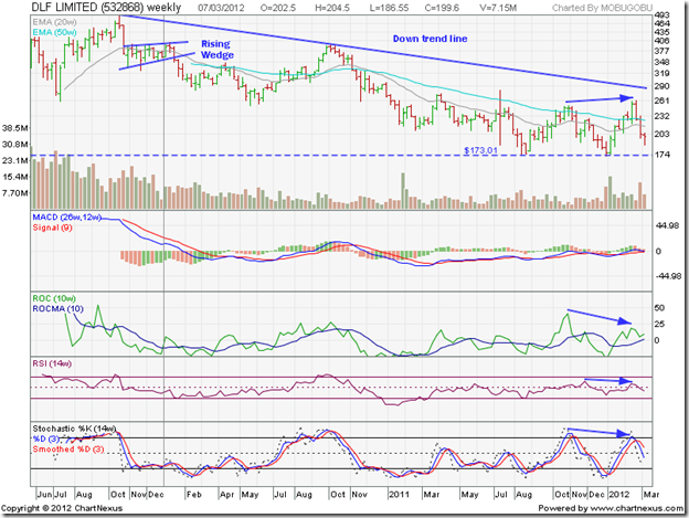
The previous detailed update to the technical analysis of the stock chart pattern of DLF Ltd. was posted more than two years back (date marked by the grey vertical line on the chart below). A further update since then had not been considered necessary because there wasn’t anything new to add to the following recommendations:
“The stock chart pattern of DLF Ltd. does not hold out much hope for the bulls. If you are still stuck at higher prices, continuing to hold may increase your losses. Investors should not go anywhere near this stock.”
So, why take a re-look at the DLF Ltd. chart now? The motivation came from the considerable interest generated by a recent report published by a Canada-based equity research house that tore the company’s business practices and financial condition to shreds. That report was based on fundamental analysis. But technical signals had warned of the decimation in the stock’s price back in Oct-Nov ‘09.
The weekly bar chart pattern of DLF Ltd shows the steady fall from the 3 yr high of 491, touched in Oct ‘09. The stock fell almost 65% to its Jan ‘12 low of 173. But that pales in comparison to the 90% fall from its all-time high of 1225 touched on Jan 15 '08 to the bottom of 124 on Feb 4 '09.
The subsequent rally led to a 300% gain (from 124 to 491) but retraced only a third of its bear market fall – less than the Fibonacci retracement level of 38.2%. That means the entire gain from 124 to 491 was a bear market rally within the long-term bear market that started from Jan ‘08. Hence the call to investors not to go anywhere near the stock. Very few stocks manage to recover from a 90% fall.
Note that the stock price formed a ‘reversal week’ pattern (higher high, lower close) when it touched 491 in Oct ‘09. A ‘distribution week’ pattern (high near open, close near low on higher volumes) followed the next week. The stock price then entered a bearish ‘rising wedge’ pattern.
After the expected break below the ‘rising wedge’, the stock dropped to 251 in May ‘10 but formed a ‘reversal week’ pattern (lower low, higher close) that marked the end of the first phase of the down move. A counter-trend rally took the stock price above the 20 week and 50 week EMAs to a high of 397 in Oct ‘10. Again, a ‘reversal week’ pattern (higher high, lower close) marked the end of the intermediate rally.
The next leg of the down move dropped the stock to a low of 173 in Aug ‘11. A bounce saw the stock price reach a high of 251 in Nov ‘11 before falling back to test the low of 173 in Jan ‘12. A rally along with the broader market took the stock to a high of 261 in Feb ‘12, when another ‘reversal week’ pattern ended the brief rally. Note the negative divergences in three of the four technical indicators (marked by blue arrows) that warned of a correction, which started even before the adverse report hit the market.
The weekly technical indicators are turning bearish. If the stock breaches its recent low of 173, it can drop all the way to test its Feb ‘09 low of 124. If you are holding the stock, ask yourself: Why?
Bottomline? The stock chart pattern of DLF Ltd. is in a long-term bear market that started more than 4 years ago, and shows no sign of ending. After years of financial shenanigans and taking customers and investors for a ride, the chicken are coming home to roost. The company is desperately trying to sell-off assets to survive, but are finding few takers. The stock doesn’t deserve to be an index constituent. AVOID.
