Tampilkan postingan dengan label overbought. Tampilkan semua postingan

Sabtu, 04 Februari 2012

BSE Sensex and NSE Nifty 50 index chart patterns – Feb 3 ‘12

The down trend lines connecting the falling tops on the BSE Sensex and NSE Nifty 50 index charts have been breached on a weekly closing basis – the first time that has happened since the down trends began in Nov ‘10.

It is immaterial to debate the cause of the sudden bullishness. It may be ‘hot money’ flowing in, or anticipation of a change in the fundamentals – but that isn’t important. What is important is that trend lines in force for 15 months have been breached, and such breaches have to be respected. Does that mean both indices have returned to bull markets?

Technically, not yet – as was explained in a post on Feb 3 ‘12. There is another reason. Any breach of a trend line (or support/resistance level) should be subjected to a ‘3% whipsaw leeway’. That means, an index (or stock) should go past by more than 3% to avoid a ‘whipsaw’ pullback. Despite strong volumes that accompanied the upward breaches last week, neither index have moved above their down trend lines by more than 3%. Those levels are about 17830 (for the Sensex) and 5370 (for the Nifty).

BSE Sensex index chart

SENSEX_FEB0312

A burst of FII buying did what 15 months of negative sentiments could not – turn the Sensex chart pattern from bearish to bullish. A little more work is left for the bulls before the bears can be finally sent off to hibernation.

Technical indicators are reflecting the bullishness, but there are a couple of concerns. Three of the indicators – ROC, RSI and slow stochastic – are showing negative divergences by touching lower tops as the Sensex rose higher. The RSI and the slow stochastic are well inside their overbought zones, which usually precedes a correction. But the ROC is hugging its 10 day MA, and the MACD is rising above its signal line in the positive zone without moving too far away – so, the up move may not end immediately.

The likely outcome may be a bit of consolidation after a strong rally, or a pullback to the top of the breached down trend line. Note the bullish ‘rounding bottom’ pattern that is forming on the 50 day EMA.

NSE Nifty 50 index chart

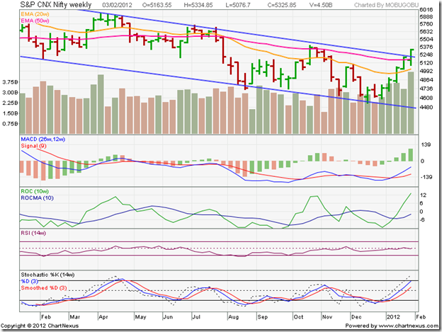
Nifty_Feb0312

The weekly bar chart of the NSE Nifty 50 index clearly shows the breach of the down trend line, accompanied by the strongest volumes in the past year. A trend line break on strong volumes is a sign of a valid break. Both the 20 week and 50 week EMAs have started rising, though the 20 week EMA is well below the 50 week EMA.

Three of the technical indicators – MACD, ROC and slow stochastic – are indicating overbought conditions. The MACD histogram (the bars that plot the difference between the MACD and its signal line) has risen to its highest level in the past year. On two previous occasions – in Apr ‘11 and Oct-Nov ‘11 – rising histogram led to corrections.

The ROC has climbed far above its 10 week MA – note the corrections that followed when this happened in Apr ‘11 and Oct ‘11. The slow stochastic has reached its overbought zone for the first time since Apr ‘11. The RSI is in neutral territory, straddling its 50% level – but has touched a slightly lower top (than the one in Nov ‘11). Looks like a correction may be around the corner after 5 straight weeks of higher closes.

Bottomline? The BSE Sensex and the Nifty 50 index chart patterns have rallied impressively from their Dec '11 lows on the back of strong FII buying, and have breached their downward-sloping channels. Technically, the breaches haven’t been confirmed yet – but that could be just a matter of time. Fundamentally, not much has changed since Dec ‘11 when both indices hit their lows. Don’t be surprised if the FIIs decide to book profits. It is always better to concentrate on individual stocks instead of getting hung-up about index movements.

Jumat, 20 Januari 2012

5 reasons why this is a sucker’s rally and not a change of trend

P. T. Barnum, a 19th century American circus owner, had apparently said: “There is a sucker born every minute.” Translated into English, that means that the world is full of gullible people. Any idea, however ridiculous and unbelievable it may be, is sure to find a few takers.

Crazy ideas - from ‘the world is flat’ and ‘the sun moves around the earth’ to ‘Suzlon is the next GE’ and ‘RJ is the Warren Buffett of India – follow his portfolio if you want to become rich’ – always find believers (a.k.a. ‘suckers’).

So, what is a “sucker’s rally”? It is a sharp price rise in an index or a stock without the support of fundamentals – usually during a bear market. Here are 5 reasons why the current rally in the Sensex and Nifty indices is a sucker’s rally:

1. There is a ‘gut feeling’ among small investors that the worst is over. Gut feelings are seldom right, unless the guts belong to some one called Warren Buffett. Even Buffett is known to make mistakes. Keep your guts where they belong. Use your brains instead. The problems in Europe haven’t been solved yet. China’s economy is struggling with slower growth. The worst may not be over yet.

2. A general consensus among market players is that RBI may start reducing rates soon; even if the interest rate remains where it is, there is likely to be a cut in the CRR to increase liquidity. The RBI has not indicated any such thing. They have only paused in hiking interest rates further. That means, interest rate remains just as high as it was a month ago when the Sensex and Nifty hit their lows. Stock markets can’t sustain in a high interest rate environment.

3. Though food inflation has started coming down, it may be more due to a high ‘base effect’ and seasonal availability of vegetables. Core inflation has moderated a bit, but still remains high. RBI has made it quite clear that controlling inflation is their top priority. Unless core inflation drops below 5%, interest rate cuts may not be effected. Inflation won’t come down as long as the government spends recklessly on various schemes to buy votes.

4. The government’s policy inaction will continue till the annual budget is announced in mid-March – thanks to the impending elections in five states. The only bit of good news for foreign investors in recent times has been the Supreme Court’s judgement in the Vodafone case, stating that the Income Tax department has no jurisdiction over a transaction between two overseas entities. But that judgement is more in the nature of removing an unnecessary irritant than paving the way for any fresh investments. The government has to be far more proactive on the policy front to change the commonly held perception that it is bureaucratic and inept.

5. Technically, both the Sensex and Nifty are in 14 months long bear markets. Bear markets (and bull markets) don’t turn around suddenly. They usually form some sort of a reversal pattern, which takes a few weeks to a few months to form. No such reversal pattern is visible as yet.

The recent spate of FII buying has begun to attract inexperienced small investors who don’t want to miss the bus. Technical indicators are looking overbought. The stage seems set for the big boys to get out. The suckers may get stuck with shares bought at higher prices.

Minggu, 02 Oktober 2011

Two market breadth indicators (an update)


Six weeks have elapsed since my previous post on two Nifty breadth indicators - the A-D line and the TRIN. During this period, the Nifty consolidated in a rectangular range between 4700 and 5200, just below the large descending triangle pattern it had formed since the top of Nov '10. Here is a quick update on the two market breadth indicators.

Nifty A-D Line


The A-D line has tracked the Nifty's fall since the Nov '10 peak with some notable exceptions. During Feb '11 to Apr '11, the Nifty made a series of three higher bottoms, while the A-D line reached three lower bottoms. In the rally that followed, the Nifty reached a higher top in Apr '11 than the top in Feb '11. But the A-D line's Apr '11 top was at the same level as its Feb '11 top. These negative divergences were a warning that the next down leg in the Nifty was imminent.

Again, the Jun '11 bottom on the Nifty was at the same level as the second bottom in Feb '11. But the A-D line touched a much lower bottom in Jun '11 - a negative divergence that suggested that the subsequent rally may be short-lived. What the A-D line does not indicate is exactly when the negative (or positive) divergences will affect Nifty's movements.

Last week, the Nifty made a higher bottom within the trading range, but the A-D line touched a slightly lower bottom. The negative divergence is a likely precursor to more selling in the coming week.

Nifty TRIN


 There are a couple of interesting points to note on the Nifty TRIN chart. In end-Aug '11, when the Nifty fell to its 52 week low after breaking down below the descending triangle pattern, the TRIN spiked to 1.25. A value of 1.2 or higher means the market is oversold and due for a rally.

The rally followed almost immediately, but the Nifty quickly reached an overbought condition - as indicated by the sharp drop of the TRIN below 0.75. A correction in the Nifty followed, but the TRIN is not indicating an oversold condition as yet. We can, therefore, conclude that the correction in the Nifty isn't over yet.

Both the A-D line and the TRIN are pointing to a further correction in the Nifty. Any upward bounces are likely to attract selling. As with all technical indicators, these two are not fool-proof and should be used in conjunction with other indicators like EMA crossovers, slow stochastic, ROC, RSI.

(Charts from: www.icharts.in)

Selasa, 06 September 2011

Gold and Silver Chart Patterns: up, up and away?

In an update of the technical chart patterns of gold and silver posted two weeks back, I had mentioned about the possibility of a sharp correction in gold’s price due to the extremely overbought condition, and advised investors to use the dip to buy. Silver’s price was expected to pull back a bit after a quick rise above the 14 day SMA, and provide a good buying opportunity.

Gold Chart Pattern

image

A sharp correction was expected – and what a sharp correction it was! Gold’s price was shaved off by almost $200 in the space of two days of trading. The 14 day SMA was easily breached and the price headed down towards the 30 day SMA. The bounce back was equally sharp.

Before the overbought condition could be properly rectified, gold’s price shot up above the $1900 mark. The volatility continues in today’s trading. Price touched a new peak of $1920, only to correct by more than $50 within a couple of hours! At the time of writing this post, gold’s price seems to be stabilising around $1900.

Such volatility is a sign of growing uncertainty, probably caused by the bleak outlook of the US and Eurozone economies. Uncertainty usually precedes a correction. That doesn’t mean that gold’s price may not rise some more. But one should be very cautious about entering near all-time highs – regardless of what you may hear or read.

Technically, the ever widening distance between the 14 day SMA as well as the 30 day SMA (not shown in the chart above) and the 200 day SMA is a harbinger of a big price meltdown. If you are invested in gold, maintain a strict stop-loss at 1820 – which is the level of the 14 day SMA.

Regular readers know that I am not a fan of buying gold because it provides no returns. If you are interested about a view based on historical analysis of gold and stock investment performance, read this article.

Silver Chart Pattern

image

Silver’s price chart shows a short and sharp correction, from $44 to $40, and a quick dip below the 14 day SMA. A pull back to $42 was expected. It provided a good entry opportunity. The quick recovery did not affect the upward momentum of the 14 day SMA or the 200 day SMA. The bull market in silver is intact, which is confirmed by the bullish pattern of rising tops and rising bottoms.

During today’s trading, silver’s price faced a sharp $2 drop before stabilising near the $42.50 mark. Technically, there isn’t any immediate threat of a big price correction. Dips can be used to accumulate. A convincing move above $49 will restore control to the bulls.

Selasa, 23 Agustus 2011

Gold and Silver Chart Patterns: an update

There is an old stock market saying: When in doubt, stay out. But in current politically and economically turbulent times, investors appear to have created a new maxim: When in doubt, buy gold (and silver).

Gold Chart Pattern

image

Gold is being bought as if the financial world is going to collapse tomorrow, or latest by next week. What else can explain a vertical $200 surge from 1700 to 1900 in the two weeks since my previous post?

Admittedly, there is sovereign gold buying, and Venezuela created a flutter by planning to repatriate $11 Billion worth of gold held in overseas banks. The sorry state of Eurozone banks is a major concern. But ask yourself: Is the global economy in a worse situation than it was in 2009?

One can debate the state of the global economy till the cows come home. The bottomline is that the parabolic rise in gold’s price over the past couple of months is unsustainable. The chart is looking extremely overbought, with the 14 day SMA (as well as the 30 day and 60 day SMAs – not shown in the chart above) climbing away from the rising 200 day SMA. A sharp correction, if not a crash, is around the corner.

If you are an investor who would rather buy gold (instead of Colgate or ITC shares), use the likely dip to buy gold ETFs. My preference is for the hefty dividends that Colgate and ITC shareholders receive – not to forget the occasional bonus shares.

Silver Chart Pattern

image

After a four month lull, during which silver’s price went through a decent correction, prices have risen sharply to touch the 44 mark. I had recommended that investors use the recent dip to buy, or to wait till the 42 level is crossed convincingly.

If you missed out on the buying opportunities, wait for a likely pullback towards 42 to enter. The 14 day SMA is turning upwards. The 200 day SMA didn’t stop rising right through the four months of price correction. The bull market in silver is alive and well.

Related Posts Plugin for WordPress, Blogger...