Tampilkan postingan dengan label Bollinger Bands. Tampilkan semua postingan

Senin, 04 Juli 2011

Stock Index Chart Patterns – S&P 500 and FTSE 100 – Jul 01, ‘11

S&P 500 Index Chart

image

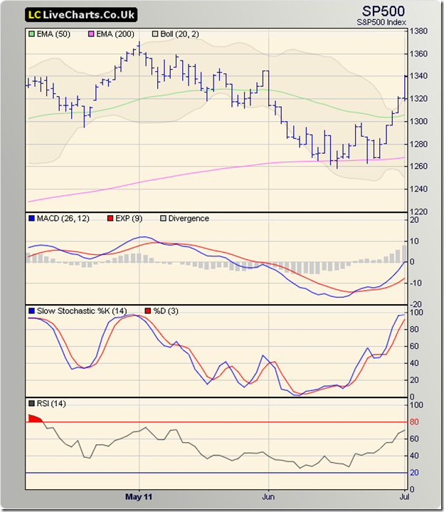
After hovering for two week’s near the 200 day EMA, the S&P 500 decided it didn’t want to drop into a bear market after all. The strong 5.6% weekly gain – the best weekly performance in two years by the index – sent the bears scurrying for cover.

What caused the sudden rally? It may seem that the financial bail-out package for Greece, forcing their government to adopt stringent austerity measures in the face of riots and protests by Greek citizens, caused world-wide relief that led to euphoria in the stock markets. The more likely reason was that the bull’s used the Greece news as an excuse to trap the bears.

The combined effect of buying and short-covering took the index well above its 50 day EMA and beyond the upper Bollinger Band. The bands are widening, which means trading can turn volatile. An entire month’s losses have been recovered in a week.

The technical indicators have turned bullish to the point of being overbought. The MACD has risen away from its signal line into positive territory. The slow stochastic is deep inside its overbought zone. The RSI is rising quickly towards its overbought zone.

There hasn’t been any great change in the US economy to warrant such a sharp rise. The Weekly Leading Index (WLI) of the Economic Cycle Research Institute (ECRI) dropped for the 10th straight week to 2.0 from the previous week’s 2.9. Initial unemployment claims declined by 1000 to 428000 – the 12th consecutive week above the psychological 400,000 mark.

FTSE 100 Index Chart

image

The FTSE 100 managed to hold on to the support level of 5650, and embarked on a swift rally – ostensibly due to all-around relief that Greece’s sovereign default was temporarily averted. The index sailed above its 200 day and 50 day EMAs, pierced the upper Bollinger Band, and regained all the ground it had lost during the month of June ‘11.

The technical indicators are looking bullish, which means the rally is likely to continue this week. The MACD has crossed above its signal line, and is about to enter positive territory. The slow stochastic has entered its overbought zone. The RSI has moved above its 50% level.

UK’s manufacturing sector grew at its slowest pace in two years. The good news is that it was still a growth. Whether the growth will sustain in the domestic market or not is debatable, as austerity measures are expected to take a toll. However, exports are picking up, which is a silver lining.

Bottomline? The chart patterns of S&P 500 and FTSE 100 indices recovered spectacularly last week. Global economic growth is slowing down, so it was more of a relief rally that the Greek crisis has been averted for now. Conservative investors can take some profits off the table. The more adventurous can use trailing stop-losses to ride the rally.
Senin, 27 Juni 2011

Stock Index Chart Patterns – S&P 500 and FTSE 100 – Jun 24, ‘11

S&P 500 Index Chart

image

The S&P 500 index chart spent another week of gyrations without making much headway. It rose a bit higher only to face resistance from the 1300 level, and closed marginally lower. Bulls may feel relieved that the index closed the entire week above the 200 day EMA.

Bears will point out that a higher high and a lower close means it was a bearish ‘reversal week’. The index has spent 18 straight trading sessions below the falling 50 day EMA. The down trend that began from the May 2 ‘11 top of 1371 remains firmly in place. The bearish pattern of lower tops and lower bottoms continues.

The technical indicators are weakening after showing some signs of life. The MACD is negative and about to cross below the signal line. The slow stochastic rose sharply to the 60% level, but the %K line has dropped below the %D line and the 50% level. The RSI is moving sideways, and is also below the 50% level. The bears are getting ready to take control.

There isn’t much good news on the economic front. The GDP growth has been downgraded to 2.7% from the earlier estimate of 2.9%. Unemployment claims increased by 9000 to 429000 – the 11th straight week above the 400000 mark. Sales of new and existing homes dipped in May ‘11. Oil prices have fallen – but that isn’t necessarily good news for the stock market.

FTSE 100 Index Chart

image

The FTSE 100 made a futile effort at an up move that was quickly stalled by the bears. The long-term moving average has now turned down and the ‘death cross’ of the rapidly sliding 50 day EMA below the 200 day EMA appears imminent. The index spent the second week in a row below the long-term moving average.

The technical indicators are bearish and not holding out much cheer for the bulls. The MACD is below its signal line, and both are falling in negative territory. The slow stochastic and RSI are both below their 50% levels. A test of the Mar ‘11 low of 5592 is on the cards.

Greece’s bailout is like using chewing gum to plug holes in a leaking boat – postponing the inevitable. The severe repercussions to European and UK banking systems have not been fully revealed yet.

Bottomline? The chart patterns of S&P 500 and FTSE 100 indices may face deeper corrections. If you are still invested, keep strict stop-losses at 1260 for the S&P 500 and 5650 for the FTSE 100. Things may get worse before they can get better.

Senin, 20 Juni 2011

Stock Index Chart Patterns – S&P 500 and FTSE 100 – Jun 17, ‘11

S&P 500 Index Chart 
Last week, I had speculated whether the S&P 500 chart will be able to bounce up from its 200 day EMA or not. The index dropped below the 200 day EMA on Wednesday and Thursday (Jun 15, 16 '11), but managed to close above the long-term moving average on both days. By Friday, the S&P 500 chart bounced up a bit to close absolutely flat on a weekly basis.
The good news is that the index halted its six weeks long downward slide. The bad news is that the halt may be temporary. As the Grateful Dead sang many years ago, there is 'trouble ahead, trouble behind, and you know that notion just crossed my mind'.
The technical indicators are bearish. The MACD has stopped falling, but remains negative and below its falling signal line. The slow stochastic's feeble effort to emerge from its oversold zone failed miserably. The RSI's up move stalled at the 40% level and it is heading down towards its oversold zone. Looks like the correction isn't over yet.
Economic indicators weren't great either. The index of small business optimism declined for the third month in a row. The Conference Board's Leading Economic Index rose by less than 1% after declining in April '11. The Weekly Leading Index growth indicator of the Economic Cycle Research Institute declined for the eighth straight week. The University of Michigan Consumer Sentiment Index was down to 71.8 from 74.3 in May '11.
FTSE 100 Index Chart 
The bears are beginning to take control of the FTSE 100 index chart. The Mar '11 low of 5592 was not tested, but the index closed the entire week below the 200 day EMA. In the process, the lower Bollinger Band was pierced. An up move may follow.

The technical indicators are bearish. The MACD is below its signal line and sliding deeper into negative territory. The slow stochastic is well inside its oversold zone. The RSI is falling towards its oversold zone. The FTSE 100 chart has formed a bearish rounding-top pattern - pointing to a deeper correction.

The UK economy remains in the doldrums, as GDP growth has remained flat in the past six months. Unemployment has decreased but consumer sentiment remains low. Retail sales declined by 1.4%. Greece's bailout is casting a pall of gloom over European indices, and the FTSE 100 is suffering from its ill effects.
Bottomline? The chart patterns of S&P 500 and FTSE 100 indices show that this is likely to be a summer of discontent. Sit back and let the corrections play out. Lower entry points are likely to be available in the not-too-distant future.

Related Posts Plugin for WordPress, Blogger...