Tampilkan postingan dengan label economy. Tampilkan semua postingan

Kamis, 08 Maret 2012

Behavioural traits of a successful investor

To be a successful investor in the stock market, one needs to develop several skills:

  • Learn how the stock market functions – the roles played by short-term traders, long-term investors, operators, company promoters, brokers, FIIs, DIIs, NSDL/CSDL, stock exchanges, SEBI
  • Know about the various types of securities that are traded – stocks, convertible and non-convertible debentures/bonds, warrants, ETFs, mutual funds, bonus/rights shares, bonus/rights debentures
  • Be aware of related information – dividends, interest on debentures/bonds, tax implications of buying and selling of various securities
  • Have working knowledge of economic concepts – supply and demand, money supply, inflation/deflation/stagflation/recession, surplus/deficit, interest rates, impact of global economies on domestic economy, effect of economic changes on different business sectors
  • Reasonable proficiency in accounting concepts – debit/credit, assets/liabilities, capital/reserves, equity/preference shares, payables/receivables, raw materials/inventory, profit/loss, cash flows, and ability to calculate and compare EPS, P/E, P/BV, RoNW, RoCE, Debt-Equity ratio, etc.

But the most important skill of all is to learn about oneself – the behavioural traits that determine who will be a successful investor and who will be an ‘also ran’.

In a recent article posted at investopedia.com, the following behavioural model developed by Bailard, Biehl and Kaiser was presented:

Investors are classified according to their decisions and actions (‘impetuous’ at one end and ‘careful’ at the opposite end) as well as their levels of confidence (‘confident’ at one end and ‘anxious’ at the other end). Based on these behavioural traits, investors are divided into five groups:

  • Celebrity – anxious and impetuous, a follower of the latest investment trends
  • Adventurer – confident and impetuous, a strong-willed risk taker
  • Individualist – confident and careful, with an analytical and self-reliant approach
  • Guardian – anxious and careful, willing to sacrifice riskier growth for more stable returns
  • Straight Arrow – equally shares the above four behavioural traits

Apparently, greatest investment success is achieved by those with the ‘Individualist’ behavioural trait. What if one has one of the four other behavioural traits? Should they exit from the stock market?

With discipline and perseverance, behavioural patterns can be changed – provided one is aware which behavioural category one belongs to.

Moral of the story? To be a successful investor – know thyself.

Related Posts

Become a successful investor by avoiding 'herd mentality'
Are you an irrational investor?
Some practical examples of Behavioural Finance

Senin, 05 Maret 2012

Stock Index Chart Patterns – S&P 500 and FTSE 100 – Mar 2, ‘12

S&P 500 Index Chart

SnP500_Mar0212

The inevitable happened. The bulls finally managed to push the S&P 500 index chart to new 52 week highs – both on intra-day and closing basis. The index touched an intra-day high of 1378 on Feb 29 ‘12 and a closing high of 1374 on Mar 1 ‘12. Is it time for celebration or caution?

All three EMAs are rising and the index is trading above them. The bulls appear to be in complete control. But there are a few concerns. The index is trading too far above its 200 day EMA, which is a precursor to a correction. Despite a spike up on Feb 29, volumes have been sliding. A bull rally needs volume support to sustain.

The technical indicators are bullish, but continue to show negative divergences. The slow stochastic is inside its overbought zone, but drifting down. The MACD is positive and touching its signal line, but slowly losing ground. The RSI is above its 50% level, but making a bearish pattern of lower tops and lower bottoms. The ROC is barely positive, but touching lower tops. Stay invested with a trailing stop-loss.

Is the slow-growing US economy reaching stall speed? Some of the data points suggest as much. Weekly unemployment claims remained flat at 351,000. ISM Manufacturing index declined to 52.4 from 54.1 in Jan. Durable goods orders declined by 4% in Jan after 3 straight monthly increases. Home prices continued to fall. But it wasn’t all bad news. Car sales crossed the 15 Million mark in Feb – a 4 yr high. Sales of previously owned homes rose 4.3% in Jan – helped by the lower prices.

FTSE 100 Index Chart

FTSE_Mar0212

The FTSE 100 chart closed marginally lower for the week. The bull rally appears to have hit a road-block below the 6000 level. The index is still trading above all three EMAs, so the bull rally is under no immediate threat. However, a correction seems to be around the corner.

The technical indicators have weakened further, and are on the verge of turning bearish. The slow stochastic has dropped from the overbought zone, but remains above the 50% level. The MACD is positive, but has slipped below the falling signal line. The RSI is resting at the 50% level. The ROC is at the ‘0’ line, after a brief dip into negative territory. A correction down to the 5800 level can be used as a buying opportunity. A deeper correction may put the nascent bull market in jeopardy.

Spectre of a double-dip recession in the UK may be fading. PMI for construction increased to 54.3 from 51.4 in Jan. PMI for services dropped to 53.8 from 56 in Jan. Remember that a figure above 50 means expansion. The big problem remains unemployment, which is at a 17 yr high. Austerity measures are not helping in job creation. High oil prices are another concern.

Bottomline? Chart patterns of the S&P 500 and FTSE 100 indices are in bull markets, which have climbed higher in spite of negligible growth in the underlying economies. Easy availability of liquidity has helped in propelling the markets. At some point, the weak fundamentals may drag the markets down. Till then, stay invested with trailing stop-losses.

Rabu, 29 Februari 2012

Is the Q3 GDP growth rate of 6.1% a good or a bad number?

The short answer to the question: It depends on your viewpoint. Such a GDP growth number can not be seen in isolation, but in comparison with what has happened before and what is happening elsewhere.

Here are a few reasons why the number is good, and a few more reasons why the number is bad. The idea is not to confuse readers, but to provoke thinking and debate.

Reasons why Q3 GDP growth of 6.1% is good

If you look at the growth figures in some of the developed economies – particularly those in the Eurozone where even a 2% growth figure is considered gooda 6.1% growth figure should be celebrated with fireworks and champagne. The stark difference in growth figures is one of the reasons FIIs are investing big sums in our stock market.

High growth usually leads to inflation and therefore, high prices for goods and services. A more moderate growth figure has helped to tame inflation to a certain extent.

The Q4 GDP growth figure is unlikely to be much higher, but things are likely to improve from here on as there is usually a spurt in spending by the government sector to utilise left over funds from the previous year’s budget. In other words, the economic cycle may be bottoming out – which it usually does a few months after the stock market bottoms out.

Reasons why Q3 GDP growth of 6.1% is bad

This was the lowest growth figure in nearly 3 years, and almost 35% lower than the heady figure of 9.5% growth seen 5 years back.

There is evidence of economic slowdown everywhere – particularly in the manufacturing sector. Even services sector is slowing down. If growth doesn’t pick up soon, the FIIs may just pull out their money and invest it elsewhere.

Government’s fiscal deficit target for the year has already been exceeded in the first 10 months. That, coupled with the rise in oil prices, means that inflation may rear its ugly head again. The RBI may feel constrained to leave interest rates at the current high levels, or reduce it only marginally. That in turn will lead to slow growth in the next financial year.

Selasa, 28 Februari 2012

Notes from the USA (Feb 2012) - a guest post

The data flowing out of the US economic indicators have been showing definite signs of recovery from the world-may-come-to-an-end kind of scenario three years ago. Two large doses of Quantitative Easing have prevented a collapse of the financial system. The stock market is soaring and corporate America is flush with cash. Unemployment situation is improving and even the moribund housing market is beginning to show signs of life.

Is this the proverbial light at the end of the tunnel, or is it the headlight of an onrushing train? In this month’s guest post, KKP expresses his apprehensions about the strength and durability of the US economic recovery. He also presents a positive outlook from a recent consumer survey report.

-------------------------------------------------------------------------------------------------------------

Beautiful Orange Sky Before Darkness

The sky looks awesome right now since it is 6 pm and we can see the sun setting on the horizon. It is a perfect time when the glare of the sun does not bother our eyes, the heat has reduced to a more comfortable level, and it is all-in-all pleasant to everyone enjoying this moment. The key is to know what happens in a few minutes to an hour. It will be dark and the lights need to turn on. Oh no, the electricity man came earlier and cut off our electricity? Is that possible? Turning to my wife, I ask if we paid the electric bill on time? Huh!

Well, it seems that we are facing such an evening right now in the global economy. The bearish blog writers have portrayed well that ‘patch-work’ solutions of the current debt-related issues are only going to take us so far. One fine day the electricity guy is not going to take our cheques (or bonds) and the darkness is not going to get illuminated with a 100 or 200 watt CFL (tube light) bulb.

Many global economies are running on borrowed time, with times of pleasure and growth in between based on government maneuvering for political reasons. Is the booster shot that Greece just got something that will last, or will it need a 2nd, 3rd, and 4th shots before the antibiotics kick-in? And will the patient be alive when those 3rd and 4th shots are given? Are the other countries after Greece in the PIIGS acronym next to ask for rescue packages? Of course, they are almost ready now. We already have a next acronym after PIIGS and it is CAASH. This is the Canadian, Australian, Hong Kong and other economies that also have their Debt-to-GDP ratios going out of whack. US tax collections are lower than ever, and annual deficits are in the same range as during 1929-1934 (% of GDP). Are we so information overloaded that we cannot see the turmoil in the air, or are we too busy with our daily chores, ‘synch’ing our mobile devices, and playing Angry-Birds on our Tablets/iPhones/Androids?

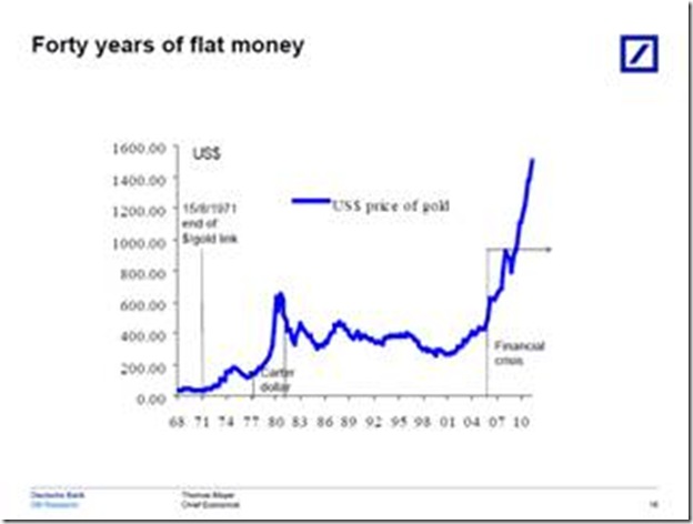
Take a look at the previous crisis and what happened to Gold. Look at what has happened to Gold even without a ‘real crisis’. I say that the crisis has not happened since we keep averting the ‘root cause’ event with patch-work. In the meantime, we have high tides and low tides in the market and have the emotional roll-coaster associated with it (being left out, or what did I do!). So, let’s watch what is happening in the global markets and react accordingly.
clip_image002

If you want to see a positive viewpoint of the most current survey that I participate in with ChangeWave, here is partial report. Of course, I was not very optimistic in my input to the survey. We are approx 5000 to 10000 people in this closed group of professionals that provide our input based on our consumer spending or enterprise spending surveys. It will show the minor waves of positive and negativity, and of course, it is showing the positive/optimistic living that we are all experiencing right now. I am all for good living, and benefitting from positive waves, but will it last?

-------------------------------------------------------------------------------------------------------------

February U.S. Consumer Spending Report

Spending Accelerates for February as Consumer Confidence and Expectations Improve

by Jean Crumrine and Paul Carton

Overview: In a clear sign of accelerating momentum, U.S. consumer spending has soared in February – the second major upswing of the past three months. Importantly, the February 1-13 ChangeWave survey shows overall spending at a nine month high, and confidence and expectations continuing to improve. ChangeWave Research is a service of 451 Research.

The survey of 2,501 U.S. consumers finds the biggest spending upticks are occurring in Travel/Vacation, Household Repairs and Improvements, Autos, and Restaurants.

Moreover after last month’s post-holiday declines, our latest findings point to renewed momentum for several retailers, including Costco (COST), Target (TGT) and Walmart (WMT).

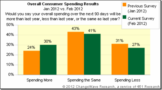
Consumer Spending Outlook: Three-in-ten U.S. respondents (30%) now say they'll spend more over the next 90 days than they did a year ago – up 6-pts since our previous ChangeWave survey in January.  Only 27% say they'll spend less, a 4-pt improvement from previously.
clip_image001

Putting the Findings in Context:  As the following chart shows, the net 10-pt jump in February is the second major uptick of the past three months – and the overall reading is higher than any of the previous 9 months.

clip_image001[4]

Consumer Expectations and Confidence: When we asked consumers about their impressions of the economy, we found confidence and expectations up again to their highest levels of the past year.

Consumer Expectations:  One-in-three consumers (33%) now believe the overall direction of the economy will improve over the next 90 days, while only 21% think it will worsen.  This represents a net 7-pt improvement since January and a striking 66-pt turnaround since the horrendous lows of six months ago.

clip_image001[6]

Stock Market Confidence:  In a similar positive, 39% say that they’re More Confident in the U.S. stock market than they were 90 days ago, while 19% say they’re Less Confident – an 8-pt improvement since the previous month.

clip_image001[8]

Respondents were asked about their investing plans going forward, and reported their money inflow into U.S. Stocks (+13; up 6-pts) is accelerating. And although Non-U.S. Stocks (-1; up 6-pts) are still registering a money outflow, the rate is subsiding – a sign that the European Union debt crisis hasn’t immobilized consumer investing.

Bottom Line: The February ChangeWave survey results show consumer spending soaring, and bring into sharp focus the improved spending environment we’ve been tracking in our monthly surveys since November of last year.

Importantly, U.S. consumer confidence and expectations are also improving for the 6th consecutive month. As for the biggest outperformers in February – it’s Travel/Vacation, Autos, Household Repairs/Improvements, and Restaurants.

-------------------------------------------------------------------------------------------------------------

KKP (Kiran Patel) is a long time investor in the US, investing in US, Indian and Chinese markets for the last 25 years. Investing is a passion, and most recently he has ventured into real estate in the US and also a bit in India. Running user groups, teaching kids at local high school, moderating a group in the US and running Investment Clubs are his current hobbies. He also works full time for a Fortune 100 corporation.

Senin, 27 Februari 2012

Stock Index Chart Patterns – S&P 500 and FTSE 100 – Feb 24, ‘12

S&P 500 Index Chart

SnP500_Feb2412

The chart pattern of the S&P 500 index reminded me of an old Cole Porter song: “So near and yet so far.” The index touched an intra-day high of 1369 on Fri. Feb 24 ‘12 and closed marginally higher on a weekly basis, but couldn’t quite cross above the May ‘11 top of 1371. Will the index touch a new 52 week high this week?

The possibility is high. The index is trading above all three of its rising EMAs, and is in a bull market. But volumes are decreasing and the technical indicators continue to show negative divergences, by failing to reach new highs. The index may pause to catch its breath after rising almost non-stop for two months.

Despite large doses of QE1, QE2 and an indirect QE3, growth in the US economy is still tepid. Initial jobless claims were almost flat at 351,000. New hiring isn’t picking up. Inventory of existing homes reduced as existing home sales rose. As per AAII’s Sentiment Survey, bullish sentiment rose by 1% to 43.7% (above its historical average of 39%) and bearish sentiment rose by 0.9% to 27.5% (below its historical average of 30%). The fly in the ointment was ECRI’s reaffirmation of a recession by mid-2012.

FTSE 100 Index Chart

FTSE_Feb2412

The FTSE 100 index chart closed with a higher weekly gain, but the bulls seem to be getting tired as the index nears the 6000 level. All three EMAs are rising with the index trading above them, which indicates a bull market.

The technical indicators are not bearish, but showing some weakness. The slow stochastic is inside its overbought zone, but sliding down. The MACD is positive and touching its signal line, but drifting downwards. The RSI has fallen sharply after touching the edge of its overbought zone, but remains above the 50% level. The ROC dropped to the ‘0’ line, but has bounced up.

The UK economy is teetering at the brink of another recession. The GDP contracted by 0.2% during the last three months of 2011, in spite of a 0.5% increase in household spending and 1% growth in government spending. The full year GDP was revised down to 0.8%.

Bottomline? Chart patterns of the S&P 500 and FTSE 100 indices are in bull markets – even though the GDP growths in the US and UK economies are negligible. Are the stock markets telling us that things will improve later in the year – or is it just that markets are being propelled by easy availability of low-cost money? Who knows, and why bother? Just ride the up trends by maintaining a stop-loss at the levels of the respective 20 day EMAs. Use dips to add.

Senin, 20 Februari 2012

Stock Index Chart Patterns – S&P 500 and FTSE 100 – Feb 17, ‘12

S&P 500 Index Chart

SnP500_Feb1712

The following observation was made in last week’s analysis of the S&P 500 index chart pattern: “A correction down to the rising 20 day EMA may be just the impetus that the bulls need to take the index past the May ‘11 top of 1371.” There was no correction – just a sideways consolidation. But the index rose to an intra-day top of 1363, within hand-shaking distance of the May ‘11 top of 1371. The bears have been all but vanquished.

Low volumes as the index rose to a new high, as well as negative divergences in all four technical indicators – which failed to reach new highs with the index - may be the trigger for a correction this week. That doesn’t mean one should short a bull market. All three EMAs are rising and the index is trading above them.

The technical indicators are looking bullish. Only the slow stochastic is looking overbought, but it can remain so for long periods. The MACD has slipped a bit, but is still positive and touching its signal line. The RSI is rising towards its overbought zone. The ROC is positive, but moving sideways.

The US economy continues to improve slowly. Initial weekly unemployment claims dropped to 348,000, its lowest level in almost 4 years. Retail sales increased by 0.4% in Jan. YoY changes in housing starts was positive for the 5th month in a row. Industrial production was marginally higher. All talk about recession is now off the table.

FTSE 100 Index Chart

FTSE_Feb1712

The FTSE 100 index traded sideways during the past week. Despite an intra-day drop to its rising 20 day EMA on Thu. Feb 16 ‘12, the index managed to close about 50 points higher on a weekly basis. All three EMAs are rising and the index is trading above them – indicating a bull market.

The technical indicators are bullish. The slow stochastic is inside its overbought zone. The MACD is positive, and touching its signal line. The RSI has climbed sharply towards its overbought zone. The ROC is positive, but moving down.

There was some good news on the economic front. CPI dropped to 3.6% in Jan. from 4.2% in Dec. Retail spending rose a surprising 0.9% in Jan. - raising hopes of avoiding a double-dip recession. However, Eurozone GDP declined by 0.3% in Q4 ‘11. Even Germany’s growth shrank and increased prospects of a recession that will dent UK’s exports to the EU.

Bottomline? Chart patterns of the S&P 500 and FTSE 100 indices are in bull markets. Stay invested with trailing stop-losses, and use dips to add.

Senin, 13 Februari 2012

Stock Index Chart Patterns – S&P 500 and FTSE 100 – Feb 10, ‘12

S&P 500 Index Chart

SnP500_Feb1012

The following observations were made in last week’s analysis of the S&P 500 index chart pattern: “The technical indicators are looking overbought and showing negative divergences. The index can remain overbought for long periods, but the negative divergences in all four indicators hint at a correction.” The index kept inching up through most of last week, till some selling on Fri. Feb 10 ‘12 caused a slightly lower weekly close.

The technical indicators are bullish, but showing signs of weakness. The slow stochastic is inside its overbought zone, but has slipped down a bit. The MACD is positive and just above its signal line. The RSI has dropped from its overbought zone, and is moving down. The ROC is positive but not really going anywhere. All three EMAs are rising with the index trading above them – so there is no threat to the bull market. A correction down to the rising 20 day EMA may be just the impetus that the bulls need to take the index past the May ‘11 top of 1371.

The US economy continues on its slow path to recovery. Initial weekly jobless claims fell to 358,000. ISM manufacturing index rose to 54.1 in Jan ‘12 from 53.1 in Dec ‘11 (a reading above 50 means expansion). Bullish sentiment rose to 51.6% (from 43.8%) while bearish sentiment fell to 20.2% (from 25.1%) in AAII’s sentiment survey. However, the Reuters/Univ. of Michigan Consumer Sentiment index slipped a little to 72.5 (from 75 in Jan ‘12).

FTSE 100 Index Chart

FTSE_Feb1012

The FTSE 100 index chart closed lower for the week due to profit booking on Fri. Feb 10 ‘12, after spending most of the week trading sideways. All three EMAs are rising with the index trading above them – a sign of a bull market.

The technical indicators are indicating bullishness, but not as much as a week ago. The slow stochastic is in its overbought zone, but moving down. The MACD has slipped a bit, but remains above the signal line in positive zone. The RSI is above the 50% level, but falling. The ROC is positive but drifting sideways.

UK’s manufacturing output rose by 1%, somewhat easing recession fears. But unemployment is rising and more job cuts are planned, as per this article. Inflation dropped to 4.1% in Jan ‘12 from 4.8% in Dec ‘11. Worries about a flagging economy forced the Bank of England to inject another 50 Billion sterling in its QE programme.

Bottomline? Chart patterns of the S&P 500 and FTSE 100 indices are back in bull markets – thanks more to easy availability of liquidity rather than any real strength in the respective economies. But as Tennyson wrote in a completely different context: “…Theirs not to reason why…”. Use dips to add, but maintain a trailing stop-loss to ensure that you don’t ride into the valley of death.

Senin, 06 Februari 2012

Stock Index Chart Patterns – S&P 500 and FTSE 100 – Feb 03, ‘12

S&P 500 Index Chart

SnP500_Feb0312

The S&P 500 index chart continued its upward march, after a brief dip to its rising 20 day EMA. All three EMAs are rising and the index is trading above them – the sign of a bull market. The May ‘11 top of 1371 is the next big hurdle on the way, but looks like the bulls will leap over it with ease.

The technical indicators are looking overbought and showing negative divergences. The index can remain overbought for long periods, but the negative divergences in all four indicators hint at a correction. The slow stochastic has re-entered its overbought zone, but touched a lower top while the index moved higher. The MACD is positive and hanging on to its signal line without rising or falling. The RSI has also re-entered its overbought zone, but touched a lower top. The ROC is positive but drifting downwards.

Last week’s jobs report was hailed by the stock market as an indication that growth in the US economy is slowly getting back on track, but all may not be well. Initial jobless claims dropped to 367,000; non-farm payrolls increased by 243,000 – much higher than consensus estimates; the unemployment rate fell to 8.3% from 8.5%. That was the good news. The bad news is that labour force participation dropped to a 30 years low at 63.7%. AAII sentiment survey showed a 4.6% drop in bullish sentiment to 43.8% (still above its historical average of 39%), and bearish sentiment rose by 6.2% to 25.1% (below its historical average of 30%).

FTSE 100 Index Chart

FTSE_Feb0312

The FTSE 100 chart has re-entered a bull market, after a short correction down to its rising 20 day EMA. The index closed at its highest level since Jul ‘11, but all four technical indicators are showing negative divergences by failing to reach higher tops. Another correction may be around the corner.

The technical indicators are looking bullish. The slow stochastic has climbed into its overbought zone after a sharp drop from a head-and-shoulders pattern. The MACD is positive and just above its signal line. The RSI bounced up from its 50% level, and rising towards its overbought zone. The ROC took support at its ‘0’ line and is moving up in positive territory.

UK’s manufacturing and services sectors enjoyed a decent start to 2012. The manufacturing PMI survey reading rose to 52.1 in Jan ‘12 from 49.7 in Dec ‘11, indicating a return to expansion. The services sector PMI rose to 56 in Jan ‘12 from 54 in Dec ‘11. A recession may be avoided if this rate of expansion persists, since the services sector forms 2/3rds of the UK economy. The bad news came from the Eurozone, where manufacturing PMI was at 48.8 in Jan ‘12 – up from 46.9 in Dec ‘11. A figure below 50 is a sign of contraction. Small and medium businesses in the UK are facing tough times, as bank lending is at its lowest level since 2009. Another dose of QE may be in the offing.

Bottomline? Chart patterns of the S&P 500 and FTSE 100 indices are back in bull markets – discounting the slow and tortuous growth in the US and UK economies. Bull rallies in both indices have been quite sharp. Likely corrections will restore the energy of the bulls. Use dips to add.

Selasa, 31 Januari 2012

Notes from the USA (Jan 2012) - a guest post

It was about 25 years back that the then head of the Department of Electronics, a dynamic government official by the name of N. Vittal, shook up the complacency in the IT industry by announcing a software export target that seemed outrageously high (by prevailing standards). The IT industry rose to the challenge, and the rest is history. Software exports mainly comprised ‘on-site body shopping’ of technically qualified software engineers.

Call center outsourcing business opened up vast employment opportunities in India for less technically savvy youth – even those located away from the major metros – and significantly expanded the size and purchasing power of the Indian middle class. In this month’s guest post, KKP points to an important trend that could potentially destroy the employment opportunities of tens of thousands of India’s educated youth.

-----------------------------------------------------------------------------------------------------------

India Sees First Wave of Outsourcing Competition

India’s success in recent years can be attributed largely to the outsourcing trend that the Internet technologies enabled in the 1990s. Companies tripped over each other in the US to migrate their business from US and Europe to India to save on costs, while servicing customers in almost the same manner.

A recent article in the Washington Post highlights the increasingly popular trend of call center outsourcing operations moving away from India. Although India remains the preferred destination for IT support (today), the country is no longer known as the call center capital of the world since salaries and other business costs have grown significantly over the past year.

Currently, a larger number of call center outsourcing employees are working in the Philippines and Malaysia rather than in India. My team in Argentina is also telling me that there is a significant growth of this business in Argentina. For companies such as 24/7 Customer, the choice has been clear. It set up its first call center in India in 2000. Today, it has 4,500 employees in the Philippines compared with 3,000 in India.

What is so crucial about it?

It is critical to understand what US does to economies around the world. US is a Wall Street driven engine for the enterprises. This means that there will be ‘trends’ and ‘herd movements’ in one direction. And when the winds blow a different way, it will all change quite quickly. In a recent conversation, a businessman who has come from Hyderabad told me how salary cuts are going on within the call center environment, and there are plenty of people, but not enough jobs. This is Phase 1.

USA businesses will make a decision on what is good for their bottom line and change, throwing away the human component quickly and switching countries in a heart-beat. Many companies have moved their operations to the Philippines also and they are serving customers well.

But, the most important trend that I have seen is moving operations to low cost states within the US where they can hire, train and operate a US based call center at almost the same cost as those in a foreign land. Here’s proof. I open/close many credit cards and lines of credit every year, and during the month of Dec and Jan, do an inventory and clean house. In doing so, I have to make calls to open new ones, and close existing ones. Every single call I made (except for Citibank), was picked up by someone in a US call center, and they announced themselves as being in the US! Of course, they served me with a level of service that is expected in the US, and with a level of urgency that falls outside of pre-written scripts and documented processes.

So, again, why is this important for us investors?

USA did this to Japan, and today, there are more Japanese plants operating outside of Japan than in Japan. This trend might hit the shores of India, and hence India will really have to boost its ‘organic growth engine’ in a huge way to compensate for the loss of business that will come over the next 1-2 decades. It is a slow moving engine since these trends are like the Titanic making a turn, but when they turn, they turn for good.

It is also possible to offset the reduction in call center work by transitioning to the BPO type of efforts, where the margins are better. Those efforts are also underway, but the push to bring business back into the country (in US and Europe) is getting stronger as job losses in those economies begin to hurt. That is a wind of change that an investor needs to worry about (macro trend).

I am not saying that Manufacturing, Auto-parts, IT support, Software development, Tier 2/3 Support, BPO efforts etc. will all move away from India, but when the first wave is affected the other waves will slowly get affected in a small manner, if not completely get wiped out over the ensuing years.

Our investments have to reflect this since a lot of infrastructure is built around this growing middle class, and the growth of middle class is becoming dependent on the flow of business from US and Europe. With both those economies slowing, and further scaling back on outsourcing to India, we may see a much larger detrimental effect on this portion of the business. The only hope is that the local growth engine revs up in the meantime to replace this slow loss that will happen over the next decade or two.

-----------------------------------------------------------------------------------------------------------

KKP (Kiran Patel) is a long time investor in the US, investing in US, Indian and Chinese markets for the last 25 years. Investing is a passion, and most recently he has ventured into real estate in the US and also a bit in India. Running user groups, teaching kids at local high school, moderating a group in the US and running Investment Clubs are his current hobbies. He also works full time for a Fortune 100 corporation.

Senin, 30 Januari 2012

Stock Index Chart Patterns – S&P 500 and FTSE 100 – Jan 27, ‘12

S&P 500 Index Chart

SnP500_Jan2712

The S&P 500 index chart touched an intra-day high of 1333 on Jan 26 ‘12 but closed lower than the previous day’s close – forming a bearish ‘reversal day’ pattern. Reversal day patterns, when formed at the end of an intermediate rally or decline, can signal a change of the intermediate trend. The index had moved up too fast, and a correction will restore the health of the bull market.

The technical indicators are signalling that a correction may be on its way – though the weekly close was flat. The slow stochastic is still inside the overbought zone, but has started to fall. The MACD is positive and above its signal line, but has also started to fall. The RSI formed a small head-and-shoulders pattern before dropping from its overbought zone. The ROC is positive, but heading down.

The US economy reminds me of a badly tuned automobile that is knocking and backfiring but still moving forward. Initial jobless claims rose to 377,000. New home sales dropped in Dec ‘11. But durable goods orders rose in Dec ‘11. AAII’s sentiment survey indicated bullishness at 48.4% was higher than its historical average of 39%; bearishness at 18.9% was much below the historical average of 30%. Q4 GDP came in at an annualised 2.8%, of which inventory build-up accounted for 1.9%. Q1 ‘12 GDP may suffer as a consequence.

FTSE 100 Index Chart

FTSE_Jan2712

The FTSE 100 index chart has followed the S&P 500 index into a bull market by rising to an intra-day high above the 5800 level and making a bullish pattern of higher tops and higher bottoms, but closed flat on a weekly basis. Volumes dropped off during the week, which doesn’t auger well for a sustained rally.

The technical indicators are signalling a correction. The slow stochastic has made a head-and-shoulders pattern and slipped down from its overbought zone. The MACD is positive and touching its signal line on the way down. The RSI is above the 50% level but moving down. The ROC is falling towards the ‘0’ line.

Britain moved closer to its second recession in three years after official figures showed the UK economy contracted by more than expected in the last three months of 2011. Eurozone problems are not going away, and are affecting UK’s growth prospects.

Bottomline? Chart patterns of the S&P 500 and FTSE 100 indices are technically back in bull markets, even as the US and UK economies continue on their painful roads to recovery. The rallies appear to be on their last legs. Corrections are around the corner - use them to add selectively.

Senin, 23 Januari 2012

Stock Index Chart Patterns – S&P 500 and FTSE 100 – Jan 20, ‘12

S&P 500 Index Chart

SnP500_Jan2012

There was no stopping the bulls as the S&P 500 index chart comfortably scaled the 1300 level, and maintained its bullish pattern of higher tops and higher bottoms. All three EMAs are rising, and the index is trading above them. The bulls are back in the drivers seat.

The technical indicators are reflecting the bullish condition. The slow stochastic is deep within its overbought zone, where it can stay for a long time. The MACD is above its signal line and rising. The RSI is in its overbought zone. The ROC is positive but sliding.

The index has risen too sharply this month, and there are negative divergences visible in the MACD (lower top) and ROC (series of lower tops). A correction may be round the corner - which should be welcomed by the bulls. It would restore the health of the nascent bull market and provide an entry point.

The US economy continues to flash mixed signals, as it slowly gets out of a downturn. Industrial production increased by 0.4% in Dec ‘11. Last week’s initial unemployment claims came in much lower at 352,000. NAHB’s Housing Market Index rose to 25 – still low but the highest since mid-2007. Core inflation is decreasing but service sector inflation is increasing – so a deflation is unlikely. Rail traffic dropped sharply in Jan ‘12. The Baltic Dry Index has dropped by more than 50% in the last three months – close to the lows of 2009. That means, global trade is slowing down.

FTSE 100 Index Chart

FTSE_Jan2012

The FTSE 100 index chart defied gravity and continued its bull rally last week. The index just about managed to get past its Oct ‘11 top, and formed a bullish pattern of higher tops and higher bottoms. The imminent ‘golden cross’ of the 50 day EMA above the 200 day EMA will technically confirm a return to a bull market.

The technical indicators are bullish, but showing signs of weakness. The slow stochastic is inside its overbought zone. The MACD is positive and above its signal line, but has stopped rising. The RSI is above its 50% level but sliding down. The ROC is barely positive, and touched a lower top as the index rose higher.

The UK economy is lagging behind the stock market. But there was some good news. Inflation fell to 4.2% in Dec ‘11 from 4.8% in Nov ‘11. This may pave the way for expansion of Bank of England’s Quantitative Easing programme. Luxury car manufacturers like Bentley, Jaguar and Land Rover (no longer British-owned brands) can help the country’s GDP growth, thanks to the healthy demand from China.

Bottomline? Chart patterns of the S&P 500 and FTSE 100 indices are back in bull markets, even as the US and UK economies continue to stumble on their way to recovery. This looks like a rally driven more by liquidity than by fundamental strength. Be prepared for sharp corrections, but use them to add. Looks like the world may not come to an end after all.

Senin, 02 Januari 2012

Stock Index Chart Patterns – S&P 500 and FTSE 100 – Dec 30, ‘11

S&P 500 Index Chart

Snp500_Dec 3011

In the technical analysis of the S&P 500 index chart last week, it was mentioned that the technical indicators were looking bullish but showing signs of fatigue – due to negative divergences in the technical indicators and low volumes.

The index touched the highest levels of the month on Dec 27 ‘11 – both on intra-day and closing basis – by the narrowest of margins and accompanied by the lowest volumes in a holiday-shortened week. The weekly close was a bit lower; the monthly close was slightly higher; but the yearly close was absolutely flat.

All the technical indicators are showing bullishness. The 20 day EMA has crossed above the 200 day EMA. The 50 day EMA is about to follow suit. The slow stochastic is at the edge of its overbought zone. The MACD has started to rise above the signal line in positive territory. The RSI has moved above the 50% level. The ROC is in the positive zone. The low volumes are a concern for the bulls. Till the Oct ‘11 top of 1293 is overcome, the bears will remain in the game.

The US economy continues to grow ever so slowly, with most indicators showing mild growth. Q3 GDP grew 1.8% vs. 1.3% in Q2. Manufacturing PMI rose to 52.7 in Nov from 50.8 in Oct. Conference Board’s LEI index is looking bullish, but ECRI’s WLI index is bearish. Housing is unlikely to lead the economic recovery, with prices still falling, foreclosures rising and new home sales at multi-decade lows. Initial unemployment claims rose to 381,000. As long as inflation and interest rates remain low, the S&P 500 may thrive.

FTSE 100 Index Chart

FTSE_Dec3011

The FTSE 100 index chart managed to close above the 200 day EMA in 3 days of trading in a holiday-shortened final week of the year, but on progressively lower volumes. The 20 day and 50 day EMAs are trading well below the 200 day EMA – so the bulls still have plenty of work to do.

The technical indicators are beginning to turn bullish. The slow stochastic is above the 50% level. The MACD is starting to rise above its signal line in positive territory. The RSI has just managed to edge above the 50% level. The ROC has climbed into the positive zone. For the rally to sustain, more volume support is required.

The UK economy is slowing down and facing strong headwinds with falling real incomes coupled with austerity measures and the debt crisis in the Eurozone leading to lower UK exports. The prospect of a recession is looming large. The only bit of good news is that inflation may come down.

Bottomline? Chart patterns of the S&P 500 and FTSE 100 indices continued their Santa Claus rallies on weak volumes. That puts question marks on the sustainability of the rallies in the new year. Both indices are indicating that the worst may be over for the respective economies. The trends have been up since touching the Oct ‘11 lows. Till the Oct ‘11 tops are crossed, one can remain cautiously optimistic.

Kamis, 29 Desember 2011

Notes from the USA (Dec 2011) - a guest post

Of late, the US economy has been showing small but positive signs of stability. A double-dip recession seems to be off the table. Doom-sayers have been less prolific in their doom-sayings. No one is talking about a collapse of the dollar and revival of the gold standard any more. Gold bulls have stopped predicting levels of $6000 and $10000.

Even the noise about impending calamity emanating from Europe have been on very muted volumes. Every one seems reasonably satisfied that Europe may be heading into another recession, but the Eurozone is not going to disintegrate and the euro won’t collapse. This is what we are getting to read and hear from CNBC and Bloomberg.

But what is the reality? In this month’s guest post, KKP provides his measured opinion from Ground Zero, and advises investors to be cautious.

---------------------------------------------------------------------------------------------------------

All Green Light with the EU Crisis Over?

With all the moves being made in the last few weeks, and the latest punch by the ECB, is the crisis in Europe done with? The bailout of various governments by the ECB allowing them to borrow money super cheap might make it seem like that. These economies need the money to buy their sovereign debt at much higher yields and save a bundle. Sure, it is a big breakthrough in policy and a correct step towards savings these economies, but in my opinion it is far from convincing that this is a one step cure. Markets seem to believe some of it caused the yields to plunge.

The US dollar has reacted accordingly by going into a slight corrective mode, with gold, A$, C$ and Euro bouncing up a bit. Again, in my opinion, this is just a resting place for these currencies before they continue down against US$, since there is too much faith in the ‘least ugly’ (of the moment) i.e. US$.

The US economy seems to be showing typical seasonal strength. People are getting temporary jobs (seasonal jobs in retail, logistics and transportation industry) and hence the unemployment claims are lower. But, this is not going to last because come January, we will have many of those people back on the streets looking for jobs.

Again, 2012 is an election year, and hence we will see artificial moves made by the politicians to show improvement in the US economy so that they can ensure a win. It will again be temporary and not last long. The economy does seem to show some stabilization, but revenue and profits are ratcheting down for corporations, although the quarter to quarter comparison (from previous year) is looking positive, and hence giving a false sense of relief to investors. Net effect is that companies are cutting employees, cutting costs, and delaying investments to show those profits. Ultimately, the reduction in employment affects the supply chain of business that is inter-related, and inter-dependent on ‘jobs and employed folks’.

Housing is showing some stability although there is enough inventory out there (hidden) that keeps coming out slowly but surely. Banks are more lenient and allowing non-mortgage payers to stay in their homes for free based on government regulations. Until prices climb up, most of the purchases made between 2004-05 and 2008-09 are homes that potentially will come back out on the market as a foreclosure sale.

So, no, I do not believe EU is out of the red-light-zone, and neither is the US. Hence, times are still turbulent (with signs of positive turn in mobile computing marketplace) and keeping money safely on the sidelines or trading quickly (in and out) is the only thing we should be doing. This applies to India as well as US.

What are you doing with your money in India or in US?

---------------------------------------------------------------------------------------------------------

KKP (Kiran Patel) is a long time investor in the US, investing in US, Indian and Chinese markets for the last 25 years. Investing is a passion, and most recently he has ventured into real estate in the US and also a bit in India. Running user groups, teaching kids at local high school, moderating a group in the US and running Investment Clubs are his current hobbies. He also works full time for a Fortune 100 corporation.

Senin, 19 Desember 2011

Stock Index Chart Patterns – S&P 500 and FTSE 100 – Dec 16, ‘11

S&P 500 Index Chart

SnP500_Dec1611

The small rounding-top bearish pattern observed on the S&P 500 index chart pattern last week led to a small correction-cum-consolidation. The outcome was along expected lines because of the contradictory technical signals. The technical indicators were looking bullish but were also showing negative divergences.

The technical picture has turned weaker. The index closed below all three EMAs on Fri Dec 16 ‘11 – a bearish weekly close due to the high volumes. The 20 day EMA failed to cross above the 200 day EMA and has turned down. A breach of the Nov ‘11 low of 1159 would form a bearish pattern of lower tops and lower bottoms. As long as the Nov ‘11 low holds, the bears won’t regain control.

The technical indicators are showing bearish signs. The slow stochastic has dropped from its overbought zone, but is above the 50% level. The MACD is barely positive and touching its signal line. The RSI is looking bullish as it rises above its 50% level. But the ROC has dipped into negative territory. The contrary signals means some more consolidation in the offing.

The US economy is starting to get back into the growth path, but too slowly. Initial unemployment claims decreased by 19000 to 366,000 – comfortably below the 400,000 mark. New loans and leases to small businesses have been increasing for the past 15 months – considered as a leading indicator of economic growth. But industrial production in Nov.’11 was down 0.2% on a month to month basis, following a 0.7% increase in Oct. ‘11.

FTSE 100 Index Chart

FTSE_Dec1611

The small bearish rounding-top pattern on the FTSE 100 index chart had pushed the index below the 200 day EMA last week. Negative divergences in otherwise bullish technical indicators encouraged the bears to sell. The index closed the week below all three EMAs.

The technical indicators have turned weaker. The slow stochastic is falling towards its 50% level. The MACD is barely positive and clinging to its signal line. The RSI is above its 50% level, but its up move has stalled. The ROC is looking bearish by falling sharply into negative territory. Watch the Nov ‘11 low of 5075 closely. If the FTSE falls below it, the bears will regain control. Till then, expect some more consolidation.

The global economic outlook for 2012 seems bleak. Europe may already be in recession. The UK may be slipping into a double-dip recession. Order books of UK factories are shrinking due to poor domestic demand and the slow down in exports to Europe. Top retailers are facing losses.

Bottomline? Chart patterns of the S&P 500 and FTSE 100 indices are struggling to keep the bears at bay. So far, the Nov ‘11 lows have held. A fall below could lead to sharp declines. This isn’t a good time to be adventurous. Hold on to your cash and await a clear trend.

Senin, 12 Desember 2011

Stock Index Chart Patterns – S&P 500 and FTSE 100 – Dec 9, ‘11

S&P 500 Index Chart

image

In last week’s technical analysis of the S&P 500 chart pattern, I had commented: “Expect a bit of consolidation before the index makes up its mind about the next move.” That was exactly what the index did during the past week - closing above the 1250 level on four out of the five trading sessions – but making very little upward progress.

The good news for the bulls is that index is trading above all three EMAs, with the 20 day EMA about to cross above the 200 day EMA. The bad news is that the index has made a small rounding-top pattern, which may be signalling an end to the brief rally. Also, the slow stochastic and the RSI are showing negative divergences by touching lower bottoms in Nov ‘11 while the S&P 500 touched a higher bottom.

The technical indicators are looking bullish. The slow stochastic has re-entered its overbought zone. The MACD is positive, and above its rising signal line. The RSI is above its 50% level, but appears reluctant to move higher. No such hesitation with the ROC, which is rising in positive territory. Some more consolidation or even a minor correction can be expected this week.

The US economic indicators are improving ever so slowly. Initial jobless claims at 381,000 were at the lowest level since Feb ‘11. The Reuters/Univ of Michigan Consumer sentiment index at 67.7 was at a 6 month high, but remains below its long-term average. Even the ECRI’s Weekly Leading index rose, though the institute is standing by its earlier prediction of a recession.

FTSE 100 Index Chart

image

The technical indicators of the FTSE 100 chart were looking bullish last week, which pointed to a continuation of the rally. But after a brief foray above the 200 day EMA, the index formed a small rounding-top pattern and slipped below long-term moving average by the end of the week.

The slow stochastic is at the edge of its overbought zone. The MACD is above its signal line in positive territory. The RSI is above its 50% level. The ROC is rising in the positive zone. These are all bullish signs. But the negative divergences in the slow stochastic and the RSI may put an end to bullish hopes. Note that both touched lower bottoms in Nov ‘11 while the index touched a higher bottom.

UK’s opting out of the European Union agreement to protect its financial interests may have far-reaching negative consequences. There is a good possibility that its manufacturing exports to the Eurozone will suffer. Already, there is a slow down with manufacturing output declining by 0.7%. The good news is that the Eurozone isn’t going to break-up and the euro may not disintegrate.

Bottomline? Chart patterns of the S&P 500 and FTSE 100 indices are showing some signs of weakness, but as long as the Nov ‘11 lows hold there should be no cause of worry. The Oct ‘11 highs are barriers on the upside that need to be crossed for bulls to regain control. Expect some more consolidation or correction. Wait for a clear trend to emerge.

Senin, 05 Desember 2011

Stock Index Chart Patterns – S&P 500 and FTSE 100 – Dec 2, ‘11

S&P 500 Index Chart

Microsoft Word - Document1

The downward break from a symmetrical triangle pattern (in yellow) observed on the chart of the S&P 500 index last week, met its downward target of 1160. Instead of falling deeper into a bear market, the index made a surprising turn around to climb above all three EMAs in another attempt to return to a bull market.

Note that the S&P 500 is facing resistance from a horizontal dotted line drawn from the apex of the symmetrical triangle. The index did cross above the dotted line on an intra-day basis but has failed to close above it convincingly. Except for a volume spike on Wed. Nov 30 ‘11, when the index climbed above all three EMAs, the volumes during the latest rally hasn’t been great. Rallies need volume support to sustain.

The technical indicators are looking mildly bullish. The slow stochastic has climbed above its 50% level. But the RSI dropped back on to the 50% level after briefly crossing it. The MACD has moved above its signal line, but is still negative. The ROC reached its ‘0’ line, but has slipped back into negative territory. Expect a bit of consolidation before the index makes up its mind about the next move.

The trigger for the sharp rally was the joint decision by six central banks - including the US, Canada, Japan, UK, Swiss and ECB - to make dollar liquidity swaps cheaper by 50 bps to provide more liquidity to global money markets. China simultaneously lowered its liquidity reserve requirements. The steps won’t solve the sovereign debt problems by any means, but will provide some breathing room. The positive US employment data (drop in unemployment rate and increase in non-farm payrolls) and increase in consumer confidence helped the bullish cause.

The economic growth in the US remains painfully slow, and it will take a long time for a full recovery. A good time to be cautiously optimistic – not wildly bullish. 

FTSE 100 Index Chart

Microsoft Word - Document1

The FTSE 100 chart had broken down below the descending triangle pattern (in yellow) last week, but the break turned out to be a ‘false’ one. Some times, break outs turn out to be ‘false’ if the volumes accompanying the break out on the downside are unusually large. That wasn’t the case here. Triangles tend to be unreliable in giving hints about the direction of the eventual break. These are challenges faced in technical analysis.

The FTSE 100 closed the week just above its 200 day EMA, and the technical indicators are pointing to a continuation of the rally. The slow stochastic has risen above its 50% level. The ROC has entered positive territory. The MACD is above its signal line, and about to enter the positive zone. But the RSI has dropped below its 50% level.

Despite the bullishness in the index, the ground realities remain grim. The UK unemployment rate rose to its highest level in 15 years. British factories are facing sharp slowdowns. Consumer confidence is falling. Inflation is up to 5%. The UK economy is showing all signs of dipping into another recession.

Bottomline? The chart patterns of the S&P 500 and FTSE 100 indices have turned around after ‘false’ break downs from triangle patterns. Both indices may be preparing for a year-end rally – thanks to the action by central banks to flood the money markets with more liquidity. Enjoy the ride while it lasts – eventually some one will have to pay the piper.

Selasa, 29 November 2011

Notes from the USA (Nov 2011) - a guest post

The US economy is slowly recovering from a massive downturn. To boost growth, interest rates have been maintained at near zero levels. Despite two rounds of Quantitative Easing, growth hasn’t picked up as expected. So, inflation has also remained low.

India has the opposite problem. High inflation has been fuelled by strong growth. To contain inflation, interest rates have been increased. But the inflation adjusted fixed income returns are negligible in both countries. In this month’s guest post, KKP gives his views on how to truly get rich by boosting your inflation-adjusted returns.

-----------------------------------------------------------------------------------

Feel Rich Only with ‘Real’ Inflation-Adjusted Net-Worth-Growth

The 8th wonder of the world is ‘% rate compounding’. In simple terms it means that growth in money based on money-making-money. In the US schools, I have taught kids how to become a millionaire by starting a part-time job at age 16 and putting $100 per month into an interest bearing account that multiplies money over the next 20-40 years of their life. On a side note, it is very interesting how many millionaires there are in the US, and in general, their profiles/habits/investment-styles (Google search for this info).

Well, the same effect of compounding works against us when it comes to inflation. In mainstream economics, the word ‘inflation’ refers to a general rise in prices measured against a standard level of purchasing power. Previously the term was used to refer to an increase in the money supply, which is now referred to as expansionary monetary policy or monetary inflation. Inflation is measured by comparing two sets of goods/services at two different points in time, and computing the increase in cost not reflected by an increase/decrease in quality. This is something that emerging economies grapple with during their entire growth phase, and we call that ‘growth pains’.

The inflation rate in India was last reported at 10.1% in Sep 2011. From 1969 until 2011, the average inflation rate in India was 7.99% reaching an historical high of 34.68% in Sep 1974 and a record low of -11.31% in May 1976 (strange but reported as negative). Many banks in India are offering 9% to 10% FD rates today, with corporate FDs getting much higher rates (at higher risk levels). Well, that is just a net 1% to 2% rate of return (after inflation). The chart below shows fluctuations in inflation within our Indian (a.k.a emerging) economy over the past three years. So, money is growing at a net-rate of only 1% to 2% in FDs or FMPs.

clip_image002

The US is about to move from a highly controlled non-inflationary environment into a high-inflation environment due to the non-stop printing of treasury bonds (no gold collateral is needed as everyone knows). Inflation basically makes you shell out more dollars to buy the same product (same quality and quantity assumed). So, one needs to earn more as a result - just to keep up with the inflation. Now, what really happens with inflation is a reduction in the value of the currency. So, as an example, one needs more dollars to buy an asset like a home, a gold coin or gallon of milk. See the chart below and study it for a couple minutes. Has the S&P500 really grown even though our Mutual Fund account might be showing net-growth-in-value? Maybe, slightly!

clip_image002

On the other hand, companies pay employees more every year to keep up with the inflationary environment, and over a period of time everyone feels good that they were earning $24,000 per year in 1996 or 2001, and now, they are earning $50,000 per year. But, when you measure it in terms of the depreciation in the dollar (caused by inflation), are they really better off with the higher salary? Or, would they rather have a no-inflation environment and get paid slightly more for their growth in experience and skills?

So, compounding effects of inflation in every economy around the world is really killing the value of the underlying savings that we hold, unless we keep growing that money ABOVE the inflation rate on a consistent basis. So, in India, if one had Rs 10 Lakhs in 2001, and now has Rs 21.58 Lakhs, then at the average inflation rate of 8% per year, their net-growth in wealth is a BIG ZERO. Same zero growth applies if one had Rs 1 Crore in 2001 and now has Rs 2.158 Crores. Yet, all of us feel good about the growth in the ‘total raw value of our accounts’.

Emerging economies give a lot of people a false sense of security that they have grown their income or assets by a huge amount over time, but one needs to beware of the 8th wonder of the world working in ‘reverse’. India is going to generate the largest population of ‘middle income earners’, but one has to consider what a ‘real middle income level’ is, as inflation rate is eating away a lot of the increased income. As a result of the growth in the underlying Indian economy, a lot of low income earners will start feeling like middle-income-families, but for many it is a false sense of hope and feeling. Beware and generate a Return on Investment (ROI) way above inflation through a mixture of Stocks, Bonds, Real Estate, Commodities, FMPs and FDs.……That is the only way to feel rich and get truly rich!

-----------------------------------------------------------------------------------

KKP (Kiran Patel) is a long time investor in the US, investing in US, Indian and Chinese markets for the last 25 years. Investing is a passion, and most recently he has ventured into real estate in the US and also a bit in India. Running user groups, teaching kids at local high school, moderating a group in the US and running Investment Clubs are his current hobbies. He also works full time for a Fortune 100 corporation.

Selasa, 11 Oktober 2011

Why long-term investors should look at the big picture

With the Sensex and Nifty indices stuck within trading ranges for more than a month, small investors are in a quandary. What to do next? Two days of sharp bounce from a bottom, and the urge to jump in and buy is almost uncontrollable. Three days of correction from a resistance level, and every one is worried about a 2008-like crash.

Getting worried and disturbed about short-term index gyrations only increases your blood pressure and clouds your decision making. Times like these are true tests of your investment mettle. In life, unplanned action is some times better than planned inaction. But, for building wealth through successful investing in the stock market, you should practice the discipline of planned inaction.

The inaction refers only to buying and selling of stocks. Reading annual reports, books and preparing buy/sell lists are part of the daily ritual of  long-term investors. What then is the big picture referred to in the headline? I’m not an economist, but here is my take on what is happening around us.

Thanks to the Internet and FIIs, our stock market is fully integrated with global markets. All the nonsense about decoupling because of our strong domestic market is just that – nonsense. So, keep an eye on what is happening in global markets. To keep readers updated, I regularly post about stock indices in the US, Europe and Asia. If you are not reading those posts, ask yourself: Why not?

Europe is in quite a mess due to a unified currency that is not helping profligate nations - like Greece, Italy, Spain, Portugal - that are deep in debt and have very little capabilities (or even intentions) of repaying that debt. They neither can print their own currencies, nor can they devalue their currencies. The only options are that a financially stronger economy like Germany, and perhaps the IMF, will bail them out to stop them from defaulting. But that is postponing the problem – not solving it.

Many Indian companies – particularly IT services companies – switched their export focus from the USA to Europe post the dot.com crash in 2001. Some have built up significant businesses in Europe, including acquisition of European companies. The economic mess in the Eurozone is going to affect their bottom lines for the next few years.

China is a wild card. For years, they have been far ahead of India in building world-class infrastructure and an export-led high-growth economy. But with global economies slowing down, China is desperately trying to re-focus on their domestic market. There is strong suspicion about their reported growth figures, and that is reflected in their sliding stock market. If they start cutting back on their commodity purchases, which has been sustaining the global commodities market and shipping businesses, a big crash in global stock markets may follow.

The USA is not on the verge of collapse – like they were three years back. The situation is grim, but not hopeless. There will be a lot of pain before their economy eventually turns around. But thanks to two rounds of quantitative easing, and significant belt-tightening, US corporations are sitting on a lot of cash. They haven’t curtailed spending on existing IT services, and there are signs that they may be spending more on new services. The strengthening dollar will add to the bottom lines of IT services and export companies.

Our over-dependence on oil imports will further add to our balance of payments problem. The government had introduced several populist measures to help the rural poor. Subsidies on diesel, kerosene, fertilisers have added to the fiscal deficit. Rampant corruption and scams, as well as high inflation are keeping FIIs away. Their inflows partly help in reducing the deficit.

However, our GDP continues to grow. Not at 8-9% but more like 6-7%, which is much better than almost every one else except China. That pretty much rules out a 2008-like crash in the Indian stock market. But it could take a while before we see new highs on the Sensex and Nifty.

The sensible approach will be to cut out the daily noise emanating from the business TV channels, and concentrate on companies that have capable and trustworthy managements, and have records of several years of good performances through bull and bear cycles. If they produce goods or services that find buyers regardless of the state of the economy, so much the better. Companies that sell toothpaste, cigarettes, soaps and detergents, biscuits, life-saving drugs, drugs for chronic diseases, tractors, power tillers, tea and coffee will continue to do well.

Just remember that the stocks that don’t fall much during a down trend, don’t rise much during the subsequent up trend. The ones that fall more, tend to rise more. Of course, this ‘rule’ works only for well-managed companies.

Senin, 03 Oktober 2011

Stock Index Chart Patterns – S&P 500 and FTSE 100 – Sep 30, ‘11

S&P 500 Index Chart


In last week's analysis, it was mentioned that the high volume break down below the bearish flag pattern on the S&P 500 index chart may be followed by a pullback, which would be a good selling opportunity. The pullback was quite sharp, and re-entered the consolidation zone and even climbed past the falling 20 day EMA.

Just when it seemed that the index was ready to test the resistance from the falling 50 day EMA, the bears decided to strike. The index fell on good volumes, and once again the Aug '11 low of 1100 is under threat. A break below 1100 can easily lead to a 10-15% correction.

The technical indicators are beginning to weaken. The slow stochastic is falling below its 50% level. The MACD is negative, and below its signal line. The RSI is trying to climb above its 50% level. The Greece default overhang is weighing heavy on market sentiments.

The economic news came in better than expectations. Initial jobless claims fell to 391,000 -  falling below 400,000 for only the second time in 25 weeks. Q2 GDP rate rose at an annualised 1.3%, instead of the expected 1%. Consumer spending rose at an annualised 0.7% rate, instead of 0.4% reported earlier. The Univ. of Michigan Consumer Sentiment Index rose to 59.4 from 55.7 in Aug '11. The fly in the ointment was ECRI's Weekly Leading Index (WLI) growth indicator, which declined to - 7.2 from the previous week's - 6.7. The ECRI has predicted another recession in the USA.

FTSE 100 Index Chart


The FTSE 100 index chart pattern seems to be playing follow-the-leader with the S&P 500 chart. The previous week's break down below the bearish flag patten was followed by a sharp pullback that almost reached the falling 50 day EMA. High volume selling on Friday (Sep 30 '11) brought the index crashing down. At the time of writing this post, the FTSE 100 is trading near the 5050 level - recovering from a drop below the 5000 mark.

The technical indicators are looking weak. The slow stochastic has dipped below the 50% level. The MACD is negative and touching the signal line. The RSI is at the 50% level, making another attempt to climb above it. A break below the Aug '11 low of 4800 will trigger the next leg of the fall.

Inflation is rising. So are job losses. The UK PMI crossed above the 50 mark unexpectedly indicating manufacturing expansion, but the market ignored the 'good' news. That is how bear markets tend to behave.

Bottomline? Chart patterns of the S&P 500 and FTSE 100 indices are getting ready to explore new depths of their bear markets. This is not the time to be heroic. Sit on your cash, and be prepared to enter at lower levels.
Related Posts Plugin for WordPress, Blogger...