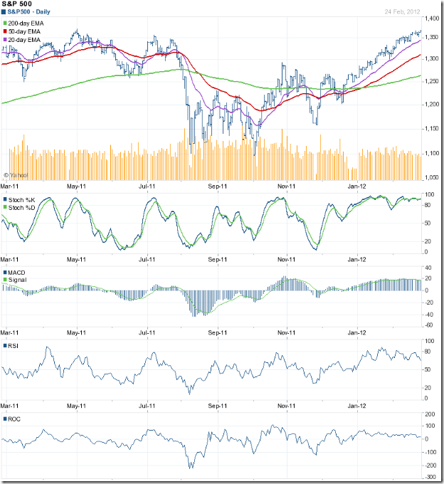
S&P 500 Index Chart
The chart pattern of the S&P 500 index reminded me of an old Cole Porter song: “So near and yet so far.” The index touched an intra-day high of 1369 on Fri. Feb 24 ‘12 and closed marginally higher on a weekly basis, but couldn’t quite cross above the May ‘11 top of 1371. Will the index touch a new 52 week high this week?
The possibility is high. The index is trading above all three of its rising EMAs, and is in a bull market. But volumes are decreasing and the technical indicators continue to show negative divergences, by failing to reach new highs. The index may pause to catch its breath after rising almost non-stop for two months.
Despite large doses of QE1, QE2 and an indirect QE3, growth in the US economy is still tepid. Initial jobless claims were almost flat at 351,000. New hiring isn’t picking up. Inventory of existing homes reduced as existing home sales rose. As per AAII’s Sentiment Survey, bullish sentiment rose by 1% to 43.7% (above its historical average of 39%) and bearish sentiment rose by 0.9% to 27.5% (below its historical average of 30%). The fly in the ointment was ECRI’s reaffirmation of a recession by mid-2012.
FTSE 100 Index Chart
The FTSE 100 index chart closed with a higher weekly gain, but the bulls seem to be getting tired as the index nears the 6000 level. All three EMAs are rising with the index trading above them, which indicates a bull market.
The technical indicators are not bearish, but showing some weakness. The slow stochastic is inside its overbought zone, but sliding down. The MACD is positive and touching its signal line, but drifting downwards. The RSI has fallen sharply after touching the edge of its overbought zone, but remains above the 50% level. The ROC dropped to the ‘0’ line, but has bounced up.
The UK economy is teetering at the brink of another recession. The GDP contracted by 0.2% during the last three months of 2011, in spite of a 0.5% increase in household spending and 1% growth in government spending. The full year GDP was revised down to 0.8%.
Bottomline? Chart patterns of the S&P 500 and FTSE 100 indices are in bull markets – even though the GDP growths in the US and UK economies are negligible. Are the stock markets telling us that things will improve later in the year – or is it just that markets are being propelled by easy availability of low-cost money? Who knows, and why bother? Just ride the up trends by maintaining a stop-loss at the levels of the respective 20 day EMAs. Use dips to add.

