Tampilkan postingan dengan label chart pattern. Tampilkan semua postingan

Senin, 05 Maret 2012

Stock Index Chart Patterns – S&P 500 and FTSE 100 – Mar 2, ‘12

S&P 500 Index Chart

SnP500_Mar0212

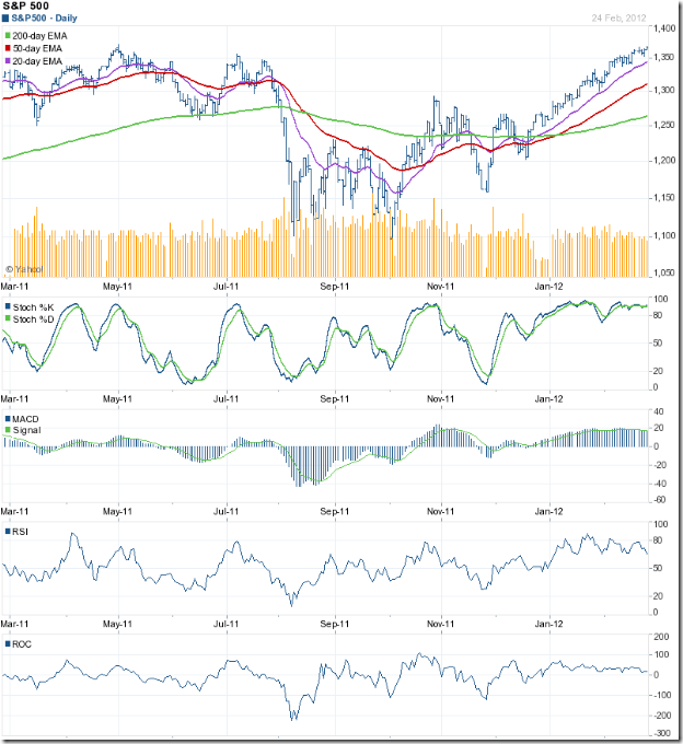
The inevitable happened. The bulls finally managed to push the S&P 500 index chart to new 52 week highs – both on intra-day and closing basis. The index touched an intra-day high of 1378 on Feb 29 ‘12 and a closing high of 1374 on Mar 1 ‘12. Is it time for celebration or caution?

All three EMAs are rising and the index is trading above them. The bulls appear to be in complete control. But there are a few concerns. The index is trading too far above its 200 day EMA, which is a precursor to a correction. Despite a spike up on Feb 29, volumes have been sliding. A bull rally needs volume support to sustain.

The technical indicators are bullish, but continue to show negative divergences. The slow stochastic is inside its overbought zone, but drifting down. The MACD is positive and touching its signal line, but slowly losing ground. The RSI is above its 50% level, but making a bearish pattern of lower tops and lower bottoms. The ROC is barely positive, but touching lower tops. Stay invested with a trailing stop-loss.

Is the slow-growing US economy reaching stall speed? Some of the data points suggest as much. Weekly unemployment claims remained flat at 351,000. ISM Manufacturing index declined to 52.4 from 54.1 in Jan. Durable goods orders declined by 4% in Jan after 3 straight monthly increases. Home prices continued to fall. But it wasn’t all bad news. Car sales crossed the 15 Million mark in Feb – a 4 yr high. Sales of previously owned homes rose 4.3% in Jan – helped by the lower prices.

FTSE 100 Index Chart

FTSE_Mar0212

The FTSE 100 chart closed marginally lower for the week. The bull rally appears to have hit a road-block below the 6000 level. The index is still trading above all three EMAs, so the bull rally is under no immediate threat. However, a correction seems to be around the corner.

The technical indicators have weakened further, and are on the verge of turning bearish. The slow stochastic has dropped from the overbought zone, but remains above the 50% level. The MACD is positive, but has slipped below the falling signal line. The RSI is resting at the 50% level. The ROC is at the ‘0’ line, after a brief dip into negative territory. A correction down to the 5800 level can be used as a buying opportunity. A deeper correction may put the nascent bull market in jeopardy.

Spectre of a double-dip recession in the UK may be fading. PMI for construction increased to 54.3 from 51.4 in Jan. PMI for services dropped to 53.8 from 56 in Jan. Remember that a figure above 50 means expansion. The big problem remains unemployment, which is at a 17 yr high. Austerity measures are not helping in job creation. High oil prices are another concern.

Bottomline? Chart patterns of the S&P 500 and FTSE 100 indices are in bull markets, which have climbed higher in spite of negligible growth in the underlying economies. Easy availability of liquidity has helped in propelling the markets. At some point, the weak fundamentals may drag the markets down. Till then, stay invested with trailing stop-losses.

Minggu, 04 Maret 2012

BSE Sensex and NSE Nifty 50 index chart patterns – Mar 2 ‘12

In last week’s analysis of the chart patterns of BSE Sensex and NSE Nifty 50 indices, it was mentioned that the ongoing corrections will be shallow unless the FIIs start to sell. Except on two days since both indices topped out on Feb 22 ‘12, the FIIs were net buyers. As a result, both the indices have stayed above important support levels so far.

BSE Sensex index chart

SENSEX_Mar0212

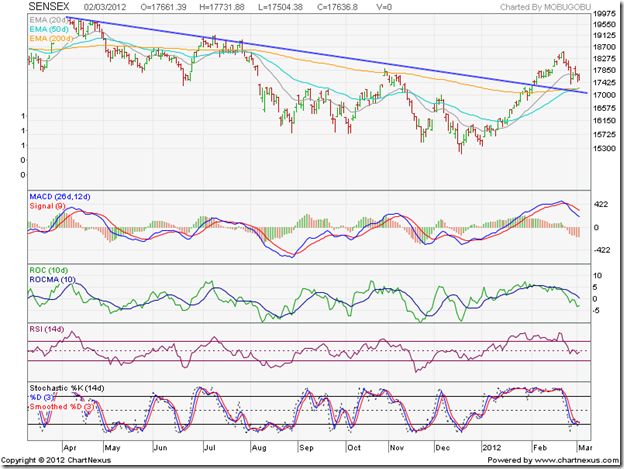
The daily bar chart of the BSE Sensex has managed to stay above the down trend line and the entangled 50 day and 200 day EMAs, keeping bullish hopes alive. But the failure of the 50 day EMA to cross above the 200 day EMA has prevented a technical confirmation of a bull market.

The technical indicators have turned bearish. The MACD is falling below its signal line in the positive zone, and the histogram has turned negative. The ROC is negative and below its falling 10 day MA. The RSI has slipped below its 50% level. The slow stochastic has dropped to the edge of its oversold zone.

Some more correction/consolidation can be expected till three likely trigger events – the UP state election results, RBI’s policy review and the union budget – get out of the way.

NSE Nifty 50 index chart

Nifty_Mar0212

The weekly bar chart of the NSE Nifty shows a classic pullback towards the down trend line that is receiving support from the rising 50 week EMA. Any upward bounce from current level will be an entry opportunity.

Some signs of weakness are visible in the technical indicators, but they haven’t turned bearish by any means. The MACD is still rising above its signal line in positive territory, but the histogram is falling. The ROC has dipped in the positive zone. The RSI is still climbing towards its overbought zone – no weakness there. The slow stochastic is in its overbought zone, but sliding down.

The UP state election is unlikely to produce a decisive result. The RBI is expected to do no more than reduce the CRR or the SLR. Both these outcomes appear to have been discounted by the stock market. All eyes are therefore on the budget, where some pro-reform policy notifications are expected. Lack of any negative surprises should help the up move to resume.

Bottomline? The chart patterns of the BSE Sensex and NSE Nifty 50 indices are going through a correction after a sharp rally. Such corrections provide entry opportunities to those who missed out on the earlier rally. That doesn’t mean one has to buy anything and every thing. The beaten down sectors, which may not be fundamentally sound, have shown greater gains. That is a worrying sign. Time to be cautiously optimistic.

Kamis, 01 Maret 2012

About trend lines and channels

Here are some extracts from my free eBook on Technical Analysis taken from Chapter 2: Trend Lines and Channels:-

“Stock or commodity prices tend to move in a trend. A bullish (or up) trend occurs when demand for a stock or commodity exceeds supply. In other words, there are more buyers than sellers. A bearish (or down) trend occurs when supply of a stock or commodity exceeds demand. That means there are more sellers than buyers.

Some times, demand from buyers and supply from sellers are almost equally matched. The trend becomes sideways – neither going up nor falling down. At such times, technical analysis doesn’t work too well. At some point, a mismatch between buyers and sellers causes a break out from the area of sideways consolidation.

There are three types of trends. A major trend lasts for a few months or years. This is the trend of greatest interest for buyers and sellers. An intermediate trend moves in a direction opposite to the major trend, and lasts for a few weeks or months. Eventually, the major trend resumes. A minor trend occurs for a few days during major and intermediate trends, and is of very little consequence.

Prices don’t move in one direction in a straight line. An up move of a few days is followed by two or three days of a down move, producing a zigzag pattern on the chart. Trend lines enable investors to identify the major and intermediate trends. These lines are drawn by connecting the progressively higher bottoms touched by prices in an up trend, or the progressively lower tops touched by prices in a down trend.

Some times, prices move within trend channels – a pair of parallel lines can be drawn connecting the tops and bottoms touched by prices during an up or down trend. A trend channel is similar to a sideways consolidation, but with an upward (or downward) bias. Eventually prices break out of the channel.

Drawing trend lines (and channels) is a skill that improves with practice. Despite its name, there is nothing ‘technical’ in technical analysis – other than dealing with graphs and geometrical shapes taught in school to every student. The important thing is to remain flexible about adjusting to changing conditions if chart patterns don’t form exactly as per expectations.”

Why remain satisfied with these extracts? Get the real thing. The eBook is absolutely free. Just send me an email at mobugobu@yahoo.com with your full name and a request for the eBook to receive your copy.

Senin, 27 Februari 2012

Stock Index Chart Patterns – S&P 500 and FTSE 100 – Feb 24, ‘12

S&P 500 Index Chart

SnP500_Feb2412

The chart pattern of the S&P 500 index reminded me of an old Cole Porter song: “So near and yet so far.” The index touched an intra-day high of 1369 on Fri. Feb 24 ‘12 and closed marginally higher on a weekly basis, but couldn’t quite cross above the May ‘11 top of 1371. Will the index touch a new 52 week high this week?

The possibility is high. The index is trading above all three of its rising EMAs, and is in a bull market. But volumes are decreasing and the technical indicators continue to show negative divergences, by failing to reach new highs. The index may pause to catch its breath after rising almost non-stop for two months.

Despite large doses of QE1, QE2 and an indirect QE3, growth in the US economy is still tepid. Initial jobless claims were almost flat at 351,000. New hiring isn’t picking up. Inventory of existing homes reduced as existing home sales rose. As per AAII’s Sentiment Survey, bullish sentiment rose by 1% to 43.7% (above its historical average of 39%) and bearish sentiment rose by 0.9% to 27.5% (below its historical average of 30%). The fly in the ointment was ECRI’s reaffirmation of a recession by mid-2012.

FTSE 100 Index Chart

FTSE_Feb2412

The FTSE 100 index chart closed with a higher weekly gain, but the bulls seem to be getting tired as the index nears the 6000 level. All three EMAs are rising with the index trading above them, which indicates a bull market.

The technical indicators are not bearish, but showing some weakness. The slow stochastic is inside its overbought zone, but sliding down. The MACD is positive and touching its signal line, but drifting downwards. The RSI has fallen sharply after touching the edge of its overbought zone, but remains above the 50% level. The ROC dropped to the ‘0’ line, but has bounced up.

The UK economy is teetering at the brink of another recession. The GDP contracted by 0.2% during the last three months of 2011, in spite of a 0.5% increase in household spending and 1% growth in government spending. The full year GDP was revised down to 0.8%.

Bottomline? Chart patterns of the S&P 500 and FTSE 100 indices are in bull markets – even though the GDP growths in the US and UK economies are negligible. Are the stock markets telling us that things will improve later in the year – or is it just that markets are being propelled by easy availability of low-cost money? Who knows, and why bother? Just ride the up trends by maintaining a stop-loss at the levels of the respective 20 day EMAs. Use dips to add.

Selasa, 21 Februari 2012

Gold and Silver chart patterns: an update

Gold Chart Pattern


Two weeks ago, gold's price had begun a correction after testing the Dec '11 top of 1770. So far, the 20 day EMA has provided good support to the price. The corrective pattern is looking like the 'handle' of a bullish 'cup and handle' pattern. That means a likely upward target above the 1900 level and a test of the all-time high touched in Sep '11.


The technical indicators are reflecting the effects of the correction. The RSI is sliding, but is above its 50% level. The MACD is positive, but has slipped below its signal line. The slow stochastic is looking bearish by falling below its 50% level, but is trying to turn around. Gold's price is trading above all three EMAs - the sign of a bull market.


Add, with a stop-loss at 1650. Conservative investors can wait for a convincing move above 1770 to enter.


Silver Chart Pattern


Silver's chart pattern shows that despite spending three weeks above the 200 day EMA - which should have been a bullish sign - the 20 day EMA has failed to cross above the 200 day EMA. The formation of a bearish 'rounding top' pattern is another concern for the bulls.


The technical indicators are beginning to look bearish. The RSI is steadily falling towards its 50% level. The MACD is barely positive, and has crossed below its signal line. The slow stochastic is below its 50% level, and still falling. Looks like silver's price is in danger of sliding back into a bear market.


Enter only on a convincing break above 36.

Senin, 20 Februari 2012

Stock Index Chart Patterns – S&P 500 and FTSE 100 – Feb 17, ‘12

S&P 500 Index Chart

SnP500_Feb1712

The following observation was made in last week’s analysis of the S&P 500 index chart pattern: “A correction down to the rising 20 day EMA may be just the impetus that the bulls need to take the index past the May ‘11 top of 1371.” There was no correction – just a sideways consolidation. But the index rose to an intra-day top of 1363, within hand-shaking distance of the May ‘11 top of 1371. The bears have been all but vanquished.

Low volumes as the index rose to a new high, as well as negative divergences in all four technical indicators – which failed to reach new highs with the index - may be the trigger for a correction this week. That doesn’t mean one should short a bull market. All three EMAs are rising and the index is trading above them.

The technical indicators are looking bullish. Only the slow stochastic is looking overbought, but it can remain so for long periods. The MACD has slipped a bit, but is still positive and touching its signal line. The RSI is rising towards its overbought zone. The ROC is positive, but moving sideways.

The US economy continues to improve slowly. Initial weekly unemployment claims dropped to 348,000, its lowest level in almost 4 years. Retail sales increased by 0.4% in Jan. YoY changes in housing starts was positive for the 5th month in a row. Industrial production was marginally higher. All talk about recession is now off the table.

FTSE 100 Index Chart

FTSE_Feb1712

The FTSE 100 index traded sideways during the past week. Despite an intra-day drop to its rising 20 day EMA on Thu. Feb 16 ‘12, the index managed to close about 50 points higher on a weekly basis. All three EMAs are rising and the index is trading above them – indicating a bull market.

The technical indicators are bullish. The slow stochastic is inside its overbought zone. The MACD is positive, and touching its signal line. The RSI has climbed sharply towards its overbought zone. The ROC is positive, but moving down.

There was some good news on the economic front. CPI dropped to 3.6% in Jan. from 4.2% in Dec. Retail spending rose a surprising 0.9% in Jan. - raising hopes of avoiding a double-dip recession. However, Eurozone GDP declined by 0.3% in Q4 ‘11. Even Germany’s growth shrank and increased prospects of a recession that will dent UK’s exports to the EU.

Bottomline? Chart patterns of the S&P 500 and FTSE 100 indices are in bull markets. Stay invested with trailing stop-losses, and use dips to add.

Sabtu, 18 Februari 2012

BSE Sensex and NSE Nifty 50 index chart patterns – Feb 17 ‘12

Before getting into detailed analysis of the BSE Sensex and NSE Nifty 50 index chart patterns, I have a confession to make. One of the reasons technical analysis is looked down upon by many well-known investors is because it can not ‘predict’ what will happen next – so why even bother to look through charts?

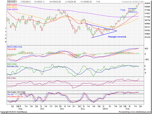
Well, the fault doesn’t lie in the charts but with the analyst who is interpreting the charts. The sudden rally that started on the Sensex and Nifty charts from the Dec ‘11 lows appeared to come as a bolt from the blue and was attributed to a rush of FII buying. That is only part of the story. On a closer inspection of both short-term and long-term charts over the weekend, it became quite clear that both indices clearly formed symmetrical triangle reversal patterns for about 4 weeks.

Why did I miss these reversal patterns earlier? A combination of hubris and a bid to second-guess the market. Symmetrical triangles are usually continuation patterns. Since the indices were in bear markets, it was expected that the break out from the triangles will be downwards. But triangles are notorious for being unreliable and can break out in either direction. Not often do triangles turn out to be reversal patterns. Also, the reversal pattern lasted only 4 weeks – much shorter duration than expected after a year-long down trend.

BSE Sensex index chart

SENSEX_FEB1712

Is this still a bear market rally or the first phase of a new bull market? Two patterns on the 6 months daily bar chart of the Sensex suggests that the trend has indeed changed. First, the small rectangular ‘flag’ pattern that formed after the index convincingly crossed above its 200 day EMA. Such patterns usually form at the mid-point of a strong up (or down) move. That gives an upward target above the 20,000 level. The ‘golden cross’ of the 50 day EMA above the 200 day EMA will confirm a bull market.

The break out above the ‘flag’ happened with a ‘gap’ – which makes the break out a strong and valid one. So, the rally is likely to continue despite the overbought condition. The MACD is positive and above its signal line, but the histogram has reduced in height - correcting the overbought situation a little. The ROC is showing negative divergence by failing to reach a new high and slipping below its 10 day MA. Both the RSI and the slow stochastic are well inside their overbought zones, and can stay there a while longer.

If you are holding from lower levels, don’t sell off in a hurry. Maintain trailing stop-losses and ride the bull. If you have missed the rally, don’t jump in now. At some point, there should be a decent 5-10% correction. Enter then.

NSE Nifty 50 index chart

Nifty_Feb1712

The 4 weeks long consolidation within a symmetrical triangle on the 1 year weekly bar chart pattern of the Nifty was followed by an upward break out on increased volumes. The volumes kept rising even further as the index climbed past the 50 week EMA and the blue down trend line. Strong volume support validates upward break outs.

The technical indicators have turned bullish. The MACD is rising above its signal line and has entered the positive zone. The ROC is also positive and above its 10 week MA. The RSI has moved above its 50% level. The slow stochastic has entered its overbought zone. Any pullback to the blue down trend line – if it happens – will provide a buying opportunity. The ‘golden cross’ of the 20 week EMA above the 50 week EMA will be the final confirmation of a return to a bull market.

The fundamentals remain a matter of concern. Q3 results have shown continued downward pressure on margins of India Inc. The fiscal deficit will end up much higher than announced in the previous budget. Big ticket reforms are pending for a long time. Interest rates remain high.  A Greek sovereign default hasn’t been ruled out. War drums are being beaten - an Israeli attack on Iran can change bullish equations.

Bottomline? The chart patterns of the BSE Sensex and NSE Nifty 50 indices have entered bull markets – thanks to strong buying support from the FIIs. It is unusual to see mid-cap and small-cap stocks making smart moves at the early stage of a bull market. Stock markets move on their own logic – there is no point in trying to second-guess the market. As Steve Winwood sang not too long ago: “Just roll with it, baby” – but remember to maintain trailing stop-losses.

Kamis, 16 Februari 2012

Stock Chart Pattern - Canara Bank (an update)

The previous post about the stock chart pattern of Canara Bank was back in Oct ‘09. The stock price was correcting after touching a 52 week high. Due to my aversion to PSU stocks in general, and Canara Bank in particular, I had advised investors to look at a couple of other PSU banks.

One of the mistakes that investors often make is failing to perceive the difference between a company and its stock chart pattern. A stock of a fundamentally sound company can perform poorly; another company that may have a weak balance sheet, can shoot up like a rocket for no rhyme or reason.

I am not ashamed to put up my hand up and say: “Mea culpa.”  I allowed a poor opinion of the customer service standards of the bank to cloud my outlook for its stock chart. A look at the three years closing chart pattern of Canara Bank will show how badly wrong I was:

CanaraBank_Feb1612

Note the two dark grey vertical lines on the chart – the first marks the date of my earlier post and the second marks the date when the stock touched its all-time closing high of 836 (a whopping 470% gain from its Mar 17 ‘09 closing low of 146 – outperforming the Sensex by a huge margin).

Shortly after I wrote the previous post, the stock price completed its correction by bouncing up from its rising 50 day EMA and then entered a 7 months long consolidation within a rectangle pattern before breaking out in July ‘10. The stock had a parabolic rise over the next 4 months and touched its all-time high of 836. Only the MACD touched a new high. The other three technical indicators - ROC, RSI and slow stochastic – failed to reach new highs.

The negative divergences gave advance signal of an impending correction, which turned out to be a change of trend as the stock fell within a downward-sloping channel for more than a year to touch a closing low of 354 on Dec 28 ‘11. The big fall of almost 500 points (58% from the peak of 836) underperformed the Sensex by more than two times.

The current FII driven rally has seen a strong recovery by the stock, which has risen nearly 55% from the low of 354 – this time outperforming the Sensex by two times. Such a performance – outperforming the Sensex during bull periods and underperforming during bear periods – can be expected from a mid-cap stock, but not from a large-cap stock like Canara Bank.

Note the two blue down arrows on the right hand side of the chart. The top one is pointing to the break out above the downward channel (and the 200 day EMA), followed by a pullback and the subsequent vertical rise. The bottom one is pointing to the sharp upsurge in volumes that accompanied the break out and subsequent rise, thus validating the break out.

Interestingly, the pullback to the top of the channel coincided with declaration of disappointing Q3 results. Net profit fell nearly 21% though income rose by 33% compared to the year-ago Q3. Both gross and net NPAs rose on a YoY and QoQ basis, which is a worrying sign. The technical indicators are looking overbought, but they have looked that way for the past month, and may remain so a while longer.

Bottomline? The stock chart pattern of Canara Bank clearly shows that it performs more like a mid-cap stock – providing large gains during bull phases and big falls during bear phases. Looks like another bull phase has begun. Add on dips, but don’t forget to maintain a suitable stop-loss.

Senin, 13 Februari 2012

Stock Index Chart Patterns – S&P 500 and FTSE 100 – Feb 10, ‘12

S&P 500 Index Chart

SnP500_Feb1012

The following observations were made in last week’s analysis of the S&P 500 index chart pattern: “The technical indicators are looking overbought and showing negative divergences. The index can remain overbought for long periods, but the negative divergences in all four indicators hint at a correction.” The index kept inching up through most of last week, till some selling on Fri. Feb 10 ‘12 caused a slightly lower weekly close.

The technical indicators are bullish, but showing signs of weakness. The slow stochastic is inside its overbought zone, but has slipped down a bit. The MACD is positive and just above its signal line. The RSI has dropped from its overbought zone, and is moving down. The ROC is positive but not really going anywhere. All three EMAs are rising with the index trading above them – so there is no threat to the bull market. A correction down to the rising 20 day EMA may be just the impetus that the bulls need to take the index past the May ‘11 top of 1371.

The US economy continues on its slow path to recovery. Initial weekly jobless claims fell to 358,000. ISM manufacturing index rose to 54.1 in Jan ‘12 from 53.1 in Dec ‘11 (a reading above 50 means expansion). Bullish sentiment rose to 51.6% (from 43.8%) while bearish sentiment fell to 20.2% (from 25.1%) in AAII’s sentiment survey. However, the Reuters/Univ. of Michigan Consumer Sentiment index slipped a little to 72.5 (from 75 in Jan ‘12).

FTSE 100 Index Chart

FTSE_Feb1012

The FTSE 100 index chart closed lower for the week due to profit booking on Fri. Feb 10 ‘12, after spending most of the week trading sideways. All three EMAs are rising with the index trading above them – a sign of a bull market.

The technical indicators are indicating bullishness, but not as much as a week ago. The slow stochastic is in its overbought zone, but moving down. The MACD has slipped a bit, but remains above the signal line in positive zone. The RSI is above the 50% level, but falling. The ROC is positive but drifting sideways.

UK’s manufacturing output rose by 1%, somewhat easing recession fears. But unemployment is rising and more job cuts are planned, as per this article. Inflation dropped to 4.1% in Jan ‘12 from 4.8% in Dec ‘11. Worries about a flagging economy forced the Bank of England to inject another 50 Billion sterling in its QE programme.

Bottomline? Chart patterns of the S&P 500 and FTSE 100 indices are back in bull markets – thanks more to easy availability of liquidity rather than any real strength in the respective economies. But as Tennyson wrote in a completely different context: “…Theirs not to reason why…”. Use dips to add, but maintain a trailing stop-loss to ensure that you don’t ride into the valley of death.

Sabtu, 11 Februari 2012

BSE Sensex and NSE Nifty 50 index chart patterns – Feb 10 ‘12

In last week's post, the 3% 'whipsaw' leeway confirmation of the breaches of the blue down trend lines ruling the BSE Sensex and NSE Nifty 50 chart patterns were awaited. Confirmations have now been received. The bulls (read FIIs) should have celebrated by taking both indices higher. They did try their level best, but were held in check by bear (i.e. DII) selling. Poor IIP numbers didn't help the bullish cause either. The week's trading ended in a stalemate.

BSE Sensex index chart


The weekly candlestick chart pattern of the BSE Sensex formed a 'doji' (highlighted in light blue), which means that there was indecision among bulls and bears. Coming after a strong rally, the 'doji' may be hinting at a corrective move in the coming week. But a 'doji' by itself does not signify too much, and one needs to await bearish confirmation in the coming week. This is one of the challenges in technical analysis. Buy/sell decisions need to wait for various confirmations - by which time the window of opportunity may close, or considerably reduce in size.


The technical indicators are giving mixed signals. The MACD is still in negative territory, but has risen further away from its signal line - as can be seen from the histogram. The slow stochastic has climbed into its overbought zone. The RSI is meandering along its 50% level. But the ROC has turned down sharply, though it remains above its 10 week MA in positive territory.


A correction may revitalize the energy of the bulls. But a correction may not happen because every one expects it to happen. The 20 week EMA is still trading below the 50 week EMA. A cross above will confirm a bull market. Till then, the bears may keep up their selling efforts.


NSE Nifty 50 index chart


In a mid-week update on the NSE Nifty 50 chart, likely technical reasons for the battle for conquering the 5400 level were explained. That battle has not yet been won or lost. The entire week's trading (within the light blue oval) was restricted near the 5400 level, with only a day's close above it on Thu. Feb 9 '12. 


The technical indicators are showing some signs of weakness - which can be expected during a period of consolidation. The MACD is positive and above the signal line, but the histogram has started falling. The ROC is still positive, but has dropped below its 10 day MA and heading down. The RSI has stayed inside its overbought zone for quite some time and may be trying to come down. The slow stochastic is also inside its overbought zone. A pullback to the blue down trend line, or to the 200 day EMA, won't be surprising.


Bottomline? The chart patterns of the BSE Sensex and NSE Nifty 50 indices are showing some signs of hesitation after a strong rally. That doesn't mean that a correction is going to happen next week. But if it does, the rally may able to continue for a longer period. Don't fret if you have missed the rally. There are always opportunities to make money in bull and bear markets. But one has to work at it.

Kamis, 09 Februari 2012

Stock Chart Pattern - IRB Infrastructure (An Update)

The previous update on the stock chart pattern of IRB Infrastructure was posted almost two years back. The stock appeared to have made a double-top at 280, which was much higher than the minimum target of 229 mentioned in a prior post, and readers were advised to book partial profits. Was it good advice?

A look at the two years bar chart pattern of IRB Infrastructure will reveal that the advice was timely, even though the stock did rise another 10% to touch an intra-day high of 313 on Aug 24 ‘10:

IRB Infra_Feb0912

The stock did not form any discernible reversal pattern, except that it formed a ‘reversal day’ pattern (higher high, lower close) on the day it hit its peak of 313. Reversal day patterns typically mark the end of an intermediate rally (or correction), but some times they can form at bull market tops and bear market bottoms – giving a very small window of opportunity to buy/sell.

This is why partial profit booking should be done when targets are met on the upside. Likewise, slow accumulation should be started when downward targets are met. It is next to impossible to catch the exact tops and bottoms.

The stock price started to correct rapidly and dropped below the 200 day EMA in Oct ‘10. It attempted a bounce back above the long-term moving average, but faced resistance form the falling 50 day EMA. A sharp fall below the 200 level in Nov ‘10 coincided with the ‘death cross’ of the 50 day EMA below the 200 day EMA – confirming a bear market.

All up moves faced resistance from the falling 50 day EMA till the stock dropped to an intra-day low of 150 in Feb ‘11. This time, the up move managed to climb above all three EMAs, but failed to clear the 229 level. Interestingly, 229 happened to be the top touched in Aug ‘09 – and the minimum upside target mentioned in an earlier post in Jun ‘09.

The dark blue down trend line drawn through the tops at 313 and 229 ruled IRB Infrastructure’s chart pattern till it touched an intra-day low of 121 on Jan 3 ‘12 - a 61.3%drop from the peak of 313 – underperforming the Sensex by a huge margin. Such are the risks associated with mid-cap (and small-cap) stocks. They tend to outperform in bull markets and underperform in bear markets.

The ongoing rally from the Jan ‘12 low has risen more than 20%, crossed above all three EMAs and the down trend line. The first two of the four criteria of a bull market (mentioned in a recent post) have been met. The rising 20 day EMA has crossed above the rising 50 day EMA and is about to cross above the 200 day EMA.

The technical indicators are correcting from overbought conditions. The MACD is positive, but has changed direction and dropped on to its signal line. The ROC crossed below its 10 day MA and fell all the way down to the ‘0’ line before bouncing up a bit. Both the RSI and the slow stochastic have dropped from their overbought zones. Expect some consolidation and a possible pullback to the down trend line.

Bottomline? The stock chart pattern of IRB Infrastructure is poised to change trend and enter a bull market. Many mid and small-cap stocks are showing similar chart patterns – on the verge of re-entering bull markets, thanks to relentless FII buying. Use dips to enter, but with a strict stop-loss. Q3 result was so-so – flat net profits on a slight increase in turnover.

Rabu, 08 Februari 2012

Nifty mid-week update: bears defend 5400

The bulls seem to be facing a ‘last mile problem’ on the Nifty 50 chart – as the 5400 level is being well-defended by the bears. What is so great about the 5400 level? Quite a bit – if you are a regular follower of the technical analysis posts on this blog.

Nifty_Feb0812

For starters, 5400 was a previous top in Apr ‘10 (and again in Oct ‘11). Previous tops have a tendency to act as support/resistance levels. In last Friday’s post, four technical definitions of a bull market were discussed. Two of them are of interest in the context of the 5400 level.

One, a 20% rise from the Dec ‘11 low of 4531 gives a level of 5437 – close enough to 5400. Two, a 50% Fibonacci retracement of the entire fall from the Nov ‘10 peak of 6338 to 4531 gives a level of 5434. To satisfy the technical definition of a bull market, the Nifty has to close above these two levels.

There is another point of technical interest mentioned in last Sunday’s post. Note the blue down trend line that dominated the Nifty chart for the past 15 months, and got breached on the upside during the recent rally. An upward breach of any resistance level is technically valid provided it closes at least 3% above the point of breach.

The down trend line was breached on Feb 1 ‘12, and the point of breach came at about 5220. A 3% higher close means a level of about 5370. In technical analysis, exact levels are not important. Approximately, 5370 is close enough to 5400.

Despite an intra-day breach of 5400 on Feb 7 ‘12, the Nifty has so far failed to close above 5370. Obviously, the bears understand and follow technical analysis and are putting up a fight to defend the 5400 level.

Who will win the battle? Will the bulls propel the Nifty above 5400 soon, or will the bears push the Nifty back into its down trend? What do readers think?

Selasa, 07 Februari 2012

Gold and Silver chart patterns: bulls regaining control

Gold Chart Pattern


In an update on gold's chart pattern three weeks back, buying was recommended on a convincing rise above 1700. The down trend line (not shown in chart) connecting the tops touched in Sep, Nov and Dec '11 was near the 1700 level, and was expected to provide resistance. Shortly after that post, gold's price broke above the down trend line and the 1700 level - accompanied by a volume spurt. Volume support on an upward break is a requirement, and ensures that the break out is not a 'false' one.


Gold's price kept on rising, but volumes were falling - till the price reached the level of Dec '11 top of 1770. Falling volumes are not suitable for sustaining a rally, as it indicates lack of buying energy. Hesitation near a previous top isn't unusual. A 'reversal day' pattern (higher high, lower close) marked an intermediate top. A pullback towards the down trend line is in progress. The rising 20 day and 50 day EMAs may provide support on the way down.


Gold is trading above its rising 20 day, 50 day and 200 day EMAs - the sign of a bull market. The technical indicators are correcting from overbought conditions. The RSI has dropped from its overbought zone, but remains above the 50% level. The MACD is positive and above its signal line.  The slow stochastic is about to fall below its overbought zone.


The correction will allow gold's price to rise and test the 1800 level. Use the dip to add, with a stop-loss at 1630.


Silver Chart Pattern


Silver's chart pattern shows that the bulls have made quite a smart comeback after the white metal's price touched a low of 26. After climbing above the 200 day EMA to reach the 34 level within a month, silver's price is taking a breather for the past few trading sessions.


The next resistance is likely from the 36 level - which corresponds to the Oct '11 top. The down trend line (not shown in chart) connecting the Apr, Aug and Sep '11 tops is also near the 36 level - which may make it a strong resistance level.


Note that the 20 day EMA has crossed above the 50 day EMA, and both are rising. That is a bullish sign for the near term. However, both are still below the 200 day EMA. The technical indicators are bullish, but showing weakness. The RSI is above its 50% level, but dropped down after touching the edge of its overbought zone. The MACD is rising above its signal line in the positive zone, but its upward momentum is slowing. The slow stochastic is well inside its overbought zone, but has started drifting down.


The bears have not been routed yet, and may fight back. Enter on a convincing break above 36.

Rabu, 01 Februari 2012

Stock Chart Pattern - Sanghvi Movers (An Update)

In the previous update of the stock chart pattern of Sanghvi Movers back in Jan '11, the stock had broken down below a bearish descending triangle pattern. Descending (and ascending) triangles have measuring implications. The downward target was calculated as 116. Stock prices don't really understand or follow arithmetic. Actual targets are never exactly met. Prices typically overshoot upward targets and fall short of downward targets.

So, what happened? The two years bar chart pattern of Sanghvi Movers is an example of how a fundamentally strong stock with a good business model can suffer when sentiments turn negative towards the sector in which the company operates:

The stock fell to a high volume 'panic bottom' of 114 in Feb '11, meeting the downward target of 116 almost exactly. It bounced up sharply - only to face resistance from the falling 50 day EMA and then dropped past its 'panic bottom' of 114 to a low of 104 in Mar '11. 'Panic bottoms' seldom hold and this is another example of it. But that doesn't prevent intrepid investors from trying to bottom-fish - and get stuck at higher levels.

Note that both the RSI and the slow stochastic were deep inside their oversold zones when the stock price dropped to 104. A correction to the earlier down move usually follows. The ROC touched a higher bottom and hinted at a possible correction or consolidation. Over the next 8 months, the stock price consolidated within a bearish 'rising wedge' pattern - oscillating around its entangled 20 day and 50 day EMAs. Throughout the consolidation period within the 'rising wedge' pattern, the 200 day EMA continued to fall - leaving no doubt that the bears were in control.

After breaking downwards below the 'rising wedge' on Nov 14 '11, the stock price attempted a pullback to the wedge. Such pullbacks after a downward break happen often, and provide a selling opportunity. The stock continued to fall on high volumes and dropped to a low of 84.50 on Jan 2 '12. It has since been trading within a small symmetrical triangle, and may seek even lower levels.

The technical indicators are bearish, but showing faint signs of improvement. The MACD is above its signal line, but in negative territory. The ROC is below its 10 day MA, and trying to climb out of the negative zone. The RSI dropped below its 50% level, but trying to rise. The slow stochastic fell inside its oversold zone, and is trying to come out.

The infrastructure sector has turned from being a darling of investors to a villain. Stocks of almost all companies with any links to the sector are getting hammered - regardless of their underlying fundamentals. The stock of Sanghvi Movers has been no exception. Debt/equity ratio is more than 1, but for a capital intensive company, that shouldn't be a major issue. Cash flows remain positive. Margins are definitely under pressure - but that is a common feature with stocks from almost all sectors. But the market knows best. No point in betting against it.

Bottomline? The stock chart pattern of Sanghvi Movers is facing technical headwinds though fundamentals appear to be reasonable. As and when the infrastructure sector starts picking up, the company will again start making a lot of money. But that seems a couple of quarters away. Watch Q3 and Q4 results before considering an entry.

Sabtu, 28 Januari 2012

BSE Sensex and NSE Nifty 50 index chart patterns – Jan 27 ‘12

The following concluding comment was made in last week’s analysis of the BSE Sensex and NSE Nifty 50 index chart patterns: “…a flood of FII buying can throw all analysis out of the window.” The deluge of FII buying drowned DII selling, and overbought conditions in the market became even more overbought.

Reminds me of the title of a funny Jack Nicholson movie: Something’s gotta give. Technicals are pointing to a correction at any time, but the market just keeps marching up. Benjamin Graham had said that in the short-term, the market acts like a voting machine. FIIs are definitely voting for a return to a bull market. Q3 results declared so far continue to demonstrate pressure on the bottom lines, even as there have been some growth in top lines.

BSE Sensex index chart

SENSEX_Jan2712

The BSE Sensex weekly bar has just about managed to close above its 50 week EMA and is only 100 odd points below the upper edge of the downward-sloping channel (within which it has traded during the past 15 months). If the FIIs continue their buying spree, the index may breach the channel on the upside and return to a bull market.

The technical indicators are looking bullish and supporting the up move. The MACD has crossed above its signal line, but remains in negative territory. The ROC has risen sharply above its 10 week MA. The RSI has edged above its 50% level. So has the slow stochastic.

Note that the technical indicators were in a similar bullish state during the previous rally in Oct ‘11, but the bear market rally fizzled out near the top end of the channel. Will the Sensex behave differently this time? Only FIIs can provide the answer.

NSE Nifty 50 index chart

Nifty_Jan2712

The NSE Nifty daily chart is looking bullish to the point of being heavily overbought. The index climbed above the 200 day EMA on a volume surge and has reached the top of the downward-sloping channel. The 20 day EMA has crossed above the 50 day EMA, and though both EMAs are rising they remain well below the 200 day EMA.

The rally has been too fast and too steep, which is typical of bear market rallies. The technical indicators are looking quite overbought. The MACD is above its signal line, and both are rising in positive territory. The ROC is also positive, and rising above its 10 day MA. The RSI and the slow stochastic are well inside their respective overbought zones.

The Nifty can remain overbought for long periods, but a correction, even a short one, will restore the technical health of the index. Otherwise, the bulls may get tired of buying and allow the bears to resume their control.

Bottomline? The BSE Sensex and the Nifty 50 index chart patterns had strong bear market rallies from their Dec '11 lows, and have reached the top end of their downward-sloping channels. Will they be able to break out of the bear grips finally? Technically, yes. Fundamentally, no. Nothing has changed much from the time that the Dec ‘11 lows were touched. Interest rates remain at their high points. Same with oil price. Balance of payments continue to deteriorate. Nothing is happening in the policy or reforms front. Inflation has moderated a bit, but that has more to do with the base effect. The Rupee has strengthened, mainly due to the FII inflows. This still looks like a sucker’s rally – but betting against the market can be hazardous to your wealth. Enjoy the ride while it lasts.

Selasa, 17 Januari 2012

Gold and Silver Chart Patterns: an update

Gold Chart Pattern

Gold_Jan1712

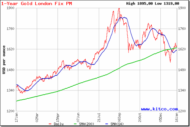
Two weeks back, gold’s price was making a second attempt at a pullback towards its 200 day SMA from below. It was expected that the bears would resort to selling and push the price down once more. But after a bit of a struggle, the price crossed above the still-rising 200 day SMA and has stayed above it since then.

Technically, the support at 1550 was not broken – gold’s price only had a day’s close below the support level. So, the drop from 1900 to 1550 should be treated as a bull market correction. The 30 day and 60 day SMAs (not shown in chart) did not fall below the 200 day SMA. Once the 14 day SMA crosses above the long-term moving average, the bulls will regain control.

Gold’s chart appears to be forming a bullish ‘falling wedge’ pattern, which is a ‘continuation’ pattern from which the likely break out should be upwards. Please remember that technical analysis is not a science, and patterns don’t always play out as expected. Buy on a convincing rise above 1700.

Silver Chart Pattern

Silver_Jan1712

Despite a smart pullback above the 14 day SMA, silver’s price is trading below its 30 day and 60 day SMAs (not shown in chart) and well below the 200 day SMA – the hallmark of a bear market.

The white metal is falling within a downward-sloping channel, making a bearish pattern of lower tops and lower bottoms. The 200 day SMA is forming a ‘rounding top’ pattern, hinting at a further fall in silver’s price.

Kamis, 12 Januari 2012

Why did the stock market fall despite a good IIP number?

India’s Nov 2011 IIP (Index of Industrial Production) came in at 5.9% – higher than the consensus estimate – raising hopes of a quick return to the growth path. Considering the Oct 2011 IIP of –5.1%, there was a huge 11% swing month-on-month.

The stock market should have celebrated by spiking higher – specially since both the Sensex and Nifty are in the midst of rallies from their recent bottoms. Instead of doing the obvious by rising, both indices lost ground. Not much, but enough to cause consternation among small investors.

What is going on? Is this just the way Mr Market behaves to separate investors from their hard-earned money?

There can be a few logical explanations, which are mentioned below:

1. Both the Sensex and Nifty are in the midst of prolonged bear markets. Good news tend to get ‘discounted’ quickly and bad news causes renewed selling during bear markets.

2. Infosys – which is generally considered to be one of the bellwethers of the Indian stock market – announced better than expected Q3 results, but disappointing Q4 guidance and got hammered. Its high weightage in both indices caused the fall.

3. Oct 2011 IIP number was unusually low – but one must remember that it was a festival month (Navratri and Diwali), which meant lower production days due to the holidays. Nov 2011 IIP was comparatively much better, but some of the new orders may be due to inventory replenishment. Lower growth usually leads to inventory draw-downs (companies tend to let their existing inventory get depleted almost completely before placing new orders).

4. Technically, both indices retreated after facing twin resistances from their 50 day EMAs and DTLs (refer last Sunday’s post on Sensex and Nifty chart patterns).

5. All of the above.

Stock markets don’t necessarily move according to logic. In the short-term, sentiments can, and often do, overrule the fundamentals. So can a rush of buying or selling by the FIIs. What should small investors do?

Remember an old saying: “Buy the rumour; sell on news.” There is no better example of that maxim than today’s price action in the TTK Prestige counter. The company announced impressive Q3 results, but the stock lost more than 7% after the ‘good news’!

The stock market is in a state of flux. After 14 months of down trend, small investors are becoming impatient to buy in the hope of a trend reversal soon. Please be aware that interest rate is still high. So is inflation – though food inflation has turned negative. Stock markets don’t reverse trend till the first few interest rate cuts happen.

There is a clamour for a CRR rate cut from all corners. If the Nov 2011 IIP figure is the reality, i.e. economic growth is back on track instead of what has been mentioned in point 3 above, then there is no reason for the RBI to cut the CRR – let alone cut the interest rate. A rate cut may stoke the inflation fire.

In other words, there is no need to turn bullish yet. Await Q3 results of the big guns and RBI’s policy announcement on Jan 24. You may miss the absolute bottom by being conservative, but in a bear market it is better to be safe than sorry.

Selasa, 10 Januari 2012

Free eBook on Technical Analysis – thanks and clarifications

The free eBook: ‘Technical Analysis – an Introduction’ was launched on the last day of 2011 – after considerable time spent at the planning stage. Some important concepts in technical analysis has been covered in brief, with real-life chart examples.

The idea was to generate curiosity and interest among small investors so that they may get motivated to delve deeper into the subject. There are some excellent and comprehensive books – such as the ones written by Edwards/Magee and Martin Pring – which cover technical analysis in greater detail. (The search box of flipkart.com at the bottom of the page can be used for searching books on investment.)

The response from regular as well as new readers has been quite overwhelming, and everyone deserves special thanks for making my endeavour in producing the eBook worthwhile. Some have already finished reading the eBook and provided suggestions for improvement. Reader involvement is appreciated.

A few of the reader feedbacks received so far made it necessary to post a few clarifications about the purpose of the eBook. The most important one is to demystify the subject of technical analysis.

Technical analysis is not a magic potion that will suddenly turn short-term trading losses into profits overnight. Nor will it identify unknown stocks that will turn a Lakh into a Crore within a short time. But knowing the basics will help investors to take more informed decisions about when to enter and when to exit a stock.

A second point worth mentioning is that the eBook is not going to turn novice investors into expert technical analysts. Becoming an expert requires several years of experience and application – as in any other subject.

A third point is that many technical patterns have specific ‘rules’ associated with them. Remembering the pattern but not the rules can cause serious losses. The human mind seems programmed to see patterns where none may exist. Bigger problems are confusing bottom-reversal and top-reversal patterns, and jumping to conclusions about a pattern before it has fully formed.

Last but not the least, is that it isn’t necessary for similar patterns to behave identically. In a recent post on IFCI Ltd, four ‘rising wedge’ patterns were identified - each behaved a little differently from the other. So, it is not enough to identify a pattern. One has to remain flexible about the outcome of the pattern.

If you haven’t yet received a copy of the free eBook, you can get one by sending an email to:mobugobu@yahoo.com

Kamis, 05 Januari 2012

5 strategies to follow in a bear market

Most small investors enter the stock market when a bull market is nearing its peak. They don’t have clear goals and strategies, and get caught on the wrong foot by the bear market that inevitably follows. The trauma of losing money in a hurry can be soul-destroying.

Without the necessary skills and experience of surviving in a bear market, investors resort to all kinds of ill-advised strategies in an effort to quickly recover the losses. That only makes a bad situation worse.

The current bear phases in the Sensex and Nifty indices are 14 months old, and so far there has been very little indication of a reversal in the down trends. Experts are saying that the bear phase can last till the first half of Financial Year 2012-13. If they are right, the bear market may sustain till Sep 2012 – another 9 months!

Whether you are one of the unfortunates who are ‘stuck’ at higher levels, or a more seasoned investor who is sitting on cash to deploy at lower levels, here are 5 strategies that you may want to follow in the current bear market:-

1. Remember that bear market rallies are sharp and swift. Don’t jump in by thinking that you will miss a buying opportunity at a low entry price. Such rallies are some times ‘created’ by bears so that they can sell at a higher price.

2. Just because a stock has fallen to a 52 week low doesn’t mean it can’t fall any lower. As long as the trend is down, it can fall lower. If it is worth buying, being patient can help you to enter at a much lower price.

3. A sharp vertical drop in price – often accompanied by strong volumes - usually attracts a lot of buyers who believe that they are being smart by entering at a low price. It is the sign of a ‘panic bottom’, which seldom holds. Prices bounce up on the buying, but then fall lower than the ‘panic bottom’.

4. At the risk of sounding like a broken record (or, a damaged CD) – do not, repeat do not, average down in price. No one knows how much further a stock’s price will fall, or worse still, if it will ever recover (e.g. Cranes Software). It is far better to average up once the price forms a bottom and starts its up move.

5. Major down trends are not reversed in a day or a week. Bottom reversal patterns take a few weeks to a few months to form. Ability to ‘read’ chart patterns can help investors to accumulate a stock while a reversal pattern is ongoing (refer Chapter 7: Reversal Patterns of my free eBook: Technical Analysis – an Introduction).

If you can’t ‘read’ a reversal pattern, don’t worry. Eventually, prices will turn up and a new bull market will begin. You may enter at a higher price, but the chances of a loss can be minimised by using a trailing stop-loss.

Related Posts

Five things you should avoid in a bear market
Five more things to avoid in a Bear Market

Rabu, 04 Januari 2012

Stock Chart Pattern - IFCI Ltd (An Update)

The previous update of the stock chart pattern of IFCI Ltd was posted more than a year back. The stock had touched a high of 78 in Nov ‘10, followed by a sharp correction to 50 and appeared to be consolidating within a triangle.

All four technical indicators – MACD, ROC, RSI and slow stochastic - touched lower tops while the stock rose to its high. The combined negative divergences had provided advance warning of a correction. The following comments were made: “If you are still holding, maintain a strict stop-loss of 54. A better idea may be get out and not go anywhere near this stock again.”

The last comment seems almost prophetic when you look at the bar chart pattern of IFCI Ltd:

IFCI_Jan0412

The negative divergences in all four technical indicators, formed during Oct – Nov ‘10 have been marked by blue arrows. After the sharp drop from the peak of 78 to a low of 50 below all three EMAs in Nov ‘10, the stock consolidated within a bearish ‘rising wedge’ pattern – marked 1 – and rose above all three EMAs.

The break down below the wedge in Jan ‘11 was followed by a pullback towards the wedge, which received combined resistances from the 20 day and 200 day EMAs. Such pullbacks happen often, but not always, as can be observed in the ‘rising wedges’ marked 2 and 4. The stock price dropped to a low of 46 in Feb ‘11 and started forming a slightly prolonged ‘rising wedge’ – marked 2. The ‘death cross’ of the 50 day EMA below the 200 day EMA confirmed a bear market.

‘Rising wedge’ number 2 failed to cross above the 200 day EMA. The stock broke down without a pullback to a low of 44 in May ‘11 before starting a consolidation within another ‘rising wedge’ – marked 3. The break down below ‘rising wedge’ number 3 wasn’t followed immediately by a pullback. It came after 10 days. The subsequent slide went all the way down to 28 in Oct ‘11, before the formation of ‘rising wedge’ number 4.

The sharp break down below ‘rising wedge’ number 4 touched a low of 20 in Dec ‘11. Note that all four technical indicators showed positive divergences by touching higher bottoms – marked by blue arrows – suggesting an upward bounce. Since the stock was deep in a bear market – having lost 75% from its peak of 78 – the bounce wasn’t strong enough to cross above the 50 day EMA, despite solid volume support.

There is every possibility of the stock falling to its Mar ‘09 low of 15. The fundamentals don’t look very encouraging. Hopes of a banking licence has receded. The MD is under scrutiny by the authorities. The government may replace its debt with equity and gain management control. The volatility in the price has turned it into a trader’s favourite.

Bottomline? The stock chart pattern of IFCI Ltd is an example of how mismanagement of operations and finances has enabled the bears to create havoc. Small investors should steer clear of such ‘cheap’ stocks.

Related Posts Plugin for WordPress, Blogger...