Tampilkan postingan dengan label pullback. Tampilkan semua postingan

Senin, 12 Maret 2012

BSE Sensex and NSE Nifty 50 index chart patterns – Mar 9 ‘12

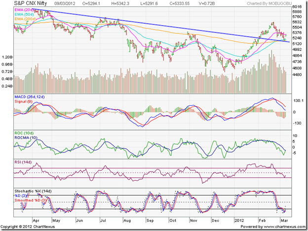
Both index charts – BSE Sensex and NSE Nifty – show classic break outs above down trend lines followed by pullbacks and upward bounces from the down trend lines. That should mean that trend reversals have occurred and it is time to buy. But all is not well as yet.

Results of the elections in five states have come and gone. The market was not expecting the thrashing that the Congress Party got at the hustings. There are rumblings from UPA partners about big-brotherly treatment. Another surprise was the 75 bps cut in the CRR announced by the RBI prior to its Mar 15 review meeting – probably to preempt the likely liquidity shortfall in the system due to advance tax payments. The better-than-expected manufacturing IIP number has further confused market players.

RBI’s Mar 15 meeting appears to have become a non-event. The good IIP number may dash any possibility of a cut in interest rates. Some experts are already suggesting that the CRR cut will be inflationary. Very little is expected from the Mar 16 budget announcement from a government that has backed itself into a corner financially and politically, with its populist measures and inability to take tough decisions.

BSE Sensex index chart

SENSEX_Mar0912

In the weekly bar chart of the Sensex, last week’s bar shows a dip below the down trend line followed by a strong upward bounce. The ‘golden cross’ of the 20 week EMA above the 50 week EMA has not taken place yet. The technical confirmation of a bull market is still awaited.

The weekly technical indicators remain bullish, but there are signs of weakness. The MACD is positive and above its signal line, but it has stopped rising and the histogram has started falling. The ROC is positive and above its rising 10 week MA. The RSI has started falling towards its 50% level. The slow stochastic has slipped down from its overbought zone.

The pre-budget rally may turn out to be a sideways consolidation. A budget without any negative surprises may provide the trigger for the rally to resume in earnest.

NSE Nifty 50 index chart

Nifty_Mar0912

The daily bar chart pattern of the Nifty shows the break out above the down trend line, followed by a pullback and then a bounce up with a gap. Note that the volume bar is smaller on last Friday’s bounce up. That is not a positive sign for bulls.

The technical indicators are bearish, but showing signs of a turnaround. The MACD is falling below its signal line, but hasn’t yet entered negative territory. The ROC is negative, but is trying to cross above its 10 day MA. The RSI has bounced up from the edge of its oversold zone, but remains below the 50% level. The slow stochastic is trying to emerge from its oversold zone.

The 50 day EMA has crossed above the 200 day EMA, signalling a return to a bull market. But see what happened back in Apr ‘11 (left part of chart above). The 50 day EMA crossed above the 200 day EMA – only to drop back below it. Any fall below the down trend line can snuff out the bull rally.

Bottomline? Chart patterns of the BSE Sensex and NSE Nifty 50 indices have bounced up nicely after pullbacks to their down trend lines. Such bounces from resistance levels offer entry opportunities – provided there is adequate volume support and bullish technical indications. These seem to be lacking – probably because of the budget announcement hanging like the proverbial sword of Damocles. Those who are already invested should hold with stop-loss at the levels of the down trend lines. New entrants should await the budget announcement.

Minggu, 04 Maret 2012

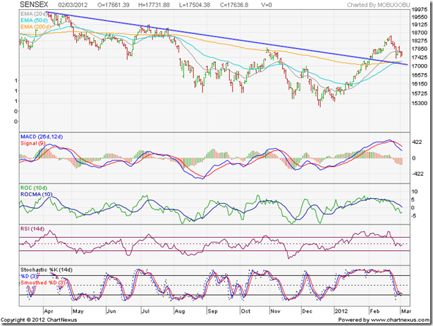
BSE Sensex and NSE Nifty 50 index chart patterns – Mar 2 ‘12

In last week’s analysis of the chart patterns of BSE Sensex and NSE Nifty 50 indices, it was mentioned that the ongoing corrections will be shallow unless the FIIs start to sell. Except on two days since both indices topped out on Feb 22 ‘12, the FIIs were net buyers. As a result, both the indices have stayed above important support levels so far.

BSE Sensex index chart

SENSEX_Mar0212

The daily bar chart of the BSE Sensex has managed to stay above the down trend line and the entangled 50 day and 200 day EMAs, keeping bullish hopes alive. But the failure of the 50 day EMA to cross above the 200 day EMA has prevented a technical confirmation of a bull market.

The technical indicators have turned bearish. The MACD is falling below its signal line in the positive zone, and the histogram has turned negative. The ROC is negative and below its falling 10 day MA. The RSI has slipped below its 50% level. The slow stochastic has dropped to the edge of its oversold zone.

Some more correction/consolidation can be expected till three likely trigger events – the UP state election results, RBI’s policy review and the union budget – get out of the way.

NSE Nifty 50 index chart

Nifty_Mar0212

The weekly bar chart of the NSE Nifty shows a classic pullback towards the down trend line that is receiving support from the rising 50 week EMA. Any upward bounce from current level will be an entry opportunity.

Some signs of weakness are visible in the technical indicators, but they haven’t turned bearish by any means. The MACD is still rising above its signal line in positive territory, but the histogram is falling. The ROC has dipped in the positive zone. The RSI is still climbing towards its overbought zone – no weakness there. The slow stochastic is in its overbought zone, but sliding down.

The UP state election is unlikely to produce a decisive result. The RBI is expected to do no more than reduce the CRR or the SLR. Both these outcomes appear to have been discounted by the stock market. All eyes are therefore on the budget, where some pro-reform policy notifications are expected. Lack of any negative surprises should help the up move to resume.

Bottomline? The chart patterns of the BSE Sensex and NSE Nifty 50 indices are going through a correction after a sharp rally. Such corrections provide entry opportunities to those who missed out on the earlier rally. That doesn’t mean one has to buy anything and every thing. The beaten down sectors, which may not be fundamentally sound, have shown greater gains. That is a worrying sign. Time to be cautiously optimistic.

Kamis, 23 Februari 2012

Is OnMobile Global for sale?

A few weeks back, there was a rumour in the market that TCS was looking at the possibility of buying OnMobile Global. That remained a rumour and did not become news. Those who may have bought the stock on the basis of the rumour may be waiting for an opportunity to sell.

That opportunity may not be far away. As per a recent article in Business India magazine, OnMobile Global is on the block and the latest suitor is Idea Cellular (of the Aditya Birla group). Apparently, Idea is ready to buy a 60% stake in the company at a price of Rs 100 – which is 33% higher than today’s closing price of Rs 74.40.

If this rumour turns out to be true, then investors may be able to pocket a neat gain if they enter at the current market price. Acquisition of a 60% stake – or even a lower stake - will trigger an open offer to existing shareholders.

In a post on the telecom sector a couple of months back, it was observed that the OnMobile stock was trying to form a bottom by consolidating within a rectangular band between 54 and 73. It was suggested that the stock could be a contrarian bet, but with a strict stop-loss at 52.

In Jan ‘12, the stock crossed above the rectangular consolidation zone, rose to an intra-day top of 84 on Feb 15 ‘12 and briefly breached its falling 200 day EMA. It has now pulled back to the top of the rectangular band. An upward bounce can be used to add/enter.

What if the rumour about Idea‘s stake buy remains a rumour – like it happened in the case of TCS? The company is fundamentally strong, and its overseas businesses, which contribute nearly half of its total revenues, are supposedly doing well. Domestic business is under pressure. Q3 results showed 12% top line growth but a 11% dip in the bottom line.

With smart phones becoming cheaper by the day and 3G service roll-outs in progress, OnMobile’s expertise in value-added software services should see growing demand. Even if the stake sale doesn’t go through, it may be worth holding on to the stock. A buy-back by the management, with a ceiling at Rs 85, is currently in progress.

Rabu, 04 Januari 2012

Stock Chart Pattern - IFCI Ltd (An Update)

The previous update of the stock chart pattern of IFCI Ltd was posted more than a year back. The stock had touched a high of 78 in Nov ‘10, followed by a sharp correction to 50 and appeared to be consolidating within a triangle.

All four technical indicators – MACD, ROC, RSI and slow stochastic - touched lower tops while the stock rose to its high. The combined negative divergences had provided advance warning of a correction. The following comments were made: “If you are still holding, maintain a strict stop-loss of 54. A better idea may be get out and not go anywhere near this stock again.”

The last comment seems almost prophetic when you look at the bar chart pattern of IFCI Ltd:

IFCI_Jan0412

The negative divergences in all four technical indicators, formed during Oct – Nov ‘10 have been marked by blue arrows. After the sharp drop from the peak of 78 to a low of 50 below all three EMAs in Nov ‘10, the stock consolidated within a bearish ‘rising wedge’ pattern – marked 1 – and rose above all three EMAs.

The break down below the wedge in Jan ‘11 was followed by a pullback towards the wedge, which received combined resistances from the 20 day and 200 day EMAs. Such pullbacks happen often, but not always, as can be observed in the ‘rising wedges’ marked 2 and 4. The stock price dropped to a low of 46 in Feb ‘11 and started forming a slightly prolonged ‘rising wedge’ – marked 2. The ‘death cross’ of the 50 day EMA below the 200 day EMA confirmed a bear market.

‘Rising wedge’ number 2 failed to cross above the 200 day EMA. The stock broke down without a pullback to a low of 44 in May ‘11 before starting a consolidation within another ‘rising wedge’ – marked 3. The break down below ‘rising wedge’ number 3 wasn’t followed immediately by a pullback. It came after 10 days. The subsequent slide went all the way down to 28 in Oct ‘11, before the formation of ‘rising wedge’ number 4.

The sharp break down below ‘rising wedge’ number 4 touched a low of 20 in Dec ‘11. Note that all four technical indicators showed positive divergences by touching higher bottoms – marked by blue arrows – suggesting an upward bounce. Since the stock was deep in a bear market – having lost 75% from its peak of 78 – the bounce wasn’t strong enough to cross above the 50 day EMA, despite solid volume support.

There is every possibility of the stock falling to its Mar ‘09 low of 15. The fundamentals don’t look very encouraging. Hopes of a banking licence has receded. The MD is under scrutiny by the authorities. The government may replace its debt with equity and gain management control. The volatility in the price has turned it into a trader’s favourite.

Bottomline? The stock chart pattern of IFCI Ltd is an example of how mismanagement of operations and finances has enabled the bears to create havoc. Small investors should steer clear of such ‘cheap’ stocks.

Sabtu, 10 September 2011

BSE Sensex and NSE Nifty 50 Index Chart Patterns – Sep 09, ‘11

In last week’s analysis, I had speculated about the cause of the rallies in the BSE Sensex and NSE Nifty 50 index chart patterns. Why stock markets go up or down can’t always be explained logically, or fundamentally. Technical analysis may help some times – but not always – by studying chart patterns that have occurred many times before under various economic conditions.

Once a clearly visible and identifiable pattern emerges – like the large descending triangles on the Sensex and Nifty charts – one should respect the pattern and expect a similar outcome that has been repeated many times before. In our case, the outcome has been as expected: a break below the descending triangle, followed by a pull back to the lower edge of the triangle. Such pull backs are selling opportunities.

BSE Sensex Index Chart

Sensex_Sep0911

Is the rally in the Sensex over then? It seems like that. The FIIs were net buyers during the first four days of the week. The index climbed above the 20 day EMA and seemed ready to move above the 17300 level. Out of the blue came the FII selling on Friday (Sep 9 ‘11) that caused a ‘reversal day’ pattern on the chart (higher high, lower close) and marked an intermediate top.

Did the FIIs sell because the index was close to 17300, or were they merely booking profits before the weekend? Only they can answer the question, but my guess is that it was a bit of both. FIIs use sophisticated models for managing their portfolios, and were aware that a resistance level was near.

Can’t more FII buying cause the rally to continue next week? Sure it can. Support and resistance levels only indicate the probability of a turn around, not a certainty. But there are a number of likely resistances to a further up move – the 17300 level; the falling 50 day and 200 day EMAs; the 300 points gap on the chart; and the blue down trend line.

The technical indicators are bullish, but showing signs of weakness. The MACD is rising above its signal line, but is negative. The ROC is positive and above its 10 day MA, but turning down. The RSI is moving sideways after crossing the 50% level. The slow stochastic entered its overbought zone, but is turning down. The Sensex is likely to consolidate between 17300 and the next support level of 15580 over the next couple of weeks.

NSE Nifty 50 Index Chart

Nifty_Sep0911

The weekly bar chart of the Nifty found resistance from the lower edge of the descending triangle but managed a marginally higher weekly close. The up-tick in volumes may encourage the bulls, but the technical indicators are not that encouraging.

The MACD has stopped falling, but is negative and below its signal line. The ROC is also negative and below its 10 week EMA, and has started falling. The RSI emerged from its oversold region, but has been unable to move up. The slow stochastic is trying to emerge form its oversold zone. Some more consolidation within the 4700 – 5200 band is likely.

Food inflation came off slightly but the overall inflation remains high and a 25 bps (0.25%) interest rate hike by the RBI is almost inevitable. Has the market discounted the rate hike? We will find out next Friday (Sep 16 ‘11), but there is a section of analysts who are expecting a pause by the RBI. The pause may lead to buying. The rate hike will attract sellers. The monsoon has been pretty good. Q2 results next month may not be so good.

Bottomline? The BSE Sensex and Nifty 50 index chart patterns are consolidating in bear markets. The good news is that the indices haven’t crashed. The bad news is that the possibility of a crash can’t be ruled out by any means. This may be a good time to avail of the higher interest rates in short-term bank fixed deposits.

Rabu, 07 September 2011

Stock Chart Pattern – SpiceJet (An Update)

What a difference a year can make! In the previous update to the analysis of the stock chart pattern of SpiceJet, I had mentioned about some fundamental changes in the company. The two most important ones were the replacement of financier Wilbur Ross by Kalanithi Maran of Sun TV fame (or, should I say notoriety?), and the departure of senior management personnel including CEO Sanjay Aggarwal.

Technically, the chart pattern was in a bull market – a long consolidation within a rectangle was followed by high volume break out to a new high of 79 – with a 100% gain in less than a year. A correction had ensued, but I had expected the stock price to recover and test its Jan ‘08 peak of 105. The analysis was concluded with the following notes of caution:

”Keep a trailing stop-loss and ride the bull. But remember that experienced airline hands have left the organisation. The new owners have political clout, which is great for wheeling and dealing but not so great for success in a complex and competitive industry which requires constant capital infusion, and globally doesn’t make much money.”

A look at the one year bar chart pattern of SpiceJet should convince readers that my warning was appropriate:

SpiceJet_Sep0711

The stock couldn’t cross the 100 mark, reaching a top of 97.45 on Nov 8 ‘10 – which turned out to be a high volume ‘distribution day’ (a higher high but a close near the day’s low opening price). The subsequent correction took the stock price below the 50 day EMA, followed by a good recovery to a lower top of 92.70 on Dec 6 ‘10 – which turned out to be another high volume ‘distribution day’. That was the signal for bulls to exit.

A quick drop to the rising 200 day EMA was followed by a milder upward bounce and then a drift down to the 200 day EMA where the stock spent several trading sessions. The decisive break below the 200 day EMA on Jan 27 ‘11 led to increasing volumes as the stock dropped to the support level of 49 (the lower edge of the rectangular consolidation zone between Dec ‘09 and Jul ‘10).

Note the huge spike in volume as the stock breached the support of the 49 level (marked by the blue arrow) on Feb 7 ‘11. The high volume was a signal that the breached support would become a strong resistance. Shortly thereafter, the 50 day EMA crossed below the 200 day EMA (marked by the light blue oval) – the ‘death cross’ formally confirming a bear market. A pull back to the 49 level culminated with an intra-day breach on Feb 17 ‘11 – which was a ‘reversal day’ that provided another opportunity to sell.

Two more attempts at a pull back to the 49 level in Apr ‘11 were thwarted by the falling 50 day EMA. The stock has been dropping deeper into a bear market, touching a 2 year low of 19.30 on Aug 19 ‘11 that was an 80% correction from its Nov ‘10 peak of 97.45. The technical indicators are showing bullish signs, but it is a bear market rally that may attract more selling.

There is a well-known joke about the airline industry: If you want to become a millionaire in the airline business, you should start with a billion. Vijay Mallya’s Kingfisher Airlines is a classic example. SpiceJet is no exception – except for the brief period when the Ross-Aggarwal team was at the helm. The number of air-passengers are increasing day-by-day. That doesn’t mean that the business is a profitable one.

Bottomline? The stock chart pattern of SpiceJet is deep within a bear market, and in danger of becoming a penny stock. The DMK’s loss in the recent state assembly elections in Tamil Nadu has negated the considerable political clout of the Marans. Their only hope will be the appearance of a white knight who can bail them out. But don’t count on it. Get out if you are still holding.

Kamis, 01 September 2011

Stock Index Chart Patterns - BSE Sectoral Indices, Aug 30, '11

A sharp rally during the last two trading days of Aug ‘11 – thanks to FII buying – saw the Sensex gain more than 800 points. Questions in the mind of many small investors, specially those without prior experience of bear markets, are: “Has the bear phase come to an end?”, and “Is this a good time to start buying?”

The short answer to the first question is: “No” – which a look at the chart patterns of the BSE Sectoral indices will confirm. The second question has already been answered in a post on Aug 11 ‘11. If you missed it earlier, it may be a good idea to go through it now.

BSE Auto Index

BSE Auto Index

The BSE Auto index has technically not broken down below the large descending triangle yet – unlike the Sensex. The gap in the chart was followed by a test and intra-day breach of the 8115 support level. The quick recovery closed the gap, but faced resistance from the falling 20 day EMA. Another test and a closing breach of the support level is a warning that worse may follow.

The subsequent upward bounce closed above the 20 day EMA. There is strong overhead resistance from the falling 50 day and 200 day EMAs, and the blue down trend line. The technical indicators are showing some bullish signs, but the support level may get breached technically (i.e. by more than 3% on a closing basis). Time to head for the exit door.

BSE Bankex

BSE BANKEX

The BSE Bankex has slipped into a bear market – the ‘death cross’ and the breach of the support level at 11330 have confirmed that. The current bounce is likely to face resistance from the falling 20 day EMA and the broken support level. Use the bounce to exit.

BSE Capital Goods Index

BSE Capital Goods Index

The BSE Capital Goods index has been technically in a bear market since the ‘death cross’ back in Jan ‘11. It has now broken below the Feb ‘11 lows, only to pull back to the support level of 12160. It is also facing resistance from the falling 20 day EMA. Even if it rallies some more, it may not be able to cross the hurdle of the falling 50 day EMA. Sell.

BSE Consumer Durables Index

BSE Consumer Durables Index

The BSE Consumer Durables index failed to test its Nov ‘10 top, broke below the blue up-trend line and is in danger of dropping into a bear market. The technical indicators are not holding out much hope of a speedy recovery. As per trend line theory: a trend remains in force till it is broken. The closing chart pattern (not shown) reveals a small head-and-shoulders reversal pattern with a downward-sloping neckline, with the head formed by the Jul ‘11 top. The ‘death cross’ will confirm a bear market. Sell.

BSE FMCG Index

BSE FMCG Index

The BSE FMCG index has been the star performer among the BSE sectoral indices, and appears to have escaped the bear attack with minor bruises. The blue up-trend line was breached with a gap, but the index is consolidating within a symmetrical triangle, and is trading above its rising 200 day EMA.

Technically, the bull market remains in force. The ROC, the RSI and the slow stochastic are showing positive divergences (reaching higher tops while the index made a lower top). The FMCG sector may not give spectacular returns in bull markets, but its resilience in bear markets makes it my favourite sector. It is a pity that most investors don’t find it an attractive investment option. Accumulate, with a stop-loss at 3720 (200 day EMA).

BSE Healthcare Index

BSE Healthcare Index

The BSE Healthcare index is supposed to represent a defensive sector, but it has broken down sharply below the blue up-trend line and the 200 day EMA. Note the classic pullback to the 200 day EMA before dropping further. The imminent ‘death cross’ and a drop below the Feb ‘11 low will confirm a bear market. The attempt at a recovery is likely to be thwarted by the 50 day and 200 day EMAs. Reduce.

BSE IT Index

BSE IT Index

The question mark about the growth in the US and Eurozone economies have worsened the outlook of the BSE IT index, which has broken sharply below a downward-sloping channel, and is in a bear market. Could this be a contrarian play? Anecdotal evidence suggests that overseas clients haven’t cut down on IT expenditure. Bet on TCS or Infosys, if you must – not on HCL Tech or Wipro. It may be more prudent to await Q2 results before entering.

BSE Metal Index

BSE Metal Index

The BSE Metal index has also broken below a downward-sloping channel, and slipped deeper into a bear market. In spite of the recovery effort, more pain is likely. Avoid.

BSE Oil & Gas Index

BSE Oil & Gas Index

The BSE Oil and Gas index also breached a downward-sloping channel, but is attempting a recovery. With inflation still not in control, diesel and kerosene prices have not yet been raised – adding to the subsidy burden. Reliance may face investigation for inflating costs of the KG-D6 basin exploration to avoid paying taxes and sharing profits with the government. Avoid.

BSE Power Index

BSE Power Index

The wind has gone out of the sails (or, more appropriately, the steam has gone out of the boilers) of the BSE Power index. Capacity additions have been way behind target; State Electricity Boards are in deep financial trouble due to mismanagement and power theft; new land acquisition laws will put a further spanner in the works. The index is going steadily down hill. Avoid.

BSE Realty Index

BSE Realty Index

The BSE Realty index didn’t fall during the six months period between Feb ‘11 and Jul ‘11. But all hopes of revival of the sector has been belied. The CCI slap of a huge fine on DLF came as a further blow to an already-beleaguered sector, and pushed the index below the support level of 1895. Buy real estate; avoid realty sector stocks.

Jumat, 18 Februari 2011

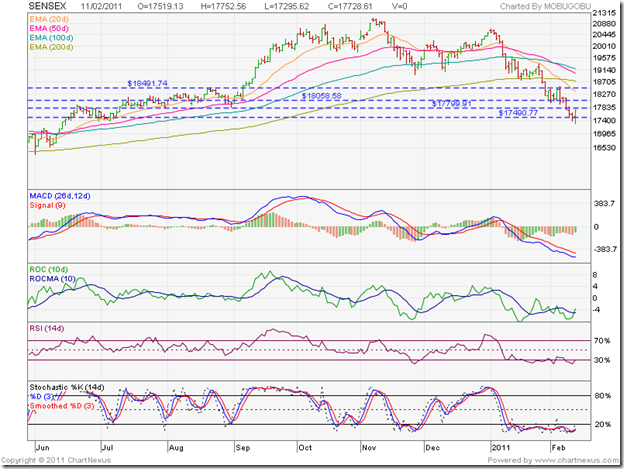
BSE Sensex and NSE Nifty 50 Index Chart Patterns – Feb 18, ‘11

In last week’s analysis, I had expected a pull back rally based on the ‘reversal day’ pattern on both the Sensex and Nifty charts on Fri. Feb 11 ‘11. The following comments may be worth repeating:

‘An upward bounce is likely, but may find resistance from the first support zone and the falling 20 day EMA. In case the Sensex manages to move up further, the 200 day EMA will be a tougher resistance to overcome.’

BSE Sensex Index Chart

SENSEX_Feb1811

As if on cue, the Sensex started a pull back rally that found resistance from the falling 20 day EMA on Tue. Feb 15 ‘11 and Wed. Feb 16 ‘11; moved up further to the top edge of the support zone at 18500 on Thu. Feb 17 ‘11; and, in today’s (Feb 18 ‘11) trading, crossed above the support zone intra-day, found strong resistance from the 200 day EMA and fell back within the support zone.

Technically, the support zone was not breached. The Sensex failed to close above it. More worrisome for the bulls is the formation of another ‘reversal day’ pattern (higher high, lower close) on the chart, backed by good volumes. The short pull back rally seems over. What next?

There could be a bit of consolidation within the support zone before the down move starts in earnest. The MACD has crossed above its signal line, but remains negative. The ROC is above its 10 day MA, and is trying to stay in positive territory. The RSI has turned down after reaching the 50% level. The slow stochastic is touching the edge of its overbought zone.

The ROC, RSI and slow stochastic have reached higher tops while the Sensex made a lower top. The positive divergences may enthuse the bulls. The ‘death cross’ has also been averted for the time being. But this is probably a better time to sell or stay away. A test of the 17500 level, and even of the previous low around 16000, are well within the realms of possibilities.

NSE Nifty 50 Index Chart

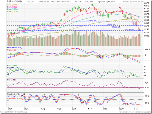
Nifty_Feb1811

An interesting picture emerges by including the OBV indicator instead of the MACD in the Nifty 50 chart. The correction in the Nifty 50 began after the index hit its peak of 6338 in Nov ‘10. But the OBV hit its peak in Oct ‘10, and has since been making a pattern of lower tops and bottoms – a sign of distribution. Even during the Dec ‘10 rally, the Nifty 50 made a higher top but the OBV made a lower one. A clear sign of smart money moving out.

The FIIs will continue to book profits and redeploy in their home markets, as well as other emerging markets where valuations look more reasonable. There are signs of inflation in the US and in Europe. That means the economic recovery is beginning to gain momentum. As long as the valuation gap remains, the FIIs won’t resume buying in a big way.

Inflation has started to moderate in India – partly due to the base effect. The monetary tightening by the RBI is also cooling things down. Investors should not have high hopes from the budget. Q4 results of India Inc. may show a reduction in profit margins. Till interest rates flatten out and start going down, buying stocks may not be a smart move.

Bottomline? The corrections in the chart patterns of the BSE Sensex and NSE Nifty 50 indices continue. Periodic rallies will only encourage the bears to sell more. Playing a waiting game could provide better value buys over the next few months.

Jumat, 11 Februari 2011

BSE Sensex and NSE Nifty 50 Index Chart Patterns – Feb 11, ‘11

Last week, I had pointed out a bearish ‘reversal day’ pattern that got formed on Fri. Feb 4 ‘11 in both indices. Due to the negative market sentiments and bearish technical indicators, I had surmised that the next support zones on the indices may also get breached.

So far, the indices are dancing to the tune of technical analysis (or so it may seem!). Actually, it is net FII selling being countered by DII net buying that is causing the indices to drop step-by-step or, support zone by support zone. Note how the 200 day EMA, and the two support zones have temporarily stalled the down move. What about today’s sharp recovery? My guess would be short covering coupled with some investment buying.

BSE Sensex Index Chart

SENSEX_Feb1111

The selling on Tue. Feb 8 ‘11 convincingly breached the first support zone between 18050 and 18500, within which the Sensex had traded a week ago. The index dropped to the next support zone between 17500 and 17800, and traded within it for the rest of the week. Note that the 17500 level was breached intra-day on Feb 10 and Feb 11 ‘11, but the index managed to close within the support zone.

Technically, the second support zone has not been broken yet – but it may be just a matter of time. The technical indicators are still quite bearish. The MACD is deep in negative territory and below its signal line. The ROC is also negative, but has moved above its 10 day MA and also made a slightly higher bottom. The RSI is trying to come out of the oversold zone. The slow stochastic seems quite content to stay inside the oversold zone.

The down move from Jan ‘11 has lasted 6 weeks. An upward bounce is likely, but may find resistance from the first support zone and the falling 20 day EMA. In case the Sensex manages to move up further, the 200 day EMA will be a tougher resistance to overcome. Note that the ‘death cross’ (50 day EMA falling below the 200 day EMA) hasn’t happened yet. Till it does, the bulls will remain in the game.

NSE Nifty 50 Index Chart

Nifty_Feb1111

Today’s (Feb 11 ‘11) recovery in the Nifty 50 was accompanied by strong volumes – in fact, the highest up day volumes in more than two months. That gives a hint that it wasn’t just short-covering. Some investment buying may have taken place also. Note that today’s trading has formed a ‘reversal day’ pattern (lower bottom, higher close). A pullback rally may happen soon.

The technical indicators are quite bearish, though today’s buying seems to have injected a bit of life into them. The inflation rate has moderated a little, but the IIP number came as a disappointment. Any pullback may give the bears another opportunity to start selling.

The UPA government and the Opposition appears to have cut a deal regarding a JPC probe into the telecom 2G spectrum allotment scam. That may allow the budget session of parliament to go through unhindered. But that may not provide any bullish trigger for the markets. More skeletons seem to be tumbling out of the cupboards with each passing day. Half-educated businessmen are manipulating the nexus between the mafia and politicians for their own ends.

Politicians have been openly looting the country’s resources for many years. India’s growth story won’t filter into the hinterland unless corruption is controlled. Neither will our stock markets reach new highs till the negative perception changes about the future of our country. In the near term, sentiment is the key to stock market movements.

Bottomline? The chart patterns of the BSE Sensex and NSE Nifty 50 indices are on the verge of entering confirmed bear markets. Some stocks have fallen to their 52 week lows. Others have dropped below their book values. That doesn’t mean that all such stocks are worth buying. Please thoroughly check the fundamentals. Remember that in bear markets, you make money by selling the rises and then buying back at lower levels.

Selasa, 08 Februari 2011

Gold Chart Pattern: is this a good time to buy?

In last month’s analysis of gold’s chart pattern, a bearish triple-top was getting formed. A decent correction looked imminent. I had mentioned that a break below 1340 would confirm the triple-top. Gold’s price dropped all the way down to 1315 on Jan 27 ‘11, correcting about 7.5% from the Nov ‘10 top of 1421.

Since then, gold’s price has pulled back above the falling 14 day SMA, and managed to close at 1356 on Feb 3 ‘11 – a 38.7% retracement of the fall from 1421 to 1315, and marginally higher than the 38.2% Fibonacci retracement level. That may be one of the reasons why the chart is struggling a bit to move higher.

But that isn’t the only reason. Let us look at the 2 year closing chart pattern of gold to understand why:

image

Note that the pullback is facing resistance from the falling 30 day SMA. That opens up the possibility of a drop down to test support from the rising 200 day SMA. There is a third reason as well. The US stock markets have been bullish and investors are regaining their appetite for riskier assets.

The doom and gloom reports about the US and European economies are getting less frequent. GDP growths remain meagre, but growth is definitely more visible. Inflation remains low. Same with interest rates. That points to a further rally in the equity markets, and a correspondingly lower investor demand for safer havens, like gold.

Is the bull market in gold over? Far from it. As long as gold’s price remains above the rising 200 day SMA, the strategy should continue to be: ‘buy the dips’. Last month, I had advised new entrants to accumulate below the level of 1340. A possible drop to the 200 day SMA may provide an opportunity to add. A convincing close above 1356 can also be used to accumulate.

Please don’t forget to maintain adequate stop-losses. This close to an all-time high is not the time to throw caution to the winds. 1350 is a support-resistance level. If the support holds, gold’s price is likely to move higher – may be after a period of consolidation. A break below 1350 could lead to a test of the 200 day SMA.

Related Posts Plugin for WordPress, Blogger...