Tampilkan postingan dengan label gold. Tampilkan semua postingan

Selasa, 06 Maret 2012

Gold and Silver chart patterns: bears fight back

Gold Chart Pattern

Gold_Mar0512

Gold’s chart pattern shows a strong fight back by the bears, just when all seemed lost. After moving above the 1770 level, gold’s price consolidated a bit before rising to a 2 months high of 1790. Proximity to the Nov ‘11 top of 1800 was used as an excuse by the bears to indulge in heavy selling.

Note that all three technical indicators touched lower tops as gold’s price reached a 2 months high. The negative divergences warned of an impending correction. But the high volume of selling marked a ‘distribution day’ (high near the opening level and a much lower close). Such high volumes were last seen during the sell-off in Sep ‘11. Volumes on down days (red volume bars) have exceeded volumes on up days (grey volume bars) on several occasions, and is a sign of distribution.

Gold’s price has dropped below its 20 day and 50 day EMAs, and it looks like it may drop further to its 200 day EMA. The technical indicators are looking bearish. The RSI has slipped below its 50% level. The MACD is still positive, but is falling below its signal line. The slow stochastic bounced up a bit from the edge of its oversold level, but it looks like a ‘dead cat bounce’.

Gold is still trading above its rising 200 day EMA – which means it is technically in a bull market. Hold, with a strict stop-loss at 1650.

Silver Chart Pattern

Silver_Mar0512

Silver’s chart pattern shows strong buying by the bulls in the third week of Feb ‘12 that pushed the price above the 37 level. High volume selling and a ‘reversal day’ pattern (higher high and lower close) marked the end of the intermediate rally from the Dec ‘11 low of 26.

The technical indicators are looking bearish. The RSI has dropped from the overbought zone to its 50% level. The MACD has crossed below its signal line, and is barely positive. The slow stochastic has fallen below its 50% level from its overbought zone.

Despite spending more than a month above the 200 day EMA, a bull market was not confirmed technically because the ‘golden cross’ of the 50 day EMA above the 200 day EMA didn’t occur.

Silver’s price is likely to fall below its 200 day EMA, and return to a bear market after a foray into bull territory. Sell.

Selasa, 28 Februari 2012

Notes from the USA (Feb 2012) - a guest post

The data flowing out of the US economic indicators have been showing definite signs of recovery from the world-may-come-to-an-end kind of scenario three years ago. Two large doses of Quantitative Easing have prevented a collapse of the financial system. The stock market is soaring and corporate America is flush with cash. Unemployment situation is improving and even the moribund housing market is beginning to show signs of life.

Is this the proverbial light at the end of the tunnel, or is it the headlight of an onrushing train? In this month’s guest post, KKP expresses his apprehensions about the strength and durability of the US economic recovery. He also presents a positive outlook from a recent consumer survey report.

-------------------------------------------------------------------------------------------------------------

Beautiful Orange Sky Before Darkness

The sky looks awesome right now since it is 6 pm and we can see the sun setting on the horizon. It is a perfect time when the glare of the sun does not bother our eyes, the heat has reduced to a more comfortable level, and it is all-in-all pleasant to everyone enjoying this moment. The key is to know what happens in a few minutes to an hour. It will be dark and the lights need to turn on. Oh no, the electricity man came earlier and cut off our electricity? Is that possible? Turning to my wife, I ask if we paid the electric bill on time? Huh!

Well, it seems that we are facing such an evening right now in the global economy. The bearish blog writers have portrayed well that ‘patch-work’ solutions of the current debt-related issues are only going to take us so far. One fine day the electricity guy is not going to take our cheques (or bonds) and the darkness is not going to get illuminated with a 100 or 200 watt CFL (tube light) bulb.

Many global economies are running on borrowed time, with times of pleasure and growth in between based on government maneuvering for political reasons. Is the booster shot that Greece just got something that will last, or will it need a 2nd, 3rd, and 4th shots before the antibiotics kick-in? And will the patient be alive when those 3rd and 4th shots are given? Are the other countries after Greece in the PIIGS acronym next to ask for rescue packages? Of course, they are almost ready now. We already have a next acronym after PIIGS and it is CAASH. This is the Canadian, Australian, Hong Kong and other economies that also have their Debt-to-GDP ratios going out of whack. US tax collections are lower than ever, and annual deficits are in the same range as during 1929-1934 (% of GDP). Are we so information overloaded that we cannot see the turmoil in the air, or are we too busy with our daily chores, ‘synch’ing our mobile devices, and playing Angry-Birds on our Tablets/iPhones/Androids?

Take a look at the previous crisis and what happened to Gold. Look at what has happened to Gold even without a ‘real crisis’. I say that the crisis has not happened since we keep averting the ‘root cause’ event with patch-work. In the meantime, we have high tides and low tides in the market and have the emotional roll-coaster associated with it (being left out, or what did I do!). So, let’s watch what is happening in the global markets and react accordingly.
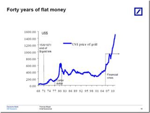
clip_image002

If you want to see a positive viewpoint of the most current survey that I participate in with ChangeWave, here is partial report. Of course, I was not very optimistic in my input to the survey. We are approx 5000 to 10000 people in this closed group of professionals that provide our input based on our consumer spending or enterprise spending surveys. It will show the minor waves of positive and negativity, and of course, it is showing the positive/optimistic living that we are all experiencing right now. I am all for good living, and benefitting from positive waves, but will it last?

-------------------------------------------------------------------------------------------------------------

February U.S. Consumer Spending Report

Spending Accelerates for February as Consumer Confidence and Expectations Improve

by Jean Crumrine and Paul Carton

Overview: In a clear sign of accelerating momentum, U.S. consumer spending has soared in February – the second major upswing of the past three months. Importantly, the February 1-13 ChangeWave survey shows overall spending at a nine month high, and confidence and expectations continuing to improve. ChangeWave Research is a service of 451 Research.

The survey of 2,501 U.S. consumers finds the biggest spending upticks are occurring in Travel/Vacation, Household Repairs and Improvements, Autos, and Restaurants.

Moreover after last month’s post-holiday declines, our latest findings point to renewed momentum for several retailers, including Costco (COST), Target (TGT) and Walmart (WMT).

Consumer Spending Outlook: Three-in-ten U.S. respondents (30%) now say they'll spend more over the next 90 days than they did a year ago – up 6-pts since our previous ChangeWave survey in January.  Only 27% say they'll spend less, a 4-pt improvement from previously.

clip_image001

Putting the Findings in Context:  As the following chart shows, the net 10-pt jump in February is the second major uptick of the past three months – and the overall reading is higher than any of the previous 9 months.

clip_image001[4]

Consumer Expectations and Confidence: When we asked consumers about their impressions of the economy, we found confidence and expectations up again to their highest levels of the past year.

Consumer Expectations:  One-in-three consumers (33%) now believe the overall direction of the economy will improve over the next 90 days, while only 21% think it will worsen.  This represents a net 7-pt improvement since January and a striking 66-pt turnaround since the horrendous lows of six months ago.

clip_image001[6]

Stock Market Confidence:  In a similar positive, 39% say that they’re More Confident in the U.S. stock market than they were 90 days ago, while 19% say they’re Less Confident – an 8-pt improvement since the previous month.

clip_image001[8]

Respondents were asked about their investing plans going forward, and reported their money inflow into U.S. Stocks (+13; up 6-pts) is accelerating. And although Non-U.S. Stocks (-1; up 6-pts) are still registering a money outflow, the rate is subsiding – a sign that the European Union debt crisis hasn’t immobilized consumer investing.

Bottom Line: The February ChangeWave survey results show consumer spending soaring, and bring into sharp focus the improved spending environment we’ve been tracking in our monthly surveys since November of last year.

Importantly, U.S. consumer confidence and expectations are also improving for the 6th consecutive month. As for the biggest outperformers in February – it’s Travel/Vacation, Autos, Household Repairs/Improvements, and Restaurants.

-------------------------------------------------------------------------------------------------------------

KKP (Kiran Patel) is a long time investor in the US, investing in US, Indian and Chinese markets for the last 25 years. Investing is a passion, and most recently he has ventured into real estate in the US and also a bit in India. Running user groups, teaching kids at local high school, moderating a group in the US and running Investment Clubs are his current hobbies. He also works full time for a Fortune 100 corporation.

Selasa, 21 Februari 2012

Gold and Silver chart patterns: an update

Gold Chart Pattern


Two weeks ago, gold's price had begun a correction after testing the Dec '11 top of 1770. So far, the 20 day EMA has provided good support to the price. The corrective pattern is looking like the 'handle' of a bullish 'cup and handle' pattern. That means a likely upward target above the 1900 level and a test of the all-time high touched in Sep '11.


The technical indicators are reflecting the effects of the correction. The RSI is sliding, but is above its 50% level. The MACD is positive, but has slipped below its signal line. The slow stochastic is looking bearish by falling below its 50% level, but is trying to turn around. Gold's price is trading above all three EMAs - the sign of a bull market.


Add, with a stop-loss at 1650. Conservative investors can wait for a convincing move above 1770 to enter.


Silver Chart Pattern


Silver's chart pattern shows that despite spending three weeks above the 200 day EMA - which should have been a bullish sign - the 20 day EMA has failed to cross above the 200 day EMA. The formation of a bearish 'rounding top' pattern is another concern for the bulls.


The technical indicators are beginning to look bearish. The RSI is steadily falling towards its 50% level. The MACD is barely positive, and has crossed below its signal line. The slow stochastic is below its 50% level, and still falling. Looks like silver's price is in danger of sliding back into a bear market.


Enter only on a convincing break above 36.

Selasa, 07 Februari 2012

Gold and Silver chart patterns: bulls regaining control

Gold Chart Pattern


In an update on gold's chart pattern three weeks back, buying was recommended on a convincing rise above 1700. The down trend line (not shown in chart) connecting the tops touched in Sep, Nov and Dec '11 was near the 1700 level, and was expected to provide resistance. Shortly after that post, gold's price broke above the down trend line and the 1700 level - accompanied by a volume spurt. Volume support on an upward break is a requirement, and ensures that the break out is not a 'false' one.


Gold's price kept on rising, but volumes were falling - till the price reached the level of Dec '11 top of 1770. Falling volumes are not suitable for sustaining a rally, as it indicates lack of buying energy. Hesitation near a previous top isn't unusual. A 'reversal day' pattern (higher high, lower close) marked an intermediate top. A pullback towards the down trend line is in progress. The rising 20 day and 50 day EMAs may provide support on the way down.


Gold is trading above its rising 20 day, 50 day and 200 day EMAs - the sign of a bull market. The technical indicators are correcting from overbought conditions. The RSI has dropped from its overbought zone, but remains above the 50% level. The MACD is positive and above its signal line.  The slow stochastic is about to fall below its overbought zone.


The correction will allow gold's price to rise and test the 1800 level. Use the dip to add, with a stop-loss at 1630.


Silver Chart Pattern


Silver's chart pattern shows that the bulls have made quite a smart comeback after the white metal's price touched a low of 26. After climbing above the 200 day EMA to reach the 34 level within a month, silver's price is taking a breather for the past few trading sessions.


The next resistance is likely from the 36 level - which corresponds to the Oct '11 top. The down trend line (not shown in chart) connecting the Apr, Aug and Sep '11 tops is also near the 36 level - which may make it a strong resistance level.


Note that the 20 day EMA has crossed above the 50 day EMA, and both are rising. That is a bullish sign for the near term. However, both are still below the 200 day EMA. The technical indicators are bullish, but showing weakness. The RSI is above its 50% level, but dropped down after touching the edge of its overbought zone. The MACD is rising above its signal line in the positive zone, but its upward momentum is slowing. The slow stochastic is well inside its overbought zone, but has started drifting down.


The bears have not been routed yet, and may fight back. Enter on a convincing break above 36.

Selasa, 17 Januari 2012

Gold and Silver Chart Patterns: an update

Gold Chart Pattern

Gold_Jan1712

Two weeks back, gold’s price was making a second attempt at a pullback towards its 200 day SMA from below. It was expected that the bears would resort to selling and push the price down once more. But after a bit of a struggle, the price crossed above the still-rising 200 day SMA and has stayed above it since then.

Technically, the support at 1550 was not broken – gold’s price only had a day’s close below the support level. So, the drop from 1900 to 1550 should be treated as a bull market correction. The 30 day and 60 day SMAs (not shown in chart) did not fall below the 200 day SMA. Once the 14 day SMA crosses above the long-term moving average, the bulls will regain control.

Gold’s chart appears to be forming a bullish ‘falling wedge’ pattern, which is a ‘continuation’ pattern from which the likely break out should be upwards. Please remember that technical analysis is not a science, and patterns don’t always play out as expected. Buy on a convincing rise above 1700.

Silver Chart Pattern

Silver_Jan1712

Despite a smart pullback above the 14 day SMA, silver’s price is trading below its 30 day and 60 day SMAs (not shown in chart) and well below the 200 day SMA – the hallmark of a bear market.

The white metal is falling within a downward-sloping channel, making a bearish pattern of lower tops and lower bottoms. The 200 day SMA is forming a ‘rounding top’ pattern, hinting at a further fall in silver’s price.

Selasa, 03 Januari 2012

Gold and Silver Chart Patterns: pullback rallies

Gold Chart Pattern

Microsoft Word - Document1

Two weeks ago, the following comment was made about gold’s price chart: “A pullback to the long-term moving average was only to be expected, and has been in progress for the past three trading sessions.” Some times, price charts provide an ego boost to technical analysts by behaving exactly as per expectations. The pullback reached the still-rising 200 day SMA, only to encounter selling pressure and plummet to a close below the 1550 level.

The break down below the symmetrical triangle pattern and the pullback to the 200 day SMA were both selling opportunities. At the time of writing this post, another pullback attempt is in progress to prevent a bear market – but it may meet the same fate as the previous one. The 14 day SMA is about to drop below the 200 day SMA. A close below 1520 will confirm a bear market.

Technically, the support at 1550 hasn’t been convincingly breached yet because gold’s price jumped up after a single day’s close below 1550. There is stronger support between 1450 and 1480, if 1550 does get breached eventually. Can gold’s price fall even lower? Anything is possible once the bears get the upper hand – and the technical signals are looking ominous for bulls.

Silver Chart Pattern

Microsoft Word - Document1

There are no doubts about bear domination of silver’s chart pattern. The white metal dropped to a new closing low of 26 for a day before embarking on a sharp pullback. The 14 day SMA (as well as the 30 day and 60 day SMAs – not shown in the chart) is falling below the 200 day SMA and silver’s price is trading below both SMAs – the sign of a bear market.

Stay away till trend-reversal signals become visible.

Kamis, 29 Desember 2011

Notes from the USA (Dec 2011) - a guest post

Of late, the US economy has been showing small but positive signs of stability. A double-dip recession seems to be off the table. Doom-sayers have been less prolific in their doom-sayings. No one is talking about a collapse of the dollar and revival of the gold standard any more. Gold bulls have stopped predicting levels of $6000 and $10000.

Even the noise about impending calamity emanating from Europe have been on very muted volumes. Every one seems reasonably satisfied that Europe may be heading into another recession, but the Eurozone is not going to disintegrate and the euro won’t collapse. This is what we are getting to read and hear from CNBC and Bloomberg.

But what is the reality? In this month’s guest post, KKP provides his measured opinion from Ground Zero, and advises investors to be cautious.

---------------------------------------------------------------------------------------------------------

All Green Light with the EU Crisis Over?

With all the moves being made in the last few weeks, and the latest punch by the ECB, is the crisis in Europe done with? The bailout of various governments by the ECB allowing them to borrow money super cheap might make it seem like that. These economies need the money to buy their sovereign debt at much higher yields and save a bundle. Sure, it is a big breakthrough in policy and a correct step towards savings these economies, but in my opinion it is far from convincing that this is a one step cure. Markets seem to believe some of it caused the yields to plunge.

The US dollar has reacted accordingly by going into a slight corrective mode, with gold, A$, C$ and Euro bouncing up a bit. Again, in my opinion, this is just a resting place for these currencies before they continue down against US$, since there is too much faith in the ‘least ugly’ (of the moment) i.e. US$.

The US economy seems to be showing typical seasonal strength. People are getting temporary jobs (seasonal jobs in retail, logistics and transportation industry) and hence the unemployment claims are lower. But, this is not going to last because come January, we will have many of those people back on the streets looking for jobs.

Again, 2012 is an election year, and hence we will see artificial moves made by the politicians to show improvement in the US economy so that they can ensure a win. It will again be temporary and not last long. The economy does seem to show some stabilization, but revenue and profits are ratcheting down for corporations, although the quarter to quarter comparison (from previous year) is looking positive, and hence giving a false sense of relief to investors. Net effect is that companies are cutting employees, cutting costs, and delaying investments to show those profits. Ultimately, the reduction in employment affects the supply chain of business that is inter-related, and inter-dependent on ‘jobs and employed folks’.

Housing is showing some stability although there is enough inventory out there (hidden) that keeps coming out slowly but surely. Banks are more lenient and allowing non-mortgage payers to stay in their homes for free based on government regulations. Until prices climb up, most of the purchases made between 2004-05 and 2008-09 are homes that potentially will come back out on the market as a foreclosure sale.

So, no, I do not believe EU is out of the red-light-zone, and neither is the US. Hence, times are still turbulent (with signs of positive turn in mobile computing marketplace) and keeping money safely on the sidelines or trading quickly (in and out) is the only thing we should be doing. This applies to India as well as US.

What are you doing with your money in India or in US?

---------------------------------------------------------------------------------------------------------

KKP (Kiran Patel) is a long time investor in the US, investing in US, Indian and Chinese markets for the last 25 years. Investing is a passion, and most recently he has ventured into real estate in the US and also a bit in India. Running user groups, teaching kids at local high school, moderating a group in the US and running Investment Clubs are his current hobbies. He also works full time for a Fortune 100 corporation.

Selasa, 27 Desember 2011

10 Reasons why small investors should love a bear market

Most small investors detest a bear market. The helpless feeling of watching stocks bought with hard-earned money falling into oblivion can be quite traumatic, and cause sleepless nights.

In a desperate and misguided effort to salvage a losing position, investors start ‘averaging’ – buying more shares at progressively lower prices. The stock doesn’t know that some one is ‘averaging’ it – and keeps going down further! The ‘average’ price of the stock decreases, but the losses increase.

Is there any remedy for this fairly common ailment? Turn a disastrous situation into a learning experience. Find out the reasons why small investors should love a bear market. Here are 10 of them.

1. Every one loves bargains. The best bargains in stocks are found during a bear market. Good stocks are available at 40%-50%-60% discounts to their recent peak values.

2. Experts and analysts appearing on TV or writing in business papers stop recommending third rate stocks. They may actually discuss about some decent companies. No longer will you hear that Suzlon is a great buy or Bartronics is the next Infosys.

3. Email or cell phone inboxes will not get overloaded with SMS stock tips about unknown companies from unknown brokerage houses. Most of those brokerages go belly-up during a bear market.

4. No one wants to discuss about stocks at weddings or college reunions. One can actually have intellectually stimulating conversations with relatives and friends – instead of saying “I’ve bought this” or asking “Why did you sell that?”

5. Working hours will not be wasted by staring at stock tickers scrolling on computer terminals. Up to the minute stock updates on cell phones will get disabled. Productivity at work places will improve.

6. One can get a haircut or a shoeshine in peace without getting stock tips from the barber or the shoeshine boy.

7. A bear market separates the short-term, one-hit rock-star companies from the true long-term wealth creating companies. The stocks that don’t fall much in a bear market are the ones that provide dividend income and stability to your portfolio.

8. If one is unfortunate enough to come face to face with a bear in a forest, the best thing to do is not to run or try to fight but to play dead. In the stock market, one can play dead by investing in fixed income avenues. Interest rates are usually higher at such times.

9. The importance of proper asset allocation becomes clear. Spreading investments among equity, fixed income, gold and cash not only saves a portfolio from annihilation but the asset allocation gives clear signals about when to buy and when to sell.

10. A bear market tests an investor’s mettle. Those who turn tail and run are just not meant to be successful investors. Those who can stick it out and learn from their mistakes are the ones who may be able to build wealth over the long term. 

Selasa, 20 Desember 2011

Gold and Silver Chart Patterns: an update

Gold Chart Pattern

Microsoft Word - Document1

In a post two weeks back, the possibility of a break below the symmetrical triangle pattern on gold’s price chart had been mentioned, even though gold was trading way above its rising 200 day SMA. A downward target of 1450 was also mentioned. Such huge drops – from 1750 to 1450 - don’t happen in one shot. But the drop of 150 within two weeks must have shaken the confidence of die-hard gold bulls.

A swift and steep drop below the 200 day SMA stopped just short of the support level of 1550 (where multiple tops were formed in May and Jun ‘11). A pullback to the long-term moving average was only to be expected, and has been in progress for the past three trading sessions.

The 14 day SMA is falling towards, and may soon drop below, the 200 day SMA. That will be the first warning of a likely change of the bull trend. The 30 day and the 60 day SMAs – not shown in chart above – are also falling. Note that the ‘panic bottom’ of 1600 – formed in Sep ‘11 – has been broken. Panic bottoms seldom hold.

The break down below the triangle was a selling opportunity. So is the current pullback. Long-term holders who may have entered at lower levels can stay invested with a stop-loss at 1550.

Silver Chart Pattern

Microsoft Word - Document1

The 200 day SMA has just about started to fall as silver’s price is moving down towards the lower edge of its downward channel. All the three moving averages – 14 day (in chart above), 30 day and 60 day SMAs – have crossed below the 200 day SMA, with silver’s price trading below all four.

Silver is in a bear market, and can fall to much lower levels. Looks like ‘game over’ for the bulls.

Selasa, 06 Desember 2011

Gold and Silver Chart Patterns: consolidating

Gold Chart Pattern

Microsoft Word - Document1

Gold’s chart has been consolidating within a symmetrical triangle pattern (in yellow) for the past 10 weeks or so, and is ripe for a break out of the triangle. In which direction? Knowing the answer can make some one seriously rich! Triangles are quite unreliable and the break out can occur in either direction.

On an upward break out – which should be accompanied by heavy volumes for the break out to be valid – gold’s price can reach 2000. On a downward break, the price can fall to 1450. There is a third possibility. Gold’s price can continue to consolidate and move sideways through the apex of the triangle (at around 1725). In the latter case, the triangle pattern would fail.

Since gold’s price chart is in a bull market – it is trading well above its rising 200 day SMA – an upward break out has greater probability. But technically, the chart is showing some weakness. Note that the recent rally faced resistance from the 1750 level and failed to reach the upper edge of the triangle. That may be a prelude to a break below the triangle.

Await the break out before taking a decision to buy or sell.

Silver Chart Pattern

Microsoft Word - Document1

Ever since the steep drop below the 200 day SMA about 10 weeks back, silver’s price has been in a sideways consolidation between 28 and 36. The 200 day SMA is beginning to flatten out and should start falling – confirming a bear market.

In my previous post, I had mentioned that silver’s price has been trading within a downward-sloping channel (in yellow). The trend is down, and will remain so till the upper end of the channel is convincingly breached. With manufacturing activities contracting in Europe and the emerging markets, there is little likelihood of a boost in silver’s price any time soon.

Stay away till clarity emerges about a resolution of the Eurozone debt problems.

Selasa, 22 November 2011

Gold and Silver Chart Patterns: an update

A few months of correction, and all the chatter about a return to the gold standard and the dollar no longer being a reserve currency is off the table! The signs of revival seen on the chart patterns of gold and silver two weeks back proved to be illusory.

Both precious metals are now trading below their 14 day, 30 day and 60 day SMAs, and may drop down to test their Sep ‘11 lows. Will that provide a buying opportunity?

Gold Chart Pattern

image

The answer should be ‘Yes’ for gold, because it is trading well above a rising 200 day SMA and is in a bull market. Note that the 1750 level provided good support till gold’s price chart formed a small ‘double-top’ reversal pattern and suddenly dived on Thu. Nov 17 ‘11.

A test of the 1600 support level is on the cards. The support should hold since the 200 day EMA is also near 1600. Just in case 1600 gets broken – nothing is certain in technical analysis – 1530 should be a stronger support due to the multiple tops formed near that level during Apr – Jun ‘11.

The downside to a bounce up from 1600 is that a bearish ‘descending triangle’ will get formed, from which gold’s price may fall all the way to 1300. This is a hypothetical possibility as of now, so no need to be alarmed. Let the chart pattern unfold. But it may be prudent not to be gung-ho bullish about buying the likely bounce up from 1600.

Silver Chart Pattern

image

The answer to the question is ‘Not yet’ for silver, because the white metal and all three of its moving averages (only the 14 day SMA is shown on the chart) are trading below the 200 day SMA – which indicates a bear market. The Sep ‘11 low of 28 may be tested and broken.

Note that silver’s price was consolidating within a small symmetrical triangle formed near the support level of 34, before breaking down sharply on Thu. Nov 17 ‘11. Drawing lines through tops formed in Apr ‘11 and Aug ‘11, and bottoms formed in May ‘11 and Sep ‘11 will form a broad downward-sloping channel pattern with its lower end currently at 26. That is a level which provided support in Nov ‘10 and Jan ‘11 – so an upward bounce can be expected from 26.

Bravehearts may try to bottom-fish at 26. Conservative investors should buy only on a convincing break out above the downward-sloping channel.

Selasa, 15 November 2011

Investing strategies in inflationary times – a guest post

The business channels and pink papers have been obsessive about high inflation in the Indian economy and the consequent rise in interest rates – and well they should be. The government doesn’t seem too perturbed about the deleterious effect that high inflation causes – not just to GDP growth, but also to the wallets of common citizens.

During such times, savings and investments may be farthest from people’s minds as they struggle to make both ends meet. However, there are some comparatively less risky investment opportunities that smart investors can avail of – and Nishit discusses them in this month’s guest post.

--------------------------------------------------------------------------------------------------------

Inflation is rising, cost of loan repayments (EMIs) is going up and jobs are getting lost. How does a common man deal with such a situation?

Government bond yields have almost reached 9%. This means interest rates may rise further in the times to come. EMIs may go up if the RBI hikes the Repo rate, which is currently at 8.5%. In the case of loans, it is best to pre-pay some amount rather than letting the tenure increase. Many people will not get a tenure extension if their tenure has reached the maximum limit of about 25 years.

This is a good time to lock in your savings in high yield fixed investments. Non Convertible Debentures of L&T Finance gives an yield of about 10%. Other fixed income investments like Bank FDs should be utilized to avail of high interest rates. A SIP can be started in a Gilt fund. The interest rate cycle is about to peak soon and Gilt funds are likely to give good returns.

The recently increased limit in PPF investments from Rs 70,000 to Rs 1 lakh, and the higher rate of PPF return of 8.6% is a wonderful opportunity and should be made use of by small investors.

The markets are headed downwards. This scenario is likely to remain till interest rates start moving down. At every decline to key support levels, one can add blue chip shares to the portfolio keeping a 5 years horizon in mind. Supports for the Nifty are at 4700, 4300 and 3700.

Gold as an investment can be looked at only when the previous high of US $1900 per oz is taken out, or near the support level of US $1600 per oz.

For astute investors, cash is king. In a slow GDP growth environment, if one is willing to put down cash then real estate as well as automobiles may be available at good discounts. Plummeting car sales indicate that good cars may soon get sold at discounts just to clear off the inventory and keep the assembly lines working.

This is a great time for an investor to build an entire new portfolio. The portfolio should comprise of fixed income instruments, stocks, commodities and real estate. A proper balance of allocation to these assets will generate wealth going forward.

--------------------------------------------------------------------------------------------------------

(Nishit Vadhavkar is a Quality Manager working at an IT MNC. Deciphering economics, equity markets and piercing the jargon to make it understandable to all is his passion. "We work hard for our money, our money should work even harder for us" is his motto.

Nishit blogs at Money Manthan.)

Selasa, 08 November 2011

Gold and Silver Chart Patterns: rallies reviving?

The sharp corrections seen on gold and silver chart patterns appear to be over, and the bull rallies are all set to resume. Gold’s price never dropped below the 200 day SMA, so technically it was just a bull market correction following a double-top reversal pattern. Silver’s price dropped below the 200 day SMA and has stayed below the long-term moving average for more than a month, raising the spectre of a bear market. However, there are signs of revival of late.

Gold Chart Pattern

image

Gold’s price is trading above its 14 day, 30 day, 60 day and 200 day SMAs, and all four moving averages are rising – which is the sign of a bull market. More importantly, the price has climbed above the 1750 level – the ‘valley’ level between the two tops at 1900.

Note that the 1750 level acted as a resistance during the recent up move, and once the resistance was overcome, the resistance level has turned into a support level. Gold’s price should start moving up towards its previous top of 1900, and eventually test and overcome the 1900 level to touch a new high.

A satisfactory resolution of the Eurozone debt problems may cause a renewed interest in risky assets and slow down the up move in gold’s price. But the bull market in gold is very much alive, and price dips can be used to add.

Silver Chart Pattern

image

Silver’s price is on a gradual recovery path, though it is still trading below the 200 day SMA. The fact that the white metal is trading above its 14 day and 30 day SMAs, and the 200 day SMA has started rising again point to a revival of interest in buying silver.

Intrepid investors can start accumulating slowly at current prices. The more prudent action will be to wait for a convincing cross above the 200 day SMA before buying. As with all purchases, a strict stop-loss should be maintained – say, at 32.

Rabu, 26 Oktober 2011

Notes from the USA (Oct 2011) - a guest post

The Eurozone debt problems have been hanging like the proverbial sword of Damocles over global stock markets. Any deal eventually worked out by Eurozone leaders is likely to be a temporary relief for a deep-rooted malady.

In this month’s guest post, KKP chalks out a plan on how investors can benefit from the turmoil in global stock markets.

-----------------------------------------------------------------------------------

Déjàvu All Over Again?

There are so many variables in the market including earnings, recessions, financing, trade imbalances, debt to GDP ratio and many others. A lot of these variables are focus elements in the media and weigh on our minds and portfolios, but US took the lime-light in 2008-09 and now Europe is about to take that seat!

So, what are these ‘economic bombs’:

  1. Greece, and the in the bigger picture, PIIGS (latest group of countries in trouble
  2. Recapitalization of Debt in Europe (and the valuation of each country’s bonds/rating)
  3. Flexibility and affordability of EFSF (needs are far beyond EFSF capabilities)
  4. ‘United we stand’ mentality amongst the EU nations (Germany, France, UK and others are not of the same opinion)

In the reality that ECRI (Laxman Achutan’s indicator) is painting, the USA is heading for a recession of sizable proportions. The time frame has not been specified, although many speculate six months. This means that USA will not be in any position to help Europe with trade balances or with any QE packages if they need more than what they can afford.

My personal view is that the US market is behaving as the “least ugly” and hence pushing upward. Think about the “least ugly vs. ugly vs. most ugly” concept and things will come to perspective. This push is really a total suckers rally with very low volumes on the Nasdaq and S&P500. None the less, it is still a rally and one where US investors should be cashing out of the equity positions, slowly but methodically, and yet more importantly without fail.

Stocks are dramatically over-valued based on the underlying business trade going on (in the US). Any gains are in complete defiance of the many identified headwinds that will show its mighty strength soon. Sales to and within US corporations are weak at best, but the comparisons made to last year make it look better.

Hence, it is going to get very unpleasant and possibly catastrophic at the first sign that EU cannot afford the outcome of one or more of PIIGS defaulting on their debts. If the sovereign debt crisis results in anything less than a deep and prolonged global recession, there are chances (albeit a low probability) that this rally will continue for a short time. We will see a lot of investors get sucked into the rally and feel very lonely at the top, when the correction resumes at 3 times the speed (typical bear move vs. bull moves of US markets) of the slow move up that we are seeing.

BRICS will feel the pinch for a while (corrective), but the only positive view of all this is that we will be able to see a US$ rally, and therefore a gold/silver correction. As with the current softness in gold/silver that I had predicted on ISG and IIF investor forums a few weeks ago, I think we will get a slightly lower price from the current levels (to the next support levels), and that will definitely be the last hurrah based on the current state of US$ and Euro. Resumption in the gold and silver rally (new money as a lot of people call it), will happen as Euro falters, and the focus returns on US issues.

Bottom line, keep your powder dry to buy at lower levels, and, from those purchases in 2012-13, we will get our eventual high of 2015-16 (8 year cycle) once all of this settles down. Buying at these deep corrective levels, building a solidly balanced portfolio will be the right thing to do for serious investors (not traders), and we will also have a good amount of gold and silver to show in our portfolios between now and the eventual high of 2015-16 (as predicted by Vivek Patil of ICICI).

(Note: At the time of posting this, Eurozone leaders seem to have worked out an emergency deal to resolve the region’s debt crisis. That may provide a boost to global stock markets.)

-----------------------------------------------------------------------------------

KKP (Kiran Patel) is a long time investor in the US, investing in US, Indian and Chinese markets for the last 25 years. Investing is a passion, and most recently he has ventured into real estate in the US and also a bit in India. Running user groups, teaching kids at local high school, moderating a group in the US and running Investment Clubs are his current hobbies. He also works full time for a Fortune 100 corporation.

Selasa, 18 Oktober 2011

Gold and Silver Chart Patterns: an update

Gold Chart Pattern

image

Gold’s price had formed a double-top reversal pattern after touching 1900. The double-top was confirmed when the price dropped below the ‘valley’ level 1750 between the two tops. Downward target of 1600 was achieved quickly on gold’s chart, after which gold’s price has been consolidating within an upward-sloping ‘wedge’ pattern.

Most consolidation patterns tend to be continuation patterns. That means, the trend before entering the pattern – down, in this case – would continue once price break out happens. Unlike triangle and rectangle patterns, from which break outs can happen in either direction, the rising wedge is fairly dependable. It forms during bear phases, and the price break out is downwards.

Bulls may feel enthused that gold’s price is trading above the 14 day SMA, and the 200 day SMA is still rising – indicating that the bull market is far from over. But the possibility of a break below the rising wedge pattern, and a test of support from the 200 day SMA should induce caution.

Existing holders can keep a stop-loss at 1540 (the level of the 200 day SMA) and continue to hold. New entrants can wait for a likely upward bounce from the 200 day to accumulate. (Note: At the time of writing this post, gold’s price has dropped sharply to 1630, indicating a break below the rising wedge.)

Silver Chart Pattern

image

After dropping like a brick below the 200 day SMA, silver’s price has been consolidating within a symmetrical triangle. Though silver’s price is trading above the 14 day SMA – a short-term positive – the longer-term outlook is not bullish.

The 30 day SMA (not shown in chart above) has slipped below the 200 day SMA, and the 60 day SMA is likely to follow suit. The 200 day SMA is flattening and may turn downwards soon. Silver’s price is in a clear down trend, marked by lower tops and lower bottoms. Downside targets are 24 and 20. Wait for the correction to play out.

Selasa, 04 Oktober 2011

Gold and Silver Chart Patterns: end of long bull rallies?

Gold Chart Pattern

image

In an update to gold’s chart pattern two weeks ago, the following conclusion was drawn:

‘The present correction/consolidation – whatever it may turn out to be – should restore the technical health of gold’s chart for the next up move.’

The expected drop to 1600 from the double-top at 1900 happened quickly, and gold’s price has been consolidating in a narrow range of $50 since then. It is beginning to look like the next up move may take a while, and gold’s price may dip further – possibly to the 200 day SMA (at about 1520) - before a sustained rise can begin again.

Note that the 200 day SMA is still rising, with gold’s price trading above the long-term moving average. Technically, gold is still in a bull market. But extreme caution is advised about entering at this stage – since the yellow metal is trading below its 14 day, 30 day and 60 day SMAs. All three are likely to act as resistances on any up moves. Not to forget the valley level of 1750 (between the two tops at 1900), which should provide strong resistance to a price rally.

A fall below the 200 day SMA will also mean a 20% drop from its peak, and a likely trend reversal from bull to bear. If you are still holding and in profit, maintain a strict stop-loss at 1520.

Silver Chart Pattern

image

There are no doubts about the state of silver’s price chart pattern – it is in a bear market. It has dropped more than 20% from its peak and is trading below the 200 day SMA. The 14 day SMA has slipped below the long-term moving average. The 30 day and the 60 day SMAs have turned down and may cross below the 200 day SMA in the near future.

Why is silver faring worse than gold? The answer probably lies in the fact that silver is not something you just buy and lock up in a bank vault. It has several industrial uses as well. With global manufacturing in clear de-growth, industrial demand for silver is declining. (The fall in copper prices are also due to this same reason.)

If you are still holding, use any price rise to exit. On the down side, the next supports are at 24 and 20.

Selasa, 20 September 2011

Gold and Silver Chart Patterns: an update

Gold Chart Pattern

image

On a closing basis, gold’s chart appears to be forming a bearish ‘double-top’ reversal pattern, with two tops at 1900. The ‘double-top’ will get confirmed only on a drop below the ‘valley’ between the two tops. That means a drop below 1750. At the time of writing this post, gold’s price is at 1780.

In case of a convincing drop below 1750, gold’s price can move down to 1600. There is also the likelihood of a bounce up from the 1750 level, in which case the ‘double-top’ will be negated and instead, a rectangular consolidation pattern will get formed.

Gold’s price is still trading way above its 200 day moving average (not shown on chart), which means the bull market is very much intact. The present correction/consolidation – whatever it may turn out to be – should restore the technical health of gold’s chart for the next up move.

Silver Chart Pattern

image

Silver’s price chart hasn’t made much headway since my previous post two weeks back. A slightly lower top at 43.50 has been followed by a steady slide below the 40 mark. Looks like the price is headed down towards the support level of 38.

That level coincides with that of the 60 day MA (not shown in chart), so silver’s price is likely to bounce up and provide an entry opportunity. A break below 38 should find good support from the rising 200 day moving average - currently at 35.

Senin, 12 September 2011

Stock Index Chart Patterns – S&P 500 and FTSE 100 – Sep 09, ‘11

S&P 500 Index Chart

image

The bears obviously recharged their batteries over the Labor Day weekend, as the S&P 500 index started the truncated week’s trading with a high volume down day. The bulls attempted a brief recovery that pushed the index above the 20 day EMA, but it failed to close above the 1200 level. Friday’s sell-off – whether due to Bernanke’s non-speech or Obama’s not-really-a-stimulus speech – ensured a lower weekly close for the index.

The S&P 500 chart has spent almost 5 weeks within an upward-sloping ‘flag’ consolidation pattern since touching the low of 1101 on Aug 9 ‘11. Flag patterns tend to be continuation patterns. Since the index descended into the pattern, it is likely to descend further out of the pattern. There are measuring implications for a downward break from a ‘flag’ – the index can fall the same distance as the drop from the Jul ‘11 top to the Aug ‘11 low of about 250 points. That gives a target of 900 on the S&P 500 index in the not-too-distant future.

The technical indicators are giving mixed signals. The slow stochastic has dipped below the 50% level, but the RSI has climbed above its 50% level. The MACD is above the signal line, but has started to move down in negative territory. One can expect a bit of consolidation before the index resumes its fall.

The economic news is neither calamitous, nor inspiring confidence. Non-manufacturing ISM number inched up to 53.3 from July’s 52.7, showing marginal growth. Exports in July was 3.6% higher than in June and 15% higher on a YoY basis. But the good news was offset by declining housing prices, and initial unemployment claims of 414,000.

FTSE 100 Index Chart

image

Last week’s chart pattern of the FTSE 100 was almost a repeat of the previous week’s trading. Two closes above the 20 day EMA; a failure to test the falling 50 day EMA; and a capitulation by the weekend. The lower top and lower bottom formed during the week is a signal that the bears are taking charge once again.

Like the S&P 500, the FTSE 100 has been consolidating within a bearish upward-sloping ‘flag’ pattern for the past 5 weeks. The drop of about 1300 points from the Jul ‘11 top of 6084 to the Aug ‘11 bottom of 4791 means that the index can drop 1300 points below the ‘flag’. That gives a downward target of 4000.

The technical indicators are mildly bullish. Both the slow stochastic and the RSI are above their 50% levels. The MACD is in negative territory, but above its signal line. Bulls may try their best to defend the 5000 level, but the bears are likely to overwhelm them sooner or later.

A Greek debt default is looming, and the other PIIGS nations aren’t in great financial shape either. The ECB appears to be unsure about what to do. UK’s economy is in danger of slipping into a double-dip recession if growth doesn’t pick-up soon. Were the recent riots across the country a harbinger of a harsh winter of discontent?

Bottomline? S&P 500 and FTSE 100 charts have formed bearish ‘flag’ patterns from which both indices can tumble down about 20% more. Stay on the sidelines, or use a further dip in gold prices to stock up on the yellow metal.

Selasa, 06 September 2011

Gold and Silver Chart Patterns: up, up and away?

In an update of the technical chart patterns of gold and silver posted two weeks back, I had mentioned about the possibility of a sharp correction in gold’s price due to the extremely overbought condition, and advised investors to use the dip to buy. Silver’s price was expected to pull back a bit after a quick rise above the 14 day SMA, and provide a good buying opportunity.

Gold Chart Pattern

image

A sharp correction was expected – and what a sharp correction it was! Gold’s price was shaved off by almost $200 in the space of two days of trading. The 14 day SMA was easily breached and the price headed down towards the 30 day SMA. The bounce back was equally sharp.

Before the overbought condition could be properly rectified, gold’s price shot up above the $1900 mark. The volatility continues in today’s trading. Price touched a new peak of $1920, only to correct by more than $50 within a couple of hours! At the time of writing this post, gold’s price seems to be stabilising around $1900.

Such volatility is a sign of growing uncertainty, probably caused by the bleak outlook of the US and Eurozone economies. Uncertainty usually precedes a correction. That doesn’t mean that gold’s price may not rise some more. But one should be very cautious about entering near all-time highs – regardless of what you may hear or read.

Technically, the ever widening distance between the 14 day SMA as well as the 30 day SMA (not shown in the chart above) and the 200 day SMA is a harbinger of a big price meltdown. If you are invested in gold, maintain a strict stop-loss at 1820 – which is the level of the 14 day SMA.

Regular readers know that I am not a fan of buying gold because it provides no returns. If you are interested about a view based on historical analysis of gold and stock investment performance, read this article.

Silver Chart Pattern

image

Silver’s price chart shows a short and sharp correction, from $44 to $40, and a quick dip below the 14 day SMA. A pull back to $42 was expected. It provided a good entry opportunity. The quick recovery did not affect the upward momentum of the 14 day SMA or the 200 day SMA. The bull market in silver is intact, which is confirmed by the bullish pattern of rising tops and rising bottoms.

During today’s trading, silver’s price faced a sharp $2 drop before stabilising near the $42.50 mark. Technically, there isn’t any immediate threat of a big price correction. Dips can be used to accumulate. A convincing move above $49 will restore control to the bulls.

Selasa, 23 Agustus 2011

Gold and Silver Chart Patterns: an update

There is an old stock market saying: When in doubt, stay out. But in current politically and economically turbulent times, investors appear to have created a new maxim: When in doubt, buy gold (and silver).

Gold Chart Pattern

image

Gold is being bought as if the financial world is going to collapse tomorrow, or latest by next week. What else can explain a vertical $200 surge from 1700 to 1900 in the two weeks since my previous post?

Admittedly, there is sovereign gold buying, and Venezuela created a flutter by planning to repatriate $11 Billion worth of gold held in overseas banks. The sorry state of Eurozone banks is a major concern. But ask yourself: Is the global economy in a worse situation than it was in 2009?

One can debate the state of the global economy till the cows come home. The bottomline is that the parabolic rise in gold’s price over the past couple of months is unsustainable. The chart is looking extremely overbought, with the 14 day SMA (as well as the 30 day and 60 day SMAs – not shown in the chart above) climbing away from the rising 200 day SMA. A sharp correction, if not a crash, is around the corner.

If you are an investor who would rather buy gold (instead of Colgate or ITC shares), use the likely dip to buy gold ETFs. My preference is for the hefty dividends that Colgate and ITC shareholders receive – not to forget the occasional bonus shares.

Silver Chart Pattern

image

After a four month lull, during which silver’s price went through a decent correction, prices have risen sharply to touch the 44 mark. I had recommended that investors use the recent dip to buy, or to wait till the 42 level is crossed convincingly.

If you missed out on the buying opportunities, wait for a likely pullback towards 42 to enter. The 14 day SMA is turning upwards. The 200 day SMA didn’t stop rising right through the four months of price correction. The bull market in silver is alive and well.

Related Posts Plugin for WordPress, Blogger...