Gold Chart Pattern
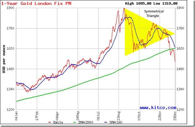
Two weeks ago, the following comment was made about gold’s price chart: “A pullback to the long-term moving average was only to be expected, and has been in progress for the past three trading sessions.” Some times, price charts provide an ego boost to technical analysts by behaving exactly as per expectations. The pullback reached the still-rising 200 day SMA, only to encounter selling pressure and plummet to a close below the 1550 level.
The break down below the symmetrical triangle pattern and the pullback to the 200 day SMA were both selling opportunities. At the time of writing this post, another pullback attempt is in progress to prevent a bear market – but it may meet the same fate as the previous one. The 14 day SMA is about to drop below the 200 day SMA. A close below 1520 will confirm a bear market.
Technically, the support at 1550 hasn’t been convincingly breached yet because gold’s price jumped up after a single day’s close below 1550. There is stronger support between 1450 and 1480, if 1550 does get breached eventually. Can gold’s price fall even lower? Anything is possible once the bears get the upper hand – and the technical signals are looking ominous for bulls.
Silver Chart Pattern
There are no doubts about bear domination of silver’s chart pattern. The white metal dropped to a new closing low of 26 for a day before embarking on a sharp pullback. The 14 day SMA (as well as the 30 day and 60 day SMAs – not shown in the chart) is falling below the 200 day SMA and silver’s price is trading below both SMAs – the sign of a bear market.
Stay away till trend-reversal signals become visible.

