Sabtu, 29 Oktober 2011

BSE Sensex and NSE Nifty 50 index chart patterns – Oct 28 ‘11

What a difference a day’s trading can make! The break out from the 12 weeks long rectangular trading ranges on the BSE Sensex and NSE Nifty 50 index charts not only happened on the upside against bearish expectations, but has opened up the possibility of a trend reversal.

BSE Sensex index chart

Sensex_Oct2911_ST

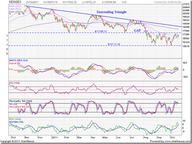
The Bullish view: The trading on Fri. Oct 28 ‘11 started with a huge upward gap between the 17300 and 17600 levels. The gap coincided with the big downward gap on the Sensex chart formed during the break below the descending triangle pattern in Aug ‘11. The gap area has been marked with a pair of blue parallel lines.

The entire trading below the gap has formed an ‘island’ of trading, opening the door for a bullish ‘island reversal’ pattern that can mark the end of the year long bearish phase, during which the Sensex corrected by 25% (more than 5000 points) from its Nov ‘10 peak. The ‘island reversal’ pattern will be confirmed only if the gap area remains unfilled (or gets partly filled).

Unless the Sensex convincingly breaks out above the blue down trend line on strong volumes and continues with the rally, there is every possibility that the resistance from the down trend line proves too strong (as has happened three times before), and the Sensex falls again to fill the gap. In the latter case, the bear phase will continue till it gets reversed at a later date.

The technical indicators are looking bullish. The MACD is rising above its signal line in positive territory. The ROC is also positive, and above its 10 day MA, but has touched a lower top. The RSI and the slow stochastic are both inside their overbought zones. That could mean a correction round the corner.

NSE Nifty 50 index chart

Nifty_Oct2811

The Bearish view: A strong upward weekly bar on the Nifty chart has re-entered the large descending triangle and closed above the 50 week EMA for the first time in 14 weeks. Such strong weekly up moves have happened several times before, but the blue down trend line has resisted all previous rallies during the past year. Till the down trend line is convincingly breached, the trend will remain down.

The technical indicators are showing signs of bullishness. The MACD has crossed above its signal line, but remains deep inside negative territory. The ROC has moved sharply above its 10 week MA into positive territory, but such sharp up moves usually don’t sustain. Both the RSI and the slow stochastic are moving up, but are below their 50% levels. Any attempt to climb above the down trend line is likely to attract selling.

Despite another interest rate hike by the RBI, inflation continued on its upward trajectory. Without strong fiscal policies from the government, RBI’s monetary tightening has hurt growth but failed to curb inflation. Even if RBI pauses its rate hike, that doesn’t mean interest rates will be lowered right away. Stock markets don’t flourish during times of high interest rates. The situation in India is quite different from that in the US and the Eurozone, where stock markets are in bull territory mainly because of zero or negligible interest rates.

Bottomline? The BSE Sensex and the Nifty 50 index chart patterns have broken out upwards from their 12 weeks long trading ranges. But trend reversals are yet to be confirmed technically. Eurozone’s debt problems have been temporarily solved through write-downs and bail-outs. Growth slow down in India caused by high interest rate is not conducive for a bull market. Time to be cautiously optimistic – not bullish.

Jumat, 28 Oktober 2011

Stock Index Chart Patterns – Hang Seng, Singapore Straits Times, Malaysia KLCI – Oct 28 ‘11

The apparent ‘resolution’ of the Eurozone debt crisis seems to have acted like a tonic for the Asian stock indices, which soared past expected resistance levels, backed by strong volumes. Two weeks back, I had made the following comment:

‘The first signal of a trend reversal will be the crossing of the 20 day EMA above the 50 day EMA. So keep a watch on the short-term and medium term moving averages.’

The 20 day EMAs are still below the 50 day EMAs, but things may change quickly if the general euphoria in global markets continue unabated next week.

Hang Seng Index Chart

HangSeng_Oct2811

The Hang Seng chart has filled the gap between 18300 and 18700 quite comfortably, and rose past its 20 day and 50 day EMAs. The larger gap between 21018 and 21726, and the falling 200 day EMA are likely to provide stronger resistances to the rally.

The technical indicators are looking overbought, which may lead to a correction or consolidation. The MACD has risen sharply above its signal line into positive territory. The ROC is also positive and above its 10 day MA, but reached a lower top as the index rose higher. The RSI and the slow stochastic are both inside their overbought zones.

A correction down to the 50 day EMA may help the index to gather more energy to climb past the 200 day EMA. Till then, it technically remains in a bear market.

Singapore Straits Times Index Chart

Straits Times_Oct2811

Like the Hang Seng index, the Straits Times index crossed above its 20 day and 50 day EMAs backed by strong volumes, and has come close to testing resistance from its falling 200 day EMA. Though technically still in a bear market, the strong upward momentum can reverse the down trend quickly.

The technical indicators are looking overbought, which could lead to a pause in the rally or even a correction. The two gaps on the chart formed on Aug 5 and Aug 8 ‘11, and the falling 200 day EMA are probable resistances to a further up move.

Malaysia KLCI Index Chart

KLCI Malaysia_Oct2811

Two weeks back, the overbought technical indicators pointed to a correction. The correction was swift, and dropped the KLCI almost 100 points (about 6.5%) from 1465 to 1371 in the space of 5 trading sessions. The recovery was sharp, and in today’s trade the index crossed above the 200 day EMA intra-day, before closing exactly on the long-term moving average.

The MACD is positive and rising above its signal line. Both the RSI and the slow stochastic are in their overbought zones, but both failed to reach new highs with the index. The ROC is positive but has crossed below its 10 day MA. A correction down to the 50 day EMA won’t be a surprise.

Bottomline? The three Asian indices are in the midst of sharp recovery rallies that are hinting at possible trend reversals. The overbought technical indicators are pointing to a pause or  brief corrections next week. The feel-good factor of the Eurozone debt resolution may wane a bit over the weekend after the fine-print is closely analysed. The worst is probably over for the Asian indices, but it may take a while for bullish sentiment to return.

Rabu, 26 Oktober 2011

Notes from the USA (Oct 2011) - a guest post

The Eurozone debt problems have been hanging like the proverbial sword of Damocles over global stock markets. Any deal eventually worked out by Eurozone leaders is likely to be a temporary relief for a deep-rooted malady.

In this month’s guest post, KKP chalks out a plan on how investors can benefit from the turmoil in global stock markets.

-----------------------------------------------------------------------------------

Déjàvu All Over Again?

There are so many variables in the market including earnings, recessions, financing, trade imbalances, debt to GDP ratio and many others. A lot of these variables are focus elements in the media and weigh on our minds and portfolios, but US took the lime-light in 2008-09 and now Europe is about to take that seat!

So, what are these ‘economic bombs’:

  1. Greece, and the in the bigger picture, PIIGS (latest group of countries in trouble
  2. Recapitalization of Debt in Europe (and the valuation of each country’s bonds/rating)
  3. Flexibility and affordability of EFSF (needs are far beyond EFSF capabilities)
  4. ‘United we stand’ mentality amongst the EU nations (Germany, France, UK and others are not of the same opinion)

In the reality that ECRI (Laxman Achutan’s indicator) is painting, the USA is heading for a recession of sizable proportions. The time frame has not been specified, although many speculate six months. This means that USA will not be in any position to help Europe with trade balances or with any QE packages if they need more than what they can afford.

My personal view is that the US market is behaving as the “least ugly” and hence pushing upward. Think about the “least ugly vs. ugly vs. most ugly” concept and things will come to perspective. This push is really a total suckers rally with very low volumes on the Nasdaq and S&P500. None the less, it is still a rally and one where US investors should be cashing out of the equity positions, slowly but methodically, and yet more importantly without fail.

Stocks are dramatically over-valued based on the underlying business trade going on (in the US). Any gains are in complete defiance of the many identified headwinds that will show its mighty strength soon. Sales to and within US corporations are weak at best, but the comparisons made to last year make it look better.

Hence, it is going to get very unpleasant and possibly catastrophic at the first sign that EU cannot afford the outcome of one or more of PIIGS defaulting on their debts. If the sovereign debt crisis results in anything less than a deep and prolonged global recession, there are chances (albeit a low probability) that this rally will continue for a short time. We will see a lot of investors get sucked into the rally and feel very lonely at the top, when the correction resumes at 3 times the speed (typical bear move vs. bull moves of US markets) of the slow move up that we are seeing.

BRICS will feel the pinch for a while (corrective), but the only positive view of all this is that we will be able to see a US$ rally, and therefore a gold/silver correction. As with the current softness in gold/silver that I had predicted on ISG and IIF investor forums a few weeks ago, I think we will get a slightly lower price from the current levels (to the next support levels), and that will definitely be the last hurrah based on the current state of US$ and Euro. Resumption in the gold and silver rally (new money as a lot of people call it), will happen as Euro falters, and the focus returns on US issues.

Bottom line, keep your powder dry to buy at lower levels, and, from those purchases in 2012-13, we will get our eventual high of 2015-16 (8 year cycle) once all of this settles down. Buying at these deep corrective levels, building a solidly balanced portfolio will be the right thing to do for serious investors (not traders), and we will also have a good amount of gold and silver to show in our portfolios between now and the eventual high of 2015-16 (as predicted by Vivek Patil of ICICI).

(Note: At the time of posting this, Eurozone leaders seem to have worked out an emergency deal to resolve the region’s debt crisis. That may provide a boost to global stock markets.)

-----------------------------------------------------------------------------------

KKP (Kiran Patel) is a long time investor in the US, investing in US, Indian and Chinese markets for the last 25 years. Investing is a passion, and most recently he has ventured into real estate in the US and also a bit in India. Running user groups, teaching kids at local high school, moderating a group in the US and running Investment Clubs are his current hobbies. He also works full time for a Fortune 100 corporation.

Selasa, 25 Oktober 2011

Market celebrates RBI interest rate hike – why?

RBI increased the repo rate (at which it provides short-duration loans to banks) and the reverse repo rate (at which banks maintain short-duration deposits with the RBI) by 25 basis points each. The repo rate is now 8.5% and the reverse repo rate is now 7.5%. The CRR has been left unchanged at 6%.

With inflation remaining stubbornly high despite 12 rounds of rate increases since Mar 2010, it was widely expected that the RBI will increase the repo and reverse repo rates by 25 bps (0.25%) today. The market should have already discounted the rate hike. Why the buying celebration then? Was there some good news that the market liked?

Apparently, there were three. First, and most important, the RBI governor hinted at inflation rate moderating to 7% by Dec ‘11, in which case there will be no further rate hike at the end of the year. Moderation of inflation and a likely pause in the rate hike cycle was considered ‘good news’ by the market.

Also, for the first time ever, interest rate on savings bank accounts have been de-regulated. That means banks have the freedom to offer any interest rate on savings bank accounts that they deem fit. Last, but not the least, banks have been given the freedom to open branches in Tier-II through Tier-VI towns without prior permission.

Let us look a little more critically at each of these pieces of ‘good news’.

How will inflation suddenly moderate to 7% in less than 2 months when it has remained uncontrollably high for the past 20 months? Will food prices suddenly fall? Will government employees get less salary? Will politicians become honest and stop their looting? The answer is: none of the above.

The moderation will happen due to the ‘base effect’. Inflation was already high in Dec ‘10. So the YoY increase in Dec ‘11 will appear to be less. Actual prices that we pay will remain almost the same as now. There is also a possibility that diesel and kerosene prices will finally be increased if inflation does moderate. So, we may get back to square one.

What about the pause in the rate hike? Well, that won’t help much either. Better than bad isn’t necessarily good. As per RBI’s guidance, the GDP growth rate has been revised down from 8% to 7.6% in year ending Mar 2012. There are already signs of growth slowdown, which will be exacerbated by today’s rate hike. Unless interest rates start heading downwards, stock markets are unlikely to go up.

Is the saving bank interest rate de-regulation good news? Certainly not for banks. Their business has already been hampered by high interest rates – due to which loans have become dearer and term deposit rates have gone up. If interest rate on savings bank accounts is increased, it will be a direct hit on bank bottom lines.

As per the Economic Times, if savings bank interest rate is increased from the current 4% to 5%, then all the banks put together may need to pay out an additional interest of Rs 15,000 Crores, which may reduce the entire banking sector’s profitability by 13%.

Look at it another way. Savings bank account holders will collectively receive an extra Rs 15,000 Crores. What will they do with the sudden inflow? Why, spend most of it. Will that stoke the fires of inflation or not? You tell me!

SBI has the largest percentage of savings bank accounts among all banks (Yes Bank has the fewest) and will be affected the most by an increase in savings bank interest rate. The CMD went on record that SBI will not increase the savings bank interest rate. He also said that de-regulation means rates can also be reduced.

What about opening branches in small towns? It may help in financial inclusion of people living in remote areas where no bank branches exist. But if there was a lot of business potential in Tier-II through Tier-VI towns, banks would have sought permission to open branches there by now. By removing the red-tape of prior permission, the business potential of remote corners of the country is not going to increase overnight. But opening branches will add to the operating costs of banks.

The ‘good news’ doesn’t seem so good, does it? What was the reason for the buying today? It was a combination of short-covering and index management – today being early F&O ‘expiry day’ because of the Diwali holiday. The broader markets didn’t participate much in the rally.

Both the Nifty and the Sensex are poised at the upper end of their respective trading ranges of the past 11 weeks – with the huge gaps caused in Aug ‘11 remaining unfilled. Tread with caution.

Senin, 24 Oktober 2011

Stock Index Chart Patterns – S&P 500 and FTSE 100 – Oct 21, ‘11

S&P 500 Index Chart

image

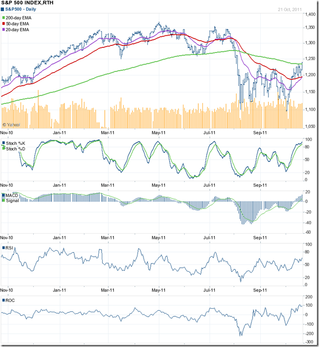
Last week, the technical indicators of the S&P 500 index chart were pointing to a continuation of the rally. The rally, supported by decent volumes, led to the highest close since Aug 2 ‘11, and a close above the 200 day EMA.

The 20 day EMA is about to cross above the 50 day EMA, and all four technical indicators are looking bullish. Have the bears been vanquished? It appears so, but there are a couple of warning signs for the bulls. Both the RSI and the ROC failed to reach new highs with the index. The negative divergences may stall the rally.

Decent corporate Q3 results, and the possibility of a resolution of the Eurozone debt problems are probable causes of the rally. End of the financial year considerations may also be behind the buying. If the bail-out plan in Europe doesn’t work out, global markets may face a lot of selling.

US economic indicators are hardly encouraging. Housing starts rose by 15%, but new building permits fell 5% in Sep ‘11. Weekly unemployment claims dropped to 403,000 but remained above 400,000. ECRI’s WLI growth indicator dropped further to –10.1 from –9.7 a week earlier.

FTSE 100 Index Chart

image

The FTSE 100 index formed a ‘reversal day’ pattern (higher high, lower close) on Mon. Oct 17 ‘11. The index consolidated sideways for the rest of the week, receiving good support from the 50 day EMA before closing a bit higher on a weekly basis.

The technical indicators are looking bullish, and the index may move up to test resistance from the 200 day EMA. Further continuation of the rally will depend on an early resolution of the Eurozone debt crisis.

UK retail sales picked up 0.6% YoY in Sep ‘11, but were down –0.2% for the Jul-Sep quarter. Manufacturing output fell 0.3% in Aug ‘11. Public sector job losses are now more than private sector job gains. The possibility of a double-dip recession can’t be ruled out.

Bottomline? The chart patterns of the S&P 500 and FTSE 100 indices continued their surprisingly strong rallies that are threatening to break the strangleholds of the bears. A satisfactory resolution of the Eurozone debt crisis has already been discounted by the markets. Any disappointments on the debt relief front may trigger off widespread selling. Better to be cautiously optimistic, instead of being brave.

Minggu, 23 Oktober 2011

Comparative performance of Sensex and global indices

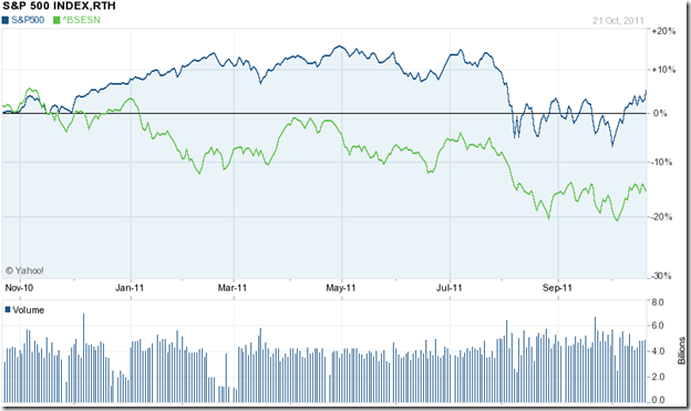
One keeps reading and hearing that the Sensex has been one of the worst performers among global stock indices over the past one year. So I decided to take a look at some of the leading global indices (in blue) to check whether the Sensex (in green) has been an underperformer or not.

Here is what I found:-

S&P 500 vs. Sensex

image

The S&P 500 index has not only outperformed the Sensex by a wide margin, but has eked out a 5% gain over the past year despite the economic slow down in the USA.

FTSE 100 vs. Sensex

image

The UK economy is in a bad shape with growth almost non-existent. Still, the FTSE 100 has outperformed the Sensex right through the past year – despite losing 5%.

DAX vs. Sensex

image

The German economy is stronger than the UK’s, but the DAX has lost 10% over the past year. Despite the steep fall in Aug ‘11, it managed to outperform the Sensex.

Bovespa vs. Sensex

image

India is no match for Brazil on the soccer field, but the Sensex has managed to outperform the Bovespa by more than 5% over the past year.

MERVAL vs. Sensex

image

The Argentine index has not gained during the past year, but has outperformed the Sensex by a wide margin.

Hang Seng vs. Sensex

image

Hang Seng is the only other major global index that has underperformed the Sensex, thanks to its steep fall over the last two months.

Jakarta Composite vs. Sensex

image

The Indonesian index has been one of the best performers in Asia, though it has made zero gains during the past year. It has significantly outperformed the Sensex.

KLCI vs. Sensex

image

The Malaysian index outperformed the Sensex throughout the past year, though it has lost about 3%.

The Sensex has indeed been an underperformer against major global indices – with the exception of the Bovespa and the Hang Seng. India’s economy is still growing in spite of the recent slow down due to high interest rates. When the turnaround comes, the index is likely to become an outperformer.

Sabtu, 22 Oktober 2011

BSE Sensex and NSE Nifty 50 index chart patterns – Oct 21 ‘11

The battle between the bulls and the bears remained inconclusive for the 11th straight week, as both the BSE Sensex and the NSE Nifty 50 index charts consolidated within rectangular trading ranges.

The longer they consolidate, the stronger will be the eventual breakouts. The only problem is that we don’t know the direction of the breakouts. The probability of downward breakouts is greater, because the consolidations have followed prolonged down trends.

BSE Sensex index chart

Sensex_Oct2111

On Mon. Oct 17 ‘11, the Sensex made a ‘reversal day’ pattern (higher top, lower close) that marked the end of the two weeks long rally from the low of 15745 touched on Oct 4 ‘11. RIL’s unimpressive result and outlook was the likely selling trigger. The good news from the bullish point of view is that the rising 20 day EMA provided good support to the retreating index.

The technical indicators are not bearish, but hinting at a downward move in the coming week. The MACD is above its signal line and positive, but has stopped rising. The RSI has slipped down before touching its overbought zone, but is just above the 50% level. The slow stochastic is still inside overbought territory, but about to drop down. The ROC is still positive, but has quickly changed direction to cross below its 10 day MA.

L&T’s not-so-great Q2 result was as per expectations, but their poor future guidance came as a big shock to the market. The strong selling in the counter dragged the index down on Fri. Oct 21 ‘11. A few more such shocks can break the resolve of the bulls to defend the 15700 level. Till then, more consolidation within the trading range is likely.

NSE Nifty 50 index chart

Nifty_Oct2111

The weekly bar on the Nifty chart shows a higher top and a lower close – a ‘reversal week’ pattern that signals the end of the two weeks long rally from the low of 4728. The combined resistances from the falling 20 week EMA and the support-resistance level of 5170 seemed to overwhelm the bulls.

The technical indicators don’t look particularly promising. The ROC rose quite sharply, but could not enter the positive zone. The MACD failed to cross above its falling signal line in negative territory. The RSI is moving sideways just above its oversold zone. The slow stochastic failed to make much headway after emerging from its oversold zone, and stayed well below the 50% level.

Inflation has shown no signs of coming down. Another 25 bps rate hike by the RBI has been factored in by the market, though signs of slow down in GDP growth has prompted a few analysts to suggest a pause in the interest rate hike.

The myth behind the growth in exports has been exposed by a group of Kotak researchers. Bogus orders from dubious overseas entities located in tax-havens like the Bahamas, and over-invoicing are being used to funnel back black money into the country. This could be another huge scam that rival the 2G and CWG scams. No wonder the FIIs are in a selling mood.

Bottomline? The BSE Sensex and the Nifty 50 index chart patterns look all set to move down towards the lower edges of their respective trading ranges. More negative surprises from index heavyweights can trigger further selling. A Diwali rally appears unlikely. Stay on the sidelines.

Jumat, 21 Oktober 2011

Stock Index Chart Patterns – Jakarta Composite, Korea KOSPI, Taiwan TSEC – Oct 21 ‘11

Jakarta Composite Index Chart

image

Two week’s back, the Jakarta Composite index chart was on the verge of slipping into a confirmed bear market. The ‘death cross’ seemed imminent, and the bearish technical indicators were pointing to a deeper fall. But the index formed a double-bottom pattern, which is also visible on the slow stochastic and ROC indicators.

A sharp recovery on very good volumes pushed the index briefly above its 200 day EMA, and prevented the 50 day EMA from falling below the long-term moving average. The recovery may be short-lived for two reasons.

First, the index corrected 52% of its fall from the peak of 4196 (on Aug 2 ‘11) to the low of 3218 (on Sep 26 ‘11), which is close to the Fibonacci retracement level of 50%. Only on a retracement of 61.8% or more can we be sure that the down trend has reversed. Second, the index is once again trading below its 200 day EMA, and has formed a bearish pattern of lower tops and lower bottoms.

Positive divergences in the technical indicators – which reached higher tops as the index touched a lower top – may lead to a rally above the 200 day EMA again. However, the down trend line (connecting the Aug ‘11 and Sep ‘11 peaks) and the Sep 9 ‘11 intra-day high of 4028 have to be crossed convincingly before the bulls can regain control.

Korea KOSPI Index Chart

image

The Korea KOSPI index withstood three consecutive tests of the Sep 26 ‘11 intra-day low of 1644, rallied sharply past its 20 day and 50 day EMAs. But there was no volume support as the index crossed above its 50 day EMA, and the rally ran out of steam. The index formed a ‘reversal day’ pattern after touching the Sep 21 ‘11 top of  1870, and dropped to its 20 day EMA.

The technical indicators are weakening. The slow stochastic is about to drop from its overbought zone. The MACD is above its signal line, but sliding down in positive territory. The ROC is also positive, but falling down. The RSI turned back before reaching its overbought zone. But positive divergences in all four indicators – which reached higher tops as the index touched a lower top – may lead to a rally above the 50 day EMA once more.

Taiwan TSEC Index Chart

image

The Taiwan TSEC index chart looks the weakest among the three Asian index charts. It formed a double-bottom, but the rally fizzled out before it could test its falling 50 day EMA. The index is trading below all three EMAs, which is characteristic of a bear market.

The technical indicators have weakened. The slow stochastic has started falling after touching the edge of its overbought zone. The MACD is above its signal line, but is negative. The ROC is positive, but moving down. The RSI is sliding towards the 50% level. Note that the technical indicators are showing positive divergences. The index may attempt to reach its 50 day EMA once again.

Bottomline? Chart patterns of the Jakarta Composite, the Korea KOSPI and the Taiwan TSEC indices are still in the grip of bears. All rallies are being used as selling opportunities. Hold on to your cash, and wait for the selling to subside.

Kamis, 20 Oktober 2011

Stock Chart Pattern - Navneet Publications (An Update)

The previous technical update of the stock chart pattern of Navneet Publications was posted about a year back. The stock had touched a new closing high of 74, but the technical indicators failed to reach new highs.

The negative divergences was an advance warning of a likely correction. The stock was trading at a high TTM P/E of 25.8, which led me to conclude as follows:

‘The stock chart pattern of Navneet Publications is looking a little overbought and ripe for a pullback. Existing holders may decide to book partial profits..’

On hindsight, the timing of my suggestion appears to be a bit fortuitous, as the stock started to correct from the very next day after my post. Let us have a look at the closing chart pattern of Navneet Publications to see how the stock has fared in the past year or so:

Navneet_Oct2011

The stock’s price formed a head-and-shoulders reversal pattern during the months of Sep, Oct and Nov ‘10. There are two interesting and important points to note. First, the volumes – which spiked during the formation of the left shoulder and the head. During the formation of the right shoulder, volumes did spike up but was quite a bit lower. This is characteristic volume action for a head-and-shoulders pattern.

The second point – though this isn’t a ‘rule’ – is the ‘pullback’ to the ‘neckline’ of the head-and-shoulders pattern immediately following the break down below the ‘neckline’. Such pullbacks provide selling opportunities.

Head-and-shoulders patterns have measuring implications. A stock’s price is expected to fall the same amount below the neckline as the height of the head above the neckline. In this case, the head was at 74 and the neckline at 60, giving a downward target of (60 – 14 =) 46.

However, the stock dropped just below the rising 200 day EMA to 53 in Dec ‘10 before bouncing up above the neckline to 64 in Jan ‘11. Downside targets usually fall short, but this was a big miss – indicating the inherent strength of the stock. The stock eventually dropped to a slightly lower close of 52 in Feb ‘11 but on the bar chart pattern (not shown) it touched a slightly higher bottom.

Note the flat OBV indicator during Jan and Feb ‘11, when the stock price was correcting. The positive divergence hinted at a rally, which is still continuing. Another very interesting point is the behaviour of the 50 day EMA, which merged with the 200 day EMA for a few days in Mar ‘11 but never crossed below it.

Though the stock dropped almost 30% from its peak of 74 to its low of 52, a bear market didn’t get confirmed since the ‘death cross’ failed. The subsequent bullish pattern of higher tops and higher bottoms, and a rising 200 day EMA means that the stock is in a bull market - outperforming the Sensex and Nifty.

However, the bears will remain in the picture as long as the stock fails to move above its previous top of 74. The stock has given zero returns in the past 12 months (except the dividend) but has provided plenty of trading opportunities.

The technical indicators are mildly bullish. The fundamentals remain quite strong with positive cash flows from operations, and steady rather than spectacular growth in top and bottom lines. A good defensive stock for conservative portfolios.

Bottomline? The stock chart pattern of Navneet Publications is in a bull market. The rising OBV indicates accumulation by smart investors. Use dips to buy. Unlike most small-cap stocks, this one trades in decent volumes. However, the price volatility indicates that the stop-loss should not be set too tight.

Rabu, 19 Oktober 2011

Should you invest in Infrastructure Bonds? – a guest post

Have you started investing regularly to avail of the various income tax benefits, or are you like most investors who leave their tax saving investments till the third week of March every year?

In this month’s guest post, Nishit suggests a tax saving investment that is not that well-known or well-publicised, but can provide quite decent returns.

------------------------------------------------------------------------------------

Diwali is just a week away. Many of us will be getting Diwali bonuses. What do we do with the money instead of blowing it up? Tax season is still 6 months away but it pays to plan early. There is an interesting Infrastructure Bonds issue of which not much is known about. Organisations like IFCI, LIC, REC, IDFC, IIFCL, SBI, ICICI, L&T have been allowed to issue these bonds.

This is the second year when the Government has permitted investment in Infrastructure Bonds of specified companies with tax benefits, subject to a tax exemption ceiling of Rs 20,000. This comes under Section 80 CCF, over and above the Rs 100,000 that can be tax exempt under section 80C. The bonds have a face value of Rs 5000, and can be bought by resident Indians and HUFs.

Power Finance Corporation has come out with a bonds issue with tenures of 10 years and 15 years. These bonds have a lock-in period of 5 years after which you can sell them on the Bombay Stock Exchange, where they will be listed in demat form. There is an option to hold the bonds in physical form too.

The 10 year bonds have a coupon rate of 8.5%, with two options of interest payments - either Annual or Cumulative. The 15 year bonds come with a coupon rate of 8.75% and with same two options as the 10 year bonds. The interest income on the bonds is taxable (under ‘Income from Other Sources’) but no TDS will be deducted.

Now, should one invest in them?

Assuming one holds them for 5 years, and gets a one-time tax benefit of Rs 6,180 in the highest tax bracket, a simple back of the envelope calculation shows one effectively saves Rs 1,236 per year. That works out to a ‘yield’ of 6.18% in addition to the coupon rate of 8.75% for a 15 years bond, which is equivalent to a pre-tax return of nearly 15%.

The above calculation assumes that one exits after 5 years and gets a similar tax break. The yield could be higher or lower depending on your tax bracket. Of course, one could continue holding till maturity of 10 or 15 years.

The bonds are secured against the immovable property of the company and PFC is a government Navratna - thus making it a very a safe investment. Whichever way one looks at it, PFC’s Infrastructure Bonds are a good investment because of the AAA rating, tax benefits, and the decent rate of interest. The bonds are open for subscription till Nov 4, 2011.

------------------------------------------------------------------------------------

(Nishit Vadhavkar is a Quality Manager working at an IT MNC. Deciphering economics, equity markets and piercing the jargon to make it understandable to all is his passion. "We work hard for our money, our money should work even harder for us" is his motto.

Nishit blogs at Money Manthan.)

Selasa, 18 Oktober 2011

Gold and Silver Chart Patterns: an update

Gold Chart Pattern

image

Gold’s price had formed a double-top reversal pattern after touching 1900. The double-top was confirmed when the price dropped below the ‘valley’ level 1750 between the two tops. Downward target of 1600 was achieved quickly on gold’s chart, after which gold’s price has been consolidating within an upward-sloping ‘wedge’ pattern.

Most consolidation patterns tend to be continuation patterns. That means, the trend before entering the pattern – down, in this case – would continue once price break out happens. Unlike triangle and rectangle patterns, from which break outs can happen in either direction, the rising wedge is fairly dependable. It forms during bear phases, and the price break out is downwards.

Bulls may feel enthused that gold’s price is trading above the 14 day SMA, and the 200 day SMA is still rising – indicating that the bull market is far from over. But the possibility of a break below the rising wedge pattern, and a test of support from the 200 day SMA should induce caution.

Existing holders can keep a stop-loss at 1540 (the level of the 200 day SMA) and continue to hold. New entrants can wait for a likely upward bounce from the 200 day to accumulate. (Note: At the time of writing this post, gold’s price has dropped sharply to 1630, indicating a break below the rising wedge.)

Silver Chart Pattern

image

After dropping like a brick below the 200 day SMA, silver’s price has been consolidating within a symmetrical triangle. Though silver’s price is trading above the 14 day SMA – a short-term positive – the longer-term outlook is not bullish.

The 30 day SMA (not shown in chart above) has slipped below the 200 day SMA, and the 60 day SMA is likely to follow suit. The 200 day SMA is flattening and may turn downwards soon. Silver’s price is in a clear down trend, marked by lower tops and lower bottoms. Downside targets are 24 and 20. Wait for the correction to play out.

Senin, 17 Oktober 2011

Stock Index Chart Patterns – S&P 500 and FTSE 100 – Oct 14, ‘11

S&P 500 Index Chart

image

The S&P 500 index chart continued with the rally of the previous week, as it surged past the 50 day EMA to touch an intra-day high of 1225 – just a whisker short of the Aug 31 ‘11 top of 1231. However, the weekly close was the highest since Aug 3 ‘11.

The possibility of a breach of the 50 day EMA due to the positive divergences in the technical indicators, was mentioned in last week’s post. Will the rally continue in the current week as well? The technical indicators seem to suggest that. The MACD and the ROC are rising in positive territories. The RSI is above the 50% level. The slow stochastic has entered its overbought zone.

Be careful about jumping in to buy. The highest close in more than two months was accompanied by the lowest volumes of the week. That is a bearish sign. The proximity of the index to the falling 200 day EMA is another worry for the bulls. Technically, the S&P 500 is in a bear market, so the rally should be a selling opportunity.

The news on the economic front is contradictory. Exports continued to grow, but the trade deficit grew as well. New unemployment claims fell by 1,000 from the week before, but stayed above the 400,000 mark. Retail sales rose by 1.1% – the highest increase in 7 months. But the Reuters/Univ. of Michigan Consumer Sentiment index fell to 57.5 from 59.4; and ECRI’s WLI (Weekly Leading Index) growth indicator was down to – 9.6 from – 8.7 a week back. ECRI has predicted a recession.

FTSE 100 Index Chart

image

The FTSE 100 index had outperformed the S&P 500 in the previous week by climbing above its 50 day EMA. It continued its outperformance last week by reaching its highest intra-day top since Aug 4 ‘11.

The drop in volumes on the last day of the week as the index rose higher is a sign that the rally is losing momentum. The slow stochastic is in its overbought zone, and the MACD is rising in positive territory – both are bullish signs. But the RSI has turned down a bit after crossing above its 50% level, and the ROC touched a lower top as the index rose higher. The FTSE 100 chart is forming a broadening pattern (higher tops and lower bottoms) which is a sign of uncertainty, and therefore, bearish.

The index is trading below its falling 200 day EMA, which indicates a bear market. Use the rally to lighten up instead of committing more funds. The Centre for Economics and Business Research has forecast UK’s GDP growth at a paltry 0.6% this year and 0.7% in 2012. Even those figures may not be achieved if there is a Lehman Brothers-like big bank failure in the Eurozone.

Bottomline? The chart patterns of the S&P 500 and FTSE 100 indices have completed two weeks of sharp bear market rallies, on the back of hopes that the Eurozone debt problems will some how get sorted out. Those hopes are likely to be belied. There may be more pain before any real gain.

Sabtu, 15 Oktober 2011

BSE Sensex and NSE Nifty 50 index chart patterns – Oct 14 ‘11

Both the BSE Sensex and the NSE Nifty 50 indices have consolidated for 10 consecutive weeks within rectangular trading ranges, after breaking down below descending triangle reversal patterns.

As mentioned in last week’s post, such consolidation patterns tend to be continuation patterns. Both indices were in clear down trends before entering rectangular consolidation zones. Which means that the break out from the ranges are likely to be downwards.

However, I’ve mentioned this before and it may bear repetition that technical analysis is not a science. Price patterns don’t always behave as per expectations. Some good news may lead to a bullish price spurt. Likewise, bad news can lead to a sudden sharp drop.

BSE Sensex index chart

Sensex_Oct1411

Last week’s trading produced a bullish bar on the BSE Sensex chart, with the highest weekly close for the past 10 weeks.  The index faces twin resistances from the falling 20 week EMA and the support-resistance level of 17300.

Even if the Sensex manages to climb back into the descending triangle, it will face stronger resistances from the falling 50 week EMA and the blue down-trend line. But the odds of the bears striking back next week seem to have improved.

Both FIIs and DIIs were net sellers on Fri. Oct 14 ‘11, but the index gained 200 points. That means index stocks were bought and non-index stocks were sold. Reliance was one of the market leaders during the week’s trading, but declared less-than-stellar Q2 results today. Likely profit booking in Reliance will pare Sensex gains.

The technical indicators have improved some what, but they are not really holding out much bullish hopes. The MACD has moved up a bit in negative territory, but is still below its signal line. The ROC has smartly crossed above its 10 week MA, but is in negative zone. Both the RSI and the slow stochastic have emerged from their oversold zones, but are well below their 50% levels. More consolidation within the rectangular trading range can be expected.

NSE Nifty 50 index chart

Nifty_Oct1411

The old saying: ‘Beauty is in the eyes of the beholder’ may well apply to the state of the NSE Nifty 50 index chart pattern. The bulls may justifiably celebrate the fact that the index closed above its 50 day EMA for the first time in nearly three months.

The bears will be quick to point out that the index is still within its 10 weeks long rectangular trading range, and the highest trading volumes during the week occurred on the two down days (Tue Oct 11 ‘11 and Thu Oct 13 ‘11). A sign of distribution?

The technical indicators are looking bullish, but with some warning signs. The MACD is trying to enter positive territory after crossing above its signal line. The ROC has already entered the positive zone after crossing above its 10 day MA, but has started slipping. The RSI has risen above its 50% level. The slow stochastic has climbed a bit too quickly into its overbought region. A correction may be round the corner.

Inflation remains stubbornly high, which means another rate hike by the RBI is almost inevitable. The UPA government is bereft of ideas about what to do to stop the visible slide in economic growth. Good Q2 results from Infosys pepped up the market last week. RIL’s results is likely to stifle the bullish fervour.

Bottomline? The BSE Sensex and the Nifty 50 index chart patterns appear to be stuck in their rectangular trading ranges. A market trend is supposed to remain in force till it gets reversed. Both indices have been in down trends for more than 11 months. As yet, there are no signs of a trend reversal. Stay on the sidelines, but spend your time fruitfully by studying annual reports in detail. 

Jumat, 14 Oktober 2011

Where is the Market going? - Part 2

In the previous post there was a picture of the QQQ's along with my scribble on future direction.  The short turn bounce(s) shown with the white arrows was close but instead of rolling over and continuing a decline we entered a sideways market where there was high volatility and consolidation.  I have heard that volatility is highest at turning points, but all these phrases mean nothing to me without clear examples. 

The previous post also outlined a large area of supply with a triangle, I have shown the same area in the image below.  The rally that started at the green arrow was powerful and went virtually straight up.  Look for a bounce or quick decline at the rectangle area at the red arrow.  A short trade with a tight stop can be initiated here, low risk, potentially high reward.

This is the approach Sam Seiden would take.  The rectangle had a strong move away, and a strong return back to it.

My plan is to short it at the rectangle.
Enter 3 times, one at the bottom, one in the middle, and one at the top of the triangle.
1st target at about 58
2nd target at about 56
3rd target at about 45
Break even at the first target.
If you use a low commission broker this should be easy.  I use IB so I will even set bracket order using Tipster Trendlines, a set and forget strategy.

You should not follow this plan.  Do your own work.  There is risk of financial loss and you are your own trader.  It does not matter why I am posting this, what matters is that you follow your own trading plan and take responsibility for your actions. 

Move the stop to break even shortly after the bounce

Another approach is to use options.  A put option, I don't know enough about options so I won't do this.

Stock Index Chart Patterns – Hang Seng, Singapore Straits Times, Malaysia KLCI – Oct 14 ‘11

In the analysis of the chart patterns of the Hang Seng, Straits Times and Malaysia KLCI indices two weeks back, the following conclusion was drawn:

‘All three Asian indices are deep within bear markets, and heading further south. Neither the fundamental nor the technical outlooks are rosy. Bide your time to enter at lower levels.’

All three indices did drop lower in the first week of Oct ‘11, but interestingly the Malaysia KLCI index reached a higher bottom, while its two Asian neighbours touched new lows.

Hang Seng Index Chart

HangSeng_Oct1411

In the previous post on Sep 30 ‘11, it was pointed out that the gap in the Hang Seng chart between 18700 and 18300 was a ‘measuring gap’ with a downward target of 16000. The index dropped to a new intra-day low of 16170 on Oct 4 ‘11. Since bear market targets tend to fall a little short (while bull market targets usually overshoot), the downward target of 16000 may be considered as met.

Note that the ROC, the RSI and the slow stochastic did not drop to new lows while the Hang Seng dropped lower. The positive divergences hinted at a rally that has not only propelled the index above its 20 day EMA, indicating short-term strength, but has closed the ‘measuring gap’ as well.

The receding volumes during this week is an indication that the rally is losing momentum. The technical indicators are giving mixed signals, hinting at a period of consolidation. The MACD is rising above its signal line, but remains negative. The ROC is positive and well above its rising 10 day MA, but has turned down. The RSI has climbed above its 50% level, which is a bullish sign. The slow stochastic has entered its overbought zone, from which has turned back quickly in the past four occasions.

Singapore Straits Times Index Chart

Straits Times_Oct1411

The Straits Times index dropped to a new low of 2522 on Oct 5 ‘11, but the MACD, the ROC and the RSI touched higher bottoms (marked by blue arrows). The positive divergences preceded a sharp rally that crossed the 20 day EMA as expected, and almost reached the falling 50 day EMA. A small ‘reversal day’ pattern on Oct 13 ‘11 supported by good volumes appears to have brought the rally to a temporary halt.

The Singapore index closed higher today, but made a lower top and lower bottom bar. Volumes were much lower as well. The technical indicators are looking bullish. The MACD is rising above its signal line in negative territory. The ROC has climbed into positive territory and is above its 10 day MA. The RSI has moved above the 50% level. The slow stochastic has entered its overbought zone. A test of resistance from the 50 day EMA may be in the offing.

Malaysia KLCI Index Chart

KLCI Malaysia_Oct1411

What had appeared to be a ‘dead cat bounce’ in the chart pattern of the Malaysia KLCI index turned into a sharp rally from the Sep ‘11 low of 1310, correcting almost 48% of its fall from the Jul ‘11 peak of 1597. The index crossed and closed above the 50 day EMA, which is a bullish sign, but the proximity to the 50% Fibonacci retracement level of 1453 may have encouraged the bears.

The index formed a ‘reversal day’ pattern today, which could mean the end of the three weeks long rally. The technical indicators are looking overbought, which is usually a precursor to a correction. The MACD is still negative, but has moved far above its rising signal line. The ROC rose too quickly above its 10 day MA, and its up move has stalled. The RSI has moved up almost vertically into its overbought zone. The slow stochastic is well inside its overbought zone.

Bottomline? All three Asian indices have risen sharply from their recent lows. Such sharp rallies are often seen in bear markets. As long as the indices trade below their falling 200 day EMAs, the bear markets will remain in force, and the strategy should be to sell the rallies. The first signal of a trend reversal will be the crossing of the 20 day EMA above the 50 day EMA. So keep a watch on the short-term and medium term moving averages.

Kamis, 13 Oktober 2011

Stock Chart Pattern – Diamines and Chemicals (an update)

More than a year ago, I had analysed the stock chart pattern of Diamines and Chemicals, and had commented as follows:

‘The previous high of 80 is the next target. If that is taken out, and there is every chance that it will be, then the stock will be in ‘blue sky’ territory (which means uncharted, with no known resistances).’

The small-cap company issued bonus shares in the ratio of 1:2 in Jul ‘11, so the price levels mentioned in the previous post need to be divided by 1.5 to adjust for the bonus. The previous high of 80 (touched in Apr ‘10) has become 53.33 on the bonus-adjusted 2 years bar chart pattern:

DiaminesChem_Oct1311  

Immediately after I wrote the post on Diamines and Chemicals in Sep 22 ‘10, the stock price surged past its previous high of 53.33 on a huge volume spurt to touch 64 on Sep 27 ‘10. But it turned out to be a ‘reversal day’, and the stock went into a sharp correction that received support from the 50 day EMA. An equally sharp bounce failed to get past the new high of 64.

The stock went into a sideways consolidation range during Nov and Dec ‘10, receiving frequent support from the 50 day EMA before breaking down below the 200 day EMA in Jan ‘11. After consolidating in a rectangular band between 44 and 52 for 4 months, during which all three EMAs became bunched together (signalling a sharp move), the stock price had an upward gap on May 17 ‘11 on good volumes.

The gap was partly filled on May 23 ‘11 before the stock embarked on the next leg of the rally that touched another new high of 87 on Jul 19 ‘11. But once again, the new high occurred on a ‘reversal day’, and the stock corrected by nearly 30% following the 1:2 bonus (marked by the light blue bell). Note that all four technical indicators reached lower tops as the stock touched a new high. The negative divergences gave advance warning of the correction.

The stock has been consolidating sideways for the past two months. The technical indicators are showing bullish signs, and the 20 day and 50 day EMAs have become entangled. The stock seems ready to make another up move.

The fundamentals are improving, with significant growth in top and bottom lines in year-ending Mar ‘11. Q1 results were much better on a YoY basis, and also showed growth on a QoQ basis. Most impressive is the fact that this small-cap stock has more than doubled in the past 2 years even as the Sensex has given negative returns.

Bottomline? The stock chart pattern of Diamines and Chemicals is in a strong bull market as characterised by higher tops and higher bottoms, and a rising 200 day EMA. Use dips to accumulate, but don’t forget to maintain a suitable stop-loss. Small-cap stocks can swing wildly on low trading volumes. That is what makes them risky.

Selasa, 11 Oktober 2011

Why long-term investors should look at the big picture

With the Sensex and Nifty indices stuck within trading ranges for more than a month, small investors are in a quandary. What to do next? Two days of sharp bounce from a bottom, and the urge to jump in and buy is almost uncontrollable. Three days of correction from a resistance level, and every one is worried about a 2008-like crash.

Getting worried and disturbed about short-term index gyrations only increases your blood pressure and clouds your decision making. Times like these are true tests of your investment mettle. In life, unplanned action is some times better than planned inaction. But, for building wealth through successful investing in the stock market, you should practice the discipline of planned inaction.

The inaction refers only to buying and selling of stocks. Reading annual reports, books and preparing buy/sell lists are part of the daily ritual of  long-term investors. What then is the big picture referred to in the headline? I’m not an economist, but here is my take on what is happening around us.

Thanks to the Internet and FIIs, our stock market is fully integrated with global markets. All the nonsense about decoupling because of our strong domestic market is just that – nonsense. So, keep an eye on what is happening in global markets. To keep readers updated, I regularly post about stock indices in the US, Europe and Asia. If you are not reading those posts, ask yourself: Why not?

Europe is in quite a mess due to a unified currency that is not helping profligate nations - like Greece, Italy, Spain, Portugal - that are deep in debt and have very little capabilities (or even intentions) of repaying that debt. They neither can print their own currencies, nor can they devalue their currencies. The only options are that a financially stronger economy like Germany, and perhaps the IMF, will bail them out to stop them from defaulting. But that is postponing the problem – not solving it.

Many Indian companies – particularly IT services companies – switched their export focus from the USA to Europe post the dot.com crash in 2001. Some have built up significant businesses in Europe, including acquisition of European companies. The economic mess in the Eurozone is going to affect their bottom lines for the next few years.

China is a wild card. For years, they have been far ahead of India in building world-class infrastructure and an export-led high-growth economy. But with global economies slowing down, China is desperately trying to re-focus on their domestic market. There is strong suspicion about their reported growth figures, and that is reflected in their sliding stock market. If they start cutting back on their commodity purchases, which has been sustaining the global commodities market and shipping businesses, a big crash in global stock markets may follow.

The USA is not on the verge of collapse – like they were three years back. The situation is grim, but not hopeless. There will be a lot of pain before their economy eventually turns around. But thanks to two rounds of quantitative easing, and significant belt-tightening, US corporations are sitting on a lot of cash. They haven’t curtailed spending on existing IT services, and there are signs that they may be spending more on new services. The strengthening dollar will add to the bottom lines of IT services and export companies.

Our over-dependence on oil imports will further add to our balance of payments problem. The government had introduced several populist measures to help the rural poor. Subsidies on diesel, kerosene, fertilisers have added to the fiscal deficit. Rampant corruption and scams, as well as high inflation are keeping FIIs away. Their inflows partly help in reducing the deficit.

However, our GDP continues to grow. Not at 8-9% but more like 6-7%, which is much better than almost every one else except China. That pretty much rules out a 2008-like crash in the Indian stock market. But it could take a while before we see new highs on the Sensex and Nifty.

The sensible approach will be to cut out the daily noise emanating from the business TV channels, and concentrate on companies that have capable and trustworthy managements, and have records of several years of good performances through bull and bear cycles. If they produce goods or services that find buyers regardless of the state of the economy, so much the better. Companies that sell toothpaste, cigarettes, soaps and detergents, biscuits, life-saving drugs, drugs for chronic diseases, tractors, power tillers, tea and coffee will continue to do well.

Just remember that the stocks that don’t fall much during a down trend, don’t rise much during the subsequent up trend. The ones that fall more, tend to rise more. Of course, this ‘rule’ works only for well-managed companies.

Senin, 10 Oktober 2011

Stock Index Chart Patterns – S&P 500 and FTSE 100 – Oct 07, ‘11

S&P 500 Index Chart

image

The S&P 500 index chart dropped to a new intra-day low of 1075 on Oct 4 ‘11, but instead of falling lower the index bounced up sharply and caught the bears by surprise. The index has crossed above the 20 day EMA again and is likely to test the resistance from the falling 50 day EMA. The rising volumes should provide an added impetus to the bulls.

The technical indicators haven’t quite turned bullish yet. The slow stochastic and the RSI are below their 50% levels. The MACD and the ROC are both negative. However, all four indicators touched higher bottoms while the index dropped lower. The positive divergences could lead to a breach of the 50 day EMA.

The economic news remains mixed – neither favouring a double-dip recession, nor showing any strength. Sept ‘11 small truck sales were higher by 9.5% over Aug ‘11, and 20% higher on a YoY basis – a sign that small businessmen are seeing growth on the horizon. ISM’s non-manufacturing business activity index rose by 2.7% over Aug ‘11 and about 5% on a YoY basis. But announced corporate layoffs rose sharply above the 100,000 mark. ECRI’s Weekly Leading Index (WLI) of growth declined further to – 8.1 from the previous week’s – 7.2.

FTSE 100 Index Chart

image 

The FTSE 100 index chart refused to play second fiddle to the S&P 500 index chart. It tested, but did not fall below, the Aug ‘11 low of 4791. The upward bounce has carried the index above its falling 50 day EMA.

The technical indicators are showing some signs of bullishness. The MACD is negative, but rising above its signal line. The slow stochastic has moved above the 50% level. The RSI and the ROC are at their ‘0’ levels, and rising. But volumes have not been great, and the FTSE 100 may fall short of reaching its 200 day EMA.

Bottomline? The chart patterns of the S&P 500 and FTSE 100 indices have bounced up sharply from last week’s lows. But remember that both indices are technically in bear markets. The rallies will probably be used as selling opportunities by the bears. Better to stay on the sidelines till the dust settles.

Sabtu, 08 Oktober 2011

BSE Sensex and NSE Nifty 50 Index Chart Patterns – Oct 07, ‘11

The BSE Sensex and NSE Nifty 50 index chart patterns have completed 11 months in down trends, and the past 9 weeks within rectangular trading ranges below large descending triangle patterns. The longer both indices consolidate within their rectangular ranges, the greater will be the significances of the eventual break outs.

Unfortunately, there is no way of knowing in advance the direction of the eventual break outs. If both indices climb above the upper resistance levels, the up moves should be accompanied by strong volumes. A break down below the lower support levels need not have much volume support.

Consolidation patterns tend to be continuation patterns. That means the previous down trends, before the indices entered rectangular consolidation zones, will continue. Probabilities of downward break outs are greater. 

Rectangular trading ranges have measuring implications. On a break down below the rectangles, the indices are expected to fall an equivalent of the height of the rectangles. Therefore, the downward targets for the Sensex and the Nifty will be 14100 and 4200 respectively; i.e. another 10-15% or so from the current levels. These downward targets are very similar to the downward targets mentioned in an earlier post.

BSE Sensex Index Chart

SENSEX_Sep0711

Note that the BSE Sensex chart has formed several small gaps during the past 9 weeks, including the upward gap on Fri. Oct 7 ‘11. Such gaps, formed within a rectangular consolidation zone, are called ‘common gaps’ that have little technical significance. The much larger downward gap that occurred when the Sensex broke down below the descending triangle (marked by light-blue oval), is a ‘breakaway gap’ that is more crucial technically. Till that gap is filled, bulls will remain at the receiving end.

The technical indicators are bearish, but showing some signs of recovery. The MACD is negative and below the signal line, but attempting a turnaround. The ROC has climbed above its 10 day MA, but is negative. The RSI has bounced up a bit near its oversold zone, but remains below the 50% level. The slow stochastic is trying to emerge from its oversold zone.

Q2 results should start hitting the market in the coming week. They are unlikely to be great, but the markets tend to discount such expectations in advance. Still, there will be stock-specific moves based on positive or negative surprises. Investors should remain nimble to take advantage of any opportunities.

NSE Nifty 50 Index Chart

Nifty_Sep0711

Despite the rally on Fri. Oct 7 ‘11, the weekly bar on a holiday-shortened week clearly shows a lower top, a lower bottom and a lower weekly close. So, the bears ‘won’ last week’s exchanges. Market sentiment remains weak, and the technical indicators are reflecting the market mood.

The distance between the 20 week and 50 week EMAs is widening, and the Nifty is trading below both EMAs. The bear market is gaining in strength. The MACD is moving sideways below its signal line in negative territory. The ROC is also negative and below its 10 week MA, but attempting to rise. Both the RSI and the slow stochastic have slipped into their oversold zones. Is the Nifty getting ready to fall below its 9 weeks long trading range?

Inflation remains a thorn in the side of the UPA government. Instead of fighting the problem together, senior government ministers are engaged in backstabbing each other. The opposition is caught on the horns of a dilemma – whether to expose the government’s corrupt deals, or to set their own house in order. The RBI will have no alternative but to increase interest rates once more.

Bottomline? The chart patterns of the BSE Sensex and NSE Nifty 50 indices are within trading ranges for the 9th straight week. The longer the consolidation, the stronger will be the move out of the range. The politicial and economic environment is not conducive to an up move. But strong FII buying (or selling) can change all equations quickly. This is a great time to learn the art of being patient till the right opportunity presents itself.

Jumat, 07 Oktober 2011

Stock Index Chart Patterns – Jakarta Composite, Korea KOSPI, Taiwan TSEC – Oct 07 ‘11

Jakarta Composite Index Chart

image

The Jakarta Composite index chart pattern was like a beacon of light amidst all the gloom and doom prevailing in Asian as well as global stock markets, reaching its all time high of 4196 on Aug 2 ‘11. But that particular day’s trading formed a ‘reversal day’ pattern (slightly higher high but a lower close) that marked the end of the phenomenal 29 months long bull run.

A ‘reversal day’ pattern usually marks the end of an intermediate up (or down) move, but some times it can signal a reversal of a major trend. In the latter case, it often is an integral part of a larger trend reversal pattern (like a head-and-shoulders or a double-top). What is unusual in the Jakarta Composite chart is that the trend reversal came out of the blue.

Note that during the last leg of the bull run in Jul ‘11, the ROC, the slow stochastic and the RSI failed to reach higher tops with the index. The negative divergences did point to a correction. The ‘panic bottom’ on high volumes in Aug ‘11 was followed by a sharp bounce. But the bear attack in Sep ‘11 breached the Aug ‘11 low, proving the maxim that “panic bottoms seldom hold”.

The correction of 23% from the Aug ‘11 peak, and the break down below the 200 day EMA has signalled a bear market. The imminent ‘death cross’ of the 50 day EMA below the 200 day EMA will confirm it. All four technical indicators are looking bearish. The index may seek much lower levels.

Korea KOSPI Index Chart

image

Two weeks back, I had made the following observation about the Korea KOSPI index chart pattern: “… the Aug 9 '11 low of 1685 is under serious threat of being broken”. The index dropped to a new low of 1644 on the very next trading session on Sep 26 ‘11. Even that low may not hold much longer, as the index is sliding downwards with up moves getting resistances from the falling 20 day and 50 day EMAs.

The technical indicators are bearish. The slow stochastic and the RSI are both below their 50% levels. The MACD is negative and below its signal line. The ROC is also negative. The KOSPI continues to slide deeper into bear territory.

Taiwan TSEC Index Chart

image

The Taiwan TSEC index chart dropped to a new intra-day and closing low of 6877 on Sep 26 ‘11, only to bounce up above the 7200 level – where it faced resistance from the falling 20 day EMA. The index once again dropped below 7000 to a slightly higher intra-day low 6890 on Oct 4 ‘11. But the today’s close at 7212 meant a marginal 13 points loss on a weekly basis.

The technical indicators are bearish, and not offering the bulls much hope. After the sharp gap-down fall in Aug ‘11, the index seems to have settled into a more gradual down move. All three EMAs are falling together – a clear sign of a bear market.

Bottomline? Chart patterns of the Jakarta Composite, the Korea KOSPI and the Taiwan TSEC indices clearly show that the Asian indices are in a firm bear grip. Periodic rallies are being used by the bears to sell more. Stay on the sidelines till the selling abates.

Rabu, 05 Oktober 2011

Should investors keep a beady eye on the BDI (Baltic Dry Index)?

What makes successful investing in the stock market (or mutual funds) such a challenge (or, intellectually stimulating – depending on your mental makeup) is the wide variety of factors and indicators that you need to keep track of. The Baltic Dry Index (BDI) is one such indicator that many investors may not have a clue about.

What is the BDI, and why should investors keep a watchful eye on it? This is how wikipedia.com describes it:

The Baltic Dry Index (BDI) is a number issued daily by the London-based Baltic Exchange. … the index tracks worldwide international shipping prices of various dry bulk cargoes.

The index provides "an assessment of the price of moving the major raw materials by sea. Taking in 26 shipping routes measured on a timecharter and voyage basis, the index covers Handymax, Panamax, and Capesize dry bulk carriers carrying a range of commodities including coal, iron ore, and grain."

In plain English, the BDI gives an indication of international rates for transporting raw materials by sea in cargo ships of different sizes – based on supply and demand of commodities.

Why should stock or funds investors be interested in the current state of the BDI? Most economic indicators, like consumer spending, unemployment figures, housing starts are lagging indicators. That means, we get to assess the implications after the events have already occurred.

However, the BDI is a leading economic indicator because increasing demand for raw materials (which leads to higher shipping rates) is a signal of greater economic activity. That in turn, leads to growth and higher stock prices. Likewise, a fall in the BDI indicates declining demand for raw materials, leading to reducing economic growth and a likely slide in stock prices.

Unlike stock and commodity exchanges, where speculation is an important part of the overall activity and may camouflage the actual supply-demand equation, the BDI is free of any speculation since the index is based on shipping rates on various representative routes submitted by international shipbrokers who have actual cargo to transport.

Supply and demand of raw materials is not the only reason for changes in the BDI. Availability of cargo carriers, heavy traffic on certain routes, bad weather, price of oil can all contribute to higher shipping rates. Like all indicators, the BDI can’t be used in isolation.

Over the past year, the BDI has fluctuated between a high of about 2750 in Oct ‘10 and a low of about 1050 in Feb ‘11. It rose sharply from 1270 in Aug ‘11 to its current level of 1890. Is it indicating that the global economy may not be in the doldrums that many economists are suggesting?

Selasa, 04 Oktober 2011

Gold and Silver Chart Patterns: end of long bull rallies?

Gold Chart Pattern

image

In an update to gold’s chart pattern two weeks ago, the following conclusion was drawn:

‘The present correction/consolidation – whatever it may turn out to be – should restore the technical health of gold’s chart for the next up move.’

The expected drop to 1600 from the double-top at 1900 happened quickly, and gold’s price has been consolidating in a narrow range of $50 since then. It is beginning to look like the next up move may take a while, and gold’s price may dip further – possibly to the 200 day SMA (at about 1520) - before a sustained rise can begin again.

Note that the 200 day SMA is still rising, with gold’s price trading above the long-term moving average. Technically, gold is still in a bull market. But extreme caution is advised about entering at this stage – since the yellow metal is trading below its 14 day, 30 day and 60 day SMAs. All three are likely to act as resistances on any up moves. Not to forget the valley level of 1750 (between the two tops at 1900), which should provide strong resistance to a price rally.

A fall below the 200 day SMA will also mean a 20% drop from its peak, and a likely trend reversal from bull to bear. If you are still holding and in profit, maintain a strict stop-loss at 1520.

Silver Chart Pattern

image

There are no doubts about the state of silver’s price chart pattern – it is in a bear market. It has dropped more than 20% from its peak and is trading below the 200 day SMA. The 14 day SMA has slipped below the long-term moving average. The 30 day and the 60 day SMAs have turned down and may cross below the 200 day SMA in the near future.

Why is silver faring worse than gold? The answer probably lies in the fact that silver is not something you just buy and lock up in a bank vault. It has several industrial uses as well. With global manufacturing in clear de-growth, industrial demand for silver is declining. (The fall in copper prices are also due to this same reason.)

If you are still holding, use any price rise to exit. On the down side, the next supports are at 24 and 20.

Related Posts Plugin for WordPress, Blogger...