Selasa, 31 Januari 2012

Notes from the USA (Jan 2012) - a guest post

It was about 25 years back that the then head of the Department of Electronics, a dynamic government official by the name of N. Vittal, shook up the complacency in the IT industry by announcing a software export target that seemed outrageously high (by prevailing standards). The IT industry rose to the challenge, and the rest is history. Software exports mainly comprised ‘on-site body shopping’ of technically qualified software engineers.

Call center outsourcing business opened up vast employment opportunities in India for less technically savvy youth – even those located away from the major metros – and significantly expanded the size and purchasing power of the Indian middle class. In this month’s guest post, KKP points to an important trend that could potentially destroy the employment opportunities of tens of thousands of India’s educated youth.

-----------------------------------------------------------------------------------------------------------

India Sees First Wave of Outsourcing Competition

India’s success in recent years can be attributed largely to the outsourcing trend that the Internet technologies enabled in the 1990s. Companies tripped over each other in the US to migrate their business from US and Europe to India to save on costs, while servicing customers in almost the same manner.

A recent article in the Washington Post highlights the increasingly popular trend of call center outsourcing operations moving away from India. Although India remains the preferred destination for IT support (today), the country is no longer known as the call center capital of the world since salaries and other business costs have grown significantly over the past year.

Currently, a larger number of call center outsourcing employees are working in the Philippines and Malaysia rather than in India. My team in Argentina is also telling me that there is a significant growth of this business in Argentina. For companies such as 24/7 Customer, the choice has been clear. It set up its first call center in India in 2000. Today, it has 4,500 employees in the Philippines compared with 3,000 in India.

What is so crucial about it?

It is critical to understand what US does to economies around the world. US is a Wall Street driven engine for the enterprises. This means that there will be ‘trends’ and ‘herd movements’ in one direction. And when the winds blow a different way, it will all change quite quickly. In a recent conversation, a businessman who has come from Hyderabad told me how salary cuts are going on within the call center environment, and there are plenty of people, but not enough jobs. This is Phase 1.

USA businesses will make a decision on what is good for their bottom line and change, throwing away the human component quickly and switching countries in a heart-beat. Many companies have moved their operations to the Philippines also and they are serving customers well.

But, the most important trend that I have seen is moving operations to low cost states within the US where they can hire, train and operate a US based call center at almost the same cost as those in a foreign land. Here’s proof. I open/close many credit cards and lines of credit every year, and during the month of Dec and Jan, do an inventory and clean house. In doing so, I have to make calls to open new ones, and close existing ones. Every single call I made (except for Citibank), was picked up by someone in a US call center, and they announced themselves as being in the US! Of course, they served me with a level of service that is expected in the US, and with a level of urgency that falls outside of pre-written scripts and documented processes.

So, again, why is this important for us investors?

USA did this to Japan, and today, there are more Japanese plants operating outside of Japan than in Japan. This trend might hit the shores of India, and hence India will really have to boost its ‘organic growth engine’ in a huge way to compensate for the loss of business that will come over the next 1-2 decades. It is a slow moving engine since these trends are like the Titanic making a turn, but when they turn, they turn for good.

It is also possible to offset the reduction in call center work by transitioning to the BPO type of efforts, where the margins are better. Those efforts are also underway, but the push to bring business back into the country (in US and Europe) is getting stronger as job losses in those economies begin to hurt. That is a wind of change that an investor needs to worry about (macro trend).

I am not saying that Manufacturing, Auto-parts, IT support, Software development, Tier 2/3 Support, BPO efforts etc. will all move away from India, but when the first wave is affected the other waves will slowly get affected in a small manner, if not completely get wiped out over the ensuing years.

Our investments have to reflect this since a lot of infrastructure is built around this growing middle class, and the growth of middle class is becoming dependent on the flow of business from US and Europe. With both those economies slowing, and further scaling back on outsourcing to India, we may see a much larger detrimental effect on this portion of the business. The only hope is that the local growth engine revs up in the meantime to replace this slow loss that will happen over the next decade or two.

-----------------------------------------------------------------------------------------------------------

KKP (Kiran Patel) is a long time investor in the US, investing in US, Indian and Chinese markets for the last 25 years. Investing is a passion, and most recently he has ventured into real estate in the US and also a bit in India. Running user groups, teaching kids at local high school, moderating a group in the US and running Investment Clubs are his current hobbies. He also works full time for a Fortune 100 corporation.

Senin, 30 Januari 2012

Stock Index Chart Patterns – S&P 500 and FTSE 100 – Jan 27, ‘12

S&P 500 Index Chart

SnP500_Jan2712

The S&P 500 index chart touched an intra-day high of 1333 on Jan 26 ‘12 but closed lower than the previous day’s close – forming a bearish ‘reversal day’ pattern. Reversal day patterns, when formed at the end of an intermediate rally or decline, can signal a change of the intermediate trend. The index had moved up too fast, and a correction will restore the health of the bull market.

The technical indicators are signalling that a correction may be on its way – though the weekly close was flat. The slow stochastic is still inside the overbought zone, but has started to fall. The MACD is positive and above its signal line, but has also started to fall. The RSI formed a small head-and-shoulders pattern before dropping from its overbought zone. The ROC is positive, but heading down.

The US economy reminds me of a badly tuned automobile that is knocking and backfiring but still moving forward. Initial jobless claims rose to 377,000. New home sales dropped in Dec ‘11. But durable goods orders rose in Dec ‘11. AAII’s sentiment survey indicated bullishness at 48.4% was higher than its historical average of 39%; bearishness at 18.9% was much below the historical average of 30%. Q4 GDP came in at an annualised 2.8%, of which inventory build-up accounted for 1.9%. Q1 ‘12 GDP may suffer as a consequence.

FTSE 100 Index Chart

FTSE_Jan2712

The FTSE 100 index chart has followed the S&P 500 index into a bull market by rising to an intra-day high above the 5800 level and making a bullish pattern of higher tops and higher bottoms, but closed flat on a weekly basis. Volumes dropped off during the week, which doesn’t auger well for a sustained rally.

The technical indicators are signalling a correction. The slow stochastic has made a head-and-shoulders pattern and slipped down from its overbought zone. The MACD is positive and touching its signal line on the way down. The RSI is above the 50% level but moving down. The ROC is falling towards the ‘0’ line.

Britain moved closer to its second recession in three years after official figures showed the UK economy contracted by more than expected in the last three months of 2011. Eurozone problems are not going away, and are affecting UK’s growth prospects.

Bottomline? Chart patterns of the S&P 500 and FTSE 100 indices are technically back in bull markets, even as the US and UK economies continue on their painful roads to recovery. The rallies appear to be on their last legs. Corrections are around the corner - use them to add selectively.

Sabtu, 28 Januari 2012

BSE Sensex and NSE Nifty 50 index chart patterns – Jan 27 ‘12

The following concluding comment was made in last week’s analysis of the BSE Sensex and NSE Nifty 50 index chart patterns: “…a flood of FII buying can throw all analysis out of the window.” The deluge of FII buying drowned DII selling, and overbought conditions in the market became even more overbought.

Reminds me of the title of a funny Jack Nicholson movie: Something’s gotta give. Technicals are pointing to a correction at any time, but the market just keeps marching up. Benjamin Graham had said that in the short-term, the market acts like a voting machine. FIIs are definitely voting for a return to a bull market. Q3 results declared so far continue to demonstrate pressure on the bottom lines, even as there have been some growth in top lines.

BSE Sensex index chart

SENSEX_Jan2712

The BSE Sensex weekly bar has just about managed to close above its 50 week EMA and is only 100 odd points below the upper edge of the downward-sloping channel (within which it has traded during the past 15 months). If the FIIs continue their buying spree, the index may breach the channel on the upside and return to a bull market.

The technical indicators are looking bullish and supporting the up move. The MACD has crossed above its signal line, but remains in negative territory. The ROC has risen sharply above its 10 week MA. The RSI has edged above its 50% level. So has the slow stochastic.

Note that the technical indicators were in a similar bullish state during the previous rally in Oct ‘11, but the bear market rally fizzled out near the top end of the channel. Will the Sensex behave differently this time? Only FIIs can provide the answer.

NSE Nifty 50 index chart

Nifty_Jan2712

The NSE Nifty daily chart is looking bullish to the point of being heavily overbought. The index climbed above the 200 day EMA on a volume surge and has reached the top of the downward-sloping channel. The 20 day EMA has crossed above the 50 day EMA, and though both EMAs are rising they remain well below the 200 day EMA.

The rally has been too fast and too steep, which is typical of bear market rallies. The technical indicators are looking quite overbought. The MACD is above its signal line, and both are rising in positive territory. The ROC is also positive, and rising above its 10 day MA. The RSI and the slow stochastic are well inside their respective overbought zones.

The Nifty can remain overbought for long periods, but a correction, even a short one, will restore the technical health of the index. Otherwise, the bulls may get tired of buying and allow the bears to resume their control.

Bottomline? The BSE Sensex and the Nifty 50 index chart patterns had strong bear market rallies from their Dec '11 lows, and have reached the top end of their downward-sloping channels. Will they be able to break out of the bear grips finally? Technically, yes. Fundamentally, no. Nothing has changed much from the time that the Dec ‘11 lows were touched. Interest rates remain at their high points. Same with oil price. Balance of payments continue to deteriorate. Nothing is happening in the policy or reforms front. Inflation has moderated a bit, but that has more to do with the base effect. The Rupee has strengthened, mainly due to the FII inflows. This still looks like a sucker’s rally – but betting against the market can be hazardous to your wealth. Enjoy the ride while it lasts.

Rabu, 25 Januari 2012

Stock Chart Pattern - Sintex Industries (An Update)

In the previous update a year back, the concluding comments were:

“The stock chart pattern of Sintex Industries is an example of how a stock that appears to be fundamentally investment-worthy is to be avoided for technical reasons. Sell.”

Lately, there has been a lot of chatter in various investment groups about the stock – so it may be worthwhile to have a look at the two years bar chart pattern of Sintex Industries and find out if there has been any worthwhile changes to reconsider the earlier advice:

Sintex_Jan2512

A grey vertical line has been drawn to indicate the date on which the previous update was posted. Note that the expected ‘death cross’ (of the 50 day EMA below the 200 day EMA) happened a few days later, but the stock price found good support at 137 over the next two months and smartly bounced up above all three EMAs.

The rally topped out at 194 on May 31 ‘11 – much lower than its Nov ‘10 peak of 233, but higher than closing level of 168 when the previous update was posted in Jan ‘11. The three EMAs came quite close to each other, though they didn’t quite get entangled. This is often a precursor to a sharp move. The move came soon enough, but not before the stock price received good support from the 137 level once more during Aug ‘11.

Another upward bounce stalled just before reaching the falling 200 day EMA, and once the stock dropped below 137 in Sep ‘11, it fell in steps all the way down to 59 on Dec 16 ‘11 – losing 75% from its Nov ‘10 peak. Mid-cap (and small-cap) stocks find it very difficult to recover from such steep falls, and Sintex is unlikely to be an exception.

Despite a volume surge during the rally over the past month, the stock price has so far failed to climb above its falling 50 day EMA and is trading way below its 200 day EMA. The technical indicators are looking bullish, so the rally may not be quite over yet. The MACD is rising above its signal line, and is about to enter the positive zone. The ROC is positive, but has dipped below its 10 day MA. The RSI has just entered its overbought zone. The slow stochastic is about to do the same.

Bottomline? The chart pattern of Sintex Industries clearly shows that the bears are on top. The present rally should be used to exit the stock.

Selasa, 24 Januari 2012

Did the stock market over-react to the 50 bps CRR cut by RBI?

The short answer to the question is: Yes. The CRR rate cut is good news, but not great news. Great news would have been a cut in the repo and reverse repo rates. Now, the long answer.

Imagine that you are a farmer in central India, and it is the middle of April. With poor access to irrigation facilities, your crop is dependent on the monsoon rains. Your cousin from the nearby town comes to visit you and mentions that it was announced on the TV that monsoon may set in a week early in the middle of June instead of the third week. No doubt, that would be good news. But the rains will still be two months away.

RBI's announcement is somewhat similar. The CRR rate cut is an indication that repo and reverse repo rates may be reduced two months down the road. So, today's high volumes may be a sign of a buying climax.

What is the CRR and what purpose will be achieved by cutting it from 6% to 5.5%? Cash Reserve Ratio (CRR) is a percentage of the total deposits in a bank that has to be maintained as a 'reserve' with the RBI. It is one of the monetary instruments used by the central bank to regulate the money supply in the financial system.

Due to the aggressive interest rate increases by the RBI to contain inflation, growth has started to slow down. In fact, the RBI has now set the GDP growth target for 2011-12 at 7% - down from earlier revised target of 7.6%. Much lower than the glory days of 9-10%. India Inc. have been complaining that growth was being sacrificed to control inflation. Now that inflation rate has finally started to moderate, RBI has taken the first step by increasing the liquidity in the financial system.

How does it work? Let us say, a bank has Rs 10,000 Crores as deposits. A 6% CRR implies that Rs 600 Crores have to be maintained as a 'reserve' with RBI. That means, the bank has access to only Rs 9400 Crores that it can give out as loans. A 50 bps (i.e. 0.5%) cut in the CRR leaves the same bank with access to Rs 9430 Crores to deploy gainfully. On the extra Rs 30 Crores, the bank can expect to generate an additional Rs 3 Crores in profit.

The overall cash infusion into the banking system is expected to be about Rs 32,000 Crores, which can be loaned out to generate a profit of say Rs 3200 Crores. Not a small sum, but not a king's ransom either. Now you know why the bank stocks rose today. But that is the theoretical view point. What is likely to happen in real life?

Is India Inc. going to break down the doors of banks to apply for loans? Highly unlikely. Remember that the interest rates remain just as high as it was two months back, when no one was taking loans and were postponing capital expenditure. Banks are also struggling to contain their NPAs and have become quite rigid in doing due diligence before handing out loans. Add to that the likelihood of the inflation fires getting stoked by the excess liquidity in the system. There is also 'hidden' inflation due to large subsidies.

All in all, definitely not a cause for celebration. The RBI governor clearly put the ball in the government's court by pointing out that fiscal profligacy is one of the major causes of inflation. Unless core inflation falls further, do not expect a cut in the repo or reverse repo rates in a hurry.
Related Post

How to use Financial News

Senin, 23 Januari 2012

Stock Index Chart Patterns – S&P 500 and FTSE 100 – Jan 20, ‘12

S&P 500 Index Chart

SnP500_Jan2012

There was no stopping the bulls as the S&P 500 index chart comfortably scaled the 1300 level, and maintained its bullish pattern of higher tops and higher bottoms. All three EMAs are rising, and the index is trading above them. The bulls are back in the drivers seat.

The technical indicators are reflecting the bullish condition. The slow stochastic is deep within its overbought zone, where it can stay for a long time. The MACD is above its signal line and rising. The RSI is in its overbought zone. The ROC is positive but sliding.

The index has risen too sharply this month, and there are negative divergences visible in the MACD (lower top) and ROC (series of lower tops). A correction may be round the corner - which should be welcomed by the bulls. It would restore the health of the nascent bull market and provide an entry point.

The US economy continues to flash mixed signals, as it slowly gets out of a downturn. Industrial production increased by 0.4% in Dec ‘11. Last week’s initial unemployment claims came in much lower at 352,000. NAHB’s Housing Market Index rose to 25 – still low but the highest since mid-2007. Core inflation is decreasing but service sector inflation is increasing – so a deflation is unlikely. Rail traffic dropped sharply in Jan ‘12. The Baltic Dry Index has dropped by more than 50% in the last three months – close to the lows of 2009. That means, global trade is slowing down.

FTSE 100 Index Chart

FTSE_Jan2012

The FTSE 100 index chart defied gravity and continued its bull rally last week. The index just about managed to get past its Oct ‘11 top, and formed a bullish pattern of higher tops and higher bottoms. The imminent ‘golden cross’ of the 50 day EMA above the 200 day EMA will technically confirm a return to a bull market.

The technical indicators are bullish, but showing signs of weakness. The slow stochastic is inside its overbought zone. The MACD is positive and above its signal line, but has stopped rising. The RSI is above its 50% level but sliding down. The ROC is barely positive, and touched a lower top as the index rose higher.

The UK economy is lagging behind the stock market. But there was some good news. Inflation fell to 4.2% in Dec ‘11 from 4.8% in Nov ‘11. This may pave the way for expansion of Bank of England’s Quantitative Easing programme. Luxury car manufacturers like Bentley, Jaguar and Land Rover (no longer British-owned brands) can help the country’s GDP growth, thanks to the healthy demand from China.

Bottomline? Chart patterns of the S&P 500 and FTSE 100 indices are back in bull markets, even as the US and UK economies continue to stumble on their way to recovery. This looks like a rally driven more by liquidity than by fundamental strength. Be prepared for sharp corrections, but use them to add. Looks like the world may not come to an end after all.

Sabtu, 21 Januari 2012

BSE Sensex and NSE Nifty 50 index chart patterns – Jan 20 ‘12

BSE Sensex and NSE Nifty 50 index chart patterns closed smartly higher on a weekly basis. Both indices crossed above their 50 day and 20 week EMAs. The FIIs continued their buying, and DIIs continued their selling to keep the up moves in check. No prizes for guessing that the FIIs prevailed in last week's bull vs. bear contest.


Q3 results declared so far show that India Inc. is facing downward pressure on their bottom lines, even as there have been instances of top line increase. Reliance announced a buyback during the early part of last week, which boosted its stock price and both indices. By the end of the week, the company announced disappointing results, which may trigger a correction.

Both Sensex and Nifty indices are trading within downward sloping channels and below their respective 200 day and 50 week EMAs. That is a sign that the bears are still on top, and the rallies from the Dec '11 lows should be treated as bear market rallies; i.e. opportunities to sell. Breaking above the downward sloping channels and sustaining above them for a few days can finally change the trend. Will the indices be able to do that?

BSE Sensex index chart
The Sensex has moved up smartly above its 20 day and 50 day EMAs, and the 20 day EMA is about to cross above the 50 day EMA. Overhead resistance to a further up move can be expected from the falling 200 day EMA and the upper edge of the downward-sloping channel. The index had failed to cross above the downward channel on three previous occasions. Will it be fourth-time-lucky?

The technical indicators seem to suggest so. Both the MACD and the ROC have entered positive territory and are still rising. But the RSI and the slow stochastic are in their overbought zones from where they appear to be turning back.

Next week has an early settlement because of Republic Day holiday on Thursday. Coupled with the less-than-stellar RIL results, the stage may be set for some profit booking.

NSE Nifty 50 index chart
The weekly chart of the Nifty shows a clear breach of the 20 week EMA on strong volumes, which is a bullish sign. Three of the technical indicators are also showing signs of bullishness. The MACD has crossed above its signal line and the ROC has risen above its 10 week MA, but both are still negative. The slow stochastic has emerged from its oversold zone, but is yet to climb up to its 50% level. The RSI is showing a contra-indication by slipping down after touching its 50% level.

Both indices are indicating short-term bullishness but long-term bearishness. Let us take a look at two breadth indicators to gauge the sustainability of the current rally. 

First, the Nifty A-D line:
Note that the A-D line is moving sideways, and failed to climb higher with the Nifty. This is a negative divergence that may trigger a correction.
Now, the Nifty TRIN:
A week ago, the TRIN was at an overbought level of 0.6. Last week, it dropped further to 0.5. Note that in the past 12 months, the TRIN has bounced up from the zone between 0.6 and 0.8 a few times (0.75 is the demarcation level, below which the market is overbought). While the market can remain overbought or oversold for long periods, the upside risk has increased considerably.

Bottomline? The BSE Sensex and the Nifty 50 index chart patterns had splendid bear market rallies from their Dec '11 lows, and look ripe for profit booking. RIL's disappointing results may trigger the selling. The fundamental situation hasn't shown any great improvement to sustain a rally. But a flood of FII buying can throw all analysis out of the window. It may be prudent to wait for a break out of the downward sloping channels before deciding on entering.

Jumat, 20 Januari 2012

5 reasons why this is a sucker’s rally and not a change of trend

P. T. Barnum, a 19th century American circus owner, had apparently said: “There is a sucker born every minute.” Translated into English, that means that the world is full of gullible people. Any idea, however ridiculous and unbelievable it may be, is sure to find a few takers.

Crazy ideas - from ‘the world is flat’ and ‘the sun moves around the earth’ to ‘Suzlon is the next GE’ and ‘RJ is the Warren Buffett of India – follow his portfolio if you want to become rich’ – always find believers (a.k.a. ‘suckers’).

So, what is a “sucker’s rally”? It is a sharp price rise in an index or a stock without the support of fundamentals – usually during a bear market. Here are 5 reasons why the current rally in the Sensex and Nifty indices is a sucker’s rally:

1. There is a ‘gut feeling’ among small investors that the worst is over. Gut feelings are seldom right, unless the guts belong to some one called Warren Buffett. Even Buffett is known to make mistakes. Keep your guts where they belong. Use your brains instead. The problems in Europe haven’t been solved yet. China’s economy is struggling with slower growth. The worst may not be over yet.

2. A general consensus among market players is that RBI may start reducing rates soon; even if the interest rate remains where it is, there is likely to be a cut in the CRR to increase liquidity. The RBI has not indicated any such thing. They have only paused in hiking interest rates further. That means, interest rate remains just as high as it was a month ago when the Sensex and Nifty hit their lows. Stock markets can’t sustain in a high interest rate environment.

3. Though food inflation has started coming down, it may be more due to a high ‘base effect’ and seasonal availability of vegetables. Core inflation has moderated a bit, but still remains high. RBI has made it quite clear that controlling inflation is their top priority. Unless core inflation drops below 5%, interest rate cuts may not be effected. Inflation won’t come down as long as the government spends recklessly on various schemes to buy votes.

4. The government’s policy inaction will continue till the annual budget is announced in mid-March – thanks to the impending elections in five states. The only bit of good news for foreign investors in recent times has been the Supreme Court’s judgement in the Vodafone case, stating that the Income Tax department has no jurisdiction over a transaction between two overseas entities. But that judgement is more in the nature of removing an unnecessary irritant than paving the way for any fresh investments. The government has to be far more proactive on the policy front to change the commonly held perception that it is bureaucratic and inept.

5. Technically, both the Sensex and Nifty are in 14 months long bear markets. Bear markets (and bull markets) don’t turn around suddenly. They usually form some sort of a reversal pattern, which takes a few weeks to a few months to form. No such reversal pattern is visible as yet.

The recent spate of FII buying has begun to attract inexperienced small investors who don’t want to miss the bus. Technical indicators are looking overbought. The stage seems set for the big boys to get out. The suckers may get stuck with shares bought at higher prices.

Kamis, 19 Januari 2012

Why did Reliance announce a share buyback?

Regular readers of this blog know that I am biased against any company that has ‘Reliance’ in its name. So it should not come as a surprise that all actions by the Ambani brothers are viewed through a lens of strong suspicion by me.

If you are a dyed-in-the-wool Reliance investor, please don’t take umbrage at my tirade. Just ignore it. If you are considering an entry into this erstwhile darling of the Indian stock market, please read through and then decide.

The performance of Reliance companies have been less than stellar during the past couple of years. The stock market has punished all the group company stocks, including those of the big daddy of them all, RIL. The Ambani brothers have become wealthy beyond belief and have acquired notoriety by using various dubious means to circumvent the rules and accumulate the shares of their own companies. The hammering of Reliance group stock prices has dented their considerable personal wealth.

What better way to make a little extra cash than to announce a buyback before announcing Q3 results? RIL’s Q3 results – to be announced on Jan 20 ‘12 – is not expected to be great. That may lead to further selling of a stock that has already lost more than a third from its 2009 peak. The buyback announcement caused a price spurt – providing a nice opportunity to make a few extra bucks.

What will happen to small investors holding the stock? Not much – unless they use the current price spurt to book profits. Buybacks are a method used by companies ostensibly to ‘reward’ shareholders. How? Usually, the bought back shares are extinguished – which means they cease to exist. So, the equity capital of the company gets reduced and correspondingly, the EPS increases. The P/E ratio becomes lower, making the stock look more attractive valuation-wise.

But it all depends on how much of the equity capital gets bought back and extinguished. A similar buyback was announced six years back, but only a small percentage of the total equity capital was bought back. If it is a tiny percentage this time as well, it will have little or no effect on the EPS or P/E. RIL is likely to buy the shares from the open market – which means small investors will get no particular benefit.

A share buyback can be an indication that the management thinks that the shares are undervalued. It can also mean that the company is bereft of ideas about what to do with their money to enhance growth. More likely the latter, based on the totally unrelated ‘di’worse’ifications that the elder Ambani has undertaken of late – into sectors like retail, telecom, media.

Make no mistakes. The refinery business has been – and continues to be - a cash cow. But refinery margins are coming down and the gas business has been mired in controversies. None of the unrelated businesses have performed well so far. Technically, the chart looks weak and the stock price can fall to its 2009 low.

Related Posts

Why rely on Reliance?
1:1 Bonus announcement by Reliance Industries - is it good news for investors?

Rabu, 18 Januari 2012

Should you invest in large-cap or mid-cap stocks?

The stock market has been in a down trend for more than a year – losing 25% from its Nov ‘10 peak. Experts suggest that such falls provide excellent opportunities to accumulate strong large-cap stocks. Large-cap stocks are less risky and offer steady rather than spectacular returns.

Most small investors have a penchant for seeking out small and mid-cap stocks in the hope of making multi-bagger returns. But high returns are usually accompanied by high risks. What should small investors do? How to contain risk without missing out on returns?

In this month’s guest post, Nishit looks at the pros and cons, and comes up with an alternative approach.

----------------------------------------------------------------------------------

The argument will always continue whether to invest in large-cap or mid-cap stocks. One of my friends was asking me this morning whether it would be a good idea to invest in mid-cap IT stocks. It was the trigger for this post.

Mid-caps have several advantages. They are the real multi-baggers. Microsoft and Infosys were mid-caps once upon a time. Mid-caps can be a 10-bagger or even a 100-bagger. Mid-cap stocks carry a greater amount of risk as compared to large-cap stocks. In a bear market, a large-cap may lose 50% of its value whereas a mid-cap can lose as much as 90-95% of its value.

So, how does one address this conundrum? Every portfolio needs to be garnished by a sprinkling of mid-cap stocks, just like our food needs a sprinkling of salt to add to the taste. Just as too salty food is not good for health or taste, too many mid-caps is not good for the health of your portfolio, which leans towards risk.

How does one identify good mid-cap stocks? There are several criteria one must keep in mind.

  1. They should have sound business models.
  2. They should be generating real profits.
  3. They should have good management. This is a very tricky question. How does one see a management to be good? A small investor cannot go and meet the management of a company he likes. One must look through the annual reports and notifications of the stock exchanges. The promoters should not have a shady reputation, or indulge in activities that harm shareholders – such as pledging of shares or dazzling announcements aimed at TV and newspapers.
  4. The companies should be generating positive cash flows and providing steady dividends. Steady dividends can be ignored if the business is growing and the promoters are not investing the money in unrelated activities.

Now that we have looked at what criteria to use in selecting a good mid-cap company, the next question is when to invest. In bear markets, mid-caps are battered beyond recognition. Hence, one can follow this strategy. Keep accumulating large-cap stocks on every dip.

For mid-caps, buy only if the Nifty sustains above its 200 day Moving Average for a week or more. 200 day Moving Average is considered the dividing line between bear and bull markets.

Also, depending on one’s risk profile, the allocation has to be done between large-cap and mid-cap ideas. A conservative portfolio can have a 80:20 ratio between large and mid-caps. A more aggressive portfolio can have 60:40 ratio between large and mid-caps.

----------------------------------------------------------------------------------

(Nishit Vadhavkar is a Quality Manager working at an IT MNC. Deciphering economics, equity markets and piercing the jargon to make it understandable to all is his passion. "We work hard for our money, our money should work even harder for us" is his motto.

Nishit blogs at Money Manthan.)

Selasa, 17 Januari 2012

Gold and Silver Chart Patterns: an update

Gold Chart Pattern

Gold_Jan1712

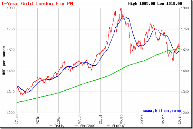
Two weeks back, gold’s price was making a second attempt at a pullback towards its 200 day SMA from below. It was expected that the bears would resort to selling and push the price down once more. But after a bit of a struggle, the price crossed above the still-rising 200 day SMA and has stayed above it since then.

Technically, the support at 1550 was not broken – gold’s price only had a day’s close below the support level. So, the drop from 1900 to 1550 should be treated as a bull market correction. The 30 day and 60 day SMAs (not shown in chart) did not fall below the 200 day SMA. Once the 14 day SMA crosses above the long-term moving average, the bulls will regain control.

Gold’s chart appears to be forming a bullish ‘falling wedge’ pattern, which is a ‘continuation’ pattern from which the likely break out should be upwards. Please remember that technical analysis is not a science, and patterns don’t always play out as expected. Buy on a convincing rise above 1700.

Silver Chart Pattern

Silver_Jan1712

Despite a smart pullback above the 14 day SMA, silver’s price is trading below its 30 day and 60 day SMAs (not shown in chart) and well below the 200 day SMA – the hallmark of a bear market.

The white metal is falling within a downward-sloping channel, making a bearish pattern of lower tops and lower bottoms. The 200 day SMA is forming a ‘rounding top’ pattern, hinting at a further fall in silver’s price.

Senin, 16 Januari 2012

Stock Index Chart Patterns – S&P 500 and FTSE 100 – Jan 13, ‘12

S&P 500 Index Chart

SnP500_Jan1312

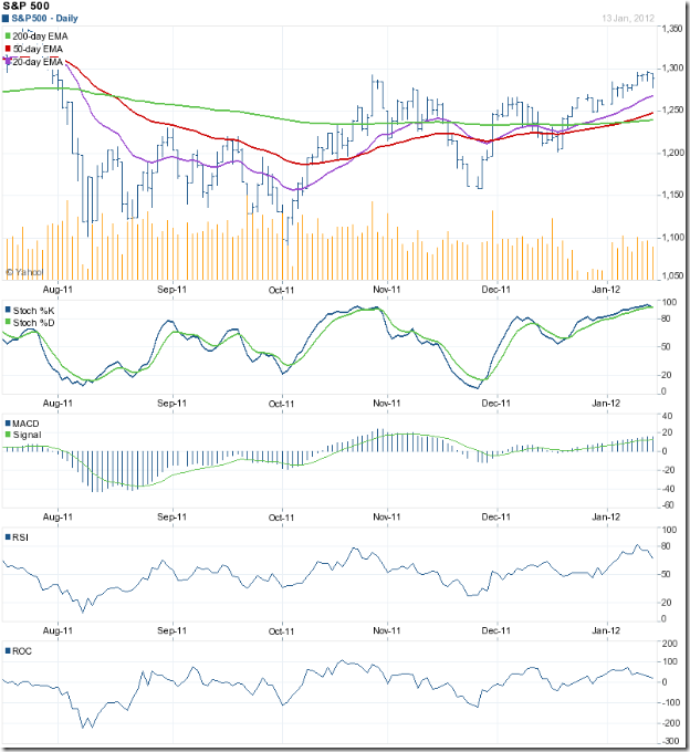
In analysing the chart pattern of the S&P 500 last week, it was mentioned that the bulls had a little more clean up work left before the bears could finally be sent into hibernation. That work has been successfully completed. The index has moved past its Oct ‘11 intra-day high of 1293, forming a bullish pattern of higher tops and higher bottoms; and, the 50 day EMA has convincingly crossed above the 200 day EMA (the ‘golden cross’) confirming a return to a bull market.

Is it time to crack open the champagne? May be not just yet. The index has been trading within a bearish ‘rising wedge’ pattern since touching its Nov ‘11 low. Volumes tapered off during the week’s trading. The slow stochastic is trying to correct the overbought condition. The RSI is already heading down from its overbought zone. The ROC is sliding towards the ‘0’ line. The MACD is positive and above its signal line, but has stopped rising. Expect some correction or consolidation in the current week. Use the likely dip to add, but don’t forget to use a tight stop-loss.

The US economy continues its painfully slow growth, taking half a step back for every step forward. The Reuters/Univ. of Michigan Consumer Sentiment index rose, but ECRI’s WLI index dropped (indicating a weaker economy 6 months down the road). Retail sales in Dec ‘11 rose a meagre 0.1% month-on-month, but a  more respectable 6.5% year-on-year. Weekly initial unemployment claims rose to 399,000. Rail traffic for the week ending Jan 7 ‘12 was down 3.7% compared to the same week in 2011. Not the kind of data that supports a full-fledged bull market.

FTSE 100 Index Chart

FTSE_Jan1312

The FTSE 100 index chart is trying to follow the S&P 500 into a bull market, but is facing some technical headwinds. The 20 day EMA has crossed above the 200 day EMA. The 50 day EMA is trying to do likewise. The index has not yet gone past its Oct ‘11 top. Instead, it is consolidating within a small rectangular ‘flag’ pattern from which it could break out in either direction. The spike in volumes on the last two days of the week is a concern, because the FTSE closed lower on those two days.

The technical indicators are hinting at a correction. The slow stochastic is turning down at the edge of its overbought zone. The MACD is positive and above its signal line, but has started falling. The RSI is moving sideways below its overbought zone. The ROC is positive, but falling sharply. The index has been trading within a bearish ‘rising wedge’ pattern since touching its Nov ‘11 low.

There was some good news for the UK economy. Inflation dropped to 4.8% in Nov ‘11 from 5% in Oct ‘11, and is expected to fall further. That may be a prelude to a dose of Quantitative Easing. But Eurozone problems are affecting exports and can push the economy into a recession. Unemployment remains quite high.

Bottomline? Chart patterns of the S&P 500 and FTSE 100 indices are climbing back into bull markets amid concerns of slow growth and recession. Bull markets are supposed to climb over a wall of worries. That doesn’t mean one has to be gung-ho bullish. Stay circumspect, and accumulate fundamentally strong stocks slowly.

Two interesting links on Technical Analysis

Given below are two links to articles that appeared some time ago on the investopedia.com site:

http://www.investopedia.com/articles/trading/07/technical-fundamental.asp?partner=basics011312#axzz1jbaryrEn

http://www.investopedia.com/articles/technical/112601.asp?partner=basics011312#axzz1jbaryrEn

If you are new to investing or technical analysis, these two articles may arouse your interest to learn more.

If you want some of the concepts mentioned in the two links in an eBook form, just send me an email for the free eBook: Technical Analysis – an Introduction.

Minggu, 15 Januari 2012

BSE Sensex and NSE Nifty 50 index chart patterns – Jan 13 ‘12

BSE Sensex and NSE Nifty 50 index chart patterns closed higher on a weekly basis but both indices are yet to convincingly cross above their 50 day EMAs and down trend lines (marked DTL). The FIIs have stepped up their buying, but DII selling kept the up moves in check.

Q3 results have started to trickle in. Infosys did well, but their Q4 guidance disappointed the market and the stock took a beating. IndusInd Bank declared encouraging results. HDFC results were also good. The market is factoring in some positive policy announcement by the RBI later this month.

Both the indices are trading within their down trend channels and are in bear markets. Till they break out above their downward channels, the bears will remain on top.

BSE Sensex index chart

SENSEX_Jan1312

The Sensex is facing resistance from the blue down trend line (DTL) within the downward-sloping channel. In case the FIIs continue their buying, the up move will need to cross above three important hurdles – the falling 20 week and 50 week EMAs and the upper end of the channel.

The weekly technical indicators are still bearish, but showing signs of turning around. The MACD is negative, but has moved up to touch its signal line. The ROC is negative and below its 10 week MA, but starting to rise. The RSI is just below its 50% level. The slow stochastic has emerged from its oversold zone.

Note that the last four weeks’ trading has formed a bearish ‘flag’ pattern, from which the likely break is downwards. However, volumes have risen during the formation of the flag, which is a contrary indication. Has the rally run its course?

NSE Nifty 50 index chart

Nifty_Jan1312

The Nifty index has moved above its 50 day EMA and the DTL, but not very convincingly yet. Volumes have picked up in the last week, thanks to FII buying. The technical indicators are bullish, but showing signs of weakness. The RSI is above its 50% level, but touching lower tops while the index moved higher. The slow stochastic is turning back after entering its overbought zone. The MACD is rising above its signal line, and about to enter the positive zone. The ROC is positive and above its 10 day MA, but its upward momentum has slowed down.

There has been bullish opinions expressed among some technical analysts that the DTL and the lower end of the downward channel has formed a bullish falling wedge pattern. But two reasons put a question mark over such a prognosis. Falling wedges usually occur as continuation patterns within an up trend. Any pattern formation within a prolonged downward channel is unlikely to have any long-term implication.

A look at the Nifty TRIN should send most bulls scrambling for cover:-

Nifty TRIN_Jan1312

The current rally in the Nifty started after touching a low of 4531 on Dec 20 ‘11 when the TRIN (in red) touched an extremely oversold level of 1.5 (any level of 1.2 and above is considered oversold). The TRIN has now dropped to an overbought level of 0.6 (levels of 0.75 and lower are considered overbought). Is this a warning prior to a break below the downward channel?

Bottomline? The BSE Sensex and the Nifty 50 index chart patterns are in bear markets and falling within downward sloping channels. Several counter-trend rallies have provided bears with opportunities to sell. A sharp fall below the down trend channels can occur at any time. Smart investors may use such a fall to accumulate fundamentally strong stocks for the long-term.

Related Post

Two market breadth indicators

Jumat, 13 Januari 2012

IT Sector stocks – time to change the game plan?

Recently, Sabeer Bhatia (of Hotmail fame) was in Calcutta/Kolkata for a little R&R-cum-business. (December and January are the two most pleasant months in the city, and attracts NRIs by the hordes.) Along with spending quality time with his in-laws and playing golf, Sri Bhatia indulged in promoting his latest venture (JaxtrSMS - free SMS through the Internet), hobnobbing with the Chief Minister and giving press interviews and speeches at IT industry gatherings.

One of the important points he raised was that Indian IT companies are over-dependent on selling services through hiring out consultants to overseas clients. Successful Indian software products are conspicuous by their absence. Apparently, JaxtrSMS has been totally designed and created by Indian software engineers sitting in India. It is time that other companies follow his lead.

Certainly the 10 chart patterns of Indian IT companies attached below indicate that Sabeer Bhatia may be right – it is time to change the game plan from services to products if the Indian IT sector wishes to retain its position in the global pecking order. Already, Philippines and East European countries are taking away IT-enabled service contracts from India.

HCL Tech

HCL Tech_Jan12

HCL Tech formed a double-top reversal pattern during Apr ‘11 to Jul ‘11 and dropped sharply into a bear market. The chart is looking weak and the price can dip to test the Aug ‘11 low. Switch to Wipro.

Infosys

Infosys_Jan12

The recent changes in management seem to have robbed Infosys of whatever little aggression it had. The recent attempts at getting back into a bull market have fizzled out. The stock is looking oversold, and can bounce up towards the blue up-trend line. That will be a selling opportunity.

KPIT Cummins

KPIT Cummins_Jan12

After touching a peak in Jul ‘11, KPIT Cummins is making a bearish pattern of lower tops and lower bottoms, and is in a bear market. The chart is looking weak, and the stock can test and break the Dec ‘11 low. Sell.

Mindtree

Mindtree_Jan12

Ashok Soota’s departure from the helm of affairs hurt the market sentiment badly. The Mindtree stock is trying to extricate itself from a strong bear grip – with some degree of success. The stock is making a bullish rounding bottom pattern, and can be added on dips (but with strict stop-loss).

MPhasis

Mphasis_Jan12

Not sure what MPhasis is doing currently, but the chart pattern shows that it is not doing it well. The stock is deep inside a bear market and likely to fall further. Avoid.

Oracle Financials

Oracle Fin_Jan12

The stock of Oracle Financials peaked out in Jul ‘11 by making a small double-top reversal pattern, and is in a bear market. The stock is expected to resume its fall soon as both the RSI and the slow stochastic are showing overbought conditions. Sell.

Tata Elxsi

Tata Elxsi_Jan12

Tata Elxsi seems to have lost its way, and is sliding in a bear market. The current rally has been on falling volumes and both the RSI and the slow stochastic are looking overbought. Avoid.

TCS

TCS_Jan12

Despite its gap-down fall below the blue up-trend line – probably in sympathy with the Infosys stock – TCS is technically in a bull market. Both the RSI and the slow stochastic are looking oversold, and a pullback towards the blue trend line is on the cards. Use the opportunity to book partial profits. Q3 results may not be as bad as some are expecting.

Tech Mahindra

Tech Mahindra_Jan12

Tech Mahindra is another stock that peaked out in Jul ‘11 and quickly slipped into a bear market. The next leg of the down move may start soon. Get out.

Wipro

Wipro_Jan12

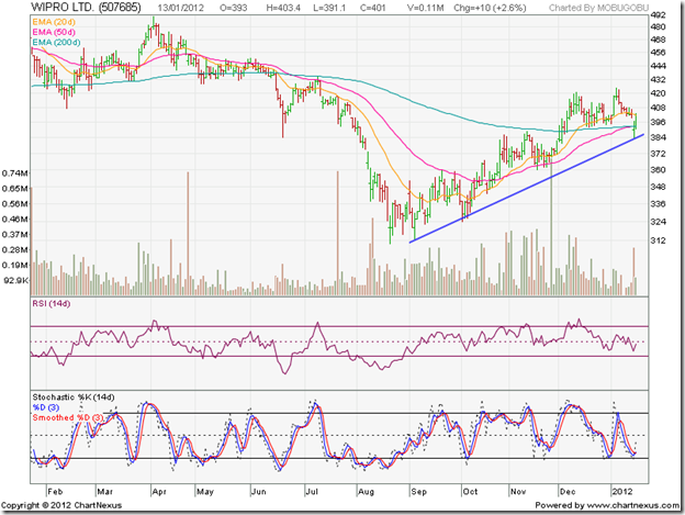
Wipro has recovered very smartly after a short spell in a bear market. The ‘golden cross’ of the 50 day EMA above the 200 day EMA will confirm a bull market. Change of CEO has brought in new direction and aggressiveness that was lacking earlier. Use dips to buy.

Related Post

In which IT Sector stocks should you invest?

Kamis, 12 Januari 2012

Why did the stock market fall despite a good IIP number?

India’s Nov 2011 IIP (Index of Industrial Production) came in at 5.9% – higher than the consensus estimate – raising hopes of a quick return to the growth path. Considering the Oct 2011 IIP of –5.1%, there was a huge 11% swing month-on-month.

The stock market should have celebrated by spiking higher – specially since both the Sensex and Nifty are in the midst of rallies from their recent bottoms. Instead of doing the obvious by rising, both indices lost ground. Not much, but enough to cause consternation among small investors.

What is going on? Is this just the way Mr Market behaves to separate investors from their hard-earned money?

There can be a few logical explanations, which are mentioned below:

1. Both the Sensex and Nifty are in the midst of prolonged bear markets. Good news tend to get ‘discounted’ quickly and bad news causes renewed selling during bear markets.

2. Infosys – which is generally considered to be one of the bellwethers of the Indian stock market – announced better than expected Q3 results, but disappointing Q4 guidance and got hammered. Its high weightage in both indices caused the fall.

3. Oct 2011 IIP number was unusually low – but one must remember that it was a festival month (Navratri and Diwali), which meant lower production days due to the holidays. Nov 2011 IIP was comparatively much better, but some of the new orders may be due to inventory replenishment. Lower growth usually leads to inventory draw-downs (companies tend to let their existing inventory get depleted almost completely before placing new orders).

4. Technically, both indices retreated after facing twin resistances from their 50 day EMAs and DTLs (refer last Sunday’s post on Sensex and Nifty chart patterns).

5. All of the above.

Stock markets don’t necessarily move according to logic. In the short-term, sentiments can, and often do, overrule the fundamentals. So can a rush of buying or selling by the FIIs. What should small investors do?

Remember an old saying: “Buy the rumour; sell on news.” There is no better example of that maxim than today’s price action in the TTK Prestige counter. The company announced impressive Q3 results, but the stock lost more than 7% after the ‘good news’!

The stock market is in a state of flux. After 14 months of down trend, small investors are becoming impatient to buy in the hope of a trend reversal soon. Please be aware that interest rate is still high. So is inflation – though food inflation has turned negative. Stock markets don’t reverse trend till the first few interest rate cuts happen.

There is a clamour for a CRR rate cut from all corners. If the Nov 2011 IIP figure is the reality, i.e. economic growth is back on track instead of what has been mentioned in point 3 above, then there is no reason for the RBI to cut the CRR – let alone cut the interest rate. A rate cut may stoke the inflation fire.

In other words, there is no need to turn bullish yet. Await Q3 results of the big guns and RBI’s policy announcement on Jan 24. You may miss the absolute bottom by being conservative, but in a bear market it is better to be safe than sorry.

Rabu, 11 Januari 2012

USDJPY not tradeable

I have stopped trading the USD/JPY. If you look at the chart you can see it’s flat lining with no price swings.  Take a look at the ATR on different time frames, the intraday isn’t that great either.

The average weekly range was around 430 points just prior to 2009, and since then it has fallen lower and lower, and now stands at a 117 points PER WEEK. The average daily trading range has often been in the 50-60 points region, sometimes more, but it has dropped off sharply to what must be close to an all-time low of just 31 points.

It is probably best to concentrate on the other major currency pairs instead, such as the GBP/USD and EUR/USD pairs for example, but watch that EUR slide!!

Selasa, 10 Januari 2012

Free eBook on Technical Analysis – thanks and clarifications

The free eBook: ‘Technical Analysis – an Introduction’ was launched on the last day of 2011 – after considerable time spent at the planning stage. Some important concepts in technical analysis has been covered in brief, with real-life chart examples.

The idea was to generate curiosity and interest among small investors so that they may get motivated to delve deeper into the subject. There are some excellent and comprehensive books – such as the ones written by Edwards/Magee and Martin Pring – which cover technical analysis in greater detail. (The search box of flipkart.com at the bottom of the page can be used for searching books on investment.)

The response from regular as well as new readers has been quite overwhelming, and everyone deserves special thanks for making my endeavour in producing the eBook worthwhile. Some have already finished reading the eBook and provided suggestions for improvement. Reader involvement is appreciated.

A few of the reader feedbacks received so far made it necessary to post a few clarifications about the purpose of the eBook. The most important one is to demystify the subject of technical analysis.

Technical analysis is not a magic potion that will suddenly turn short-term trading losses into profits overnight. Nor will it identify unknown stocks that will turn a Lakh into a Crore within a short time. But knowing the basics will help investors to take more informed decisions about when to enter and when to exit a stock.

A second point worth mentioning is that the eBook is not going to turn novice investors into expert technical analysts. Becoming an expert requires several years of experience and application – as in any other subject.

A third point is that many technical patterns have specific ‘rules’ associated with them. Remembering the pattern but not the rules can cause serious losses. The human mind seems programmed to see patterns where none may exist. Bigger problems are confusing bottom-reversal and top-reversal patterns, and jumping to conclusions about a pattern before it has fully formed.

Last but not the least, is that it isn’t necessary for similar patterns to behave identically. In a recent post on IFCI Ltd, four ‘rising wedge’ patterns were identified - each behaved a little differently from the other. So, it is not enough to identify a pattern. One has to remain flexible about the outcome of the pattern.

If you haven’t yet received a copy of the free eBook, you can get one by sending an email to:mobugobu@yahoo.com

Senin, 09 Januari 2012

Stock Index Chart Patterns – S&P 500 and FTSE 100 – Jan 06, ‘12

S&P 500 Index Chart

SnP500_Jan0612

In last week’s analysis of the S&P 500 index chart pattern, the technical indicators were looking bullish and the 20 day EMA had crossed above the 200 day EMA. The 50 day EMA has just crossed above the 200 day EMA – for the first time since Aug ‘11 – but the cross hasn’t been a convincing one yet. The ‘golden cross’ (of the 50 day EMA above the 200 day EMA) confirms a return to a bull market.

A little more work remains to be done by the bulls. The Oct ‘11 intra-day top of 1293 has to be surpassed to form a bullish pattern of higher tops and higher bottoms. There are a couple of technical concerns. Volumes have not been that great. The technical indicators are showing some signs of being overbought.

The slow stochastic is inside the overbought zone. The RSI is about to enter its overbought zone. The MACD is positive and rising above its signal line. The ROC is rising in positive territory. These are bullish signals. But there is a tendency to hesitate near a previous top (or bottom).

The US economy is returning to the growth path – albeit slowly. Initial unemployment claims came in lower at 372,000. Non-farm private sector employment rose to 325,000 in Dec ‘11 from 204,000 in Nov ‘11. Part of the rise can be attributed to holiday season part-time hires. The Jan ‘12 employment figures will reveal the true picture. AAII’s survey of individual investors showed bullish sentiment at an 11 month high of 48.9%, and bearish sentiment at a year low of 17.2%.

FTSE 100 Index Chart

FTSE_Jan0612

The FTSE 100 index chart is trying to follow in the footsteps of the S&P 500 index by trading above its 200 day EMA – but is a few steps behind. Note that both the 20 day EMA and 50 day EMA are still below the 200 day EMA, though the 20 day EMA may cross above the long-term moving average soon.

Volumes are on the lower side, which puts a question mark on the sustainability of the current rally. The Oct ‘11 intra-day high of 5747 needs to be crossed. The technical indicators are showing signs of weakness. The slow stochastic is at the edge of its overbought zone, and moving sideways. The RSI is dropping towards its 50% level. The MACD, which is a lagging indicator, is rising above its signal line in positive territory. The ROC is also positive, but its upward move has stalled.

The UK economy continues to lag the bullish stock index. Retail sales during the recent holiday season were not up to the mark. This could lead to more job losses as businesses downsize to survive. Stronger-than-expected growth in the dominant services sector last month may have saved the UK economy from contraction in the final quarter of 2011, as per this article. The December PMI figure was 49.6, up from the 47.7 recorded in November, but still below the 50 mark that signals growth.

Bottomline? Chart patterns of the S&P 500 and FTSE 100 indices appear poised to return to bull markets, despite the sluggish growth (or, lack of it) in the US and UK economies. However, every silver lining has a dark cloud. Both indices appear to be forming bearish ‘rising wedge’ patterns from their Nov ‘11 lows, which could lead to downward breaks and retreats back to bear markets. So, caution is advised till the Oct ‘11 tops are convincingly surpassed.

Minggu, 08 Januari 2012

BSE Sensex and NSE Nifty 50 index chart patterns – Jan 07 ‘12

The BSE Sensex and NSE Nifty 50 index chart patterns spent the first week of the new year consolidating within narrow ranges in an extended week necessitated by the extra trading on Saturday to test a new software installation at NSE.

Food inflation came in at a negative figure – probably due to the high ‘base effect’ and seasonal inflow of vegetables. Much was made of the higher than expected PMI figure – but whether the improvement was due to inventory replenishment (which happens after inventory draw downs during a slower growth period) or rising production due to new orders will only be known after a couple of months.

Government’s annual budget has been postponed by two weeks to accommodate elections in a few states. Till then, important policy decisions will be kept in abeyance. Not that this government has been very forthcoming with important policy decisions! Q3 results, to be announced from this week onwards, and RBI’s interest rate policy announcement towards the end of this month will be the next triggers for the indices to change directions or continue their downward slides.

BSE Sensex index chart

SENSEX_Jan0712

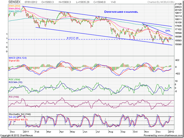
The Sensex played hide-and-seek with its 20 day EMA and managed to stay above the support level of 15700. But it is trading well below its 200 day EMA, and also below its 50 day EMA and the small down trend line (marked DTL). The bears are very much in control. The convergence of the 50 day EMA and DTL may provide strong resistance on the up side.

Can the Sensex move up much further from here? The technical indicators are giving out mixed signals. The MACD is rising above its signal line, but is in negative territory. Mildly bullish. The ROC has dropped below its 10 day MA into the negative zone. Bearish. The RSI is rising above its 50% level towards the overbought zone. Bullish. The slow stochastic turned down immediately after entering its overbought zone. Mildly bearish. Honours were even between the bulls and bears last week.

Some more sideways consolidation can be expected in the near term.

NSE Nifty 50 index chart

Nifty_Jan0612

Despite the extra trading session on Sat. Jan 7 ‘12, the weekly volume bar of the Nifty isn’t conducive for a stronger rally. Note that the last three green volume bars (representing weeks when the Nifty closed higher than the previous week) are reducing in size. That shows lack of buying conviction.

The technical indicators are all bearish, but showing faint signs of a turn around. The MACD is below its signal line, but has stopped falling. The ROC is looking very weak, falling below its 10 week MA, deeper into the negative zone. The RSI is trying to climb towards its 50% level. The slow stochastic is trying to emerge from its oversold zone.

The Nifty is trading well below its 20 week and 50 week EMAs, and remains in a bear market.

Bottomline? The BSE Sensex and the Nifty 50 index chart patterns continue their falls within downward-sloping channels. The balance of power is with the bears, and sharp falls below the channels may happen at any time. Some mid-cap and small-cap stocks have started jumping around. Don’t be tempted to buy – these are called ‘sucker’s rallies’. Remain patient. If you want to buy for the long term, accumulate fundamentally strong stocks slowly.

Jumat, 06 Januari 2012

Stock Index Chart Patterns – Hang Seng, Singapore Straits Times, Malaysia KLCI – Jan 6 ‘12

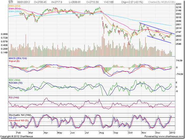
The chart patterns of the Asian indices, last analysed three weeks back, are showing clearly diverging moves. The Hang Seng index is moving sideways in a bear market; the Straits Times index is sliding down in a bear market; the KLCI Malaysia index is climbing up in a bull market.

Hang Seng Index Chart

HangSeng_Jan0612

Since touching an intermediate top at 20173 in Nov ‘11, the Hang Seng index has been consolidating sideways within a symmetrical triangle pattern. The index is trading well below its falling 200 day EMA, so the logical break out of the triangle should be downwards. But triangles can be unpredictable. The index may break out upwards or continue to trade sideways.

The technical indicators are bullish, but showing signs of weakness. The MACD is above its signal line and trying to enter the positive zone. The ROC is positive and above its 10 day MA, but turning down. The RSI is above its 50% level, but its upward movement has stalled. The slow stochastic has dropped down from its overbought zone.

A break below the triangle could lead to a test of the Oct ‘11 low.

Singapore Straits Times Index Chart

Straits Times_Jan0612

The Singapore Straits Times index is in a bear market, and has been trading within a downward-sloping channel for the past couple of months. Note the falling volumes, which is typical in down trends.

The technical indicators are giving contrasting signals. The MACD is rising above its isgnal line, but is still in negative territory. The ROC is positive and above its 10 day MA, but has turned around sharply. The RSI has climbed towards its overbought zone. The slow stochastic has already entered its overbought zone.

The index may make another attempt to cross above the downward channel. Whether it will be successful or not is a moot point.

Malaysia KLCI Index Chart

KLCI Malaysia_Jan0612

The KLCI Malaysia index appears to have shaken off the bears as it climbed above all three EMAs. The index is trading within an upward-sloping channel. The 20 day EMA has crossed above the 200 day EMA. The 50 day EMA is all set to follow suit – the ‘golden cross’ will confirm a return to a bull market.

The bears have not been vanquished yet. Note the progressively lower volume peaks as the index has moved up. There are negative divergences visible in the MACD and ROC, which failed to touch higher tops with the index. The technical indicators are correcting from overbought conditions.

A drop to the lower edge of the channel is a possibility, but the up trend may not get reversed.

Bottomline? The three Asian index chart patterns are moving in three different directions. The Hang Seng index is consolidating within a triangle; await the break out. The Singapore Straits Times index is in a down trend; sell the rallies. The KLCI Malaysia index is in an up trend; buy the dips.

Kamis, 05 Januari 2012

5 strategies to follow in a bear market

Most small investors enter the stock market when a bull market is nearing its peak. They don’t have clear goals and strategies, and get caught on the wrong foot by the bear market that inevitably follows. The trauma of losing money in a hurry can be soul-destroying.

Without the necessary skills and experience of surviving in a bear market, investors resort to all kinds of ill-advised strategies in an effort to quickly recover the losses. That only makes a bad situation worse.

The current bear phases in the Sensex and Nifty indices are 14 months old, and so far there has been very little indication of a reversal in the down trends. Experts are saying that the bear phase can last till the first half of Financial Year 2012-13. If they are right, the bear market may sustain till Sep 2012 – another 9 months!

Whether you are one of the unfortunates who are ‘stuck’ at higher levels, or a more seasoned investor who is sitting on cash to deploy at lower levels, here are 5 strategies that you may want to follow in the current bear market:-

1. Remember that bear market rallies are sharp and swift. Don’t jump in by thinking that you will miss a buying opportunity at a low entry price. Such rallies are some times ‘created’ by bears so that they can sell at a higher price.

2. Just because a stock has fallen to a 52 week low doesn’t mean it can’t fall any lower. As long as the trend is down, it can fall lower. If it is worth buying, being patient can help you to enter at a much lower price.

3. A sharp vertical drop in price – often accompanied by strong volumes - usually attracts a lot of buyers who believe that they are being smart by entering at a low price. It is the sign of a ‘panic bottom’, which seldom holds. Prices bounce up on the buying, but then fall lower than the ‘panic bottom’.

4. At the risk of sounding like a broken record (or, a damaged CD) – do not, repeat do not, average down in price. No one knows how much further a stock’s price will fall, or worse still, if it will ever recover (e.g. Cranes Software). It is far better to average up once the price forms a bottom and starts its up move.

5. Major down trends are not reversed in a day or a week. Bottom reversal patterns take a few weeks to a few months to form. Ability to ‘read’ chart patterns can help investors to accumulate a stock while a reversal pattern is ongoing (refer Chapter 7: Reversal Patterns of my free eBook: Technical Analysis – an Introduction).

If you can’t ‘read’ a reversal pattern, don’t worry. Eventually, prices will turn up and a new bull market will begin. You may enter at a higher price, but the chances of a loss can be minimised by using a trailing stop-loss.

Related Posts

Five things you should avoid in a bear market
Five more things to avoid in a Bear Market

Rabu, 04 Januari 2012

Stock Chart Pattern - IFCI Ltd (An Update)

The previous update of the stock chart pattern of IFCI Ltd was posted more than a year back. The stock had touched a high of 78 in Nov ‘10, followed by a sharp correction to 50 and appeared to be consolidating within a triangle.

All four technical indicators – MACD, ROC, RSI and slow stochastic - touched lower tops while the stock rose to its high. The combined negative divergences had provided advance warning of a correction. The following comments were made: “If you are still holding, maintain a strict stop-loss of 54. A better idea may be get out and not go anywhere near this stock again.”

The last comment seems almost prophetic when you look at the bar chart pattern of IFCI Ltd:

IFCI_Jan0412

The negative divergences in all four technical indicators, formed during Oct – Nov ‘10 have been marked by blue arrows. After the sharp drop from the peak of 78 to a low of 50 below all three EMAs in Nov ‘10, the stock consolidated within a bearish ‘rising wedge’ pattern – marked 1 – and rose above all three EMAs.

The break down below the wedge in Jan ‘11 was followed by a pullback towards the wedge, which received combined resistances from the 20 day and 200 day EMAs. Such pullbacks happen often, but not always, as can be observed in the ‘rising wedges’ marked 2 and 4. The stock price dropped to a low of 46 in Feb ‘11 and started forming a slightly prolonged ‘rising wedge’ – marked 2. The ‘death cross’ of the 50 day EMA below the 200 day EMA confirmed a bear market.

‘Rising wedge’ number 2 failed to cross above the 200 day EMA. The stock broke down without a pullback to a low of 44 in May ‘11 before starting a consolidation within another ‘rising wedge’ – marked 3. The break down below ‘rising wedge’ number 3 wasn’t followed immediately by a pullback. It came after 10 days. The subsequent slide went all the way down to 28 in Oct ‘11, before the formation of ‘rising wedge’ number 4.

The sharp break down below ‘rising wedge’ number 4 touched a low of 20 in Dec ‘11. Note that all four technical indicators showed positive divergences by touching higher bottoms – marked by blue arrows – suggesting an upward bounce. Since the stock was deep in a bear market – having lost 75% from its peak of 78 – the bounce wasn’t strong enough to cross above the 50 day EMA, despite solid volume support.

There is every possibility of the stock falling to its Mar ‘09 low of 15. The fundamentals don’t look very encouraging. Hopes of a banking licence has receded. The MD is under scrutiny by the authorities. The government may replace its debt with equity and gain management control. The volatility in the price has turned it into a trader’s favourite.

Bottomline? The stock chart pattern of IFCI Ltd is an example of how mismanagement of operations and finances has enabled the bears to create havoc. Small investors should steer clear of such ‘cheap’ stocks.

Selasa, 03 Januari 2012

Gold and Silver Chart Patterns: pullback rallies

Gold Chart Pattern

Microsoft Word - Document1

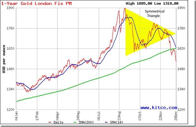
Two weeks ago, the following comment was made about gold’s price chart: “A pullback to the long-term moving average was only to be expected, and has been in progress for the past three trading sessions.” Some times, price charts provide an ego boost to technical analysts by behaving exactly as per expectations. The pullback reached the still-rising 200 day SMA, only to encounter selling pressure and plummet to a close below the 1550 level.

The break down below the symmetrical triangle pattern and the pullback to the 200 day SMA were both selling opportunities. At the time of writing this post, another pullback attempt is in progress to prevent a bear market – but it may meet the same fate as the previous one. The 14 day SMA is about to drop below the 200 day SMA. A close below 1520 will confirm a bear market.

Technically, the support at 1550 hasn’t been convincingly breached yet because gold’s price jumped up after a single day’s close below 1550. There is stronger support between 1450 and 1480, if 1550 does get breached eventually. Can gold’s price fall even lower? Anything is possible once the bears get the upper hand – and the technical signals are looking ominous for bulls.

Silver Chart Pattern

Microsoft Word - Document1

There are no doubts about bear domination of silver’s chart pattern. The white metal dropped to a new closing low of 26 for a day before embarking on a sharp pullback. The 14 day SMA (as well as the 30 day and 60 day SMAs – not shown in the chart) is falling below the 200 day SMA and silver’s price is trading below both SMAs – the sign of a bear market.

Stay away till trend-reversal signals become visible.

Related Posts Plugin for WordPress, Blogger...