S&P 500 Index Chart
In last week’s analysis, I had mentioned that the S&P 500 index chart looked overbought and ripe for a correction. But the way every dip was being used by the bulls to buy, any correction would be a short one.
I have added Bollinger Bands to the S&P 500 chart, which shows that the index failed to touch the upper edge of the band when it reached a new high of 1344 on Feb 18 ‘11. So, the three days of correction last week wasn’t entirely unexpected. Neither was the quick recovery on strong volumes on Fri. Feb 25 ‘11 that prevented the index from falling to the rising 50 day EMA and the lower edge of the band.
The technical indicators have weakened. The MACD is well below its signal line, and both are falling. The slow stochastic almost dropped to its oversold zone before making a slight recovery. The RSI showed a bit of resilience by bouncing up from its 50% level. The 1300 level should be observed closely. A drop below it could mean a breach of the 50 day EMA and formation of a bearish pattern of lower tops and bottoms.
The crisis in Libya and the resulting spike in oil prices may have triggered the correction. The downward revision in Q4 GDP growth rate from the earlier estimate of 3.2% to 2.8% may have been another trigger. Some times, investors just look for an opportunity to book profits. There is no immediate threat to the bull market. Stay invested, but maintain appropriate stop-losses.
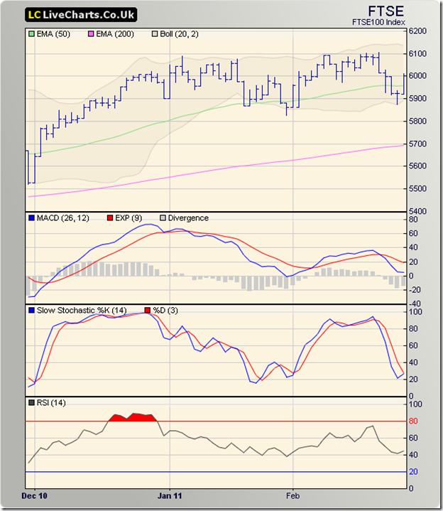
FTSE 100 Index Chart
The addition of Bollinger Bands on the FTSE 100 chart shows a technical reason for last week’s correction. The new high of 6106, reached on Mon. Feb 21 ‘11 failed to reach the upper edge of the band. All three technical indicators reached lower tops than the one’s in Dec ‘10.
The negative divergences contributed to the sharp correction. The index breached the 50 day EMA and touched the lower edge of the band. The pullback on Fri. Feb 25 ‘11 helped the FTSE 100 to close above the 50 day EMA and the 6000 level. The index has traded within a range of 5800 – 6100 for nearly three months.
The technical indicators are looking bearish. The MACD is barely positive and well below the signal line. The slow stochastic had a small bounce from its oversold zone. The RSI is below the 50% level. There could be some more sideways consolidation. As long as the index trades above its rising 200 day EMA, bulls will be in charge.
Bottomline? The sharp corrections in the chart patterns of the S&P 500 and FTSE 100 indices were caused by technical and fundamental reasons. Uprisings in North Africa and the Middle-East have pushed up oil prices. Caution should be the watch-word till the dust settles. Take some profits off the table. Stay invested, with suitable stop-losses.

