Kamis, 31 Maret 2011

Notes from the USA (Mar 2011) – a guest post

The Indian markets are on a tear once again, as the FIIs have renewed their buying after a few months of profit booking. What caused the turnaround? Is it the realisation that the US and European economies are growing a lot slower than expected earlier?

In this month’s guest post, KKP takes a look at the US housing market, and points out that while there are signs of improvement, it may take quite a while before normalcy returns. KKP is a very busy person, wearing multiple hats. Yet he still finds time to write these monthly posts to enlighten this blog’s readers about the real state of the US economy.

------------------------------------------------------------------------------------------------------------

Current State of the Economy and the Housing Market

Guys, as I have been writing about the state of the US economy, there are many things that surprise me and others that just go ho-hum as expected. For example, the housing data for the fourth quarter of 2010 as released in Feb 2011 indicate that the recovery in the housing market continues to remain fragile. In the production sector, single-family housing permits increased and new housing starts remained steady, although completions fell. Multifamily housing permits (i.e. apartment buildings), starts, and completions all fell, although permits and completions were down only slightly.

This really means that overall, the existing resale of real estate as well as new constructions were down in the 4th quarter. As a result, inventories of available homes at the current sales rate decreased in the fourth quarter of 2010, reaching an average rate of 8.0 months’ supply of new homes and 9.4 months’ supply of existing homes, down from rates of 8.5 and 11.7 months’ supply, respectively, in the previous quarter. This seems like contradictory data, but it is really still a soft market. Here is a graphical representation from the CSI for Chicago:

clip_image002

As we started March 2011, I continued the zeal to own more real estate, and my searches have led to too much competition from other buyers like me who are snapping up ‘deals’. When I say ‘deals’, this means housing that is at the low end of the market for any sub-division or area. This means that ‘bargain hunters’ like me are tracking these houses and apartment building and bidding on those. When a home comes on the market, within a week or so there are multiple buyers, who then go into Best and Final Offers, and then the highest price wins. The above is not in the ‘auction market’. In the auction market higher prices are bound to happen since the auctioneer creates this type of a competitive environment, collects all the buyers, and sets a time-line of when someone can bid on homes. I have used ‘auctions’ to my advantage to put a competitive bid on the table for a home being sold by a broker versus an auction bid in progress for a home on the same street.

Home pricing across the US is still soft, as depicted by the two graphs below. It will take some time for the tide to rise again, although all of it depends on how the overall economy performs, and how job growth fares.

clip_image002[4]

My most recent home purchase was a contract that we finalized on Dec 21st, 2010, that finally came to a conclusion this week (March’2011)…..3 months to come to a conclusion is normal these days, and this one was purchased in a bid, although not an auction. It takes a lot of courage to put hard earned money to work, but when we get a deal for 29.723 cents to the dollar, it was hard to refuse for a 4 bedroom, 2 bathroom, 2 kitchen, and 1 car garage property (basically 2 flats in one building). You might ask, why do you think it was being given away? Because these are homes where the owner cannot pay the mortgage for more than 1 year, and it was time for the Bank to own it and then the Sheriff to come and get the home evacuated. We will do some fixing up to make it pretty and upgrade a few things and rent it out. That is a successful model with a high ROI (Return on Investment) on the investment from the rents. ROIs in property investments of this kind range from 12% to 26% on the investment today, without accounting for any capital gains on the property when we eventually sell it.

clip_image002[6]

Mortgage rates are slowly coming down due to soft demand, but we are still looking at 5½% to 6% borrowing rate on any home loans with people who have a decent job. If one does not have a decent job, or no job at all, it is impossible to get a mortgage from a bank, which means that their intent to buy the house is only a dream. Too many people fall into the latter category, which is why the rental market is really hot relative to buying.

Hostels/Dormitories where kids have to live while they are in college are also raising their prices simply due to demand at Universities, but also because, rents are going up. Well, an alternative that a parent has to getting a kid into a hostel is to buy a condo/apartment/flat near the university and allow their kids to stay in it. This is my plan for my kids, although it takes time to pull off a strategy of this kind. Many parents are trying based on my research and findings. This again must be due to the fact that condos have gotten cheaper and dormitory fees have gotten higher ($11,000 per year per child for 8 months of University studies which consists of 2 semesters).

Jobs on the other hand are very selective and almost a privilege to have, and hence everyone is working their tail off to keep their job, and advance in their career. Corporations are optimizing their resources heavily while putting a ton of automation into their business processes to eliminate heads. This steady reduction in work-force and the doldrums in the economy are going to continue to put a lid on real estate market (ownership), whereas it is going to keep the rental market alive and well for 2 to 5 years (minimum). I do see the real estate market starting to turn in 2-5 years (by 2015) assuming that we do not get any effects like Japan in the US, or economies like Japan does not affect the overall US economy or US dollar.

Technologies that make the US economy more efficient are being implemented by corporations with video conferencing, Voice over IP, variety of portals, automated scripting, cloud computing, Web 2.0, alternative energy, Pads of all kinds, mobile platform (along with automation) etc making our world simpler/faster/better. This is bringing some stability to the people who are part of the leading edge technologies (sales, implementations and operations). Service industries that serve the running of the economy are also surviving, but if the business model is weak, then those are getting weaker day by day, and the weaker ones are tumbling. This is keeping the unemployment at the published 9-10% levels, although who knows what the real number is below the surface.

We shall see what 2011-12 brings with it…..Once again, if one has a good job and is keeping up with the changes, then this economy is soft or in recession. If one is not keeping up with the technological changes, then this is a recessionary environment for them, but if one has lost their job, it definitely feels like a depression.

In the meantime, enjoy the super-bull-market of India – everything has a cycle, so just as the pundits say, things do not grow to the sky, and everything that goes up has to come down. So, capitalize while you can, since everything does not stay green all the time!!!!!! Please put views from your rose coloured glasses on the blog as usual….

------------------------------------------------------------------------------------------------------------

KKP (Kiran Patel) is a long time investor in the US, investing in US, Indian and Chinese markets for the last 25 years. Investing is a passion, and most recently he has ventured into real estate in the US and also a bit in India. Running user groups, teaching kids at local high school, moderating a group in the US and running Investment Clubs are his current hobbies. He also works full time for a Fortune 100 corporation.

Selasa, 29 Maret 2011

A Simple Exercise on Cash Flows

Last week, I had written two posts about how to read the Cash Flow statement in an Annual Report. An old proverb says: The proof of the pudding is in the eating. The best way to figure out whether you have understood the basic concepts of the Cash Flow statement is to do a simple exercise.

Here are three companies and their condensed Cash Flow statements. Analyse the three on the basis of their Cash Flows, and explain which of the three companies you would like to invest in, and why. All three companies are popular among small investors, but their names have been deliberately hidden to remove any bias in your analysis.

Company ‘A’

(Rs crore)

Mar '10 Mar '09 Mar '08

Mar '07

Mar '06
Profit before tax 710.15 157.04 344.84 231.16 92.90
Cash flow - operations 344.66 4.88 105.47 49.48 3.78
Cash Flow - investing -406.21 -301.73 -12.00 -606.64 -232.01
Cash Flow - financing -14.15 160.97 -185.45 723.43 356.58
Incr/decr in cash -75.70 -135.88 -91.98 166.27 128.35

Company ‘B’

(Rs crore)

Mar '10

Mar '09

Mar '08

Mar '07

Mar '06

Profit before tax

328.84

273.78

285.33

185.10

103.73

Cash flow - operations

179.68

46.83

-377.53

-127.51

-83.85

Cash Flow - investing

-127.77

-236.37

-132.33

-426.58

-288.69

Cash Flow - financing

8.09

113.28

463.37

533.80

164.20

Incr/decr in cash

59.99

-76.27

-46.65

-20.53

-208.33

Company ‘C’

(Rs crore)

Mar '10 Mar ‘09 Mar ‘08 Mar ‘07 Mar ‘06
Profit before tax 213.64 216.23 195.62 181.01 91.90
Cash flow - operations 1148.20 206.11 -19.21 -271.94 -89.61
Cash Flow - investing 19.20 -844.59 -1410.82 -641.73 -434.46
Cash Flow - financing -1176.20 626.72 1388.16 1054.87 524.54
Incr/decr in cash -8.80 -11.76 -41.87 141.20 0.27

The last rows in each of the three tables is the sum of the previous three rows, giving the net cash at the end of each year. Negative numbers mean cash outflows; positive numbers mean cash inflows.

If you are one of those who gets scared by tables full of numbers, let me assure you that it isn’t my wish to scare you at all. It is far more scary to invest in the shares of a company without having a clue about how much cash it is generating and using up.

So put on your thinking caps, and give it a shot. Results (and the company names) to be announced next week. Needless to say, the most logical attempt(s) at answering will be duly acknowledged.

Related Posts

How to read the Cash Flow Statement – Part 1
How to read the Cash Flow Statement – Part 2

Senin, 28 Maret 2011

Stock Index Chart Patterns – S&P 500 and FTSE 100 – Mar 25, ‘11

S&P 500 Index Chart

image

In last week’s analysis of the S&P 500 index chart pattern, the technical indicators were looking bearish, but the bull market was intact as the index was trading above its rising 200 day EMA. Bulls needed to cross the hurdle of the 50 day EMA with good volumes to regain control.

After three days of hesitation near the medium-term moving average, the S&P 500 finally climbed back into bull territory with a 2.7% weekly gain. But volumes were lower than the previous week’s. Conquering the Mar ‘11 top of 1332 should now be on the agenda of the bulls. The technical indicators are pointing to such a possibility.

The MACD has crossed above the signal line in positive territory. The slow stochastic has risen rapidly above its 50% level. The RSI has also moved above its 50% level. After a sharp ‘V’ shaped rally on comparatively lower volumes, a pullback towards the 50 day EMA can’t be ruled out. Use it to add.

The economic news was mixed. Q4 GDP growth was revised upwards. Results from tech companies were good. But Univ. of Michigan Consumer Sentiment index was below consensus estimates and down 10 points from Feb ‘11. Rising gas and food prices remain a concern. Bull markets are supposed to climb on a ‘wall of worries’, and that is exactly what the S&P 500 appears to be doing. Use trailing stop-losses and stay invested.

FTSE 100 Index Chart

image

Bearish hopes were dashed as the FTSE 100 index chart moved above the 200 day EMA to the 5800 level, and consolidated sideways for three days. A spurt on the last two days of the week, albeit on lower volumes, saw the index close above the 50 day EMA with a 3.2% weekly gain.

Can the rally be sustained? It may require quite a bit of effort from the bulls. The MACD has crossed above its signal line, but remains deep in negative territory. The RSI is still below its 50% level. The slow stochastic is looking bullish with a smart rise above its 50% level. The bearish pattern of lower tops and lower bottoms will not be negated till the FTSE 100 index crosses the Mar ‘11 top of 6052.

The bad news of the Japanese disaster and the Middle-East crisis seem to have been discounted, and technically the FTSE 100 is in a bull market.

Bottomline? The chart patterns of the S&P 500 and FTSE 100 indices appear to have recovered from decent corrections and are back in bull markets. Investors should remain invested, but maintain trailing stop-losses to protect profits.

Minggu, 27 Maret 2011

Stock Index Chart Patterns - BSE Sectoral Indices, Mar 25, '11

Last month, the chart patterns of the BSE Sectoral indices were trying to recover after varying degrees of correction. Are the corrections over, or is there more pain in the offing? Let us take a look.

BSE Auto Index

BSE Auto Index

The BSE Auto index has remained range bound within 8130 at the lower end and the 200 day EMA at the upper end. The bad news is that the long-term moving average is proving to be a tough hurdle. The good news is that the 50 day EMA is yet to fall below the 200 day EMA – keeping alive bullish hopes. The technical indicators are suggesting that the recent rally may break above the combined resistances from the 50 day and 200 day EMAs. The next hurdle on the up side will be the 9220 level. Hold.

BSE Bankex

BSE BANKEX

The BSE Bankex is looking more bullish than the Auto index - showing real signs of recovery. The chart formed a bullish ascending triangle pattern (flat top, higher bottoms), from which it has broken upwards (marked by the blue arrow). In the process, the index has moved above both the 50 day and 200 day EMAs. The technical indicators are all bullish. The rally is likely to continue, but watch out for a pullback down to the 12770 level. Buy the dips.

BSE Capital Goods Index

BSE Capital Goods Index

The woes of the BSE Capital Goods index continue as it languishes in a bear market. The recent rally has found resistance from the falling 50 day EMA. The only solace for the bulls is that the Feb ‘11 low of 12146 has not been breached, and the index has managed to move above the 13000 level. In spite of the bullish technical indicators, the bulls need to cover a lot of ground just to reach its falling 200 day EMA. With rising interest rates, this sector is really taking it on the chin. Avoid.

BSE Consumer Durables Index

BSE Consumer Durables Index

The BSE Consumer Durables index is back in bull territory after a steady rally. It seems to be forming a bullish rounding bottom pattern. All four technical indicators are looking bullish, but periodic corrections can be expected during the up move. Buy the dips.

BSE FMCG Index

BSE FMCG Index

The BSE FMCG index seems to have bottomed out, and is making another effort to climb above the 3500 level after several failed attempts earlier during the month. The index found support from the 200 day EMA during the recent corrective move, and is trading above both the 50 day and 200 day EMAs. The technical indicators are showing bullish signs. Buy the dips.

BSE Healthcare Index

BSE Healthcare Index

The BSE Healthcare index is facing resistance from its 200 day EMA, but there is a good possibility that it will be back in bullish territory soon. Resistances from the 50 day EMA and the 6060 level need to be crossed convincingly. The technical indicators are supporting the bullishness. Hold.

BSE IT Index

BSE IT Index

The BSE IT index bounced up smartly from the 200 day EMA, moved above the 50 day EMA and is facing a temporary resistance from the 6380 level. The bulls appear to be wresting control from the bears. Buy the dips.

BSE Metal Index

BSE Metal Index

The BSE Metals index finally succumbed to the ‘death cross’, and is technically in a bear market. The recent rally has found resistance from the falling 50 day EMA. The sector has suffered due to the poor growth in the capital goods and infrastructure sectors, and rising interest rates. Hold.

BSE Oil & Gas Index

BSE Oil & Gas Index

The BSE Oil & Gas index is in a bear market, though there are some signs of recovery. The recent rally found resistance from the 200 day EMA – keeping the bearish pattern of lower tops and lower bottoms intact. Avoid.

BSE Power Index

BSE Power Index

The BSE Power index remains deep inside bear territory. The recent rally was resisted by the falling 50 day EMA. The technical indicators are looking bullish, but reaching the falling 200 day EMA seems to be an uphill task. Avoid.

BSE Realty Index

BSE Realty Index

The BSE Realty index continues to bring up the rear. The technical indicators are suggesting a recovery, but I wouldn’t like to be a contrarian. A sector best avoided by small investors.

Jumat, 25 Maret 2011

BSE Sensex and NSE Nifty 50 Index Chart Patterns – Mar 25, ‘11

For the bulls, the Indian markets had one of the better weeks of trading in a long time. Both the BSE Sensex and Nifty 50 indices managed to close above the 200 day EMA after 2 months. I’m reminded of an old Billie Holiday song, which goes (with due apologies for the paraphrasing):

‘What a little FII buying can do, Wait a while, Till a little bear comes peepin’ through.’

Why am I even thinking of bears when India has just beaten Australia in the World Cup, and every one knows that the stock market goes up when India wins a cricket match? It is to inject a note of caution among the general sense of relief bordering on euphoria.

The chart patterns of the indices have serious bearish implications, though it isn’t certain that the bears will dominate once again.

BSE Sensex Index Chart

SENSEX_Mar2511

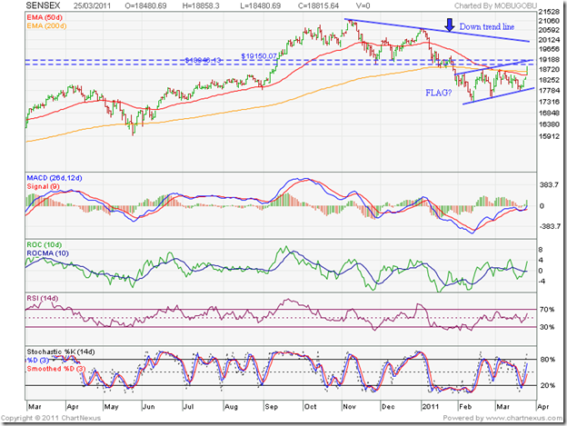
The calamity in Japan, rising inflation in India and anaemic growth of the economies in Europe and USA all seem to have been ‘discounted’ by the BSE Sensex, as a bout of FII buying propelled the index above both the 50 day and 200 day EMAs. Is the bear market over? The short answer is: Not yet. Some serious hurdles are on the way.

Last two month’s consolidation has been redrawn as a ‘flag’ pattern. Why the question mark? The consolidation has lasted 8 weeks, and flag patterns typically get completed within 4-5 weeks. The Sensex has been consolidating after correcting 18% (about 3800 points) from its Nov ‘10 peak of 21100, and flag patterns tend to occur in the middle of a move. If and when the Sensex breaks down below the flag, it can fall 3800 points.

Stock markets don’t move according to logic or arithmetic. But technical analysis enables us to be prepared for eventualities. As my tax lawyer likes to repeat: ‘Let us hope for the best, but prepare for the worst!’

The technical indicators are suggesting that the rally may continue. The MACD has moved above its signal line and is touching the ‘0’ line. The ROC has risen above its 10 day MA into positive territory. Both the RSI and slow stochastic are above their 50% levels and heading towards their overbought zones.

Note that the Sensex has reached a higher top during Mar ‘11, but the RSI and slow stochastic have not. This shows underlying weakness. There are likely resistances to the up move from the upper edge of the flag pattern, the support-resistance zone between 18950 – 19150, and the 5 months long down trend line connecting the Nov ‘10 and Jan ‘11 tops.

Nifty 50 Index Chart

Nifty_Mar2511

Rising volumes during the week suggest that the rally has buying support – which is corroborated by the FII data. The question is: how much of the buying is due to short covering? Note that during the past 2 months volumes have receded during the flag pattern formation – as it should. But down day volumes were higher than up day volumes, which signifies distribution. The Nifty has corrected 1160 points from its Nov ‘10 peak. Any break down below the flag pattern can see another drop of 1160 points.

But it is not all doom and gloom. The fact that the Nifty has closed above the 200 day EMA after 2 months is a bullish sign. If the 50 day EMA is able to cross above the 200 day EMA, the bulls will regain control. Till then, we have to wait for the Nifty to breach the support-resistance zone between 5685 – 5755 and a convincing break out above the flag pattern. (The 5755 level just happens to be the 50% Fibonacci retracement level of the fall from the Nov ‘10 peak of 6338 to the Feb ‘11 trough of 5178.)

The approach of the RBI to hike interest rates in small steps in an effort to balance growth and inflation doesn’t seem to be working. Inflation continues to rise, and a bolder approach is necessary, even if it hurts growth in the near term. Oil price above the $100 mark is not helping matters. All eyes will now be on the Q4 results to determine the market direction.

Bottomline? The chart patterns of the BSE Sensex and Nifty 50 indices are showing signs of coming out of a 5 months long correction. A few more hurdles need to be crossed before the bulls can regain control. Accumulate slowly, and maintain strict stop-losses.

Kamis, 24 Maret 2011

How to read the Cash Flow Statement – Part 2

In last Tuesday’s post, I had covered the first part of the Cash Flow Statement – Cash Flow from Operating Activities. The next two parts will be discussed in this post.

Part 2: Cash Flow from Investing Activities 

To remain in business over the long haul, a company needs to grow. Without growth, a business will stagnate and eventually die or get acquired. But growth has a price. Cash has to be spent to buy land, machinery and related equipment, build factories and offices, acquire other companies, start subsidiaries or joint ventures, and make appropriate investments.

All of the above comes under Cash Flow from Investing Activities. You don’t have to be a genius to guess that this figure will be a (negative) one for most companies. Many mature companies, particularly those in the FMCG sector, don’t have much need for Capital Expenditure (i.e. spending cash on factories and equipment) because their rate of growth has slowed down.

Ideally, the depreciation amount in the Profit and Loss statement should be less than or equal to the amount of cash being spent in investing activities – because depreciation is meant to cover the notional loss due to wear and tear of the existing plant and machinery. If a company does not continuously spend on upgrading and modernising its facilities, it will not be able to compete with newer entrants who may have the latest technology and equipment.

The definition of Free Cash Flow is:

Cash Flow from Operating Activities – Capital Expenditure

This is a (negative) number for companies in their early growth stage, when cash generated from core operations may be insufficient to cover the cost of capital expenditure. But for well-established companies, positive Free Cash Flow is an indication of financial health. The more positive Free Cash Flow a company can generate, the easier it is for them to expand, acquire, pay dividend or buy back shares, and pay off loans.

Part 3: Cash Flow from Financing Activities 

What if a company has (negative) Free Cash Flow, or still worse, has (negative) Cash Flow from Operating Activities? Where will they get the cash to pay their suppliers, interest to banks for any loans taken, and for growing the business?

They can either resort to more borrowings, and/or issue more shares. If such companies are showing a net profit, then they are also expected to pay dividends to their shareholders. All inflows and outflows of cash due to loans, share issues, share buybacks, dividend payments come within Cash Flow from Financing Activities.

Financial prudence should dictate a company’s growth plans. As a thumb rule for selecting good stocks, about 60-70% of the Cash Flow from Investing Activities (Part 2) should be funded by positive Cash Flow from Operating Activities (Part 1); the balance 30-40% should come from Cash Flow from Financing Activities (Part 3).

Many companies forget the simple adage that one should cut one’s coat according to the cloth. They may even have positive Cash Flow from Operating Activities, but their ambitious growth plans require far more cash than they can afford. They resort to frequent borrowings and share issues in the hope of reaching the top quickly. One or two bad years can bring such companies down to their knees. Pantaloon and Suzlon come to mind.

(Note: The financial health of banks and financial institutions can’t be judged by analysing the Cash Flow Statement alone – because they need to borrow cash to give loans, and invariably have negative Cash Flow from Operating Activities. Price to Book Value and Return on Assets are better measures for such companies.)

Related Post

What is the Return on Assets (RoA) ratio?

Rabu, 23 Maret 2011

Stock Chart Pattern - Marico Ltd (An Update)

The previous update on the stock chart pattern of Marico Ltd was in May ‘10. The stock had just hit an intra-day low below 100, and the technical indicators as well as volume spikes on down days were pointing to further downside.

But the stock took support from its rising 200 day EMA, and embarked on the next leg of the rally, hitting a new intra-day high of 136 on Jun 30 ‘10. When I wrote the original post back in Jul ‘09, the stock had moved above its Jan ‘08 bull market peak and was looking overbought at 90. Reader Sumit disagreed, and suggested a target of 160 within 2 years. I am not ashamed to admit that Sumit was right – as the one year bar chart pattern of Marico Ltd will reveal:

Marico_Mar2311

The stock price corrected from 136 down below the 50 day EMA to 116 on Aug 12 ‘10 – which happened to be a high volume ‘reversal day’ (lower low, higher close). The next rally ended with a sharp intra-day spike to 153 on Oct 25 ‘10 – nearly meeting Sumit’s target.

The stock continued to move higher on a closing basis for a few more days, but the down trend had begun. Note the negative divergences in the technical indicators (marked with blue arrows) – they touched lower tops as the stock reached a higher top.

The down trend appears to have ended with another very high volume ‘reversal day’ pattern on Feb 9 ‘11. The subsequent rally first broke the down trend line on Mar 7 ‘11, followed by a breach of the support/resistance level of 136 on Mar 16 ‘11.

A pullback to the down trend line is in progress. Twin supports from the rising 50 day EMA and the down trend line should make this a possible entry point. Despite the stock spending several trading sessions below the 200 day EMA and correcting more than 25% from its Oct ‘10 peak, a bear market didn’t get confirmed because the 50 day EMA never crossed below the 200 day EMA (‘death cross’).

Both the 50 day and 200 day EMAs are rising again with the stock trading above them, signifying a bull market. The technical indicators are showing some weakness – thanks to the pullback. The MACD is positive but has slipped below its signal line. The ROC has dropped below its 10 day MA into negative territory. Both the RSI and slow stochastic are falling towards their 50% levels after visiting their overbought zones. The stock may consolidate a bit between the down trend line and the 136 level.

Marico Ltd is fundamentally strong, though margins are under pressure. A TTM P/E of more than 32 doesn’t leave any ‘Margin of Safety’. Still, the stock has given more than 25% returns in 10 months – a good reason why small investors should take a serious look at this FMCG company.

Bottomline? The stock chart pattern of Marico Ltd is an example of why FMCG is my favourite sector. Small investors should add such stocks to their portfolios for steady gains and downside protection, instead of running after mythical multibaggers. Existing holders can top up their holdings. New entrants should wait for a convincing break above 136 to buy.

Selasa, 22 Maret 2011

How to read the Cash Flow Statement – Part 1

Have you heard the statement: Cash is king? A business needs cash like a car needs fuel. If there is no regular generation of cash from the day-to-day operations, the business will need to resort to debt and share issues to survive. Seems logical that investors would first look at the Cash Flow Statement in an Annual Report – right?

Unfortunately, most investors in the stock market – even those who have been investing for many years - do not understand or know how to interpret the Cash Flow Statement. Just looking at the Balance Sheet, Profit and Loss statement and the Management Discussion and Analysis is not enough. The real state of a company’s finances is hidden in the Cash Flow Statement and the Notes on Accounts.

With another accounting year coming to a close on Mar 31, 2011, this is as good a time as any to learn the basics of the Cash Flow Statement:-

The Cash Flow Statement allows you to check the different sources of cash inflows into a company during a particular year vis-a-vis the prior year, how much cash was spent, and what it was spent on. Cash inflows are positive, cash outflows are (negative). The three parts of a Cash Flow Statement enable you to understand what a company’s management is doing with the cash at its disposal, by comparing the figures with those appearing in the Balance Sheet and Profit and Loss statement.

Part 1: Cash Flow from Operating Activities

The Net Profit before tax and exceptional items from the Profit and Loss statement is adjusted with depreciation, interest, provisions, profit/loss on investments, debtors, inventories, creditors to arrive at the cash generated from operations. Tax and exceptional items are then adjusted to arrive at the Net Cash from Operating Activities.

Though it may seem counter-intuitive to non-accountants (like me), depreciation is considered an inflow (it is an expenditure in the Profit and Loss statement, but the cash is not paid to any one and remains within the company); creditors/accounts payable is an inflow (because they haven’t been paid yet); debtors/accounts receivable is an outflow (because a ‘sale’ has been accounted in the Profit and Loss statement but the money hasn’t been received yet).

Net Cash Flow from Operating Activities should preferably be positive, and greater than the previous year’s if the net profit has gone up. Newly set-up companies, particularly those in high growth fields like Information Technology or Bio-technology, often have negative cash flows from operations in their initial years. They need to ramp up operations quickly to meet demand but may not be able to negotiate good payment terms from their clients.

Negative cash flows from operations of established companies, if over prolonged periods, indicate that there is something amiss with the business model, or the management has questionable integrity and is diverting cash to unlisted subsidiaries or to related parties.

Investors need to be particularly wary of companies that show good top-line and bottom-line growth year after year, and pay taxes and dividends but show negative cash flows from operations. Where is the cash to pay the taxes and dividends? It comes from regular borrowings and share issues. If such a situation continues for a few years, the debt burden will eventually sink the company. Many realty and high-flying infrastructure companies, and investor favourites like Bartronics, Cranes Software fall within this category.

(Note: The next two parts of the Cash Flow Statement will be covered in Thursday’s post – so please stay tuned.)

Related Post

Can a growing, profitable company go out of business?

Senin, 21 Maret 2011

Stock Index Chart Patterns – S&P 500 and FTSE 100 – Mar 18, ‘11

S&P 500 Index Chart

image

Last week, the technical indicators were suggesting that the correction in the S&P 500 chart wasn’t over. But the index was trading well above the rising 200 day EMA, which meant that the bull market was intact. I had indicated a possible drop to the 1280 level as a buying opportunity.

The index dropped below the 50 day EMA to an intra-day low of 1249 on Wed. Mar 15 ‘11, and closed below the lower edge of the Bollinger Band. Volumes were the highest during the week on Wednesday’s down day – a sign of distribution. The recovery over the next two days almost regained the 1280 level, but not the 50 day EMA. The index lost about 2% on a weekly basis.

The technical indicators remain bearish. The MACD is well below its signal line, and both are in negative territory. The slow stochastic briefly dropped inside the oversold zone; the subsequent bounce has been weak. The RSI is below the 50% level, and moving sideways. The index needs to move above the 50 day EMA on strong volumes to enable the bulls to regain control.

Housing starts dropped more than 22% from Jan ‘11 and permits for new home construction declined by more than 8%. As per a survey by the AAII, bullish sentiment of individual investors has dropped from more than 60% three months back to below 30%. New jobless claims dropped by 16000; so did industrial production by 0.1%. These are not the signs of healthy economic growth.

If the S&P 500 index is unable to clear the 1332 level, the bearish pattern of lower tops and lower bottoms may lead to a deeper correction down to the 200 day EMA. Buy selectively, but with appropriate stop-losses.

FTSE 100 Index Chart

image

The previous week’s bearish technical indicators of the FTSE 100 index chart had hinted at a likely drop to the 200 day EMA. The index fell even lower to 5600 and closed below the 200 day EMA three days in a row, raising the spectre of a bear market. The upward bounce on Fri. Mar 18 ‘11 took the index above the 200 day EMA on an intra-day basis and a close exactly on the long-term moving average. The FTSE 100 lost nearly 2% on a weekly basis.

Friday’s trading volume was the highest in three months, which should provide some consolation to the battered bulls. But the technical indicators are not conducive for a swift recovery. The MACD is below the signal line, and both are deep inside negative territory. The slow stochastic is in the oversold zone. The RSI is just above its oversold zone. The Mar ‘11 top of 6052 needs to be crossed to negate the bearish pattern of lower tops and lower bottoms.

In the midst of austerity measures, the UK government has decided to take a lead role in teaching Libya a lesson. The cost of the military adventure will be considerable, if quick success isn’t achieved. A possible interest rate hike in Apr ‘11 may further stymie the feeble economic growth.

Bottomline? The chart patterns of the S&P 500 and FTSE 100 indices are yet to recover fully from strong bear attacks. Both indices are facing meaningful corrections after 4 months. That will be good for the longer term health of the bull markets. Stay invested with appropriate stop-losses. Any buying should be very selective, and in small quantities.

Minggu, 20 Maret 2011

Stock Index Chart Patterns – Hang Seng, Singapore Straits Times, Malaysia KLCI – Mar 18 ‘11

The previous analysis of Asian stock indices was written three months ago. The Hang Seng and Straits Times indices had formed bearish head-and-shoulders topping patterns, while the KLCI was moving in a downward sloping channel. This is what I had concluded:

‘The chart patterns of the Asian indices are undergoing corrections. The Hang Seng and Straits Times indices may test or even breach their 200 day EMAs. The KLCI looks more bullish and may not face as deep a correction.’

Hang Seng Index Chart

HangSeng_Mar1811

The Hang Seng index chart had formed a head-and-shoulders pattern during Oct-Dec ‘10. But instead of falling further after breaching the ‘neckline’ briefly, it bounced upwards. Note the low volumes during the end-Dec ‘10 bounce up – which was a sign of underlying weakness. Volumes picked up in Jan ‘11. The RSI made a higher top, but it was not supported by the other three indicators.

The Hang Seng started trading in a bearish downward sloping channel and received good support from the rising 200 day EMA during Feb ‘11. It has finally broken down below the long-term moving average on high volumes. All four technical indicators are bearish. The index is all set for a decent correction. Note that the 50 day EMA is falling, but remains well above the 200 day EMA. The ‘death cross’ will confirm a bear market.

Singapore Straits Times Index Chart

Straits Times_Mar1811

The Singapore Straits Times index had also formed a bearish head-and-shoulders pattern during Oct – Dec ‘10, but bounced upwards without penetrating the ‘neckline’. Upward bounces from a support level can be used to add, provided there is volume support. Note the volume bars in end-Dec ‘10 – they were lower than the volumes during the earlier part of the month.

The break down in the Straits Times index, which was one of the better performers among Asian indices in 2010, has been sharper. The index breached the 200 day EMA in Feb ‘11, bounced up to find resistance from the falling 50 day EMA, and has dived below the long-term moving average on strong volumes. The technical indicators are bearish, and another 10% drop from current levels won’t be a surprise. The ‘death cross’ is imminent.

Malaysia KLCI Index Chart

KLCI Malaysia_Mar1811

The Malaysia KLCI index, which was looking the strongest of the three indices 3 months back, proved its strength by breaking above the downward sloping channel on strong volumes. It reached a new high in Jan ‘11, but could not sustain there very long.

The index is below its 50 day EMA, and trading in a downward sloping channel once again. However, it has still not tested support from the 200 day EMA. The technical indicators are less bearish. The index may continue to trade within the downward sloping channel for a while.

Bottomline? The chart patterns of the Asian indices are undergoing varying degrees of corrections. Take some profits home, if you haven’t done so already. Technical analysis remains an art, and not a science. The point to note is that once bearish patterns develop, they indicate a sign of weakness – even if that weakness does not lead to an immediate crash. Volumes and technical indicators often act like a window to the unfolding scenario.

Sabtu, 19 Maret 2011

BSE Sensex and NSE Nifty 50 Index Chart Patterns – Mar 18, ‘11

Despite concerns over inflation, oil prices and the catastrophe in Japan, Indian stock indices had remained quite resilient till mid-week. The inflation number came in higher than expected, and the RBI had no choice but to increase the repo and reverse repo rates by another 25 bps (0.25%).

Many market players were hoping that the RBI won’t increase rates because there were signs that the economy was beginning to slow down. Readers of this blog had been warned: If the RBI hikes interest rates next week, the bears may use that as a trigger to sell.’

BSE Sensex Index Chart

Sensex_Mar1811

Oil prices rose above the $100 mark again, which compounded the problem of the interest rate hike. India’s weightage in the MSCI index was reduced, and FIIs – not surprisingly – turned net sellers. The 18050 level, which had supported the Sensex for the previous 12 trading sessions, was decisively broken on Fri. Mar 18 ‘11.

Both the 50 day and 200 day EMAs have fallen within the consolidation zone between 17300 and 18700, and they are ensuring that the upside remains capped. A test of support from 17300 is almost inevitable. Whether the support will hold or not is the bigger worry for bulls. A break below could take the Sensex down to 16000.

The technical indicators are bearish. The MACD is negative, and has drifted down to touch its signal line. The ROC has dropped below its 10 day MA into the negative zone. The RSI is slipping down towards its 50% level. The slow stochastic is just below its 50% level.

The Sensex correction is in its fifth month with no sign of a trend change yet. Still I am getting requests about which stocks to buy. The Sensex is technically in a bear market, and you make money in a bear market by selling short. That is not a strategy recommended for small investors. Better wait for the trend to turn bullish.

Nifty 50 Index Chart

Nifty_Mar1811

Many analysts and TV experts were convinced that 5400 was a ‘strong support’. One such expert mentioned the huge open interest at 5400; another went on record that the support was strong because it had been tested a few times. Supports (and resistances) don’t become stronger if they are tested in quick succession. They become weaker.

The other thing to note is that 5400 is the mid-point in the consolidation range between 5200 and 5600, and can be used as a ‘line of control’ by short-term traders. Sell when the Nifty moves above 5400 and buy when it falls below.

5200 is a stronger support because it has been tested only once about a month back. That is no guarantee that the support will hold the next time it is tested. A break below 5200 could see the Nifty testing 4800.

Global indices have been correcting due to the twin effects of high oil prices and likely supply-chain disruptions due to factory closures and port destructions in Japan. The barely visible economic growth rates in Europe and USA are facing headwinds again. Gold price has started to rise as appetite for risky assets gets reduced.

Bottomline? The chart patterns of the BSE Sensex and Nifty 50 indices continue to consolidate within trading ranges. Short-term traders can make some money by trading the range. Long-term investors should use such periods to learn patience, and read books about fundamental and technical analysis (links on the right panel of this blog).

Kamis, 17 Maret 2011

Using Earnings Yield (E/P) to time your investments – a guest post

In last Thursday’s post, I had taken a look at the historical P/E ratios of the Nifty 50 index and suggested an investment strategy. In this month’s guest post, Nishit takes a slightly different view. He compares Nifty’s earnings yield with the 10 years G-Sec yield to time stock market investments.

-------------------------------------------------------------------------------------------------------------

Subhankar had written about Nifty’s P/E multiple or Price to Earnings Multiple last week. Let us delve deeper into it. He had written “Nifty’s P/E ratio has varied between 11 and 27 during the past 12 years - with peaks of 27.35 on Mar 1, 2000 and 27.64 on Jan 1 2008, and troughs of 11.62 on Jan 1, 1999; 10.86 on May 2, 2003 and 11.76 on Dec 1, 2008. The average P/E ratio over the past 12 years is 18.24.”

image

Price/Earnings ratio is nothing but the Market Price divided by the Profits per share of a company in rupee terms. Assume the share price of a company is Rs 100 and it makes a profit of Rs 10. So its P/E ratio is 100/10 = 10. It is a very fundamental ratio of finding out the valuation of a stock (or index). Now, P/E by itself has no significance. How do we know if P/E of 10 is stretched or P/E of 50 is stretched?

We look at the growth prospects of a company and sector. The derived ratio is PEG Ratio (Price to Earnings Growth ratio). Now if the company is going to grow at an annualized growth rate of 100% for the next 3 years, a P/E of 100 may be acceptable. This is especially true of the IT companies in the glory days of 1998-2001 when Infosys used to come out with 100% growth figures every quarter.

The inverse of P/E (i.e. E/P) is the earnings yield. It is the amount per annum you are going to earn by investing in a company. This ratio is very important in the sense that you can use it to find if a stock (or the Nifty) is over-valued or not. What will we compare against? Let us take the 10 years Government Treasury Bill return. This is the safest investment in the country. Whenever 10 years G-Sec yield is more than equity earnings yield that is the time to go long big time.

Let us take an example. During Oct ’08 – Mar ’09, the Nifty P/E ratio dropped below 15; the earnings yield was 6.66% and below. The G-Sec Yield was 7.83% in Nov ’08.That was the time when the long term portfolio of stocks should have been built up.

For the past 1 year, the Earnings Yield of the Nifty has been around 5%. The G-Sec yield is around 8%. At such times, exposure to equity has to be limited. That is, keep trailing stop losses and don’t add fresh equities.

The Earnings Yield is a simple extension of the P/E concept and comparing it to the Bond Yield gives us a perspective on finding whether the equity markets are overvalued as compared to the Bonds Market or not.

clip_image002[4]

-------------------------------------------------------------------------------------------------------------

(Nishit Vadhavkar is a Quality Manager working at an IT MNC. Deciphering economics, equity markets and piercing the jargon to make it understandable to all is his passion. "We work hard for our money, our money should work even harder for us" is his motto.

Nishit blogs at Money Manthan.)

Rabu, 16 Maret 2011

Stock Chart Pattern - Bharat Bijlee (An Update)

The stock chart pattern of Bharat Bijlee is an example of why technical analysis should never be relied upon completely. It is not a science. Price targets are fixed on the basis that previous chart patterns will get repeated. While this happens often, many times the outcomes are contrary to expectations.

Pattern failures happen when there isn’t appropriate volume support. One of the reasons why even fundamentally strong small-cap stocks are risky bets is because they tend to trade in miniscule volumes. That makes buying and selling a difficult proposition. Low volumes also renders technical analysis ineffective.

The bar chart pattern of Bharat Bijlee reveals the deficiencies in technically analysing small-cap stocks:

Bharat Bijlee_Mar1611  

In the previous update back in May ‘10, I had observed a bearish descending triangle pattern being formed after the stock touched a high of 1170 in Jan ‘10. I had expected the stock to fall below the support level of 880 to a low of 700. Accordingly, I had recommended the following course of action to investors:

‘Existing holders should get out now, or at best, hold with a strict stop-loss at 880. New entrants should avoid the stock.’

Triangles are consolidation patterns that are generally unreliable. That means that the stock price can break out of a triangle in either direction. But ascending triangles (flat top, rising bottoms) and descending triangles (lower tops, flat bottom) tend to be more reliable. Price usually breaks above a flat top or below a flat bottom.

Note that the bearish descending triangle price pattern formed between Jan – Jun ‘10 turned out to be a failure. A burst of buying from the third week of Jun ‘10 propelled the stock price to a high of 1284 on Jul 2 ‘10. After a brief dip, a second burst of buying saw the stock reach 1316 on Jul 22 ‘10.

The fun and games of the bulls finally ran out of steam. While the stock reached a higher top, all four technical indicators made lower tops (marked by blue arrows). The combined negative divergences started a correction within another descending triangle pattern that has lasted almost 8 months.

Through Aug ‘10 and most of Sep ‘10, the stock price was supported by the 50 day EMA as a bearish pattern of lower tops and lower bottoms got formed. The stock found resistance from the downward sloping trend line of the descending triangle pattern on Oct 7 ‘10, and quickly dropped to the 200 day EMA. For the next 3 weeks, the stock traded between the 50 day and 200 day EMAs before decisively breaching the support from the long-term moving average on Nov 15 ‘10.

The ‘death cross’ signalling a bear market (marked by blue oval) happened on Dec 8 ‘10. On the next day, the stock plunged to the support level of 880 on a volume spike. A ‘reversal day’ pattern (lower low, higher close) on Dec 10 ‘10 marked the end of the fall. But the meagre volume suggested that the rally was unlikely to be a strong one. A 3 months long sideways consolidation has ensued, with up moves finding resistance from the 200 day EMA. If the support level of 880 doesn’t get breached soon, the second descending triangle pattern may also turn out to be a failure.

The technical indicators are not showing any clear direction – typical of consolidation periods. The MACD is entangled with the signal line, and both are barely in the positive zone. The ROC has fallen below its 10 day MA into negative territory. The RSI has moved down to its 50% level. The slow stochastic is about to drop to the 50% mark.

Bottomline? The stock chart pattern of Bharat Bijlee is almost back where it was 10 months ago. One can hold with a strict stop-loss at 880, and add only on a high volume break out above the descending triangle. At today’s closing price of 974.25, the stock is trading at less than 25% of its Jan ‘08 bull market peak price of 3950. Fundamentally, the company is financially sound and continues to perform well. But margins are under pressure.

Selasa, 15 Maret 2011

Why Japan’s calamity can hurt the global economy and stock markets

There is an English proverb: Misfortune never comes alone. In Japan’s case, misfortune seems to be coming in droves. Before the stoic and resilient people from the island country could recover from the horrendous calamity of the massive earthquake and devastating tsunami, the explosions and radiation leaks from the ageing Fukushima nuclear power plant has sent shock waves through the entire global economy.

Oil prices dipped on the assumption that demand from Japan will diminish as the economic growth may stall while the nation reconstructs the severe damage to life and property. Japan is the third largest oil consumer in the world, and there may be a drop in demand in the near term.

But global demand for oil may increase. Many countries, including the USA, depend on oil for their energy requirements – unlike India where coal-fired power generation is the norm. The US-India civilian nuclear treaty was supposed to be a win-win agreement for both. New nuclear power plants built with US technology was supposed to alleviate India’s perennial power shortage, and boost the demand for US-made equipment and consultancy services. The crisis in Japan’s nuclear power plant, built with equipment and technology from the US giant General Electric, will now put nuclear power as an alternative energy source on the back burner.

Japan also happens to be a large market for luxury goods, with more than 10% of world sales. Any further slowdown of an already slowing Japanese economy will seriously affect the businesses of luxury goods makers the world over. Many of these luxury goods – whether Gucci bags or parts for BMW cars – are actually manufactured in Asian countries.

With the Japanese Nikkei index taking a beating, investors are likely to pull out of Japanese funds that invest in global stock markets to cover their losses. As per a CNBC report, more than US $7 Billion has been invested by Japanese funds in Indian markets – and that is less than 20% of their total investments in emerging markets as a whole. The Sensex dropped 18% when FIIs recently pulled out US $2 Billion. Any Japanese withdrawal can cause a much bigger correction. Already, European indices have felt the heat.

Many Indian companies have built up their Japanese bases over a long period of time. Infosys and TCS are among them. There is talk of repatriation of Indian employees. It remains to be seen what effect that may have on the bottom lines of Indian companies.

Unlike the rise in oil prices, which every one expects to moderate in the near term as the unrest in North Africa and the Middle East gets quelled with firm hands, the crisis in Japan isn’t going to end soon. A melt-down in a nuclear reactor in a populated area can have serious long-term repercussions. Operations of many global companies will be disrupted because of damaged roads and ports, and shutdown of manufacturing facilities.

Indian investors need not sell in a panic. Corrections due to ‘black swan’ events, like the one in Japan, provide buying opportunities. Be patient and stay prepared for a deeper correction.

Senin, 14 Maret 2011

Stock Index Chart Patterns – S&P 500 and FTSE 100 – Mar 11, ‘11

S&P 500 Index Chart

image

In last week’s analysis, the bull market in the S&P 500 chart was going strong, with the index trading above the rising 50 day and 200 day EMAs. But the turmoil in the Middle East and North Africa had pushed up oil prices that led me to advise caution. The index drifted down to close below the 1300 level and the 50 day EMA on Thu. Mar 10 ‘11 – its first close below the medium-term moving average in more than 6 months. Even more worrisome for the bulls were the high volumes.

Despite the horrific news and visuals of the earthquake and tsunami in Japan, the S&P 500 managed to close above the 1300 level and the 50 day EMA on Fri. Mar 11 ‘11. But it lost more than 1% on a weekly basis, and formed a bearish ‘lower tops and lower bottoms’ pattern. From the Feb ‘11 top of 1344 the correction has lasted 3 weeks, and the technical indicators are suggesting that it isn’t over yet.

The MACD is barely positive; it is below its signal line and falling fast. The slow stochastic has almost dropped to the edge of its oversold zone. The RSI is below the 50% level. The index has corrected less than 4% from its Feb ‘11 top, so the bulls shouldn’t be too worried. The S&P 500 is trading well above its rising 200 day EMA, which means the long-term bull market is intact. The 1280 level should provide support and a buying opportunity.

The economy continues to muddle along. Retail sales in Feb ‘11 rose by 1% – its 8th straight monthly increase. The University of Michigan Consumer Sentiment index dropped sharply to 68.2 in Mar ‘11 from 77.5 in Feb ‘11. Average gasoline prices just above $3.50 per gallon has been well absorbed. But in some parts of the US, gas prices are touching the $4 mark, which is a ‘tipping point’ for consumer sentiments.

FTSE 100 Index Chart

image

The technical indicators of the FTSE 100 index chart were looking bearish last week. I had suggested waiting for a break of the trading range between 5800 and 6100 before deciding on the next course of action. The bad news of Moody’s downgrade of Spain’s sovereign credit rating, the high oil prices plus news and views of devastation from Japan seemed to push the FTSE 100 over the edge.

The index closed below the 50 day EMA three days in a row, and briefly dropped below the 5800 level on intra-day basis on Fri. Mar ‘11. The technical indicators are looking quite bearish. The MACD has moved deeper into the negative zone, and is well below its signal line. The slow stochastic has entered its oversold region. The RSI is just above its oversold zone.

The 50 day EMA has turned down; the index may drop to the rising 200 day EMA. The FTSE 100 has corrected 5% from its Feb ‘11 top of 6106. An upward bounce from the long-term moving average can provide a buying opportunity.

Bottomline? The chart patterns of the S&P 500 and FTSE 100 indices are facing deeper corrections. Upward bounces from support levels may provide opportunities to enter – but only with strict stop-losses. Better to err on the side of caution.

Minggu, 13 Maret 2011

The state of the stock market – a broker’s views

I cornered my erudite stock broker friend just after he had finished his morning round of golf, and asked him about the current state of the stock market. Here, in no particular order, is the gist of his uncensored views during a freewheeling discussion:-

1. The Sensex is very likely to test its recent low of 17300. It may even go down to 16000, but the probability is low.

2. The market is likely to trade in a range for another 3 months, or even longer. With high oil prices further messing up India’s fiscal deficit, markets won’t be able to move much higher.

3. The second half of the year should be ‘technically’ better. That is when the ‘big players’ have decided to sit down together with the Udayan Mukherjees of the business channels to decide (and announce) where they are going to push up the stock market.

4. Oil prices won’t come down any time soon. The turmoil in the Middle East and North Africa will be fomented by the USA for two main reasons. The first is their insatiable desire to corner oil resources, which was the main reason for their invasion of Iraq. Every one knew that there were no ‘weapons of mass destruction’ in Saddam Hussein’s armoury.

The second reason is the dismal state of the US economy. All the dollar printing hasn’t improved anything. The US economy thrives after wars. A Republican president would have used the Tunisia and Egypt uprisings as excuses to send troops. The Democrat president is pussy-footing around. But he will soon have no choice but to start a war by sending in the US marines. There is already talk of enforcing a no-fly zone in Libya.

5. The talk of ‘valuation difference’ between developed and emerging markets being the reason for the recent correction is all hogwash. Valuation differences were there a year back, when FIIs were pouring money into emerging markets.

6. The export lobby has been moaning and groaning about the rupee appreciation against the dollar hurting the country’s exports. There is not a peep from the import lobby because none exists. The government is the biggest importer. They should ignore the exporters and let the rupee appreciate against the dollar. That is the only way to cushion the rising cost of oil imports. Imports far exceed exports anyway.

7. There is no greed and fear in the Indian stock market. There is only more greed and less greed. Nothing else explains the paltry cash volumes compared to the huge F&O volumes of trade every day.

8. Small individual investors in the more evolved and sophisticated US market invest mainly through mutual funds. In India, any one who has Rs 5000 to spare wants to invest in equity shares. Since he doesn’t have enough money to buy even 10 TISCO shares, he goes out and buys 15000 shares of Cals Refineries. How smart is that?!

Part of the blame lies with us brokers, who want investors to regularly buy and sell stocks, because our livelihoods depend on that. But, small investors will be far better off investing regularly in an index fund or a balanced fund.

Sabtu, 12 Maret 2011

BSE Sensex and NSE Nifty 50 Index Chart Patterns – Mar 11, ‘11

Last week, I had mentioned that the post-budget relief rally had helped the bulls to keep the ‘death cross’ at bay. But the inevitable happened. High oil prices and inflation concerns led to FII selling, and the 50 day EMA slipped below the 200 day EMA on the Sensex and Nifty charts. The devastating earthquake and tsunami in Japan added to the selling pressure in an already weak market.

BSE Sensex Index Chart

SENSEX_Mar1111

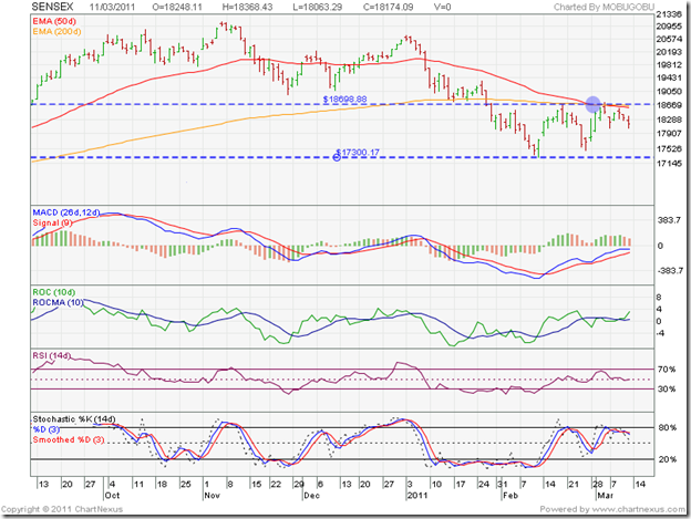
What is heartening from a bullish point of view is that despite negative news flows and bearish investor sentiments, the Sensex hasn’t really cracked. It completed six weeks within the consolidation range between 17300 and 18700, and is likely to spend some more time within the range. Will the support from the 17300 level hold?

As per the theory of consolidation patterns, the answer is ‘No’. Consolidation patterns tend to be continuation patterns. In other words, the previous trend – which was down - will continue after the consolidation is over. Note that last week’s brief up move found resistance from the falling 50 day EMA. Both the 50 day and 200 day EMAs have dropped within the trading range and may thwart any up moves.

The technical indicators are still giving mixed signals. The MACD is above the signal line, but remains in negative territory and has stopped rising. The ROC has moved above its 10 day MA into the positive zone. The RSI has dropped to its 50% level. The slow stochastic has started retreating after reaching its overbought region.

Nothing is sacrosanct in technical analysis. So watch the 17300 level closely. A high volume upward bounce may just get the buying support to break above the consolidation range. A more likely outcome is a break below 17300 and a test of the May ‘10 low of 16000. If the RBI hikes interest rates next week, the bears may use that as a trigger to sell.

NSE Nifty 50 Index Chart

Nifty_Mar1111

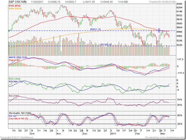
The Nifty traded within the range of 5200 and 5600 for the sixth week in a row. Note that volumes have begun to recede, and that means the index is likely to drift down towards the lower edge of the trading range. The technical indicators are not providing any clear direction, so the consolidation within the trading range may continue.

Industrial production figures were an improvement. Inflation has also started to moderate, thanks to the base effect. But such ‘good’ news is being ignored by the market, which is a bearish sign. The rising cost of oil imports with no increase in retail prices of petrol, diesel or kerosene means an additional subsidy burden. By postponing the FPOs of ONGC, SAIL and others in the pipeline, the government is worsening a bad situation.

The release of the biggest Income Tax defaulter and money launderer on bail is ridiculous. It points to his high level connections that may have been revealed if he was kept behind bars and interrogated. India is becoming a laughing stock in front of the international community, and tomtomming our GDP growth isn’t going to bring in FDI and FII money that we badly need to build our infrastructure and sustain growth.

Bottomline? The chart patterns of the BSE Sensex and Nifty 50 indices are still consolidating within a trading range. Investor patience gets sorely tested by such periods of consolidation. The medium and long-term trends are down, and the ‘death cross’ has confirmed a bear market. Long-term investors should maintain a strict stop-loss at the lower edge of the trading range. Short-term players can trade the range.

Jumat, 11 Maret 2011

Gold Chart Pattern: another buying opportunity?

Last month, gold’s 2 years price chart was struggling to move above the 30 day SMA after recovering from a drop to 1315 from its earlier peak of 1421. I had suggested buying below 1340, and accumulating on a convincing move above 1356. After consolidating a bit near 1356, gold’s price shot up close to its previous high of 1421, and after a brief pause rose to a new all-time high of 1437.

image

Profit booking seems to be the reason why the price has slipped to 1411, just below the rising 14 day SMA. Can it fall some more? Yes, it can. It has already dropped below the triple top at 1421. The next support level is at 1400, from where an upward bounce can be expected.

Is this correction another buying opportunity? Yes, it is. Note that the 200 day SMA continues to rise, and gold’s price is trading much above the long-term moving average. That is the sign of a bull market, and the strategy should be to ‘buy the dips’. Note that the chart pattern is close to two previous peaks. Accumulating in small quantities would be a more prudent approach, rather than buying in bulk.

How long will this bull market in gold continue? Who knows, and why should investors be bothered? There is still a lot of uncertainty all around. Emerging markets are facing inflation pressures, which could lead to a slow down in their economies. The recoveries in the US and Europe have been less than stellar so far. The unrest in North Africa and the Middle East is pushing oil prices higher, which will not at all be conducive to faster economic growth.

Gold seems to be the safest haven of all. Stay invested with a suitable trailing stop-loss, may be at the level of the rising 200 day SMA. That is as close to a ‘sure thing’ as you can get in investing these days.

Kamis, 10 Maret 2011

Is the Nifty overvalued or undervalued?

Since hitting a peak in Nov ‘10, the Nifty has been in a corrective mode for 4 months. The correction began when the Nifty came near its earlier all-time high touched in Jan ‘08. What initially seemed like a routine bull market correction, turned into a more serious correction due to the unrest in North Africa and the Middle East that sent oil prices above the three figure mark.

The index dropped 18% from its peak before recovering somewhat, and has been trading within a range of 5200 - 5600 for the past 5 weeks. The FIIs have been net sellers during 2011, pulling out $2 Billion to redeploy in their home markets. Relative valuations of developed market indices like the S&P 500 and the FTSE 100 were more attractive. Of late, they seem to be buying again, as the overseas markets are correcting.

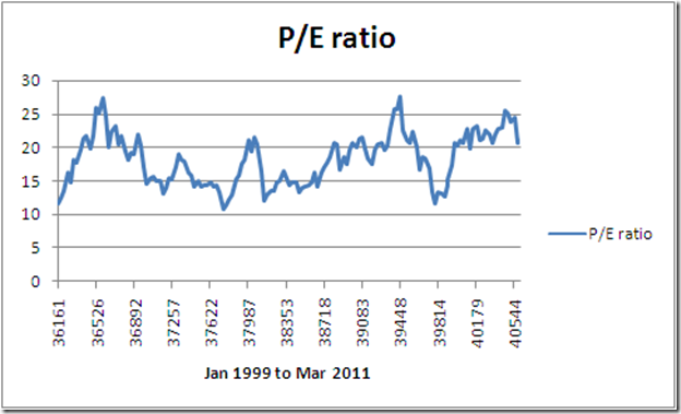
What should investors do? Is the Nifty undervalued after the correction, making it a good opportunity to buy? Or is it still overvalued despite the correction? The best way to find out is to look at Nifty’s monthly P/E ratio chart, drawn for the period Jan ‘99 to Mar ‘11:

image

Nifty’s P/E ratio has varied between 11 and 27 during the past 12 years - with peaks of 27.35 on Mar 1, 2000 and 27.64 on Jan 1 2008, and troughs of 11.62 on Jan 1, 1999; 10.86 on May 2, 2003 and 11.76 on Dec 1, 2008. The average P/E ratio over the past 12 years is 18.24.

Leaving the peaks and troughs aside, as it is next to impossible to catch the exact tops and bottoms, we can reasonably assume that P/E ratios between 15 and 21 is the ‘hold’ range. In other words, only stock specific buying should be done when the Nifty P/E ratio is between 15 and 21. Any drop below 15 is the across-the-board ‘buy’ zone and any move above 21 is a ‘sell’ signal. Patient, long-term investors can use these levels to decide entry and exit points for almost assured returns.

The Nifty traded at or below 15 P/E continuously between Aug ‘02 – Aug ‘03, providing the ‘mother of all buying opportunities’  in the past 12 years. It also traded continuously below 15 P/E between Jun ‘04 – Nov ‘04, Feb ‘05 – Sep ‘05, and Nov ‘08 – Apr ‘09. The market does provide great buying opportunities, if only investors would learn to wait for them.

On the other hand, between Dec 1 ‘09 – Jan 3 ‘11, the Nifty continuously traded at or above 21 P/E – giving excellent selling opportunities to those who may have bought earlier. Nifty’s P/E ratio on Mar 1 ‘11 was 21.04. So, it has only dropped to the outer edge of the ‘hold’ range – in spite of the four months long correction.

Since the Nifty is trading above its average P/E ratio of 18, it is still ‘overvalued’. That is one of the reasons why FII money is flowing out.

Related Posts Plugin for WordPress, Blogger...