Rabu, 14 Maret 2012

Stock Chart Pattern - Reliance Capital Ltd. (An Update)

The previous technical analysis update of the stock chart pattern of Reliance Capital was posted back in Nov ‘09 (marked by a grey vertical line on the chart below). The stock price had corrected after touching an intra-day peak of 1066 in Jun ‘09 and had twice received support from the upper edge of the gap formed in May ‘09.

As long as the gap was not closed, there was hope of further upside. Accordingly, I had made the following recommendation to readers: “Existing holders can stay invested with a stop-loss at 680. New entrants should await a convincing cross above the 1050 mark.” A look at the chart below will show that my advice was timely and appropriate.

Regular readers know that I have a bias against any company with the word ‘Reliance’ in its name. If you don’t know (or remember) why, you can read this post. What is the reason then for posting this update? Well, there are two reasons. The first is to admit to a classic investing mistake. The original post on Reliance Capital in Apr ‘09 was premised on the prospect of likely monetisation of the company’s ‘hidden assets’ – its huge asset management business (Reliance Capital had the highest AUM back then) and its thriving insurance and financial services businesses. The mistake? Hidden assets may stay hidden and never get monetised. (This is particularly true for ‘holding companies’ that hold huge number of shares in different companies.)

The second and more important reason is to warn new investors that though the stock price had more than doubled – from the intra-day low of 225 (Jan 2 ‘12) to an intra-day high of 482 (Feb 22 ‘12) – during the recent rally, the stock is technically still in a bear market and in a down trend. There is no reason to enter now.

Let us have a look at the three years daily bar chart pattern of Reliance Capital:

RelCap_Mar1412

The gap in the chart formed in May ‘09 – approximately between 620 and 680 – was filled a year later. That opened up further downsides and triggered the stop-loss of 680 mentioned in the previous update. The stock price bounced up from the lower edge of the gap, and over the next 5 months, gained 40%. But it formed a lower top that marked the beginning of a sharp down trend, which coincided with the bear phase in the broader market.

Note the sideways consolidation between 620 and 680 during Dec ‘10, before a convincing break down below 620 in Jan ‘11. A ‘panic bottom’ formed at 478 in Feb ‘11, following which the stock price bounced up quickly – only to face strong resistance from the earlier support level of 620 in Apr ‘11 and Jul ‘11. This is another example of how a breached resistance level becomes a support level, and a broken support level becomes a resistance level. Another point to note is that support-resistance levels provide better and safer entry-exit points than Fibonacci levels or EMA levels.

The stock price is oscillating near its 200 day EMA. The 50 day EMA is still below the 200 day EMA. The technical indicators are mildly bullish. The MACD is positive and just below its falling signal line. The ROC is also positive and above its 10 day MA, but has turned down. The RSI is a little below its 50% level. The slow stochastic has climbed above its 50% level. The stock price is trying to move up to test the blue down trend line once more, but the falling volumes mean another likely failure of an upward break out attempt.

Bottomline?  The stock chart pattern of Reliance Capital is a clear example of disenchantment within the investing community. The recent sharp rally may have provided huge short-term gains to a fortunate few. If you are one of them, book your profits. New investors can look at a company like Sundaram Finance. If you don’t trust the Ambanis, avoid all companies with ‘Reliance’ in its name.

Related post

Why rely on Reliance?

Selasa, 13 Maret 2012

The truth(?) behind the 6.8% Jan ‘12 IIP growth number

The Index of Industrial Production (IIP) published by the government each month is supposed to give an idea about what is going on in the economy. The Jan ‘12 figure of 6.8% came as a positive surprise, because the IIP number for Dec ‘11 was only 2.5%, and the consensus estimate for Jan ‘12 was about 2.1%. Naturally, the much higher figure seemed to indicate that growth was returning to the Indian economy.

The stock market should have celebrated the news – but didn’t. Were market participants ‘selling on news’, or did they ignore the news as unbelievable? Digging a little deeper into the published data raises more questions than answers.

Manufacturing growth was at a respectable 8.5%. But that growth was largely due to a whopping 92.6% growth in food products and beverages; 56.1% growth in printing, publishing and reproduction of recorded media; and 29.9% growth in medical, precision and optical instruments, watches and clocks. Minus these three items, manufacturing growth would be negative.

In plain English, the above data means that Indian citizens consumed almost twice the amount of food and drinks than what they did in Jan ‘11. Surely, population increase and rural prosperity through the NREGA scheme had roles to play. But 92.6% growth is hard to believe. So is the data that indicates a sudden rise in reading books, newspapers and listening to music and watching movies at home.

A growth in medical instruments may be explained away by the proliferation of modern hospitals and clinics. But why the propensity for buying watches and clocks? Of course, the published data has the following disclaimer: “Indices for January ‘12 are Quick Estimates.” May be the data collection was outsourced and improperly supervised.

More intriguing are the areas of de-growth. Electrical machinery and apparatus fell by –30.5%. Office, accounting and computing machinery fell by –14.1%. Radio, TV and communication equipment and apparatus fell by –13.8%. India is definitely not shining if electrical machinery, computers and communication equipment are showing de-growth.

As happens almost every month, these ‘Quick Estimates’ get revised subsequently. Which means these initial numbers don’t count for much and don’t indicate any trend. The collective wisdom of market participants in ignoring the Jan ‘12 IIP growth number proved correct in this instance.

Senin, 12 Maret 2012

BSE Sensex and NSE Nifty 50 index chart patterns – Mar 9 ‘12

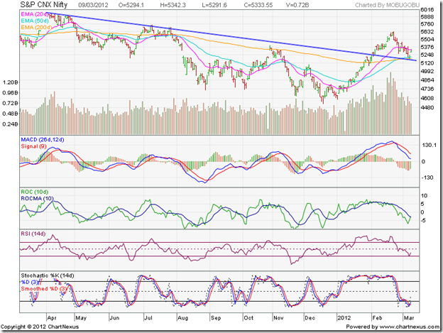
Both index charts – BSE Sensex and NSE Nifty – show classic break outs above down trend lines followed by pullbacks and upward bounces from the down trend lines. That should mean that trend reversals have occurred and it is time to buy. But all is not well as yet.

Results of the elections in five states have come and gone. The market was not expecting the thrashing that the Congress Party got at the hustings. There are rumblings from UPA partners about big-brotherly treatment. Another surprise was the 75 bps cut in the CRR announced by the RBI prior to its Mar 15 review meeting – probably to preempt the likely liquidity shortfall in the system due to advance tax payments. The better-than-expected manufacturing IIP number has further confused market players.

RBI’s Mar 15 meeting appears to have become a non-event. The good IIP number may dash any possibility of a cut in interest rates. Some experts are already suggesting that the CRR cut will be inflationary. Very little is expected from the Mar 16 budget announcement from a government that has backed itself into a corner financially and politically, with its populist measures and inability to take tough decisions.

BSE Sensex index chart

SENSEX_Mar0912

In the weekly bar chart of the Sensex, last week’s bar shows a dip below the down trend line followed by a strong upward bounce. The ‘golden cross’ of the 20 week EMA above the 50 week EMA has not taken place yet. The technical confirmation of a bull market is still awaited.

The weekly technical indicators remain bullish, but there are signs of weakness. The MACD is positive and above its signal line, but it has stopped rising and the histogram has started falling. The ROC is positive and above its rising 10 week MA. The RSI has started falling towards its 50% level. The slow stochastic has slipped down from its overbought zone.

The pre-budget rally may turn out to be a sideways consolidation. A budget without any negative surprises may provide the trigger for the rally to resume in earnest.

NSE Nifty 50 index chart

Nifty_Mar0912

The daily bar chart pattern of the Nifty shows the break out above the down trend line, followed by a pullback and then a bounce up with a gap. Note that the volume bar is smaller on last Friday’s bounce up. That is not a positive sign for bulls.

The technical indicators are bearish, but showing signs of a turnaround. The MACD is falling below its signal line, but hasn’t yet entered negative territory. The ROC is negative, but is trying to cross above its 10 day MA. The RSI has bounced up from the edge of its oversold zone, but remains below the 50% level. The slow stochastic is trying to emerge from its oversold zone.

The 50 day EMA has crossed above the 200 day EMA, signalling a return to a bull market. But see what happened back in Apr ‘11 (left part of chart above). The 50 day EMA crossed above the 200 day EMA – only to drop back below it. Any fall below the down trend line can snuff out the bull rally.

Bottomline? Chart patterns of the BSE Sensex and NSE Nifty 50 indices have bounced up nicely after pullbacks to their down trend lines. Such bounces from resistance levels offer entry opportunities – provided there is adequate volume support and bullish technical indications. These seem to be lacking – probably because of the budget announcement hanging like the proverbial sword of Damocles. Those who are already invested should hold with stop-loss at the levels of the down trend lines. New entrants should await the budget announcement.

Minggu, 11 Maret 2012

Is it worth investing in tax-saving bonds?

To reap the benefits of high interest rates prevailing in the market, many investors have been booking profits in the stock market and parking the proceeds in bank fixed deposits (FD). But the interest received from bank FDs is taxable. It is that time of year when advance taxes need to be paid. Shouldn’t investors be looking at saving taxes by investing in infrastructure bonds and tax-saving bonds?

In this month’s guest post, Nishit explains the basic difference between infrastructure bonds and tax-saving bonds, and recommends that investment in tax-savings bonds is definitely worth considering seriously.

-----------------------------------------------------------------------------------------------------------

Tax-saving bonds are the flavour of the month. Let us try and ascertain if they are worth buying. Earlier in the year, Infrastructure Bonds were introduced. Some of those bond issues are still open. How are the current tax-saving bonds different from the Infrastructure Bonds?

For starters, to avail tax breaks in the infra bonds, the limit up to which one could invest was Rs 20,000. This Rs 20,000 would be deducted from your taxable income for the year. This would save about Rs 6,180 in the highest tax bracket. The interests from these bonds are not tax free and would be added to one’s taxable income in subsequent years. The interest rates offered were in the rage of 8-8.25% per annum.

The tax-savings bonds being offered now are of a different type. In these bonds, a retail investor can invest Rs 1 lakh for a period of 10-15 years. These bonds are offered by various government undertakings like REC, NHAI, PFC and are hence safe investments. The bonds offer tax free returns as the interest is not taxable. The interest rates are about 7.93% to 8.32%. This means if Rs 1 lakh is invested, then upto Rs 8,130 interest which one gets annually is not taxed. Over a period of 10 years, this amounts Rs 81,300 which is not taxed. To get equivalent returns from a taxable bank FD, the interest rate one should get is about 11.5%. There is no bank FD which falls under the ‘safe category’ offering such returns.

The REC issue is due to get closed on the 12th of March, 2012 and one can definitely look at further similar issues hitting the markets. The benefit of such issues over the infrastructure bonds is that one can save a much larger amount of tax.

Details of REC issue as below:

There is another tax free bond in the market! REC or Rural Electrification Corp. Ltd. is going to raise Rs 3,000 Crore by selling tax free secured redeemable non-convertible bonds . The subscription will open on March 6 and close on March 12 , 2012. While it is being sold that the interest on the bond will be tax free, it is important that subscribers should know other aspect of this tax free bond issue.

Credit Rating : “CRISIL AAA/Stable” by CRISIL, “CARE AAA” by CARE, “ICRA AAA” by ICRA & “Fitch AAA (Ind)” by FITCH.

The Company has confirmed the following interest rates:

Tenure of the bonds

Other than Category III investors (i.e. QIBs & Corporates and Individuals/HUFs investing > 1,00,000)

Category III investors (Individuals and/or HUF investing upto Rs. 1,00,000/- in the issue)

10 years

7.93%

8.13%

15 years

8.12%

8.32%

Individual/HUF limit reduced due to a notification dated February 14 issued by Central Board of Direct Taxes (CBDT) clearing the issue has said that “any individual investing over Rs 1 lakh will be classified as high net worth individual (HNIs)”.

  • Bucket size: The issue size would be Rs. 3000 Crores (shelf limit)
  • Minimum Application: Rs 5000/-(5 Bonds of Rs 1000/-) and in multiple of Rs 1000/-
  • Issuance Mode - Demat only
  • Listing at BSE only
  • Interest Payment – Annually
  • Allotment on first come first served basis.
  • Interest on the refund money will be at rate of 5% p.a.

Category of investors

Bucket size

Category I (includes QIBs and Corporate)

50%( 1500 Cr)

Category II (Individuals/HUFs investing > 1,00,000)

25% (750 Cr)

Category III (Individuals/HUFs investing < 1,00,000)

25% (750 Cr)

Tax Benefits:

  1. The income by way of interest on these Bonds shall not form part of total income as per provisions under section 10(15)(iv)(h) of I.T. Act, 1961;
  2. There shall be no deduction of tax at source from the interest, which accrues to the bondholders;
  3. As per provisions under section 2 (29A) of the I.T. Act, read with section 2 (42A) of the I.T. Act, a listed Bond is treated as a long term capital asset if the same is held for more than 12 months immediately preceding the date of its transfer. Under section 112 of the I.T. Act, capital gains arising on the transfer of long term capital assets being listed securities are subject to tax at the rate of 20% of capital gains calculated after reducing indexed cost of acquisition or 10% of capital gains without indexation of the cost of acquisition;
  4. Wealth Tax is not levied on investment in Bond under section 2(ea) of the Wealth-tax Act, 1957.

Note: The investment limit for Category III investors has been increased from Rs 1 Lakh to Rs 5 Lakhs.

-----------------------------------------------------------------------------------------------------------

(Nishit Vadhavkar is a Quality Manager working at an IT MNC. Deciphering economics, equity markets and piercing the jargon to make it understandable to all is his passion. "We work hard for our money, our money should work even harder for us" is his motto.

Nishit blogs at Money Manthan.)

Sabtu, 10 Maret 2012

Chart Patterns of 10 Banking Sector stocks (an update)

There is nothing like a nice, long bear market to separate the men from the boys. Banking sector stocks have been no exception. Back in Dec ‘10, banking sector stocks were undergoing corrections after touching new highs. Those corrections turned out to be the first phase of a 14 months long bear market.

There are two schools of thought in the stock market. One group believes that stocks that have undergone deeper corrections during a bear market, are likely to gain more during the subsequent bull rally. There may be some truth to this line of thought – if gains are measured in percentage terms from the lows.

The other group prefers stocks that fall less during a bear phase, but recover more quickly in the subsequent bull phase – even though the gains may not be high in percentage terms. If you are not sure which group you should follow, have a look at the charts of ten banking sector stocks below to help you to decide.

Punjab National Bank

Punjab National Bank_Mar1012

Punjab National Bank’s stock was one of the star performers during the bull phase from Mar ‘09 to Nov ‘10. The bear market shaved 46% off its peak level of 1395. The recent bull rally from its Dec ‘11 low of 751 pierced the 200 day EMA from below and reached 1091 – a 45% gain from the low. But the stock price remains in a bearish pattern of lower tops and lower bottoms and has slipped down below its 200 day EMA. Technically, the stock is in a bear market. Avoid.

Bank of Baroda

Bank of Baroda_Mar1012

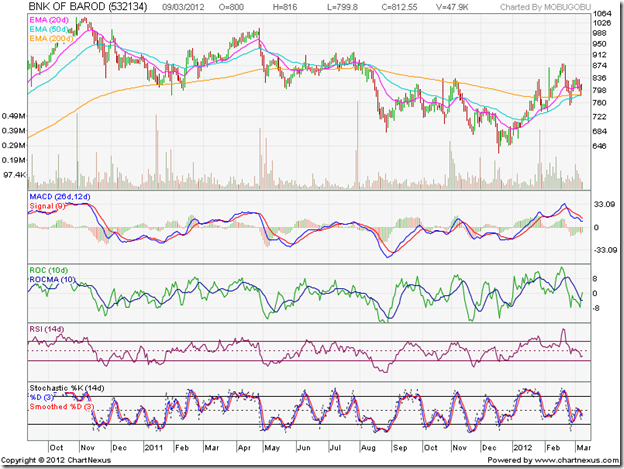
Bank of Baroda’s stock dropped from a peak of 1050 in Nov ‘10 to a low of 630 in Dec ‘11 – a 40% fall. The recent rally topped out at 881 – a gain of 40% from its low. The stock is trading above its 200 day EMA, but is still in a bearish pattern of lower tops and lower bottoms. Hold.

Central Bank

Central Bank_Mar1012

Central Bank’s stock made a double-top at 249 during Oct-Nov ‘10 and fell steadily down to touch a low of 63 in Jan ‘12 – a 75% fall from its peak. Though the recent rally gave a 76% gain from its low to its intermediate top of 111, the stock is trading below its 200 day EMA and remains deep inside a bear market. Avoid.

Corporation Bank

Corporation Bank_Mar1012

The stock price of Corporation Bank fell 59% from its top of 815 to its bottom of 335. The subsequent rally gained 57%. The stock is struggling to stay above its 200 day EMA, and remains in a down trend. Note the sharp volume spike as it crossed above its 200 day EMA – an indication that it may not fall much further. Hold.

Indian Overseas Bank

Indian Overseas Bank_Mar1012

Indian Overseas Bank’s stock dropped 58% from its peak of 176 to a low of 73. Though the stock price rose sharply above its 200 day EMA – gaining 73% from its low – it has dropped equally fast and remains in a bear market. Avoid.

HDFC Bank

HDFC Bank_Mar1012

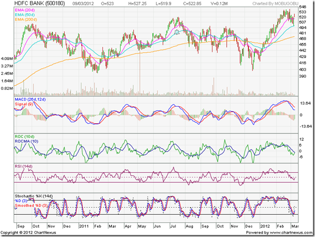
A favourite of the FIIs for obvious reasons, HDFC Bank’s stock has risen steadily to touch a new high in Feb ‘12 – forming a bullish pattern of higher tops and higher bottoms. Despite several drops below its long-term moving average, the stock is in a bull market. If you think that HDFC Bank’s stock is too expensive, and it is better to go for ‘cheap’ stocks like Central Bank of Indian Overseas Bank – think again. Cheap can get cheaper. Buy.

ICICI Bank

ICICI Bank_Mar1012

The stock price of ICICI Bank lost almost 50% from its peak of 1277 in Nov ‘10. The recent rally produced a 55% gain from its Dec ‘11 low of 641. The stock is in a clear down trend and struggling to get out of its bear market. Hold.

Axis Bank

Axis Bank_Mar1012

Axis Bank’s stock touched a high of 1608 in Oct ‘10 and a trough of 784 in Jan ‘12 – a 51% loss. The sharp rally to 1309 means a 67% gain. But the stock price is in a long-term down trend and struggling to get out of a strong bear grip. Hold.

Kotak Mahindra Bank

Kotak Mahindra Bank_Mar1012

The stock price of Kotak Mahindra Bank is in a bull market and touched a new high in Feb ‘12. The subsequent correction is receiving good support from its 20 day EMA. Buy.

Yes Bank

Yes Bank_Mar1012

Yes Bank’s stock made a double-bottom (in Feb ‘11 and Jan ‘12) reversal pattern and re-entered a bull market. The stock is consolidating, and should test and break above its Nov ‘10 top of 388. Buy.

Jumat, 09 Maret 2012

Stock Index Chart Patterns – Jakarta Composite, Singapore Straits Times, Malaysia KLCI – Mar 09, ‘12

A month ago, the chart patterns of the Jakarta Composite, Singapore Straits Times and Malaysia KLCI indices were looking bullish, after recovering well from bear attacks. The bulls have been trying hard to regain control and momentum. But the bears are still reluctant to give up ground. In the process, some interesting chart patterns have been forming.

Jakarta Composite Index Chart

Jakarta_Mar0912

The Jakarta Composite index never entered a bear market technically. The 50 day EMA had bounced off the 200 day EMA back in Oct ‘11, and has been moving up since. After a sharp drop below the 200 day EMA and an equally sharp recovery, the index has been trading within an upward-sloping channel for the past four months.

The interesting thing to note is that the index faced strong resistance from the 4030 level, where it had earlier faced resistance in Jul, Aug and Sep ‘11. As a result, the index has not been able to make any headway for the last two months – though it is trading above its rising 200 day EMA and is technically in a bull market.

The technical indicators are mildly bullish. The MACD is barely positive and has merged with its signal line. The ROC has crossed above its 10 day MA into positive territory, but appears unable to decide which direction it wants to go. The RSI is resting at its mid-point. The slow stochastic has dropped from its overbought zone.

The bulls still have some work left to be able to test the Aug ‘11 top of 4196. 

Singapore Straits Times Index Chart

Straits Times_Mar0912

The Singapore Straits Times index climbed smoothly above all three EMAs. The ‘golden cross’ of the 50 day EMA above the 200 day EMA (marked by light blue oval) technically confirmed a return to a bull market. But the lower edge of the gap (at 3030 level) formed in Aug ‘11 is providing strong resistance to the bull rally.

After a short correction down to its rising 50 day EMA, the index has bounced up smartly. But the technical indicators are yet to turn bullish. The MACD is still positive, but has made a bearish ‘inverted saucer’ pattern and is falling below its signal line. The ROC has dropped into negative territory. The RSI is below its 50% level. The slow stochastic bounced up from the edge of its oversold zone, but is below its 50% level.

The bulls need to concentrate their efforts on closing the Aug ‘11 gap before they can hope to regain control.

Malaysia KLCI Index Chart

KLCI Malaysia_Mar0912

The Malaysia KLCI index chart is clearly trending up in a bull market, and looks the most bullish of the three indices. After coming within two points of its Jul ‘11 top of 1597, the KLCI index had to beat a slight retreat. Will the brief setback turn into a correction?

The technical indicators are suggesting the possibility. Volumes have reduced considerably and all four indicators touched lower tops (marked by blue arrows) as the index rose to test its previous top. The combined negative divergences may pull the index down some more.

Note that all three EMAs are rising in tandem and the KLCI is trading above them. That is a clear sign of a bull market. Do not make the mistake of shorting a rising index. Use any dips to add.

Bottomline? The Asian index chart patterns are back in bull markets. The bears haven’t given up the fight, but are slowly losing ground. Once the nearby resistance levels are overcome, the bulls will regain complete control. Add the dips and maintain trailing stop-losses.

Kamis, 08 Maret 2012

Behavioural traits of a successful investor

To be a successful investor in the stock market, one needs to develop several skills:

  • Learn how the stock market functions – the roles played by short-term traders, long-term investors, operators, company promoters, brokers, FIIs, DIIs, NSDL/CSDL, stock exchanges, SEBI
  • Know about the various types of securities that are traded – stocks, convertible and non-convertible debentures/bonds, warrants, ETFs, mutual funds, bonus/rights shares, bonus/rights debentures
  • Be aware of related information – dividends, interest on debentures/bonds, tax implications of buying and selling of various securities
  • Have working knowledge of economic concepts – supply and demand, money supply, inflation/deflation/stagflation/recession, surplus/deficit, interest rates, impact of global economies on domestic economy, effect of economic changes on different business sectors
  • Reasonable proficiency in accounting concepts – debit/credit, assets/liabilities, capital/reserves, equity/preference shares, payables/receivables, raw materials/inventory, profit/loss, cash flows, and ability to calculate and compare EPS, P/E, P/BV, RoNW, RoCE, Debt-Equity ratio, etc.

But the most important skill of all is to learn about oneself – the behavioural traits that determine who will be a successful investor and who will be an ‘also ran’.

In a recent article posted at investopedia.com, the following behavioural model developed by Bailard, Biehl and Kaiser was presented:

Investors are classified according to their decisions and actions (‘impetuous’ at one end and ‘careful’ at the opposite end) as well as their levels of confidence (‘confident’ at one end and ‘anxious’ at the other end). Based on these behavioural traits, investors are divided into five groups:

  • Celebrity – anxious and impetuous, a follower of the latest investment trends
  • Adventurer – confident and impetuous, a strong-willed risk taker
  • Individualist – confident and careful, with an analytical and self-reliant approach
  • Guardian – anxious and careful, willing to sacrifice riskier growth for more stable returns
  • Straight Arrow – equally shares the above four behavioural traits

Apparently, greatest investment success is achieved by those with the ‘Individualist’ behavioural trait. What if one has one of the four other behavioural traits? Should they exit from the stock market?

With discipline and perseverance, behavioural patterns can be changed – provided one is aware which behavioural category one belongs to.

Moral of the story? To be a successful investor – know thyself.

Related Posts

Become a successful investor by avoiding 'herd mentality'
Are you an irrational investor?
Some practical examples of Behavioural Finance

Rabu, 07 Maret 2012

Stock Chart Pattern - DLF Ltd. (An Update)

The previous detailed update to the technical analysis of the stock chart pattern of DLF Ltd. was posted more than two years back (date marked by the grey vertical line on the chart below). A further update since then had not been considered necessary because there wasn’t anything new to add to the following recommendations:

“The stock chart pattern of DLF Ltd. does not hold out much hope for the bulls. If you are still stuck at higher prices, continuing to hold may increase your losses. Investors should not go anywhere near this stock.” 

So, why take a re-look at the DLF Ltd. chart now? The motivation came from the considerable interest generated by a recent report published by a Canada-based equity research house that tore the company’s business practices and financial condition to shreds. That report was based on fundamental analysis. But technical signals had warned of the decimation in the stock’s price back in Oct-Nov ‘09.

DLF_Mar0712

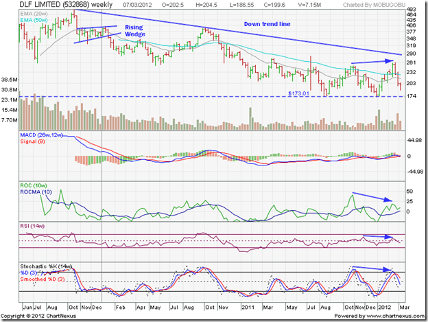
The weekly bar chart pattern of DLF Ltd shows the steady fall from the 3 yr high of 491, touched in Oct ‘09. The stock fell almost 65% to its Jan ‘12 low of 173. But that pales in comparison to the 90% fall from its all-time high of 1225 touched on Jan 15 '08 to the bottom of 124 on Feb 4 '09.

The subsequent rally led to a 300% gain (from 124 to 491) but retraced only a third of its bear market fall – less than the Fibonacci retracement level of 38.2%. That means the entire gain from 124 to 491 was a bear market rally within the long-term bear market that started from Jan ‘08. Hence the call to investors not to go anywhere near the stock. Very few stocks manage to recover from a 90% fall.

Note that the stock price formed a ‘reversal week’ pattern (higher high, lower close) when it touched 491 in Oct ‘09. A ‘distribution week’ pattern (high near open, close near low on higher volumes) followed the next week. The stock price then entered a bearish ‘rising wedge’ pattern.

After the expected break below the ‘rising wedge’, the stock dropped to 251 in May ‘10 but formed a ‘reversal week’ pattern (lower low, higher close) that marked the end of the first phase of the down move. A counter-trend rally took the stock price above the 20 week and 50 week EMAs to a high of 397 in Oct ‘10. Again, a ‘reversal week’ pattern (higher high, lower close) marked the end of the intermediate rally.

The next leg of the down move dropped the stock to a low of 173 in Aug ‘11. A bounce saw the stock price reach a high of 251 in Nov ‘11 before falling back to test the low of 173 in Jan ‘12. A rally along with the broader market took the stock to a high of 261 in Feb ‘12, when another ‘reversal week’ pattern ended the brief rally. Note the negative divergences in three of the four technical indicators (marked by blue arrows) that warned of a correction, which started even before the adverse report hit the market.

The weekly technical indicators are turning bearish. If the stock breaches its recent low of 173, it can drop all the way to test its Feb ‘09 low of 124. If you are holding the stock, ask yourself: Why?

Bottomline? The stock chart pattern of DLF Ltd. is in a long-term bear market that started more than 4 years ago, and shows no sign of ending. After years of financial shenanigans and taking customers and investors for a ride, the chicken are coming home to roost. The company is desperately trying to sell-off assets to survive, but are finding few takers. The stock doesn’t deserve to be an index constituent. AVOID.

Selasa, 06 Maret 2012

Gold and Silver chart patterns: bears fight back

Gold Chart Pattern

Gold_Mar0512

Gold’s chart pattern shows a strong fight back by the bears, just when all seemed lost. After moving above the 1770 level, gold’s price consolidated a bit before rising to a 2 months high of 1790. Proximity to the Nov ‘11 top of 1800 was used as an excuse by the bears to indulge in heavy selling.

Note that all three technical indicators touched lower tops as gold’s price reached a 2 months high. The negative divergences warned of an impending correction. But the high volume of selling marked a ‘distribution day’ (high near the opening level and a much lower close). Such high volumes were last seen during the sell-off in Sep ‘11. Volumes on down days (red volume bars) have exceeded volumes on up days (grey volume bars) on several occasions, and is a sign of distribution.

Gold’s price has dropped below its 20 day and 50 day EMAs, and it looks like it may drop further to its 200 day EMA. The technical indicators are looking bearish. The RSI has slipped below its 50% level. The MACD is still positive, but is falling below its signal line. The slow stochastic bounced up a bit from the edge of its oversold level, but it looks like a ‘dead cat bounce’.

Gold is still trading above its rising 200 day EMA – which means it is technically in a bull market. Hold, with a strict stop-loss at 1650.

Silver Chart Pattern

Silver_Mar0512

Silver’s chart pattern shows strong buying by the bulls in the third week of Feb ‘12 that pushed the price above the 37 level. High volume selling and a ‘reversal day’ pattern (higher high and lower close) marked the end of the intermediate rally from the Dec ‘11 low of 26.

The technical indicators are looking bearish. The RSI has dropped from the overbought zone to its 50% level. The MACD has crossed below its signal line, and is barely positive. The slow stochastic has fallen below its 50% level from its overbought zone.

Despite spending more than a month above the 200 day EMA, a bull market was not confirmed technically because the ‘golden cross’ of the 50 day EMA above the 200 day EMA didn’t occur.

Silver’s price is likely to fall below its 200 day EMA, and return to a bear market after a foray into bull territory. Sell.

Senin, 05 Maret 2012

Stock Index Chart Patterns – S&P 500 and FTSE 100 – Mar 2, ‘12

S&P 500 Index Chart

SnP500_Mar0212

The inevitable happened. The bulls finally managed to push the S&P 500 index chart to new 52 week highs – both on intra-day and closing basis. The index touched an intra-day high of 1378 on Feb 29 ‘12 and a closing high of 1374 on Mar 1 ‘12. Is it time for celebration or caution?

All three EMAs are rising and the index is trading above them. The bulls appear to be in complete control. But there are a few concerns. The index is trading too far above its 200 day EMA, which is a precursor to a correction. Despite a spike up on Feb 29, volumes have been sliding. A bull rally needs volume support to sustain.

The technical indicators are bullish, but continue to show negative divergences. The slow stochastic is inside its overbought zone, but drifting down. The MACD is positive and touching its signal line, but slowly losing ground. The RSI is above its 50% level, but making a bearish pattern of lower tops and lower bottoms. The ROC is barely positive, but touching lower tops. Stay invested with a trailing stop-loss.

Is the slow-growing US economy reaching stall speed? Some of the data points suggest as much. Weekly unemployment claims remained flat at 351,000. ISM Manufacturing index declined to 52.4 from 54.1 in Jan. Durable goods orders declined by 4% in Jan after 3 straight monthly increases. Home prices continued to fall. But it wasn’t all bad news. Car sales crossed the 15 Million mark in Feb – a 4 yr high. Sales of previously owned homes rose 4.3% in Jan – helped by the lower prices.

FTSE 100 Index Chart

FTSE_Mar0212

The FTSE 100 chart closed marginally lower for the week. The bull rally appears to have hit a road-block below the 6000 level. The index is still trading above all three EMAs, so the bull rally is under no immediate threat. However, a correction seems to be around the corner.

The technical indicators have weakened further, and are on the verge of turning bearish. The slow stochastic has dropped from the overbought zone, but remains above the 50% level. The MACD is positive, but has slipped below the falling signal line. The RSI is resting at the 50% level. The ROC is at the ‘0’ line, after a brief dip into negative territory. A correction down to the 5800 level can be used as a buying opportunity. A deeper correction may put the nascent bull market in jeopardy.

Spectre of a double-dip recession in the UK may be fading. PMI for construction increased to 54.3 from 51.4 in Jan. PMI for services dropped to 53.8 from 56 in Jan. Remember that a figure above 50 means expansion. The big problem remains unemployment, which is at a 17 yr high. Austerity measures are not helping in job creation. High oil prices are another concern.

Bottomline? Chart patterns of the S&P 500 and FTSE 100 indices are in bull markets, which have climbed higher in spite of negligible growth in the underlying economies. Easy availability of liquidity has helped in propelling the markets. At some point, the weak fundamentals may drag the markets down. Till then, stay invested with trailing stop-losses.

Minggu, 04 Maret 2012

BSE Sensex and NSE Nifty 50 index chart patterns – Mar 2 ‘12

In last week’s analysis of the chart patterns of BSE Sensex and NSE Nifty 50 indices, it was mentioned that the ongoing corrections will be shallow unless the FIIs start to sell. Except on two days since both indices topped out on Feb 22 ‘12, the FIIs were net buyers. As a result, both the indices have stayed above important support levels so far.

BSE Sensex index chart

SENSEX_Mar0212

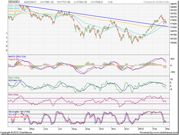
The daily bar chart of the BSE Sensex has managed to stay above the down trend line and the entangled 50 day and 200 day EMAs, keeping bullish hopes alive. But the failure of the 50 day EMA to cross above the 200 day EMA has prevented a technical confirmation of a bull market.

The technical indicators have turned bearish. The MACD is falling below its signal line in the positive zone, and the histogram has turned negative. The ROC is negative and below its falling 10 day MA. The RSI has slipped below its 50% level. The slow stochastic has dropped to the edge of its oversold zone.

Some more correction/consolidation can be expected till three likely trigger events – the UP state election results, RBI’s policy review and the union budget – get out of the way.

NSE Nifty 50 index chart

Nifty_Mar0212

The weekly bar chart of the NSE Nifty shows a classic pullback towards the down trend line that is receiving support from the rising 50 week EMA. Any upward bounce from current level will be an entry opportunity.

Some signs of weakness are visible in the technical indicators, but they haven’t turned bearish by any means. The MACD is still rising above its signal line in positive territory, but the histogram is falling. The ROC has dipped in the positive zone. The RSI is still climbing towards its overbought zone – no weakness there. The slow stochastic is in its overbought zone, but sliding down.

The UP state election is unlikely to produce a decisive result. The RBI is expected to do no more than reduce the CRR or the SLR. Both these outcomes appear to have been discounted by the stock market. All eyes are therefore on the budget, where some pro-reform policy notifications are expected. Lack of any negative surprises should help the up move to resume.

Bottomline? The chart patterns of the BSE Sensex and NSE Nifty 50 indices are going through a correction after a sharp rally. Such corrections provide entry opportunities to those who missed out on the earlier rally. That doesn’t mean one has to buy anything and every thing. The beaten down sectors, which may not be fundamentally sound, have shown greater gains. That is a worrying sign. Time to be cautiously optimistic.

Sabtu, 03 Maret 2012

Running Multiple Copies of MT4

How do you synch the files (experts, scripts, etc.) between multiple copies of MT4?

Where do you run your line MT4? …and your demo?  How fast does the machine need to be?

Here is my routine and set-up, to give you something to think about.

I have two computers. 

1. One I use on a day to day bases to check email, surf, do MT4 coding and back testing, general stuff.  It’s blazing f’n fast with RAID hard drives.  Windows 7, AMD IIX4 3.2Ghz, 8Gb ram, 64 bit OS.  I don’t need this speed for this PC but I needed a new PC, the price was right.

2. Second PC is an old P4 running XP, 3.0Ghz and 4GB ram.  I hate using it as a day to day, it’s to slow and can’t keep up with me.  But as a trading machine sitting in the corner it’s quite happy.  I also run Winamp on it 24/7 with an FM transmitter PCI card in it so I have tunes all over my house.

3. NAS – Network Area Storage – 1TB of redundant drives.  This is where the MP3’s are that played on the second computer.  This is where I store my MT4 files for back-up and synching.

Here’s the drill:

Saturday – On computer 2 – run cCleaner to get rid of old files, and a registry check, defrag the hard drive, run a virus scan full power down, power up.  Virus scanner doesn’t check my trading directories, I excluded them.  All files to this machine come from computer 1 anyways, and they get checked there.  I use the free Microsoft virus scanner.

Sunday – set-up trades on my live accounts running on computer 2.  Also set up some trades on demo account running on computer 1.  I also run a demo on computer 2 that copies trades from other traders, checking to see if this is worthwhile.

During the Week – might do some coding on computer 1.  Once I’m done, I run Microsoft SyncToy.  It copies all the files in my demo MT4 coding platform to the NAS for storage.  Then it copies those files to computer 2 to all the MT4 platforms running there.  I have to run SynchToy twice for the changes to make.

To format my code before I am finished with it, I do this:

Downloaded AStyle.exe, a free open source formatter.  Put it in experts and scripts directory.  Then I made a batch file and put it in there as well.  To format my code, double click the format.bet file and away you go, takes less than a second.  Here is the batch file called “format.bat”

ECHO OFF

ECHO ...............................................

ECHO THIS WILL FORMAT ALL MQ4 FILES IN THIS DIRECTORY

ECHO ...............................................

pause

AStyle.exe -A2 -s3 --mode=c *.mq4

ECHO ...............................................

ECHO CHECK RESULTS AND PRESS ANY KEY TO EXIT

ECHO ...............................................

pause

Here is the interesting part, how much processor does the MT4 take up?  It depends on how many ticks are coming in, that triggers your EA’s to execute.  Here’s a short video on using a tick simulator while running several MT4’s with EA’s and how the number of ticks per second causes the processor load to increase.

Jumat, 02 Maret 2012

magic stick versus trading sticks

Either way you compare these two they are both not for me.

You can read about them here….

http://www.4xcircle.com/blog/

http://www.forexpeacearmy.com/public/review/www.4xcircle.com – for comments and user reviews, assuming what you read is by real people not affiliated with them. 

and here is the price at http://www.forexmoneytrendline.com/

$500.  Put away your reading glasses, it says five hundred bucks!!!!

Learn to trade with price action and supply and demand, then get the FREE TipsterTrendlines for MT4.

Here is the link for the free stuff.

Kamis, 01 Maret 2012

Trading Mentor…. or not?

I received some email asking about trade mentoring.  As I have never taking a trading course or had a mentor I’m looking for some honest input from readers.

I think the worst part about finding a mentor is trusting if they are actually profitable.  If I was to have someone teach me, let’s say, how to install wiring for my addition to the house, I’m pretty sure I would only take advice from an electrician.  By the same token, if I was to take advice from a trader, I would want to see his statements for the last 3 years, and not some random stuff he might have made up.  Some online, lets log into your account and take a look, and see if your playing with some real money.  If he had 20K I wouldn't be interested.  I think an account of 100K or more and profitable yearly for 3 years would make me comfortable.  Good luck finding this taught.  Good traders are probably to busy making $$ to worry about teaching others to compete with them.

If you want something done right, do it yourself.  Learn price action.  Here is a suggestion.

Open up a chart with a 1hour timeframe or higher.  Zoom in so you can see maybe 50 to 100 bars.  Mark off areas with a box where you think price might turn next time it gets there. Let’s say there was a breakout to the upside, mark the area with a yellow triangle.  Then move along the chart marking off more area, don’t worry yet about seeing if that area was a turning point.  Once your done all the data, zoom out and see what happened.  Make notes.

Do this a few time with different pairs or trading instruments.  Then do the same thing but also mark off a target.  Then zoom out and see what happened.

You will notice that some trading vehicles don't give a rats ass about price action.  Try this first with EURUSD.  Then try some strange pair.  You will then realise that trading these odd pairs isn’t worth it.  I stick to the majors. unless I’m testing some EA.

Once your done this, watch a chart on a 5 minute time frame between 9am EST and 11am EST.  I have also done a 1 minute video screen capture of the NFPA news release to see how it moves.  Watch it a few times.  Watch price when it gets to a supply demand level on a 1 minute timeframe and see how it bounces around. 

My number 1 problem is that I chase price sometime.  I almost always lose money when I pull the trigger on a market order.  When I use limit order and set it and walk away, checking every 30 minutes, I’m usually profitable or breakeven.  I actually prefer to trade off 4 hour charts on forex, sometimes I have to wait more than 1 week for the entry. But in that week, I haven't lost any green, and the right set-up give you a smile on your face when it goes into profit shortly after entry.

So once you’ve done all that stuff above, try this game out.  Hint: switch time frames to drill down, use the pause button.

Click for the trading game Trading Game

By the way, if you’ve read this far, I just watch all Sam Siedens videos and got his odds enhancer list somewhere on line and studied it, to learn price action.  His stuff and Alphatrends helped a lot.

If you have a mentor or use a trading service, post a comment.  Not really interested in the service or who is the mentor, just interested in the result…. is it helping you become consistent and profitable?  Leave a comment.

About trend lines and channels

Here are some extracts from my free eBook on Technical Analysis taken from Chapter 2: Trend Lines and Channels:-

“Stock or commodity prices tend to move in a trend. A bullish (or up) trend occurs when demand for a stock or commodity exceeds supply. In other words, there are more buyers than sellers. A bearish (or down) trend occurs when supply of a stock or commodity exceeds demand. That means there are more sellers than buyers.

Some times, demand from buyers and supply from sellers are almost equally matched. The trend becomes sideways – neither going up nor falling down. At such times, technical analysis doesn’t work too well. At some point, a mismatch between buyers and sellers causes a break out from the area of sideways consolidation.

There are three types of trends. A major trend lasts for a few months or years. This is the trend of greatest interest for buyers and sellers. An intermediate trend moves in a direction opposite to the major trend, and lasts for a few weeks or months. Eventually, the major trend resumes. A minor trend occurs for a few days during major and intermediate trends, and is of very little consequence.

Prices don’t move in one direction in a straight line. An up move of a few days is followed by two or three days of a down move, producing a zigzag pattern on the chart. Trend lines enable investors to identify the major and intermediate trends. These lines are drawn by connecting the progressively higher bottoms touched by prices in an up trend, or the progressively lower tops touched by prices in a down trend.

Some times, prices move within trend channels – a pair of parallel lines can be drawn connecting the tops and bottoms touched by prices during an up or down trend. A trend channel is similar to a sideways consolidation, but with an upward (or downward) bias. Eventually prices break out of the channel.

Drawing trend lines (and channels) is a skill that improves with practice. Despite its name, there is nothing ‘technical’ in technical analysis – other than dealing with graphs and geometrical shapes taught in school to every student. The important thing is to remain flexible about adjusting to changing conditions if chart patterns don’t form exactly as per expectations.”

Why remain satisfied with these extracts? Get the real thing. The eBook is absolutely free. Just send me an email at mobugobu@yahoo.com with your full name and a request for the eBook to receive your copy.

Related Posts Plugin for WordPress, Blogger...