Rabu, 29 Februari 2012

Is the Q3 GDP growth rate of 6.1% a good or a bad number?

The short answer to the question: It depends on your viewpoint. Such a GDP growth number can not be seen in isolation, but in comparison with what has happened before and what is happening elsewhere.

Here are a few reasons why the number is good, and a few more reasons why the number is bad. The idea is not to confuse readers, but to provoke thinking and debate.

Reasons why Q3 GDP growth of 6.1% is good

If you look at the growth figures in some of the developed economies – particularly those in the Eurozone where even a 2% growth figure is considered gooda 6.1% growth figure should be celebrated with fireworks and champagne. The stark difference in growth figures is one of the reasons FIIs are investing big sums in our stock market.

High growth usually leads to inflation and therefore, high prices for goods and services. A more moderate growth figure has helped to tame inflation to a certain extent.

The Q4 GDP growth figure is unlikely to be much higher, but things are likely to improve from here on as there is usually a spurt in spending by the government sector to utilise left over funds from the previous year’s budget. In other words, the economic cycle may be bottoming out – which it usually does a few months after the stock market bottoms out.

Reasons why Q3 GDP growth of 6.1% is bad

This was the lowest growth figure in nearly 3 years, and almost 35% lower than the heady figure of 9.5% growth seen 5 years back.

There is evidence of economic slowdown everywhere – particularly in the manufacturing sector. Even services sector is slowing down. If growth doesn’t pick up soon, the FIIs may just pull out their money and invest it elsewhere.

Government’s fiscal deficit target for the year has already been exceeded in the first 10 months. That, coupled with the rise in oil prices, means that inflation may rear its ugly head again. The RBI may feel constrained to leave interest rates at the current high levels, or reduce it only marginally. That in turn will lead to slow growth in the next financial year.

Selasa, 28 Februari 2012

The Sound of Price

I tried this script and got it working.  You hear popping sounds as the ticks come into your MT4 platform.  For you price watchers, would you ever try this out?  Do you think its of any use?  In the evening I tried this out and it serves a purpose in my view if you're looking to scalp of looking for a breakout on a small time frame.


Hope you comment!


Read this post at forex factory on The Sound of Price

Notes from the USA (Feb 2012) - a guest post

The data flowing out of the US economic indicators have been showing definite signs of recovery from the world-may-come-to-an-end kind of scenario three years ago. Two large doses of Quantitative Easing have prevented a collapse of the financial system. The stock market is soaring and corporate America is flush with cash. Unemployment situation is improving and even the moribund housing market is beginning to show signs of life.

Is this the proverbial light at the end of the tunnel, or is it the headlight of an onrushing train? In this month’s guest post, KKP expresses his apprehensions about the strength and durability of the US economic recovery. He also presents a positive outlook from a recent consumer survey report.

-------------------------------------------------------------------------------------------------------------

Beautiful Orange Sky Before Darkness

The sky looks awesome right now since it is 6 pm and we can see the sun setting on the horizon. It is a perfect time when the glare of the sun does not bother our eyes, the heat has reduced to a more comfortable level, and it is all-in-all pleasant to everyone enjoying this moment. The key is to know what happens in a few minutes to an hour. It will be dark and the lights need to turn on. Oh no, the electricity man came earlier and cut off our electricity? Is that possible? Turning to my wife, I ask if we paid the electric bill on time? Huh!

Well, it seems that we are facing such an evening right now in the global economy. The bearish blog writers have portrayed well that ‘patch-work’ solutions of the current debt-related issues are only going to take us so far. One fine day the electricity guy is not going to take our cheques (or bonds) and the darkness is not going to get illuminated with a 100 or 200 watt CFL (tube light) bulb.

Many global economies are running on borrowed time, with times of pleasure and growth in between based on government maneuvering for political reasons. Is the booster shot that Greece just got something that will last, or will it need a 2nd, 3rd, and 4th shots before the antibiotics kick-in? And will the patient be alive when those 3rd and 4th shots are given? Are the other countries after Greece in the PIIGS acronym next to ask for rescue packages? Of course, they are almost ready now. We already have a next acronym after PIIGS and it is CAASH. This is the Canadian, Australian, Hong Kong and other economies that also have their Debt-to-GDP ratios going out of whack. US tax collections are lower than ever, and annual deficits are in the same range as during 1929-1934 (% of GDP). Are we so information overloaded that we cannot see the turmoil in the air, or are we too busy with our daily chores, ‘synch’ing our mobile devices, and playing Angry-Birds on our Tablets/iPhones/Androids?

Take a look at the previous crisis and what happened to Gold. Look at what has happened to Gold even without a ‘real crisis’. I say that the crisis has not happened since we keep averting the ‘root cause’ event with patch-work. In the meantime, we have high tides and low tides in the market and have the emotional roll-coaster associated with it (being left out, or what did I do!). So, let’s watch what is happening in the global markets and react accordingly.

clip_image002

If you want to see a positive viewpoint of the most current survey that I participate in with ChangeWave, here is partial report. Of course, I was not very optimistic in my input to the survey. We are approx 5000 to 10000 people in this closed group of professionals that provide our input based on our consumer spending or enterprise spending surveys. It will show the minor waves of positive and negativity, and of course, it is showing the positive/optimistic living that we are all experiencing right now. I am all for good living, and benefitting from positive waves, but will it last?

-------------------------------------------------------------------------------------------------------------

February U.S. Consumer Spending Report

Spending Accelerates for February as Consumer Confidence and Expectations Improve

by Jean Crumrine and Paul Carton

Overview: In a clear sign of accelerating momentum, U.S. consumer spending has soared in February – the second major upswing of the past three months. Importantly, the February 1-13 ChangeWave survey shows overall spending at a nine month high, and confidence and expectations continuing to improve. ChangeWave Research is a service of 451 Research.

The survey of 2,501 U.S. consumers finds the biggest spending upticks are occurring in Travel/Vacation, Household Repairs and Improvements, Autos, and Restaurants.

Moreover after last month’s post-holiday declines, our latest findings point to renewed momentum for several retailers, including Costco (COST), Target (TGT) and Walmart (WMT).

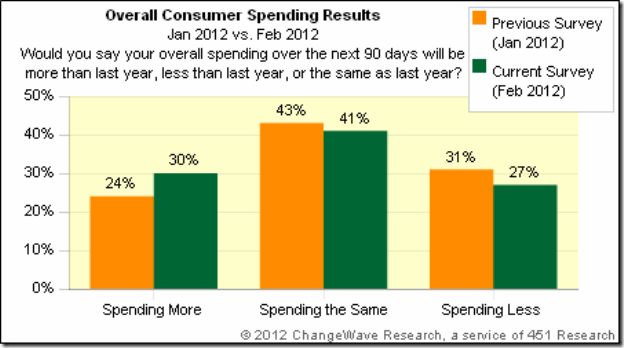
Consumer Spending Outlook: Three-in-ten U.S. respondents (30%) now say they'll spend more over the next 90 days than they did a year ago – up 6-pts since our previous ChangeWave survey in January.  Only 27% say they'll spend less, a 4-pt improvement from previously.

clip_image001

Putting the Findings in Context:  As the following chart shows, the net 10-pt jump in February is the second major uptick of the past three months – and the overall reading is higher than any of the previous 9 months.

clip_image001[4]

Consumer Expectations and Confidence: When we asked consumers about their impressions of the economy, we found confidence and expectations up again to their highest levels of the past year.

Consumer Expectations:  One-in-three consumers (33%) now believe the overall direction of the economy will improve over the next 90 days, while only 21% think it will worsen.  This represents a net 7-pt improvement since January and a striking 66-pt turnaround since the horrendous lows of six months ago.

clip_image001[6]

Stock Market Confidence:  In a similar positive, 39% say that they’re More Confident in the U.S. stock market than they were 90 days ago, while 19% say they’re Less Confident – an 8-pt improvement since the previous month.

clip_image001[8]

Respondents were asked about their investing plans going forward, and reported their money inflow into U.S. Stocks (+13; up 6-pts) is accelerating. And although Non-U.S. Stocks (-1; up 6-pts) are still registering a money outflow, the rate is subsiding – a sign that the European Union debt crisis hasn’t immobilized consumer investing.

Bottom Line: The February ChangeWave survey results show consumer spending soaring, and bring into sharp focus the improved spending environment we’ve been tracking in our monthly surveys since November of last year.

Importantly, U.S. consumer confidence and expectations are also improving for the 6th consecutive month. As for the biggest outperformers in February – it’s Travel/Vacation, Autos, Household Repairs/Improvements, and Restaurants.

-------------------------------------------------------------------------------------------------------------

KKP (Kiran Patel) is a long time investor in the US, investing in US, Indian and Chinese markets for the last 25 years. Investing is a passion, and most recently he has ventured into real estate in the US and also a bit in India. Running user groups, teaching kids at local high school, moderating a group in the US and running Investment Clubs are his current hobbies. He also works full time for a Fortune 100 corporation.

Senin, 27 Februari 2012

Stock Index Chart Patterns – S&P 500 and FTSE 100 – Feb 24, ‘12

S&P 500 Index Chart

SnP500_Feb2412

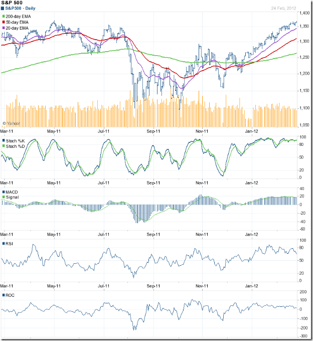
The chart pattern of the S&P 500 index reminded me of an old Cole Porter song: “So near and yet so far.” The index touched an intra-day high of 1369 on Fri. Feb 24 ‘12 and closed marginally higher on a weekly basis, but couldn’t quite cross above the May ‘11 top of 1371. Will the index touch a new 52 week high this week?

The possibility is high. The index is trading above all three of its rising EMAs, and is in a bull market. But volumes are decreasing and the technical indicators continue to show negative divergences, by failing to reach new highs. The index may pause to catch its breath after rising almost non-stop for two months.

Despite large doses of QE1, QE2 and an indirect QE3, growth in the US economy is still tepid. Initial jobless claims were almost flat at 351,000. New hiring isn’t picking up. Inventory of existing homes reduced as existing home sales rose. As per AAII’s Sentiment Survey, bullish sentiment rose by 1% to 43.7% (above its historical average of 39%) and bearish sentiment rose by 0.9% to 27.5% (below its historical average of 30%). The fly in the ointment was ECRI’s reaffirmation of a recession by mid-2012.

FTSE 100 Index Chart

FTSE_Feb2412

The FTSE 100 index chart closed with a higher weekly gain, but the bulls seem to be getting tired as the index nears the 6000 level. All three EMAs are rising with the index trading above them, which indicates a bull market.

The technical indicators are not bearish, but showing some weakness. The slow stochastic is inside its overbought zone, but sliding down. The MACD is positive and touching its signal line, but drifting downwards. The RSI has fallen sharply after touching the edge of its overbought zone, but remains above the 50% level. The ROC dropped to the ‘0’ line, but has bounced up.

The UK economy is teetering at the brink of another recession. The GDP contracted by 0.2% during the last three months of 2011, in spite of a 0.5% increase in household spending and 1% growth in government spending. The full year GDP was revised down to 0.8%.

Bottomline? Chart patterns of the S&P 500 and FTSE 100 indices are in bull markets – even though the GDP growths in the US and UK economies are negligible. Are the stock markets telling us that things will improve later in the year – or is it just that markets are being propelled by easy availability of low-cost money? Who knows, and why bother? Just ride the up trends by maintaining a stop-loss at the levels of the respective 20 day EMAs. Use dips to add.

Sabtu, 25 Februari 2012

BSE Sensex and NSE Nifty 50 index chart patterns – Feb 24 ‘12

The seven weeks long rallies on the charts of the BSE Sensex and NSE Nifty 50 indices finally came to a halt last week. There was no dearth of FII buying that had fuelled the rally. Selling by the DIIs overwhelmed the FII buying during the last couple of days. Unless the FIIs also start to sell, the correction should be a shallow one.

BSE Sensex index chart

SENSEX_FEB2412

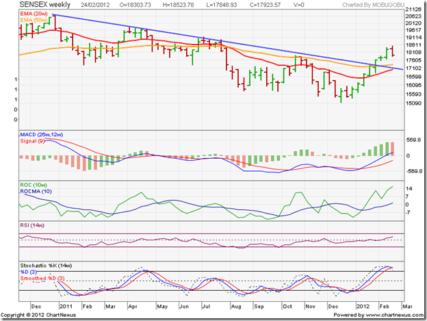
On the weekly bar chart, the Sensex is trading above its rising 50 week EMA. The 20 week EMA is rising below the 50 week EMA, and an impending cross above the 50 week EMA may seal the fate of the bears. On the downside, the Sensex is likely to receive strong support from the 17000 – 17300 zone (where the 20 week EMA, 50 week EMA and the blue down trend line are congregating). A convincing drop below the down trend line may end the nascent bull market – but as of now, the probability of that happening is low.

The technical indicators are still quite bullish. The MACD is climbing above its signal line in positive territory. But the histogram has dipped a bit. The ROC is positive and rising well above its 10 week MA. The RSI is creeping up towards its overbought zone. The slow stochastic is inside its overbought zone, but showing signs of turning down.

The election results in UP and the central budget after that will be the next triggers for the Sensex to move up or down. Till then, expect some consolidation. Hold on with a stop-loss at 17300.

NSE Nifty 50 index chart

Nifty_Feb2412

There are a couple of technical points to note on the Nifty 50 daily bar chart pattern. First, the small gap on the chart (between 5420 and 5460) was closed on Fri. Feb 24 ‘12. That has probably put paid to another sharp up move for the time being. Second, the ‘golden cross’ (highlighted by the light-blue oval – just below the blue down trend line) of the 50 day EMA above the 200 day EMA is about to confirm the return to a bull market.

The technical indicators are beginning to look bearish. The MACD is positive, but has crossed below its signal line. The ROC has dropped well below its 10 day MA and is about to enter the negative zone. Both the RSI and the slow stochastic have fallen sharply from their overbought zones and seem ready to slip below their 50% levels.

The correction may continue a bit longer and drop the index below its 20 day EMA. The confluence of the 50 day EMA, 200 day EMA and the blue down trend line should provide strong support near the 5200 level. In case the index falls below 5200, the bull rally may take some time to resume.

Rising oil prices will extract a heavy toll on India’s surging balance of payment problem. If the RBI maintains interest rates at current levels, there will be no fundamental reason for a runaway bull market. However, the FIIs are aware that their buying and selling move the Indian market. So remain calm and follow sound investing principles – like remaining true to your asset allocation plan and picking fundamentally strong stocks that do not use too much debt leverage.

Bottomline? The chart patterns of the BSE Sensex and NSE Nifty 50 indices appear to be resting a little after a hectic rise into the first stage of new bull markets. Stay invested with stop-losses at 17300 (Sensex) and 5200 (Nifty). Any bounce up from the blue down trend lines will be buying opportunities. Drops below the down trend lines may stall the nascent bull markets. Be alert and nimble. No need to be gung-ho bullish or bearish.

Jumat, 24 Februari 2012

Manual for TipsterTrendlines for MT4

Instead of keeping a PDF up to date, I decided to keep a blog post, its easier to update.

Files are available at these two forums;

Stevehopwoodforex.com

Forex Factory

Introduction

I wrote this EA to be able to place my manual trades easily, avoid errors, and let the computer do the repetitive tasks. If you enter trades manually this EA should help you.

I use EA robots as well, but mainly I enter manual trades based on price action. This EA can be used on the same platform as other robots, just make sure the Magic Numbers (MN) are different. This EA also used Magic Number to track, so ensure your broker let’s you use MN’s. Order comments are used but not required. Brokers such as Oanda do not let you use MN’s, and the comment field is filled out by them so be careful, run this on a demo account first to ensure it works as expected.

This document will only discuss the 2P version, the 1P is very similar.
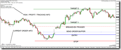
image

Setup

Put the file into the experts folder and start (re-start) MT4. Drag it onto an open chart. At the first incoming tick the EA will draw all the lines you need to set-up your trade. There are no ticks on weekends so you may need a tick simulator for the EA to draw the lines.

The EA uses include files that are already on your system. (DLL’s were removed in version 10a).

· #include <stdlib.mqh>

· #include <stderror.mqh>

Functionality

To setup an order, you need to place the 5 lines on the chart to a valid location (Entry, Stop, Target 1, Target 2, BreakEven), then go to Expert Advisors Properties and set LimitOrder to true or false. The lines are initially drawn on the chart by the EA after the first tick is received, if you can’t see the lines then right click on the chart -> Object, and delete all of them. The EA will display the order type on the lower left of the chart, check it before you set “Live” to ‘true’ in EA Properties. Lines can be horizontal or sloped.

The EA determines the type of order based on the location of the lines relative to each other and current price. Note: If the ticket numbers (generate by MT4) are not sequential a pop up box will appear, you can select to delete the orders. If the order ticket numbers are not sequential, the EA cannot manage the trade properly.

Placing a Trade

Here’s a quick run through of how a typical trade set-up is accomplished once the EA is on the chart and MT4 is set up as described above.

1. Set up the lines.

2. Turn on the EA, EA properties à Live = “true”, LimitOrder = “true of false”

3. Price is not between the dashed blue buffer line and the blue entry line, the bottom left on the screen says “+LIVE+ …waiting. Sell Stop order set”.

4. Price is now between the two lines described above, two orders are sent to the broker (pending limit orders), and the only difference is the targets. The bottom left of the screen says “+LIVE+ <<PENDING ORDER>> Sell Stop order for 0.10 lots

5. The target for the second order is always closest to the entry, the EA takes care of this, even when you move the lines around when the trade is open. This is done so it can track the single remaining order once the first target is hit. When you have a pending order (not filled) you can drag the lines around. Note that the lines cannot be on top of each other, the EA keeps them slightly apart so you can grab them.

6. When price hits the entry line you are now in a position, you can drag the lines around. Be careful not to drag the targets or stops to close to current price or your position could be closed unexpectedly. Sometimes it’s a good idea to make Live = false and adjust the lines up, then turn it back on. You can also use the “Expert Advisor” button on the MT4 menu area.

7. A screen capture image is stored in /experts/files/ with the filename that shows the symbol, ticket number, etc so you can figure out what the trade setup was when you look at the picture in the future. Images are captured so you can review your trades later to see what you can improve upon.

8. After price hits a target one order is closed and the other is tracked by the EA as long as it is on and running. If you used horizontal lined you can turn the EA off. If you used sloping lines you need to leave it on so it will update the new order details as new bars open.

9. Once both positions are closed an image capture is stored in /experts/files/

10. To reset the EA you can just delete one of the lines, the line will be re-drawn and the EA will be ready to go again. The best method however, is to got o EA properties, “Reset”, then right click on the chart to “Objects”, CNTL A to select all, then “Delete”. Another way is to use the TipsterDelete script that will clear the screen.


LIMIT ORDERS (set in EA Properties LimitOrder true)

Buy Limit Order:

· Current price must be above the blue entry line.

· Both green target lines must be above the blue entry line.

· The red stop line must be below the blue entry line.

· The dashed red breakeven line must be above the blue entry line.

· The order will be sent when price is above the blue entry line and below the dashed blue buffer line.

· The distance between the blue entry line and the dashed blue buffer line can be set in EA Properties.

clip_image002[4]


STOP ORDERS (set in EA Properties LimitOrder false)

Sell Stop Order:

· Current price must above the blue entry line.

· Both green target lines must be below the blue entry line.

· The red stop line is above the blue entry line.

· The dashed red breakeven line is below the blue entry line

· The order will be sent when price is above the blue entry line and below the dashed blue buffer line.

· The distance between the blue entry line and the dashed blue buffer line can be set in EA Properties.

clip_image004[4]


The Break-Even Line

The BreakEven (BE) dashed red line is set to the price where you want the stop moved to breakeven, note there is an automatic breakeven offset in this EA, when price hits the dashed red line it takes the spread and doubles it. In the above chart, price needs to move up past the blue entry line and eventually to the dashed red line, at that time the orders stop will be moved to the entry price. If you don’t want to use the BE feature, put the dashed red line beyond the second target.

DANGER - Watch out for this scenario – a sell stop order is set up, looking for a break downwards. The price breaks through and we enter a position. Price climbs up then back down to the BE line. At this time the stop is moved to BE but BE is below current price, the trade is closed for a loss. I suggest always using a horizontal BE line that is placed away from any possibly entry on the current bar. Then you can walk away and check the trade progress at a later time.

clip_image006[4]

Using Magic Numbers to track your progress

The EA “out of the box” (OOTB) is set to use MagicNumber 900000 and 900001, 900000 for the first order and 900001 for the second. Whatever you choose for the MagicNumber, the next order will be MagicNumber + 1. MagicNumbers are required for this EA to function.

I use MyfxBook to track my trading progress. When I place orders on different types of set-ups I use a different MagicNumber. Here’s how I do it;

Default: 900000, if I see this on MyfxBook, I know I didn’t set the MagicNumber up and I would have to check my screen captures to see what kind of a trade it was.

1st Digit:

· 9 = TipsterTrendlines

· 8 = Tipster Trendlines straddle trade (use 9 for top line, 8 for bottom line)

2nd digit: At demand or a breakout.

· 0 = forgot to set it (default)

· 1 = Enter trade at a demand or supply level (limit order)

· 2 = Breakout trade (stop order)

3rd digit: # of take profits used, usually 2 but if I put them around the same area this would be a 1.

· 0 = forgot to set it (default)

· 1 = 1 target for both orders

· 2 = 2 target locations

4th digit: Breakeven location.

· 0 = forgot to set it (default)

· 1 = Entry, BE, Target, Target

· 2 = Entry, Target, BE, Target

· 3 = Entry, Target, Target, BE

5th digit: Sloped or horizontal lines.

· 0 = forgot to set it (default)

· 1 = horizontal

· 2 = sloped

· 3 = straddle trade horizontal

· 4 = straddle trade sloped

6th digit: Used by EA to track orders. Use zero (0).

Examples

· 900000 = forgot to set MagicNumber, don’t know what kind of trade or set-up it was, check screen captures

· 912110 = Demand/Supply, 2 targets, Entry | BE | Target | Target, horizontal lines

· 922220 = Breakout, 2 targets, Entry | Target | BE | Target, sloped lines

· 911310 = Demand/Supply, 1 target, Entry | Target | Target | BE, horizontal lines


EA Properties (F7)

This is what the properties box looks like

clip_image007[4]

Here is the code for the external user inputs. You can go into the code and set the user inputs to your defaults then press “compile”. In addition, you can remove the “extern” on any line and the user input will disappear from the properties pop up box.

clip_image008[4]

EA Properties Settings Explanation

Setting

Value

(default)

Explanation

Live

true

false

T = EA is running and will place orders and manage orders

F = EA will draw lines but will not place any new orders or manage any orders or positions

LimitOrder

true

false

T = Limit order will be placed

F = Stop order will be placed

EnterOnClose

true

false

Waits for the current candle to close before sending the order. Could help avoid false breakouts.

UseRiskManagement

true

false

Determines lot size based on account size and distance from entry to stop. This will determine the order size as if one order was being placed.

RiskPercent

Integar

(2)

Percent of account balance used in the UseRiskManagement calculation

ManualLots_Help

Note

This reminds you that the number of lots (ManualLots) will be doubled since 2 orders are being placed. So if you indicate 0.1 lots, two orders are placed at 0.1 lots, for a total for 0.2 lots.

ManualLots

Integar

(0.1)

Number of lots for each individual order.

MagicNumber

Integar

(900000)

Use a different magic number if you use the same symbol on different charts.

Place_Order_Buffer

Note

A note to remind you of the setting below

PlaceOrderBuffer

Integar

(500)

The distance from the blue entry line to the dashed blue buffer line

textcolor

Color black

Color of the on screen text.

OrderLineColor

Color blue

The color of the entry line.

Emailalert

true

false

If you set up email in options, you will get an email when an order is placed, filled, and closed.

DisableSTOPAndTARGET

true

false

Setting to true lets you place the order with just the entry line. You can also use entry and target, or entry and stop. This disables the check for the lines.

Slippage

Integar

(3)

Amount of slippage you will allow for your orders

Reset_Stop

note

If you press Q and P together on your keyboard the stop will go to the red line. This is helpful if the stop went to breakeven and you don’t want it at breakeven yet. You have to have dll’s enabled in EA properties Common tab for this to work.

ShowRiskInfo

true

false

This will show risk related information on the top left of the chart screen

ShowDebug

true

false

This will show debug messages in the experts tab

ShowInformation

true

false

This shows account information in the experts tab, such as point size, etc.

ShowInstructions

true

false

This will show brief instructions on using this EA on the screen

PrintMagicNumbers

true

false

This will print all the magicnumbers to the experts tab. Useful if your platform lost settings. For example, you can determine the magic number of specific trade by ticket number and symbol, set up TT2P and it will track the order for you.

CaptureScreenShot

true

false

When a position is entered a screen shot will be stored in /experts/files/ and again when the trade is closed. A screen shot is not saved at the first target, only at stop or second target.

TipsterDelete Script (TipsterDelete_v2.mq4)

Script Files

These files are optional; you don’t need it to run the main EA (TT1P or TT2P). Additional information is on the last page.

· TT2P_DeleteLines.mq4

This script will delete all the lines that TT2P created on the chart. Put the file in /experts/scripts/ and re-start MT4. To use it, open navigator and look for it under “scripts”, drag it onto the chart or double click it. In addition, you can right click on it, select “set hot keys” for using a keyboard shortcut, I recommend “ALT D”.

· TT2P_ALL_On_Off.mq4

Run tis script to turn the TT2P ON or OFF on all charts that it is loaded on. Be careful. I review all my charts first, for example on Sunday night after I re-boot and defrag, then turn them all on.

· TT2P_ResetStop.mq4

Run this script to reset the stop line and move the stop back to the red stop line. Under normal operation, the EA will only move the stop towards profit and won’t let you move it away unless you run this script. A pop up message will appear.

Straddles

You can set up a straddle trade using two charts with the same symbol. You need to use different magic numbers.

Back test

You can run this EA in back test mode to practice. Use visual mode and set the expert to live before you press start. Once it is started you need to slow it down or pause it to move your lines into place. You won’t have access to the expert properties during the back test. To set up the next trade, just right click on one of the lines and delete it, the expert will reset it-self.

Tick Simulator

The EA requires ticks to function so it doesn’t work very well on the weekends, the EA will only execute code when it receives an incoming tick. You can use a tick simulator such as “mt4ticker.exe”.

Definitions:

Buy Stop Order

A stop order that becomes a market order to buy a security if it rises above its current price. That is, a buy stop order is not executed so long as the security is at or below the price when the order was made, but is executed at the best available price when it rises above that order. An investor who makes a buy stop order operates on the premise that if a security rises, it will likely continue to rise. In other words, the maker of a buy stop order hopes to profit from a security's upward momentum.

Sell Stop Order

An order to a broker to sell a security if its price falls below a certain level. A sell stop order exists to stop the losses, should a security's price fall. That is, it protects against further losses. This is not a stop loss order, this order is used to enter the market.

Limit order

An order to buy a stock at or below a specified price, or to sell a stock at or above a specified price. For instance, you could tell a broker "buy me 100 shares of XYZ Corp at $8 or less" or "sell 100 shares of XYZ at $10 or better" The customer specifies a price, and the order can be executed only if the market reaches or betters that price.

Stop loss order

Used to protect your position from additional loss. For a long position, a stop order turns to a market order when price goes below the stop order value and the position is liquidated.

For further reading on order types, consult Google or your broker.
Stock Index Chart Patterns – Hang Seng, Taiwan TSEC, Korea KOSPI – Feb 24, ‘12

Chart patterns of the Asian indices are in various stages of recovery from their 2011 lows. Technically, only the Korea KOSPI chart has re-entered a bull market. The Hang Seng chart is about to join the Korean index in bull territory. The Taiwan TSEC index is still struggling to get out of a bear hug.

Hang Seng index chart

HangSeng_Feb2412

The Hang Seng index has climbed almost 35% from its Oct ‘11 low of 16170, and closed the larger of the two downward gaps formed on the chart in Aug ‘11. It has sailed past its 200 day EMA and is correcting a bit after almost reaching the 22000 level. The ‘golden cross’ of the 50 day EMA above the 200 day EMA will confirm a return to a bull market. Note the bullish pattern of higher tops and higher bottoms from the Oct ‘11 low.

Negative divergences are visible in all four technical indicators – three of which touched lower tops as the index rose higher, while the MACD remained flat. The ongoing correction may continue a bit longer. The dip can be used to add selectively.

Note the head-and-shoulder patterns that formed on the ROC, RSI and slow stochastic during Oct-Nov ‘11 even though such a pattern isn’t visible on the Hang Seng chart. The subsequent correction over the next two months turned out to be a consolidation within a symmetrical triangle.

The upward break out from the triangle in early Jan ‘12 was accompanied by increasing volumes, which validated the break out. However, volumes have been sliding ever since the index crossed above its 200 day EMA – raising questions about the sustainability of the rally.

Taiwan TSEC index chart

TSEC_Feb2412

The Taiwan TSEC index has risen 21% from its Dec ‘11 low of 6609 and past its 200 day EMA on strong volumes, but is facing resistance from the lower end of the large gap formed on the chart in Aug ‘11. The 20 day EMA has crossed above the 200 day EMA, but the 50 day EMA is still a couple of hundred points below the long-term moving average.

The gap on the chart needs to be closed before the index can re-enter a bull market. The technical indicators are suggesting that may not happen in the near term. The slow stochastic is inside its overbought zone, but has started falling. The MACD is positive and touching its signal line, but has also started falling. The ROC is positive but sliding towards the ‘0’ line. The RSI has dropped sharply from its overbought zone.

A correction to the rising 20 day EMA is likely.

Korea KOSPI index chart

Kospi_Feb2412

The Korea KOSPI index chart has gained almost 25% from its Sep ‘11 low of 1644 and is trading well above its 200 day EMA. The lower of the two gaps on the chart, formed in Aug ‘11, has been closed. The 50 day EMA has crossed above the 200 day EMA. The rally has gained strength during Feb ‘12 – as indicated by the rising volumes.

However, all is not well. All four technical indicators are showing negative divergences by sliding down while the index was rising. A correction has started, and may continue a bit more. The dip can be used to add.

Bottomline? The chart patterns of the Asian indices are in the process of recovering from their brief bear markets. The bulls still have some work left. The bears are unlikely to give in easily. The doomsday scenario painted by many - thanks to the sovereign debt problems in the Eurozone – may not turn out to be as bad as expected. Use the ongoing correction/consolidation to buy selectively.

Kamis, 23 Februari 2012

Is OnMobile Global for sale?

A few weeks back, there was a rumour in the market that TCS was looking at the possibility of buying OnMobile Global. That remained a rumour and did not become news. Those who may have bought the stock on the basis of the rumour may be waiting for an opportunity to sell.

That opportunity may not be far away. As per a recent article in Business India magazine, OnMobile Global is on the block and the latest suitor is Idea Cellular (of the Aditya Birla group). Apparently, Idea is ready to buy a 60% stake in the company at a price of Rs 100 – which is 33% higher than today’s closing price of Rs 74.40.

If this rumour turns out to be true, then investors may be able to pocket a neat gain if they enter at the current market price. Acquisition of a 60% stake – or even a lower stake - will trigger an open offer to existing shareholders.

In a post on the telecom sector a couple of months back, it was observed that the OnMobile stock was trying to form a bottom by consolidating within a rectangular band between 54 and 73. It was suggested that the stock could be a contrarian bet, but with a strict stop-loss at 52.

In Jan ‘12, the stock crossed above the rectangular consolidation zone, rose to an intra-day top of 84 on Feb 15 ‘12 and briefly breached its falling 200 day EMA. It has now pulled back to the top of the rectangular band. An upward bounce can be used to add/enter.

What if the rumour about Idea‘s stake buy remains a rumour – like it happened in the case of TCS? The company is fundamentally strong, and its overseas businesses, which contribute nearly half of its total revenues, are supposedly doing well. Domestic business is under pressure. Q3 results showed 12% top line growth but a 11% dip in the bottom line.

With smart phones becoming cheaper by the day and 3G service roll-outs in progress, OnMobile’s expertise in value-added software services should see growing demand. Even if the stake sale doesn’t go through, it may be worth holding on to the stock. A buy-back by the management, with a ceiling at Rs 85, is currently in progress.

Rabu, 22 Februari 2012

Stock Index Chart Patterns - BSE Sectoral Indices, Feb 22, '12

A few days after the previous post two months back on the chart patterns of BSE’s Sectoral indices, the Sensex touched a bottom and embarked on a two months long rally. It may be a good time to check how the Sectoral indices have fared.

BSE Auto Index

BSE Auto Index

The BSE Auto index received good support from the lower end of the rectangular consolidation zone between 8000 and 9700 and rallied smartly to the upper end of the band earlier in Feb ‘12. After a brief consolidation, the index has broken out to test its Jan ‘11 top.

A pullback down to the top of the rectangular band can be expected. The ‘golden cross’ of the 50 day EMA above the 200 day EMA and more than a 20% rise from its recent bottom have confirmed a return to a bull market. Add on dips.

BSE Bankex

BSE BANKEX

The BSE Bankex has risen more than 40% from its Dec ‘11 low, but is yet to test its 2011 tops. The index has moved well past the support/resistance level of 11400 and its 200 day EMA, but the ‘golden cross’ is still awaited. That should not deter investors from accumulating.

BSE Capital Goods Index

BSE Capital Goods Index

The BSE Capital Goods index is struggling to break the stranglehold of the bears. It is trading below the support/resistance level of 12300 and is yet to convincingly move above its 200 day EMA. Accumulate selectively.

BSE Consumer Durables Index

BSE Consumer Durables Index

The BSE Consumer Durables index has risen almost 40% from its Dec ‘11 low and is on the verge of entering a bull market. Three ‘fan lines’ have been drawn through the Nov ‘10 top. Note that the second line drawn through the Apr ‘11 top became a support level in Jun, Aug and Nov ‘11. After getting breached in Dec ‘11, it briefly acted as a resistance level. Accumulate selectively.

BSE FMCG Index

BSE FMCG Index

One look at the BSE FMCG index should make it clear to all why it is my favourite sector. Despite a brief drop below the 200 day EMA in Feb ‘11, the index remained in a bull market and outperformed the Sensex. Nothing spectacular or exciting, just a steady climb along the second fan line. Add on dips.

BSE Healthcare Index

BSE Healthcare Index

After a 13 months long consolidation within a triangle pattern, the BSE Healthcare index has broken out upwards and returned to a bull market. It is currently consolidating within a small ‘falling wedge’ pattern from which it should break out upwards. Accumulate.

BSE IT Index

BSE IT Index

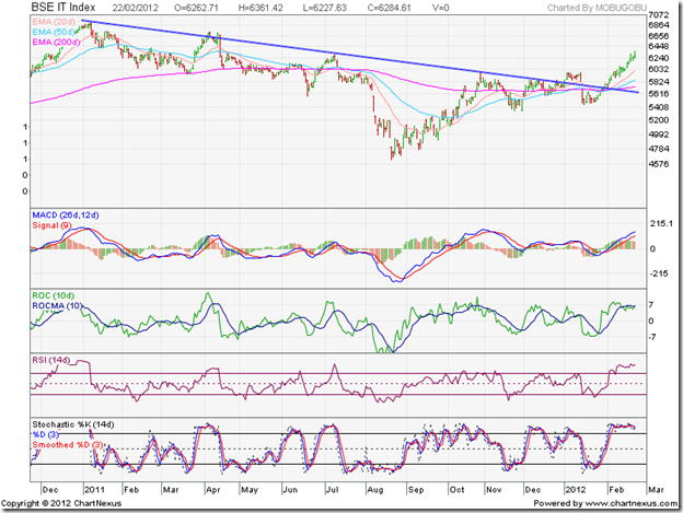
The BSE IT index has sailed above the blue down trend line and back into a bull market. The expected slow down in the Eurozone didn’t happen. Add on dips.

BSE Metal Index

BSE Metal Index

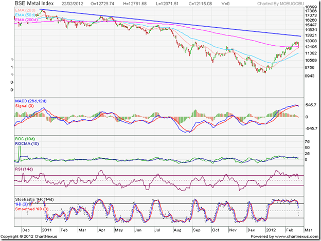
The BSE Metals index is still in a bear market, despite rising 37% from its Dec ‘11 low and a brief foray above the 200 day EMA. The blue down trend line continues to rule the chart. One can be a contrarian, but be very selective in choosing stocks.

BSE Oil & Gas Index

BSE Oil & Gas Index

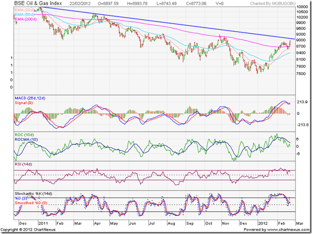
The BSE Oil & Gas index is trying desperately to stay above the 200 day EMA, but has still not broken its down trend line. Interference by the government has almost ruined this sector. Avoid the oil PSUs. The gas PSUs are in better shape.

BSE Power Index

BSE Power Index

A spectacular rally in the beaten down BSE Power index has almost propelled it into a bull market. The index is trading above its 200 day EMA and has pulled back to the blue down trend line after climbing past it. The ‘golden cross’ is still awaited. Rumours of likely sops in the forthcoming budget has fuelled the rally. Unless coal supply is ensured, the power sector may continue to face headwinds. Avoid.

BSE Realty Index

BSE Realty Index

The BSE Realty index had been hammered to a pulp by the bears, but is trying to make a strong recovery. The chart shows an upward break out from a bullish inverse head-and-shoulders reversal pattern. The ‘head’ of the pattern is itself a mini inverse head-and-shoulders pattern. Note that the minimum upward target from the inverse head-and-shoulders pattern has been met.

After climbing above the 200 day EMA and the support-resistance level of 1900, the index is pulling back towards both. If you want to invest in the sector, you may want to read this recent post.

Selasa, 21 Februari 2012

Gold and Silver chart patterns: an update

Gold Chart Pattern


Two weeks ago, gold's price had begun a correction after testing the Dec '11 top of 1770. So far, the 20 day EMA has provided good support to the price. The corrective pattern is looking like the 'handle' of a bullish 'cup and handle' pattern. That means a likely upward target above the 1900 level and a test of the all-time high touched in Sep '11.


The technical indicators are reflecting the effects of the correction. The RSI is sliding, but is above its 50% level. The MACD is positive, but has slipped below its signal line. The slow stochastic is looking bearish by falling below its 50% level, but is trying to turn around. Gold's price is trading above all three EMAs - the sign of a bull market.


Add, with a stop-loss at 1650. Conservative investors can wait for a convincing move above 1770 to enter.


Silver Chart Pattern


Silver's chart pattern shows that despite spending three weeks above the 200 day EMA - which should have been a bullish sign - the 20 day EMA has failed to cross above the 200 day EMA. The formation of a bearish 'rounding top' pattern is another concern for the bulls.


The technical indicators are beginning to look bearish. The RSI is steadily falling towards its 50% level. The MACD is barely positive, and has crossed below its signal line. The slow stochastic is below its 50% level, and still falling. Looks like silver's price is in danger of sliding back into a bear market.


Enter only on a convincing break above 36.

Senin, 20 Februari 2012

Stock Index Chart Patterns – S&P 500 and FTSE 100 – Feb 17, ‘12

S&P 500 Index Chart

SnP500_Feb1712

The following observation was made in last week’s analysis of the S&P 500 index chart pattern: “A correction down to the rising 20 day EMA may be just the impetus that the bulls need to take the index past the May ‘11 top of 1371.” There was no correction – just a sideways consolidation. But the index rose to an intra-day top of 1363, within hand-shaking distance of the May ‘11 top of 1371. The bears have been all but vanquished.

Low volumes as the index rose to a new high, as well as negative divergences in all four technical indicators – which failed to reach new highs with the index - may be the trigger for a correction this week. That doesn’t mean one should short a bull market. All three EMAs are rising and the index is trading above them.

The technical indicators are looking bullish. Only the slow stochastic is looking overbought, but it can remain so for long periods. The MACD has slipped a bit, but is still positive and touching its signal line. The RSI is rising towards its overbought zone. The ROC is positive, but moving sideways.

The US economy continues to improve slowly. Initial weekly unemployment claims dropped to 348,000, its lowest level in almost 4 years. Retail sales increased by 0.4% in Jan. YoY changes in housing starts was positive for the 5th month in a row. Industrial production was marginally higher. All talk about recession is now off the table.

FTSE 100 Index Chart

FTSE_Feb1712

The FTSE 100 index traded sideways during the past week. Despite an intra-day drop to its rising 20 day EMA on Thu. Feb 16 ‘12, the index managed to close about 50 points higher on a weekly basis. All three EMAs are rising and the index is trading above them – indicating a bull market.

The technical indicators are bullish. The slow stochastic is inside its overbought zone. The MACD is positive, and touching its signal line. The RSI has climbed sharply towards its overbought zone. The ROC is positive, but moving down.

There was some good news on the economic front. CPI dropped to 3.6% in Jan. from 4.2% in Dec. Retail spending rose a surprising 0.9% in Jan. - raising hopes of avoiding a double-dip recession. However, Eurozone GDP declined by 0.3% in Q4 ‘11. Even Germany’s growth shrank and increased prospects of a recession that will dent UK’s exports to the EU.

Bottomline? Chart patterns of the S&P 500 and FTSE 100 indices are in bull markets. Stay invested with trailing stop-losses, and use dips to add.

Sabtu, 18 Februari 2012

BSE Sensex and NSE Nifty 50 index chart patterns – Feb 17 ‘12

Before getting into detailed analysis of the BSE Sensex and NSE Nifty 50 index chart patterns, I have a confession to make. One of the reasons technical analysis is looked down upon by many well-known investors is because it can not ‘predict’ what will happen next – so why even bother to look through charts?

Well, the fault doesn’t lie in the charts but with the analyst who is interpreting the charts. The sudden rally that started on the Sensex and Nifty charts from the Dec ‘11 lows appeared to come as a bolt from the blue and was attributed to a rush of FII buying. That is only part of the story. On a closer inspection of both short-term and long-term charts over the weekend, it became quite clear that both indices clearly formed symmetrical triangle reversal patterns for about 4 weeks.

Why did I miss these reversal patterns earlier? A combination of hubris and a bid to second-guess the market. Symmetrical triangles are usually continuation patterns. Since the indices were in bear markets, it was expected that the break out from the triangles will be downwards. But triangles are notorious for being unreliable and can break out in either direction. Not often do triangles turn out to be reversal patterns. Also, the reversal pattern lasted only 4 weeks – much shorter duration than expected after a year-long down trend.

BSE Sensex index chart

SENSEX_FEB1712

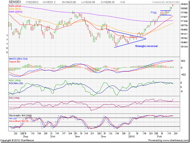
Is this still a bear market rally or the first phase of a new bull market? Two patterns on the 6 months daily bar chart of the Sensex suggests that the trend has indeed changed. First, the small rectangular ‘flag’ pattern that formed after the index convincingly crossed above its 200 day EMA. Such patterns usually form at the mid-point of a strong up (or down) move. That gives an upward target above the 20,000 level. The ‘golden cross’ of the 50 day EMA above the 200 day EMA will confirm a bull market.

The break out above the ‘flag’ happened with a ‘gap’ – which makes the break out a strong and valid one. So, the rally is likely to continue despite the overbought condition. The MACD is positive and above its signal line, but the histogram has reduced in height - correcting the overbought situation a little. The ROC is showing negative divergence by failing to reach a new high and slipping below its 10 day MA. Both the RSI and the slow stochastic are well inside their overbought zones, and can stay there a while longer.

If you are holding from lower levels, don’t sell off in a hurry. Maintain trailing stop-losses and ride the bull. If you have missed the rally, don’t jump in now. At some point, there should be a decent 5-10% correction. Enter then.

NSE Nifty 50 index chart

Nifty_Feb1712

The 4 weeks long consolidation within a symmetrical triangle on the 1 year weekly bar chart pattern of the Nifty was followed by an upward break out on increased volumes. The volumes kept rising even further as the index climbed past the 50 week EMA and the blue down trend line. Strong volume support validates upward break outs.

The technical indicators have turned bullish. The MACD is rising above its signal line and has entered the positive zone. The ROC is also positive and above its 10 week MA. The RSI has moved above its 50% level. The slow stochastic has entered its overbought zone. Any pullback to the blue down trend line – if it happens – will provide a buying opportunity. The ‘golden cross’ of the 20 week EMA above the 50 week EMA will be the final confirmation of a return to a bull market.

The fundamentals remain a matter of concern. Q3 results have shown continued downward pressure on margins of India Inc. The fiscal deficit will end up much higher than announced in the previous budget. Big ticket reforms are pending for a long time. Interest rates remain high.  A Greek sovereign default hasn’t been ruled out. War drums are being beaten - an Israeli attack on Iran can change bullish equations.

Bottomline? The chart patterns of the BSE Sensex and NSE Nifty 50 indices have entered bull markets – thanks to strong buying support from the FIIs. It is unusual to see mid-cap and small-cap stocks making smart moves at the early stage of a bull market. Stock markets move on their own logic – there is no point in trying to second-guess the market. As Steve Winwood sang not too long ago: “Just roll with it, baby” – but remember to maintain trailing stop-losses.

Jumat, 17 Februari 2012

Chart Patterns of 10 Realty Sector stocks (an update)

If you have the money, buy realty, not realty sector company stocks. Why? Because most realty sector companies lack transparency, need lots of capital, have poor governance and a tendency to take buyers for a ride. Not to forget the nexus of local politicians and the underworld that usually leads to substandard quality of construction.

In the previous bull market, the sector was a favourite of big and small investors, and provided astounding returns to some. Those glory days are long gone, and unlikely to return. If you are stuck at higher levels, use the current rally to exit or switch.

In a previous post more than a year back, brief technicals of 10 realty sector stocks were presented. Not for suggesting investment, but to point out that even in a not-so-great sector, there are a few stocks that can swim against the tide. If you are enamoured by the real estate sector, pick those few exceptions.

Hubtown (Ackruti City)

Hubtown(Ackruti)_Feb2012

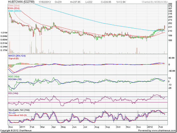
A change of name and branding hasn’t changed the fortunes of Ackruti City – now known as Hubtown. The stock has provided no returns for the past year, and is technically still in a bear market. It is showing some signs of life, but the technical indicators are pointing to a correction from overbought condition.

Ashiana Housing

Ashiana Housing_Feb2012

In complete contrast to the Ackruti City/Hubtown stock chart, the chart pattern of Ashian Housing is in an uptrend in a bull market, and touched a 52 week high last week. Note that the Dec ‘11 low, from which the current rally started, was actually a higher bottom than those touched in May ‘11 and Oct ‘11. Technical indicators are looking overbought, but looks like there is some steam left in the rally.

DLF Ltd

DLF_Feb2012

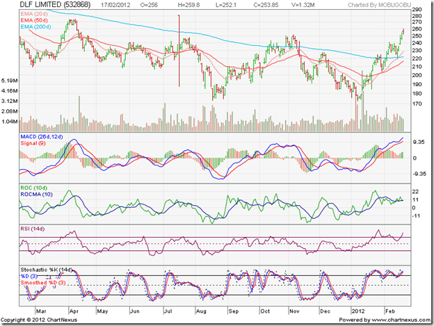
The big daddy of the real estate sector, DLF has provided almost zero returns over the past year and is trying to emerge from its 15 months long bear market. The stock dropped more than 50% from its Oct ‘10 peak, underperforming the Sensex, and is looking overbought.

DS Kulkarni

DSKulkarni_Feb2012

The stock traded within a rectangular band between 46 and 66 during the past year, before breaking out above the 66 level on a volume spurt last week. The stock price immediately pulled back to the 66 level, but the 50 day EMA crossed above the 200 day EMA indicating a possible return to a bull market.

Ganesh Housing

Ganesh Housing_Feb2012

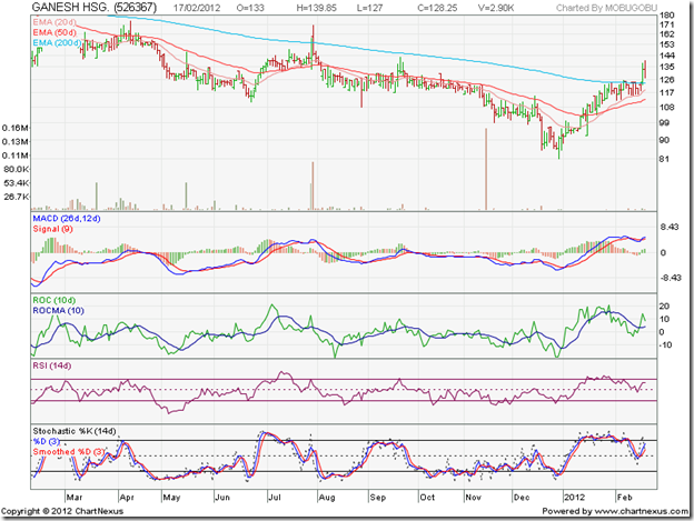
This was one of the better performing stocks in 2010, but suffered badly as the bears took their toll in 2011. The stock has given no returns during the past year and is technically still in a bear market, and the bearish pattern of lower tops and lower bottoms continues. The stock had shaved off 70% from its Oct ‘10 peak.

HCC

HCC_Feb2012

The Lavasa controversy nearly dropped the stock into single digits, as it fell 80% from its Jan ‘10 peak. The current sharp rally, backed by strong volumes, has caused a 100% jump from its Dec ‘11 low but the stock is technically still in a bear market. Technical indicators are signalling an overbought condition.

Omaxe

Omaxe_Feb2012

This is another stock that has been in a bull market, after forming three intra-day bottoms at 120. It has climbed above its previous intra-day high touched in Nov ‘10, and is trading above all three of its rising EMAs.

Purvankara

Purvankara_Feb2012

The stock is desperately trying to get out of a strong bear grip after providing negative returns over the past year. Technically, it is still in a bear market.

Unitech

Unitech_Feb2012

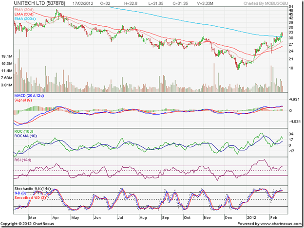
This is one stock that tried to fly too high, like Icarus, and came crashing down to lose 80% from its Oct ‘10 peak. It provided negative returns over the past year and is still in a bear market technically.

Vijay Shanti Builders

Vijay Shanti Builders_Feb2012

A favourite stock of small investors, it lost more than 75% from its Jan ‘10 peak. The current rally has seen a spectacular parabolic rise, but the stock is looking extremely overbought.

Bottomline? The broader market rally from Dec ‘11 lows has propelled beaten down realty sector stocks above their 200 day EMAs, but that doesn’t mean their fundamentals have improved. Caveat emptor.

Data from MT4 to Amibroker & Orders from Amibroker to MT4

After learning all about MT4 and MQL language, I thought “MT4 is MT Shit”, too many limitations and I know AFL way better than MQL.  Besides that the Amibroker back tester is far superior to the MT4 back tester.  I’ll do my system up in Ami and send the order to MT4. 
Here are the steps to do this:
  1. Load historical data into Ami (See this post Forex MSN Data)
  2. Get streaming data from MT4 to Amibroker
  3. Find or make AFL and MQL files to interact between the two platforms.  I found an MQL file (on a forum) that will read a text file.  Now I just need to make the trading system AFL write the text file.  I’ll make this code as an AFL include file.
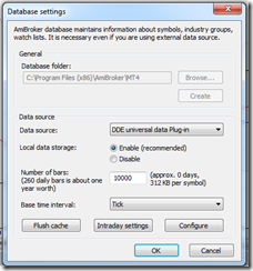
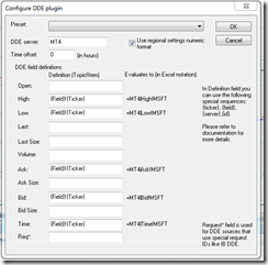
I just finished setting up the DDE feed from MT4 to Amibroker.  Here is how to set up the Amibroker DDE price feed.  One thing to watch out for is the fields, I got that part wrong initially.  See this screen shot and make sure it looks EXACTLY like this, notice the Ticker Price fields, which one comes first?  I wasn’t paying attention and spent a while figuring this out.
By the way, I’m using this on Windows 7 64 bit.
image
Notice the {Field}!{Ticker} – Field is first, when you open up this window for the first time, these fields are reversed.
image
Add the symbol to Amibroker, the same as it appears in MT4, some brokers add some stuff after the symbol, mine was only EURUSD for example.  So I added EURUSD to Amibroker.  Once you see the green box at the lower right side of Ami, add the symbol to the real time feed and watch the quotes come in. 
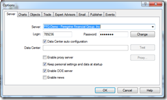
In MT4, you have to enable the “DDE Server”.  Go to “Tools->Options” and check the box.

To see errors, look at the MT4 "Journal" tab.  View->Terminal, then goto the new thingy that just opened and click the Journal tab.  You might see some errors that begin with "DDE......"

If you have any questions, use Google first, than ask me if your stuck.

image

image

Kamis, 16 Februari 2012

Stock Chart Pattern - Canara Bank (an update)

The previous post about the stock chart pattern of Canara Bank was back in Oct ‘09. The stock price was correcting after touching a 52 week high. Due to my aversion to PSU stocks in general, and Canara Bank in particular, I had advised investors to look at a couple of other PSU banks.

One of the mistakes that investors often make is failing to perceive the difference between a company and its stock chart pattern. A stock of a fundamentally sound company can perform poorly; another company that may have a weak balance sheet, can shoot up like a rocket for no rhyme or reason.

I am not ashamed to put up my hand up and say: “Mea culpa.”  I allowed a poor opinion of the customer service standards of the bank to cloud my outlook for its stock chart. A look at the three years closing chart pattern of Canara Bank will show how badly wrong I was:

CanaraBank_Feb1612

Note the two dark grey vertical lines on the chart – the first marks the date of my earlier post and the second marks the date when the stock touched its all-time closing high of 836 (a whopping 470% gain from its Mar 17 ‘09 closing low of 146 – outperforming the Sensex by a huge margin).

Shortly after I wrote the previous post, the stock price completed its correction by bouncing up from its rising 50 day EMA and then entered a 7 months long consolidation within a rectangle pattern before breaking out in July ‘10. The stock had a parabolic rise over the next 4 months and touched its all-time high of 836. Only the MACD touched a new high. The other three technical indicators - ROC, RSI and slow stochastic – failed to reach new highs.

The negative divergences gave advance signal of an impending correction, which turned out to be a change of trend as the stock fell within a downward-sloping channel for more than a year to touch a closing low of 354 on Dec 28 ‘11. The big fall of almost 500 points (58% from the peak of 836) underperformed the Sensex by more than two times.

The current FII driven rally has seen a strong recovery by the stock, which has risen nearly 55% from the low of 354 – this time outperforming the Sensex by two times. Such a performance – outperforming the Sensex during bull periods and underperforming during bear periods – can be expected from a mid-cap stock, but not from a large-cap stock like Canara Bank.

Note the two blue down arrows on the right hand side of the chart. The top one is pointing to the break out above the downward channel (and the 200 day EMA), followed by a pullback and the subsequent vertical rise. The bottom one is pointing to the sharp upsurge in volumes that accompanied the break out and subsequent rise, thus validating the break out.

Interestingly, the pullback to the top of the channel coincided with declaration of disappointing Q3 results. Net profit fell nearly 21% though income rose by 33% compared to the year-ago Q3. Both gross and net NPAs rose on a YoY and QoQ basis, which is a worrying sign. The technical indicators are looking overbought, but they have looked that way for the past month, and may remain so a while longer.

Bottomline? The stock chart pattern of Canara Bank clearly shows that it performs more like a mid-cap stock – providing large gains during bull phases and big falls during bear phases. Looks like another bull phase has begun. Add on dips, but don’t forget to maintain a suitable stop-loss.

Related Posts Plugin for WordPress, Blogger...