Sabtu, 30 April 2011

BSE Sensex and NSE Nifty 50 Index Chart Patterns – Apr 29, ‘11

Several bullish arguments were put forth in last week’s analysis of the BSE Sensex and NSE Nifty 50 weekly closing chart patterns. All attempts by the bulls to breach the down trend lines came to nought, as the FIIs remained net sellers last week. DII buying could not prevent both indices from dropping down to their 50 day EMAs.

BSE Sensex Index Chart

Sensex_Apr2911_ST

To get a better sense of Sensex movements, an ascending triangle with 18700 level as the flat top has been drawn. The zone between 18700 and 19000 is a support/resistance area. The Sensex has received support last week from the 50 day EMA, which coincides with the 19000 level.

The technical indicators are looking quite bearish. The MACD is falling below its signal line, though both are still positive. The ROC touched its 10 day MA, then dropped like a stone into negative territory. Both the RSI and slow stochastic are below their 50% levels, and heading down. The down trend that started from the Nov ‘10 top is intact.

The 200 day EMA is a little above the 18700 level. The two together may provide strong resistance if the Sensex falls further. Below that, the upward sloping trend line of the ascending triangle is another likely support. If the FII selling continues, the Sensex can drop to the longer-term support level of 17600.

The down trend line needs to be breached on strong volumes for the bulls to regain control.

Nifty 50 Index Chart

Nifty_Apr2911

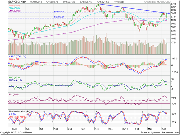
The break out from the ascending triangle pattern was accompanied by rising volumes, indicating that the break out was a valid one. But the upside target of 6020 could not be met, as the Nifty ran into strong resistance from the down trend line.

The zone between 5600 and 5700 should provide good support, in case the Nifty falls further. Below that, the upward sloping trend line of the ascending triangle may provide support. If the Nifty drops more – continued FII selling could trigger that – it may test the long-term support at 5300.

High volumes on down-days during April ‘11 is a sign of distribution. Since retail participation has dwindled, the logical assumption is that stocks are moving from FII accounts to DII accounts. The markets have already discounted a likely 25 bps interest rate hike by the RBI next week. If the actual hike is 50 bps, there can be more selling. Q4 results have been mixed so far. Higher commodity prices and interest rates appear to be taking a toll on margins. But sales growth seems to be on track.

Bottomline? The BSE Sensex and Nifty 50 index chart patterns are struggling to avoid another drop into bear markets. Caution should be the watch word. If you are in profits, book some of it and stash it away in a bank fixed deposit. That will enable you to buy another day.

Jumat, 29 April 2011

Calling All Robots v2

This is a re-post.  The first competition had some technical issues with the rules I set up so I stopped it and created another one.  Join in!!

If you use MT4 (or MT5) and trade forex I invite you to join this free contest. The winner gets bragging rights.

I use MTi to track my performance of both live and demo account. My demo account is running a robot and MTi allows me to see the trade stats. They recently added a new feature called "Competitions". I've started a new competition and I invite you to participate. It's called "Calling All Robots"

To enter you need MT4, and an account with MTi. It's easy to sign up. Once you've signed up you download this and install, it installs automatically. You disable the FTP feature in MT4 options as this new file will upload all the trades to MTi. It's pretty slick.

The competition is scheduled to run from Fri, 27 May 2011 14:08 GMT to Wed, 1 Jan 2020 16:00 GMT
Basically, forever!


Rules The competition is open to both live and demo accounts.
  • All accounts must be in USD.
  • The maximum size of any individual order is 5.00 lots. Competitors will be disqualified if they place an order larger than this during the competition.
  • The maximum volume traded during the competition is 10.00 lots. Competitors will be disqualified if the total volume on trades during the competition is larger than this.
  • Competitors must not make deposits or withdrawals during the competition.
  • Performance is measured from the first equity figure published by your trading software after the competition starts to the last equity figure published before the competition ends.
  • Competitors must publish from the same broker account throughout the competition.

Leader Board


AnotherBrian is my real account.
AnotherBriandemo runs a robots, or robots, on test.  Most robots are of my own making.

I also have started another competition, "Perpetual Trading", its for real accounts only and runs for a long, long time.

Kamis, 28 April 2011

Notes from the USA (Apr 2011) – a guest post

Nowadays, it seems like every investor has only one tune on her lips – the chorus from Shirley Bassey’s title song from the James Bond movie ‘Goldfinger’: “He loves only gold; only gold; he loves gold”!

When every one and his brother-in-law are excited about investing in gold, it is probably a good time to take some profits, or, at the very least, refrain from buying. KKP sounds just such a note of caution in this month’s guest post. If you enjoy reading this post, and/or disagree with him, please take a few moments to let him know (by using the ‘comments’ link below this post).

-------------------------------------------------------------------------------------------------------------

A Gold Rush or Just Gold Mania?

clip_image002

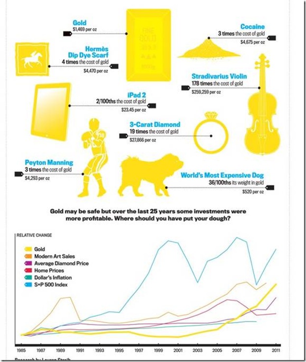
Gold and Silver have been on the top pages of many trade magazines; now it has started to appear on normal (lay people’s) magazines. The above graphic is from Newsweek…..When articles appear in abundance on magazines for the layman, it usually signals a market top or bottom of the underlying asset class. It is the peak of emotion that gives the final ‘uumph’ to the underlying asset class, and marks the top or bottom. Gold and silver are approaching such levels, leading to possible corrections. So, what actually happened?

The Dollar Index slipped to 73.735 on April 21 (and again lower on April 27), the lowest since August 2008, which really is fore-telling that the confidence in the US dollar is fading. So, is the move in gold completely a reflection of the dollar’s under-performance? Yes. Correlation has been uncanny this year - U.S. Dollar Index has fallen 6.3% since the end of last year while gold bullion has risen 6.2%!!!

Silver has more than doubled over the past year as investors rode after silver as a store of value amid speculation that China will buy gold and silver to diversify its foreign-exchange holdings.

As every speculation that mankind has experienced has come to an end, the gold bugs are concerned too. Tulip mania, Y2K reprogramming, Internet revolution, Housing boom from 2000-2006 (see graph below), FII moving billions to Emerging Markets (see graph below of crash in 2008), US being crushed under debt, US$ on a big decline etc. The concern of gold bugs is not just theoretical either. Many expect the dollar to stage a comeback after the U.S. Federal Reserve brings its monetary stimulus program — its second round of quantitative easing (QE2) — to an end this coming June 30 ’11. As interest rates are also supposed to bump up at some point in time to combat the inflation created by oil/depreciated-dollar, we will start seeing some strength in the US$. Indeed, some are anticipating that the rally could begin as soon as June-July, depending on the outcome of the Fed’s meeting. Will it last?

clip_image002

clip_image002[5]

Technically, the meteoric rise of gold and silver is a concern, which foretells a correction of some magnitude. Volatility is growing and the exponential rise is happening now. Compounding it with the economic event of QE2 ending, might be simply a convergence of events that might create a buying opportunity for gold bugs or the people who feel left out…..This might look like a bearish view from me, but it really is a cautionary view. This means that buying more at these prices is not warranted unless you are a short term trader. What do you think?

Disclaimer: I am still holding gold/silver bullion, numismatic coins, Gold ETF and gold/silver/diamond jewellery as one of the asset classes in my portfolio.

-------------------------------------------------------------------------------------------------------------

KKP (Kiran Patel) is a long time investor in the US, investing in US, Indian and Chinese markets for the last 25 years. Investing is a passion, and most recently he has ventured into real estate in the US and also a bit in India. Running user groups, teaching kids at local high school, moderating a group in the US and running Investment Clubs are his current hobbies. He also works full time for a Fortune 100 corporation.

Rabu, 27 April 2011

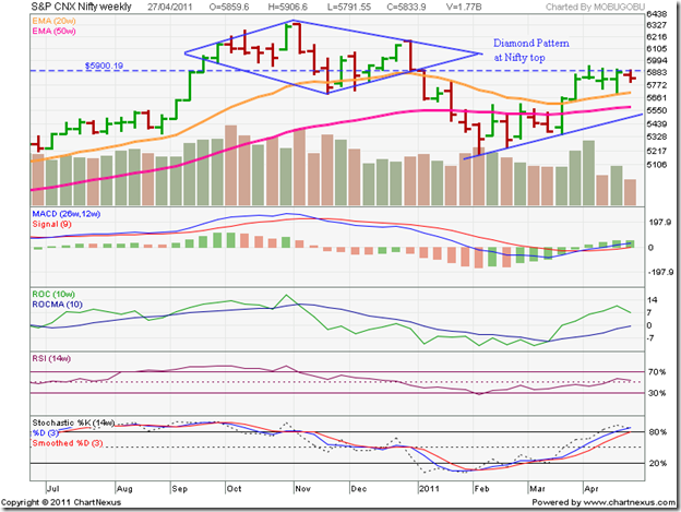
Is this a ‘diamond pattern’ which I see before me?

With apologies to the late great William S. for paraphrasing a quote from Macbeth’s soliloquy, it does look like the Nifty 50 index formed a rare ‘diamond pattern’, which is usually a reversal pattern. It can some times be a continuation pattern also.

What are the conditions that are needed to satisfy a diamond reversal pattern? Like all reversal patterns, it should have something to reverse – in other words, it should form at a market top after a prolonged up move. In the case of the Nifty 50 index, this condition has been satisfied.

Like the name, the pattern must be visually diamond-shaped – a initial broadening formation that transforms into a converging symmetrical triangle. A look at the weekly Nifty 50 bar chart confirms this second condition.

Why a weekly chart? The diamond pattern is more clearly defined and easier to spot on a weekly chart. (I did take a look at Nifty’s long-term weekly chart recently, but the pattern wasn’t visible in the closing chart pattern.)

Nifty_Diamond top_Apr2711

A clearly discernible diamond pattern has been marked on the Nifty 50 chart above. British comic writer Douglas Adams said: “If it looks like a duck and quacks like a duck, we have at least to consider the possibility that we have a small aquatic bird of the family anatidae on our hands.”

We also have to consider the possibility that we have a diamond of the bearish reversal pattern family on our hands. Another condition – that of depleting volumes during the pattern formation – has not really been satisfied. Is there a possibility that this particular diamond may end up shining brightly for the bulls and prove to be a consolidation pattern that was designed to trap the bears? Nothing can be ruled out on chart patterns. (No wonder investors get confused by technical analysis!)

Was the diamond indeed a reversal pattern, in spite of the comparatively higher volumes during its formation? Like the head-and-shoulders reversal pattern, the diamond has measuring implications. The index is expected to fall at least by the same amount (from the break down point) as the difference between the peak and trough of the diamond.

In our case, the high of the week ending Nov 5 ‘10 was 6338 (diamond peak) and the low of the week ending Nov 26 ‘10 was 5690 (diamond trough) giving a difference of 648 points. Interestingly, the break down point from the diamond pattern occurred at 5900 – a support/resistance level. (Now you know why the Nifty is struggling to cross 5900!)

How far did the Nifty fall? 722 points to the low of 5178 in the week ending Feb 11 ‘11 – thereby more than meeting the minimum down side target of 648 points. Does that mean that the Nifty reversal is over and done with? It would appear so from the subsequent pattern formation.

Would readers like to take a shot at analysing the pattern(s) that formed since the break down from the diamond? The technical indicators are suggesting bullish pattern(s) with measuring implications.

There will be no brickbats thrown for incorrect responses, so no need to feel shy about attempting an answer! Logical answers with upside targets will be duly acknowledged. Note that diamond patterns, which are quite rare, hardly ever form at bottoms of chart patterns.

Selasa, 26 April 2011

Stock Index Chart Patterns - BSE Sectoral Indices, Apr 26, '11

The weekly charts of the BSE Sectoral Indices, since the bull market began in Mar ‘09, provides a long-term perspective of the broader market. Most sectors have broken out of their down trends, but are yet to reach new highs. A couple of sectors are in long consolidation patterns. Two sectors are struggling in bear markets.

BSE Auto Index

BSE Auto Index

The BSE Auto index breached its down trend line earlier this month after oscillating about its 50 week EMA for a few weeks. It is gradually rising above its 20 week and 50 week EMAs. The technical indicators are looking bullish, but hinting at a pull back to the trend line. That would be a buying opportunity.

BSE Bankex

BSE BANKEX

The BSE Bankex moved above its down trend line in Mar ‘11, but the subsequent up move above its two EMAs has been gradual. The technical indicators are bullish, but showing signs of weakness. A drop to the 20 week or 50 week EMA is possible. The dip can be a buying opportunity.

BSE Capital Goods Index

BSE Capital Goods Index

The BSE Capital Goods index broke above its down trend line earlier in Apr ‘11, but pulled back immediately. The blue down arrow indicates the ‘death cross’ of the 20 week EMA below the 50 week EMA. Unless the index can sustain above its 50 week EMA, the bulls will be under pressure. Technical indicators are giving mixed signals, which means the correction may continue for a while. Hold.

BSE Consumer Durables Index

BSE Consumer Durables Index

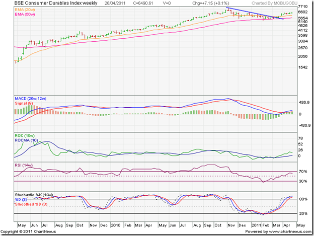
The BSE Consumer Durables index has been one of the better performers. It didn’t close below its 50 week EMA even for a single week, and convincingly breached the down trend line in Mar ‘11. Technical indicators are bullish. Dips can be bought.

BSE FMCG Index

BSE FMCG Index

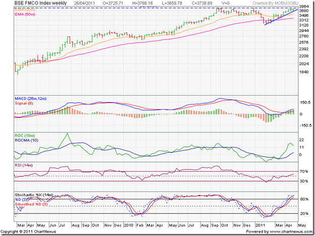
The BSE FMCG index has been a star performer. Note that after almost meeting the down side target from the triple top at 3800, the index has climbed sharply above both its EMAs. Technical indicators are bullish, and a breach of the previous high is likely. But one should be cautious near a previous top – particularly one that has provided strong resistance earlier. Hold.

BSE Healthcare Index

BSE Healthcare Index

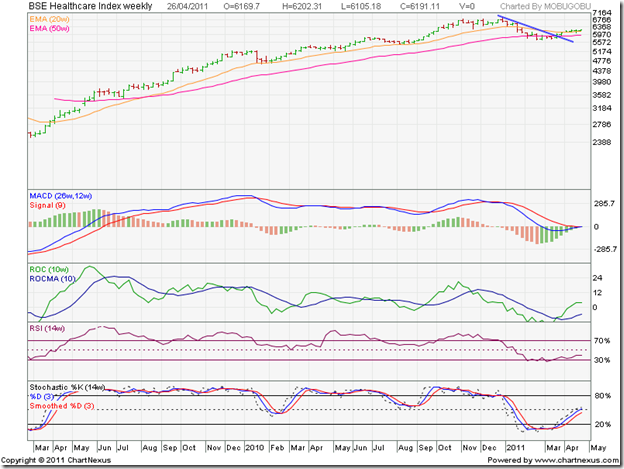
The BSE Healthcare index breached its down trend line in Mar ‘11, but has been consolidating sideways for four weeks. Technical indicators are mildly bullish, suggesting that the consolidation may continue. Hold.

BSE IT Index

BSE IT Index

The BSE IT index remained above its 50 week EMA throughout the correction before comfortably breaching its down trend line last month. The pullback was equally sharp. Technical indicators are looking bearish. Time to book partial profits.

BSE Metal Index

BSE Metal Index

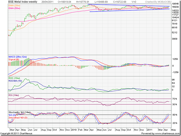
The BSE Metal index has been consolidating within a symmetrical triangle-like pattern for more than a year, alternately moving below and above its 50 week EMA. It spent the previous 5 weeks above its 20 week and 50 week EMAs, but the technical indicators are not supporting an immediate upside break out. Hold.

BSE Oil & Gas Index

BSE Oil & Gas Index

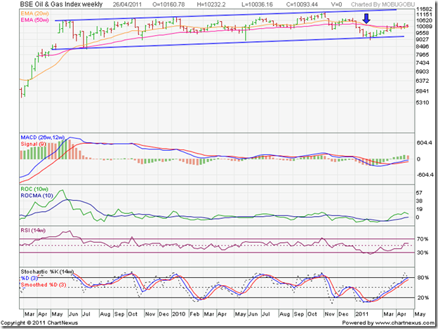
The BSE Oil & Gas index has been consolidating within a slightly upward sloping channel for almost two years. The ‘death cross’ marked by the blue arrow was followed by a bounce from the lower edge of the trading channel. Technical indicators are showing signs of bullishness. If oil prices are raised following the state elections, the index may break out above the channel. Trade the channel, or wait for a break out to buy/sell.

BSE Power Index

BSE Power Index

There is no power in the BSE Power index chart. After consolidating within an upward sloping channel for 20 months, the index dropped out of the channel in Jan ‘11. It subsequently made a bullish rounding bottom pattern, but the up move lost steam after moving briefly above the falling 20 week EMA. Technical indicators are mildly bullish, but the index is below its falling 50 week EMA – the sign of a bear market. Avoid.

BSE Realty Index

BSE Realty Index

The BSE Realty index remains at the bottom of the pack. It never really emerged from its long-term bear market of more than 3 years duration – despite spending several weeks above its 50 week EMA. Note that the 20 week EMA failed to convincingly rise above the 50 week EMA, which would have confirmed a bull market. Technical indicators are showing bullish signs, but the index remains within a downward sloping channel, and well below its falling 50 week EMA. Avoid.

Senin, 25 April 2011

Stock Index Chart Patterns – S&P 500 and FTSE 100 – Apr 21, ‘11

S&P 500 Index Chart

image

The MACD and slow stochastic were looking bearish last week, but the RSI was giving a contrary signal. That led me to conclude that the correction may continue, but won’t be too deep. On Mon. Apr 18 ‘11, the S&P 500 dropped below the rising 50 day EMA and the 1300 level to the lower edge of the Bollinger Band. A sharp bounce could not prevent a close below the 50 day EMA.

Just as the bears thought that the tide was turning in their favour, the bulls struck back strongly. The 50 day EMA was regained on Tuesday. A gap up opening on Wed. Apr 20 ‘11 was followed by a weekly close just below the 1340 level before the long Easter weekend. The index gained almost 1.5% week-on-week.

The technical indicators are beginning to look bullish. The MACD is rising in positive territory, and is about to cross above its signal line. The slow stochastic has climbed sharply towards its overbought zone. The RSI is above its 50% level, but hesitating a bit. The 1340 level provided strong resistance earlier this month, and more resistance can be expected before the index can finally cross it.

The US economy remains on a slow growth curve. Unemployment claims were lower by 13000 from the week before, but is still above the 400,000 mark. The Conference Board Leading Economic Index rose for the 24th straight month since Apr. 2009. Inflation concerns are affecting consumer sentiments.

FTSE 100 Index Chart

image

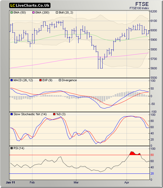
The likelihood of the correction continuing in the FTSE 100 chart was mentioned last week. What wasn’t mentioned was the likely volatile behaviour due to the widening of the Bollinger bands. The index swung like a yo-yo, falling by more than 130 points on Mon. Apr 18 ‘11 and rising almost an equal amount on Wed. Apr 20 ‘11.

The FTSE 100 closed the first two days of a holiday shortened trading week below its 50 day EMA, but regained the 6000 level for a 22 points weekly gain. The technical indicators are giving mixed signals. The MACD is positive, and touching its signal line. The slow stochastic has risen above the 50% level. The RSI is resting on its 50% level. Some consolidation can be expected before an attempt is made to reach new highs.

Bottomline? The corrections in the chart patterns of the S&P 500 and FTSE 100 indices provided opportunities to the bulls to outsmart the bears. Both indices are trading above their rising 50 day and 200 day EMAs – indicating bull markets. The Feb ‘11 tops still need to be conquered. Stay invested.

Minggu, 24 April 2011

How to identify winning stocks – a guest post

The Sensex and Nifty have been quite volatile lately, jumping up and down like a kid on a trampoline. Small investors are not sure whether to buy or sell. At times like these, it may be better to sit back and do nothing.

Niteen has a better idea. Learn how to identify winning stocks using his 12 parameters. If you like his post, please write a comment or query. Your feedback may motivate him to contribute regularly.

-------------------------------------------------------------------------------------------------------------

After 18 years in the stock market, I have observed that most small investors are only interested in tips for making quick money. But without exception, they end up losing money. Remember that the reverse of ‘TIP’ is ‘PIT’. ‘TIP’s can take you to the ‘PIT’s. There are no short cuts to making money. The stock market is a place that requires a highly disciplined approach. To make money, investing should be viewed as a long term process.

How to identify a winning stock without depending on tips? What are the parameters that help in choosing a winner?

The most important parameter is the ‘Margin of Safety’. The concept of margin of safety was first introduced by Benjamin Graham, author of investment classics like ‘The Intelligent Investor’ and ‘Security Analysis’.

Graham said: "Margin of Safety is always dependent on the price paid". One should buy a stock when it is worth more than its market price. This is the central thesis of the value investing philosophy, which emphasises preservation of capital. Graham looked at unpopular or neglected companies with low P/E and P/BV ratios.

If you feel that a stock is worth Rs 100, buying it at Rs 75 will give you a margin of safety. In case your analysis is incorrect and the stock is worth only Rs 90, the Margin of Safety provides a cushion against a possible loss. In India, markets tend to be volatile, so it becomes more important to look at each stock through the magnifying glass of Margin of Safety.

Very few stocks make it through the stringent screening process given below, and many potentially investment-worthy stocks can get excluded. If you come across any tips and get tempted to invest, at least you should screen those stocks through these parameters to ensure that you are not overpaying.

There are 12 parameters grouped under four heads.

(I)  Valuation & returns

  • P/E ratio < 40% of highest average P/E ratio over previous 5 years: take the highest P/E ratio of each year for last 5 years and then take an average
  • Earnings yield (E/P) > 2 x (RBI bond yield): RBI Bonds give a return of around 8%
  • Dividend yield > 2/3 x (RBI bond yield): Dividend yield is calculated by dividing the last dividend paid by a company, by the current stock price. Some companies retain earnings and do not pay dividends to maintain growth. But most blue-chip companies that have grown from the time they were not blue-chip, have consistently paid dividends for many years

(II)  Balance Sheet related

  • Current ratio > 2.0. This will give you a positive Net Current Asset Value (NCAV) number per share
  • Stock price < 1.2 x (Book Value)
  • Inventory trend: Inventory trend should reflect revenue numbers. Goods are produced to be sold, and not stored in a warehouse. If inventories increase faster than sales, a problem is brewing
  • Minimum 12% Return on Invested Capital (ROIC)
  • Debt/Profit =<5 and Debt/Equity ratio =<1.5: A company should pay its debt out of its profits, and not out of the equity base of the company. A ratio of 5 means that the debt can be paid out of 5 years profits

(III) Profit & Loss related

  • Revenue and profit should preferably increase consistently during last 5 years. A drop in any one of the 5 years can be considered also
  • Consistently paying dividends, bonuses: This is in line with (I) above

(IV) Governance

  • Published Statements of previous 6 months/Management Discussion and Analysis (from Annual Report): If the management is over optimistic about future earnings, an investor should stay away. Infosys, which is well-known for its transparency, has always been cautious in projecting future earnings
  • Shareholding pattern – Buying, selling or pledging: If management is selling/pledging their holdings, the stock should be avoided

The above parameters are available (or, can be calculated) free of cost from sites like: www.icicidirect.com, www.anagram.co.in or from economictimes.indiatimes.com.

There can be cases where you need to consider some additional parameters. The measurement of one parameter can be relaxed due to the strength of another parameter. This comes through experience and a new investor/analyst should avoid relaxing the parameters.

-------------------------------------------------------------------------------------------------------------

(Niteen S Dharmawat is an MBA who has been working with Indian IT companies. A firm believer in long-term financial planning, and an 18 years veteran of the stock market, he likes to analyse the economy, and individual stocks. He also conducts investor education sessions.

Niteen blogs at http://dharmawat.blogspot.com.)

Related Post

What exactly is the Margin of Safety?

Jumat, 22 April 2011

BSE Sensex and NSE Nifty 50 Index Chart Patterns – Apr 22, ‘11

Another trading week, shortened by a holiday, has gone by. Both the Sensex and Nifty indices continued their consolidation within the trading ranges marked in last week’s chart patterns. The bulls and bears have been unable to resolve their differences. Or have they?

I have been analysing the daily bar chart patterns of both indices. This week, I decided to take a longer term view. Weekly closing charts of the entire bull market since the closing lows touched in Mar ‘09 are analysed below. They throw up some interesting findings.

BSE Sensex Index Chart

SENSEX_Apr2211

The down trend line drawn through the closing tops of Nov 5 ‘10 (21005) and Dec 31 ‘10 (20509) was touched by Thursday’s (Apr 21 ‘11) closing level of 19602. The down trend appears to be intact, but may not be for long. The technical signs are bullish, and I will take them up one by one.

The long-term support/resistance level of 17600 – which corresponds to the closing top of Jan ‘10 - was briefly, but not convincingly, breached in Mar and Apr ‘10. A convincing break out (i.e. past the 3% ‘whipsaw’ leeway) occurred in Jul ‘10, after which 17600 acted as a support level during the recent correction.

The 20 week and 50 week EMAs came close to touching each other during the recent correction. Both have started rising and moving away from one another, and the index is trading above them. The long-term bull market is very much alive, though the Sensex spent 8 straight weeks below the 50 week EMA (which is considered equivalent to the 200 day EMA on daily charts) and threatened to fall into a bear market.

The MACD has crossed above its signal line into positive territory. The ROC is positive, and rising above its 10 week MA. The RSI has moved above the 50% level for the first time in 2011. The slow stochastic is about to enter its overbought zone after almost 6 months. More importantly, three of the four indicators are showing positive divergences by reaching higher tops (marked by blue arrows).

The bulls are all set to regain control of the Sensex.

Nifty 50 Index Chart

Nifty_Apr2211

The Nifty 50 chart is looking even more bullish. This week’s closing level breached the down trend line (barely visible on the top right corner of the chart, and marked with a down-arrow) – though the breach is not convincing yet. Volumes were not significantly higher. Some more consolidation may be required before a convincing break out occurs. The technical indicators are supporting the bulls.

Despite all the global and local bad news, the Nifty hasn’t breached the long-term support/resistance level of 5300. On a closing basis, the index corrected just about 1000 points (16%), and remains in a long-term bull market. What we have witnessed over the past 6 months appears to be just a bull market correction.

Q4 results declared so far have been good. Infosys and Reliance results were good, but below market expectations. TCS, HCL Tech, Yes Bank results were very good and above expectations. Food inflation is still a concern, and the market appears to have discounted a 25 basis points interest rate hike by the RBI next month.

Bottomline? The BSE Sensex and Nifty 50 index chart patterns are showing signs of emerging from 6 months of correction. Valuations look fair, which means aggressive buying should be avoided. This may be a good time to churn your portfolios based on Q4 results – get rid of the weak performers and switch to better stocks. Long-term investors can stay invested using the long-term support/resistance levels marked on the charts as stop-loss levels.

Kamis, 21 April 2011

Why building a stock portfolio is like buying a car

One of the requests I receive most often from blog readers and newsletter subscribers is to help them in building a ‘good’ stock portfolio. Many think that this is a trivial task. All they need is a list of ‘good’ stocks to buy. It is not that simple. A portfolio is not a ‘T’ shirt with a ‘L’ written on its label that will fit 90% of investors. It needs to be custom-tailored for a near perfect fit, to suit each individual investor’s background, experience, financial commitments, risk tolerance, and future plans.

But the real problem lies elsewhere. Most young investors can spare Rs 1 - 2 lakhs. Some have recently started earning and can only spare Rs 3000 – 5000 per month. These are insufficient amounts for building a ‘good’ stock portfolio. So, I use the analogy of buying a car.

One doesn’t go out and buy a car – specially if they have just started earning. Some prior planning is required. (Car loans are readily available nowadays, but the EMIs can burn a big hole in your pocket.) A better option may be to buy a scooter or motor cycle for immediate transportation needs. Even then, you need to learn the rules of the road, and get a driver’s licence before you buy anything.

Unfortunately, there is no licence required to invest in the stock market. Most small investors jump into the market without any knowledge of the basic rules of investing. No wonder their stocks crash and they suffer heavy injuries (to their savings). Grow your capital by regularly investing in fixed deposits, recurring deposits, PO MIS, ETFs, mutual fund units till you have sufficient capital to buy a ‘good’ car.

Can’t you buy Rs 3000 – 5000 worth of stocks every month? Yes, but which stocks? You can’t even buy 10 shares of Tata Steel. So you’ll probably buy 100 shares of Suzlon instead, or worse still, 800 shares of Cranes Software! Your risk of loss will increase proportionately. You are far better off investing that amount of money every month in a ‘good’ fund like DSPBR Top 100 or HDFC Prudence. After 5 or 6 years of regular savings, you may have sufficient capital for a ‘good’ portfolio.

How much is sufficient capital? I suggest Rs 5 lakhs as a bare minimum. Rs 10 lakhs is a more reasonable figure. Can’t cars be bought for Rs 1 - 2 lakhs? Yes, they can. But they won’t be ‘good’ cars. How about a used car? That may work, but is likely to require regular trips to the service centre for repairs. And you really can’t be sure if a used car is really a ‘good’ car. The previous owner may not have driven or maintained it properly.

Even with Rs 5 lakhs, you will only be able to buy a decent entry-level car. But if you are ready to spend Rs 10 lakhs, then your choice of ‘good’ cars increases significantly. And if you own a Rs 10 lakh car, chances are that you will take good care of it by following scheduled maintenance procedures, getting repairs done promptly, adding accessories that will enhance your driving comfort and experience.

A ‘good’ stock portfolio needs sufficient capital, and has to be nurtured and maintained as well – by keeping track of market happenings, individual stock results, using opportunities to book part profits or add more on dips. The emphasis should be on safety, and not about driving/investing recklessly.

Rabu, 20 April 2011

Stock Chart Pattern - Larsen and Toubro (An Update)

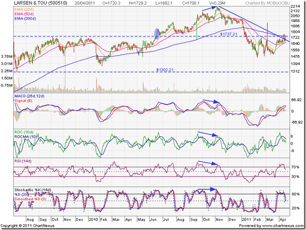
When I updated my analysis 10 months back, the stock chart pattern of Larsen and Toubro had been consolidating within a rectangular band between 1300 and 1750 for a year. I had advised readers to stay invested even though the stock seemed to be going nowhere. The very next day after my post on Jun 16 ‘10, the stock broke out above the year-long trading range on a smart rise in volumes (marked by blue oval).

The timing was fortuitous. Rectangular consolidation patterns are usually continuation patterns. The trend (in this case, up) before entering the pattern tends to resume after the break out. Let us check out the 2 years bar chart pattern of Larsen and Toubro to identify some classic technical signals:

LnT_Apr2011

The volume spiked up during the upward break out – which it should, otherwise the break out may be a ‘false’ one. The stock price pulled back to the upper edge of the rectangle – as often happens after a break out – and then quickly rallied 200 points. It touched a high of 1949 on Jul 26 ‘10, which turned out to be a ‘reversal day’ (higher high, lower close).

A sharp correction dropped the stock below its rising 50 day EMA, but the stock stopped short of testing support from the upper edge of the rectangle. The next leg of the rally reached a new high of 2117 on Oct 4 ‘10. Another ‘reversal day’ pattern led to a quick correction down to the 50 day EMA. A final bullish spurt took the stock price to a new two-year high of 2212 on Nov 4 ‘11. But the stock failed to test its previous bull market high of 2335 touched in Nov ‘07.

Note that as the stock price rose towards its 2 year high, three of the four technical indicators made ‘lower’ tops and one made a flat top (marked by blue arrows). The combined negative divergences was an advance warning of a likely correction. But the severity of the correction caught many investors by surprise.

The stock first fell below the 200 day EMA in Jan ‘11 and after a brief hesitation, dropped back into the rectangular consolidation zone. On Feb 10 ‘11, Larsen and Toubro’s stock fell to a low of 1463 – a 34% correction from its peak of 2212, underperforming the Sensex which corrected only 18%. Fortunately, the stock formed a ‘reversal day’ (lower low, higher close) pattern and climbed up quickly – only to face strong resistance from the support/resistance level of 1750.

Another sharp correction reached a slightly higher bottom of 1481 on Feb 25 ‘11, followed by an intra-day high of 1933 on Mar 7 ‘11 – but the stock closed down inside the rectangle and slid down to a slightly higher low of 1503 on Mar 21 ‘11. The subsequent month-long rally has several bullish signs:

The stock is trading above both its 20 day and 50 day EMAs; both EMAs are rising and the 20 day EMA has crossed above the 50 day EMA; the down trend line connecting the Nov ‘10 and Jan ‘11 tops has been broken; the support/resistance level of 1750 and the falling 200 day EMA were breached on intra-day basis twice; the bullish pattern of higher tops and higher bottoms continue from the low of Feb ‘11.

All these bullish signs are negated by the fact that Larsen and Toubro’s stock price is yet to close above the 1750 level or the 200 day EMA since it fell below both in Jan ‘11. Unless the stock closes convincingly above both (i.e. by more than 3%), the bears will dominate.

The technical indicators are showing weakness. The MACD is positive and above its signal line, but has stopped rising. The ROC is still positive, but is below its falling 10 day MA. The RSI and slow stochastic are above their 50% levels, but both have dropped from their overbought zones. The stock may consolidate within the rectangle for a bit longer.

Bottomline? The stock chart pattern of Larsen and Toubro seems to have found a bottom and is gathering strength to return to a bull market. The sale of its electrical products division to Eaton will bring in a massive amount of cash to the company. If Q4 results disappoint, the stock may dip further. That will be a good opportunity to enter/add. Risk averse investors should wait for a clear break out above 1750 to buy.

Selasa, 19 April 2011

Are acquisitions beneficial for small investors?

The short answer is: ‘No’ (for small investors of the acquiring company), and ‘Maybe’ (for shareholders of the acquired company). The acquiring company ends up paying too high a price – usually financed through debt – which adds downward pressure to the stock’s price.

Integrating the business of a different company with a different set of values is not an easy task. More so if the business of the acquired company has little or no synergy with its own. If the integration fails, the acquiring company may be forced to divest its acquisition at a loss.

Shareholders of the acquired company typically end up with a smaller number of shares in the acquiring company, and some times get a monetary compensation instead of any shares if their original holdings were small. However, if several acquirers start a bidding war to acquire a company, thereby giving a boost to the company’s share price, then small shareholders can use the opportunity to book out with a tidy profit.

What happens when a company decides to sell one of its divisions, instead of the entire company? This happened recently when Aditya Birla Chemicals (formerly Bihar Caustic, and a subsidiary of Hindalco) acquired the Chloro-Chemicals division of Kanoria Chemicals. It was a win-win situation for both companies. Small investors in both companies have already seen their holdings increase in value, as share prices of both companies have moved up subsequent to the announcement of the acquisition.

Kanoria Chemicals had sales of Rs 421 Crores in 2009-10 with a PBIT of Rs 51 Crores. Its Chloro-Chemicals division (CCD) had sales of Rs 303 Crores with a PBIT of Rs 47 Crores. Obviously, the rest of their businesses are neither large nor very profitable. So, how do they benefit by selling off their largest and most profitable division?

Kanoria Chemicals will receive Rs 830 Crores in cash for CCD – valuing it at nearly 2.75 times its sales. Though there was talk of using the cash for acquisitions and expansions, the plain fact is that at 9% rate of interest in a bank fixed deposit Kanoria Chemicals can earn more money every year than they have ever earned running their company!

No wonder the share price has doubled in a month! Looking at the chart pattern, there are clear signs of insider buying, since the stock made a bullish rounding bottom pattern and started rising well before the acquisition announcement. The stock is looking extremely overbought, and existing investors should use the opportunity to sell. A special dividend offer is likely, but there doesn’t seem to be great future opportunities for the company.

Will small investors of Aditya Birla Chemicals benefit? It appears so, even though a high price was paid for the acquisition (which will be funded through debt and internal accruals). CCD will more than double the caustic soda production capacity of Aditya Birla Chemicals, and is located near Hindalco’s Renukoot factory, which will add to the synergy. Hindalco is significantly increasing its own production capacity, and this acquisition gets rid of a competitor plus doubles the capacity of an essential input for aluminium production.

Aditya Birla Chemicals has an excellent balance sheet, and has assured business from its parent company. The stock is in a bull market, and can be added on dips.

Related Post

About advantages and disadvantages of mergers and acquisitions (M&A) and demergers

Senin, 18 April 2011

Stock Index Chart Patterns – S&P 500 and FTSE 100 – Apr 15, ‘11

S&P 500 Index Chart

image

Last week, weakness in the technical indicators had indicated a possible drop towards the rising 50 day EMA. A bearish rounding top formation saw the S&P 500 index chart slip down to test support from the 50 day EMA, only to bounce up and close the week just below the 1320 level. Is the correction over, or can the index drop some more?

Two of the three technical indicators are suggesting that a further correction or consolidation is likely. The MACD is still positive but has fallen below its signal line. The slow stochastic has dropped below its 50% level. The RSI bounced up from its 50% level, and may prevent a deep correction.

Macro-economic news continues to be unexciting. New unemployment claims rose above the 400000 mark. University of Michigan Consumer Sentiment index rose marginally, but remains almost 20% below its average value. High oil prices and rising inflation remain concerns. Two doses of QE have boosted the S&P 500 chart, but the time of reckoning may be near.

FTSE 100 Index Chart

image

The technical indicators were looking overbought last week, and I had mentioned the possibility of a correction in the FTSE 100 chart. The index made a bearish rounding top pattern, followed by an intra-day test of support from the 50 day EMA on Thurs. Apr 14 ‘11. The index bounced up, but closed a bit below the 6000 level – a 1% loss on a weekly basis.

The technical indicators are showing some weakness. The MACD is positive, but has changed directions and about to touch its signal line. The slow stochastic dropped from its overbought zone, but is above the 50% level. Likewise for the RSI. The correction may not be over yet.

Bottomline? The chart patterns of the S&P 500 and FTSE 100 indices are undergoing corrections. The failure of both indices to move above their Feb ‘11 tops leaves the door open for a bearish double-top reversal pattern. The double-tops will get confirmed only if the indices fall below their Mar ‘11 lows. The possibility should induce caution. Taking some profits off the table, and maintaining stop-losses will be the prudent option.

Minggu, 17 April 2011

Are the PIIGS stock market indices ready for slaughter?

Europe’s economic recovery has been largely restrained by the PIIGS countries. Greece is almost a basket case. Ireland is not far behind. Their stock index chart patterns reflect the sorry state of their economic affairs. Portugal, Italy and Spain seem to be tottering on the brink.

Spain (Madrid General)

image

Spain’s Madrid General index has been struggling to stay above its 200 day EMA. Each foray above the long-term moving average has met selling pressure. The index appears to be consolidating within an ascending triangle since June ‘10, with progressive higher bottoms and a flat top around 1135. The technical indicators are bearish, so the down move may last a bit longer.

Greece (Athens General)

image

Greece’s Athens General index started a rally in Jan ‘11 that took it above the 200 day EMA after 9 months. But the rally fizzled out after touching a high of 1747 in Feb ‘11. Note that the 50 day EMA didn’t even move up close to the 200 day EMA, and the bear market has resumed in right earnest. The technical indicators are looking very bearish.

Ireland (Dow Jones Ireland)

image

Ireland’s stock index is working hard to remain above its 200 day EMA. A steady rally from the low of 165 in Aug ‘10 to the high of 196 in Feb ‘11 faced strong selling pressure and dropped to a low of 173 in Mar ‘11. A ‘V’ shaped recovery took the index to a lower top of 193, where a sideways consolidation has started. All three EMAs are bunched together and the technical indicators are hinting at a continuation of the rally.

Italy (Dow Jones Italy)

image

Italy’s stock index is technically in a bull market, but facing strong headwinds. After touching a low of 141 in May ‘10, the index has been in a bullish pattern of higher tops and higher bottoms. The technical indicators have turned weak, and a test of support from the rising 200 day EMA is likely.

Portugal (Dow Jones Portugal)

image

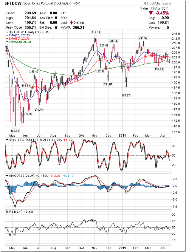
Portugal’s stock index is also in a bull market technically, but after reaching a peak of 214 in Nov ‘10 it has been trading within a bearish pattern of lower tops and lower bottoms. The 200 day EMA is still rising, but the index closed just below it. The technical indicators are bearish, which means the correction may continue for some time.

Sabtu, 16 April 2011

BSE Sensex and NSE Nifty 50 Index Chart Patterns – Apr 15, ‘11

In a trading week shortened by two holidays, both the BSE Sensex and Nifty 50 index chart patterns consolidated within a range, facing resistance from the downward sloping trend lines and getting support from their rising 20 day EMAs.

I had presented bullish and bearish cases last week. Both sides seem to be holding their grounds. The bears may seem to have the upper hand, as both indices closed lower on a weekly basis. But technically, the 20 day, 50 day and 200 day EMAs are rising, and both indices are trading above their three moving averages. That is the sign of a bull market.

BSE Sensex Index Chart

SENSEX_Apr1511

The up trend from the low of Feb ‘11 took the BSE Sensex index to a lower top, keeping the 5 months long down trend intact. However, all four technical indicators are showing positive divergences. The MACD, ROC and RSI reached higher tops than the ones in Jan ‘11. The slow stochastic made a flat top.

However, the near term indications are bearish. The MACD is well inside positive territory, but has turned around and is about to touch the signal line. The ROC has dropped close to the ‘0’ line – well below its falling 10 day MA. The RSI spent a few days in its overbought zone, but is about to drop down. The slow stochastic has slipped below its over bought zone. Some more consolidation within 19000-19800 can be expected. The 50 day and 200 day EMAs are likely to provide support if 19000 is broken.

Nifty 50 Index Chart

Nifty_Apr1511

The Nifty 50 index chart gyrated to the tune of the FIIs, on alternate days of net selling and net buying. There seems to be no end to the spate of bad news – globally and locally. Japan’s nuclear power plant disaster is going from bad to worse. Production and availability of spare parts in the automobile sector is likely to be affected badly.

European economies are tottering – particularly the weaker ones like Portugal and Ireland. However, inflation in UK seems to be moderating. USA’s jobless growth continues, but inflation is becoming a major concern. Domestic news isn’t much better. Oil price is still above $100 per barrel, worsening the trade deficit. Inflation refuses to come down, which could lead to another interest rate hike soon. The Capital goods and infrastructure sectors are facing tough times. On top of it all, Infosys declared Q4 results that were below consensus estimates, and the stock took a beating that affected both indices.

One would have expected the Nifty to crash under the weight of such negative news. But the index has proved remarkably resilient so far. The consolidation between 5700-5950 may continue. Below 5700, there are likely supports from the 50 day and 200 day EMAs.

Bottomline? The BSE Sensex and NSE Nifty 50 chart patterns are trading within a range. Long-term investors should stay invested with appropriate stop-losses, and await a clear break out from the range to decide the next course of action. Short-term players can trade the range.

Kamis, 14 April 2011

The implication of high oil price for investors – a guest post

With oil prices ruling above $100 per barrel, India’s trade deficit is widening and inflation remains a major concern. In this month’s guest post, Nishit looks at the implication of high oil prices for investors, and suggests how we can benefit from this adversity.

------------------------------------------------------------------------------------------------------------

clip_image001

From a low of about $33, Crude Oil has now spiralled up to a high of almost $110 a barrel. Crude Oil is the lubricant which runs the world, so let us investigate why the rise in price and what are its implications for India.

Most of the crude oil deposits lie in the Middle East. Middle East has been racked by turmoil and unrest. Supply of oil has been threatened in Libya and other parts like Saudi Arabia. The price rise has been mainly on the back of supply concerns.

India imports 70% of its oil, and if the price rises it implies that it would need to spend more dollars to buy the fuel. A country earns dollars by exports, inward remittances by Indians settled abroad and also foreign investments into India.

We spend the dollars on imports. The difference between exports and imports is known as Current Account Deficit. As we import more than we export, we are always in trade deficit.

If Oil is pricey, the deficit widens, and India’s credit worthiness declines making it less attractive for foreign investors. Petrol price rise gets passed on to the consumer, thereby leaving him with less income to spend.

Subsidy on Diesel of almost Rs 18 to a litre weakens government finances leaving it with less money to spend on infrastructure and developmental activities.

In 2008, crude oil price rose and peaked at around $145 per barrel. All the time, as oil price was rising the equity markets did not react too much to the price rise. A month after the prices peaked, the markets tanked. This was aided also by the Lehman Brothers meltdown.

Now how do we play this as small investors?

We have oil producers like ONGC and Cairn. Cairn is a major beneficiary but now caught up in legal tangle over its acquisition by Vedanta, and ONGC has to bear the subsidy burden.

The legal tangle has no effect on its daily operations and hence I would still prefer Cairn to ONGC. Portfolio allocation could be these two companies and Gold. Average gold price per ounce is 15 times a barrel of oil. This implies fair price for Gold now is $1650 per ounce.

This also means avoid the Auto sector, Banks and anything which is linked to rising Interest Rates. Rates will keep rising as government battles inflation and also seeks to raise more money to pay for oil.

Don’t like the petrochemicals sector? Long Gold and short Banks could be an interesting option.

------------------------------------------------------------------------------------------------------------

(Nishit Vadhavkar is a Quality Manager working at an IT MNC. Deciphering economics, equity markets and piercing the jargon to make it understandable to all is his passion. "We work hard for our money, our money should work even harder for us" is his motto.

Nishit blogs at Money Manthan.)

Related Post

Cairn India: an oil story worth betting on – a guest post

Rabu, 13 April 2011

Stock Chart Pattern - OnMobile Global (An Update)

The previous update of the chart pattern of OnMobile Global generated a fair amount of reader queries and comments, which implies that the stock finds a place in the portfolios of many small investors. Some bought at the IPO price of 440 during the previous bull market. Others entered at various lower levels, but have not really got much returns from the stock.

What is the reason for investor fascination with OnMobile? Is it because the company is in the high-tech field of telecomm software, and investors assumed that growth in telecomm subscribers would automatically lead to growth in the telecomm software field? Or, is it because one of the promoters is an ex-Infosys employee, and OnMobile was going to be the ‘next Infosys’?

The disappointing performance of the OnMobile stock has left many small investors bewildered. However, the company is backed by a strong balance sheet – unlike Bartronics or Cranes Software, which were also favourites of small investors. So, the likelihood of the company providing decent returns in the future is high. The overseas rollouts of the company’s software services (for Vodafone and Telefonica) have commenced. These should boost revenues and profitability.

But investors must appreciate that growth in telecomm subscribers does not necessarily translate into higher profits for telecomm software providers. The company  provides discretionary value-added services, which users may not opt for. And, the ‘next Infosys’ is a myth.

What does the 2 years bar chart pattern of OnMobile Global tell us?

OnMobile_Apr1311

The stock has been in a down trend since touching a high of 682 back in Jul ‘09. A bear market was confirmed by the ‘death cross’ (marked by blue oval) of the 50 day EMA below the 200 day EMA in Nov ‘09. A bearish pattern of lower tops and lower bottoms continues. As per Dow Theory, the down trend remains in force till it is reversed.

Note that brief moves above the falling 200 day EMA in Jan ‘10, Sep-Oct ‘10 and earlier this month were met with selling. This is typical of bear markets where one is supposed to ‘sell the rises’. The rally from the Feb ‘11 low of 181 found resistance at the long-term support/resistance level of 310 and has dropped quickly to the next support/resistance level of 255.

The announcement of the 1:1 bonus issue on Mar 7 ‘11 (record date still to be decided) has not helped the bulls to loosen the bear hug on the stock so far. Is there a possibility of a trend reversal any time soon? The positive divergences in the technical indicators seem to suggest as much. All four reached higher tops while the stock made a lower top (marked by blue arrows). The stock may also be in the process of forming an inverse head-and-shoulders reversal pattern – with the left shoulder at the Nov ‘10 low of 226; the head at the Feb ‘11 low of 181; the right shoulder is still being formed; and the neckline at the 310 level.

Announcement of the record date for the bonus issue and good Q4 results can be the catalysts for the stock to reverse the down trend. Till then, one can expect the stock to consolidate between 255-310. The near-term technical indications are weak. The MACD is positive and just above its signal line, but has reversed direction. The ROC is also positive, but has dropped below its 10 day MA. The RSI has dropped from its overbought region, but is above the 50% level. The slow stochastic touched its overbought zone, only to fall below its 50% level.

Bottomline? The stock chart pattern of OnMobile Global is showing signs of reversing the down trend. Good volume support on up days is an indication that the bad days may be getting over. A high volume break out above 310 will be the first confirmation of a trend change, and a buying opportunity. The ‘golden cross’ of the 50 day EMA above the 200 day EMA will confirm a bull market.

Selasa, 12 April 2011

Which stocks are keeping the Sensex down?

The BSE Sensex index comprises 30 stocks. 16 of them are currently trading above their 200 day EMAs – indicating bull markets. 14 are trading below their 200 day EMAs, preventing the Sensex from reaching new highs.

Here are brief thumb sketches of the laggards:

BHEL: Bounced up sharply from a low of 1905, but found resistance from the 200 day EMA; currently trading just below the long-term moving average.

CIPLA: Touched a low of 286 before a sharp rally to 332 – above its 200 day EMA; now consolidating between the 50 and 200 day EMAs.

DLF: The rally from the low of 209 stopped well short of the falling 200 day EMA; the stock has dropped down to seek support from its 50 day EMA.

Hero Honda: The stock touched a low of 1378; a spirited rally was stalled at its falling 200 day EMA; the stock has started to drop towards its 50 day EMA.

HUL: The stock dropped below its 200 day EMA on Jan 27 ‘11; it has been trading sideways since then, alternately going above and below the long-term moving average.

Jaiprakash Assoc.: From a low of 70, the stock reached a high just short of the 100 mark but well below its falling 200 day EMA; it has dropped down to seek support from its 50 day EMA.

L&T: The stock is trading sideways in a narrow range, just above its 50 day EMA but well below its falling 200 day EMA.

Maruti: Trading below the 200 day EMA for the past three months, the stock had a day’s close above the long-term moving average, only to drop below its 50 day EMA.

NTPC: The stock has been trading below the 200 day EMA since end-Oct ‘10; a couple of brief forays above the long-term average saw strong selling pressure; currently trading below its 50 day EMA.

ONGC: The bonus and stock split didn’t help the stock much; a day’s close above the 200 day EMA was followed by a steep drop below its 50 day EMA.

Rel. Comm.: A rally on strong volumes could only sustain above its 50 day EMA briefly, and has fizzled out already; the stock is well below its 200 day EMA.

Reliance: The stock has been trading in a broad sideways range, oscillating around its 200 day EMA – giving no returns to its investors; currently trading just below the long-term moving average.

Rel. Infra.: Another ADAG stock with equally disastrous results – a brief rally on good volumes above the 50 day EMA that is showing signs of weakness; the stock is trading way below its 200 day EMA.

Sterlite: A sharp rally accompanied by a volume spike took the stock from a low of 45 to a high of 68; but it stopped short of its falling 200 day EMA and started correcting.

Unless some of these 14 stocks start to rally soon, the Sensex may remain range-bound. Technically, the most likely candidates to help propel the Sensex upwards are BHEL, CIPLA, HUL, L&T, Maruti and Reliance. Dropping Rel. Comm. and Rel. Infra. from the index would not hurt either.

Senin, 11 April 2011

Stock Index Chart Patterns – S&P 500 and FTSE 100 – Apr 08, ‘11

S&P 500 Index Chart

image

The 1340 level proved to be a strong resistance during the past week for the S&P 500 index chart. It failed to test the Feb ‘11 top of 1344, consolidated sideways, and closed the week marginally lower. Hesitation near a previous top was expected.

The technical indicators are showing signs of fatigue. The MACD is positive and above its signal line, but is turning down. The RSI rose quickly into the overbought zone, but has started correcting. The slow stochastic is still in its overbought zone, and hinting at a correction. Further consolidation, and may be another drop towards the rising 50 day EMA is possible.

Employment growth remains weak, probably due to rising productivity and profits in corporate America. Why hire, when the existing employees are working harder! As per this article, consumer sentiment is directly correlated with job growth. The question is: What will happen when QE2 is withdrawn? Will the economy start contracting? More importantly for equity investors, will the markets crash?

FTSE 100 Index Chart

image

The bull rally in the FTSE 100 index chart crossed an important hurdle by closing above the Mar ‘11 top of 6052, with another weekly gain. Friday’s higher close was on lower volumes. The Feb ‘11 top of 6106 needs to be conquered before the bulls can regain complete control. Note that the Bollinger Bands are widening – a sign of increasing price volatility.

The technical indicators are looking overbought. The MACD is above its signal line and rising in positive territory. The RSI is inside its overbought zone, where it doesn’t like to spend much time. The slow stochastic seems well entrenched in its overbought zone. A bit of correction or consolidation may provide the impetus to the bulls to take the index to a new high.

Bottomline? The chart patterns of the S&P 500 and FTSE 100 indices are facing some technical headwinds. A correction or consolidation is likely. Both indices are in bull markets, so stay invested and buy the dips.

Minggu, 10 April 2011

Stock Index Chart Patterns – Hang Seng, Singapore Straits Times, Malaysia KLCI – Apr 08 ‘11

In last month’s analysis of chart patterns of the Asian indices, the Hang Seng was trading just below its 200 day EMA; the Straits Times had dropped well below its 200 day EMA and the ‘death cross’ (50 day EMA crossing below the 200 day EMA) seemed imminent; the Malaysia KLCI was trading in a downward sloping channel below its 50 day EMA. Technical indicators were looking bearish, and I concluded that the corrections in the three indices were likely to continue.

Technical analysis deals with probabilities – not certainties. Interpretation of chart patterns is more art than science, as it is based on prior patterns repeating in future. When patterns don’t turn out as per expectations – is it technical analysis that is fallible, or is it the analyst who misinterpreted the patterns? In this case, mea culpa. I failed to observe the positive divergences in the technical indicators.

Hang Seng Index Chart

HangSeng_Apr0811

The Hang Seng index chart embarked on a sharp ‘V’ shaped recovery the very next day after I wrote my bearish post. Note that while the index slipped below the 200 day EMA to touch a lower bottom in Mar ‘11, the ROC made a flat bottom and both the RSI and slow stochastic made higher bottoms (marked with blue arrows). The positive divergences rang a warning bell for a probable trend change – I just didn’t hear it.

The Hang Seng quickly climbed above its 50 day and 200 day EMAs on good volume support, and has broken out above the down trend line joining the Nov ‘10, Jan ‘11 and Mar ‘11 tops. The technical indicators are now signalling an overbought condition, which could lead to a pullback to the down trend line. The 50 day and 200 day EMAs are rising, and the 5 months long correction appears to be over.

Singapore Straits Times Index Chart

Straits Times_Apr0811

The Singapore Straits Times embarked on a sharp ‘V’ shaped recovery that managed to prevent the ‘death cross’. Note that all four technical indicators touched higher bottoms in Mar ‘11 while the index made a lower bottom.

The volume support wasn’t strong enough to propel the index above the down trend line. The technical indicators are looking overbought, and the ROC has already changed direction. A pullback to the 50 day EMA is likely before the down trend line can be convincingly breached.

Malaysia KLCI Index Chart

KLCI Malaysia_Apr0811

The Malaysia KLCI index didn’t even get close to its rising 200 day EMA. The correction started two month’s later, and the bull market wasn’t under any threat. The ROC, RSI and slow stochastic were making flat or higher bottoms during the past three months, while the index was touching lower bottoms. The MACD made a bullish rounding-bottom pattern.

After the index moved above its 50 day EMA, there was a rapid up move on a spike in volumes. But instead of testing or crossing its Jan ‘11 peak, the KLCI seems to have run out of breath. The technical indicators are overbought and hinting at a correction. A pullback to the rising 50 day EMA may precede a breach of the down trend line.

Bottomline? The down trend in the chart pattern of the Hang Seng index appears to have been reversed. The Singapore Straits Times and Malaysia KLCI haven’t quite reversed their down trends yet, but should be able to do so soon enough. All three indices are near their previous tops. Part profit booking after the sharp up moves may be a good idea.

Sabtu, 09 April 2011

BSE Sensex and NSE Nifty 50 Index Chart Patterns – Apr 08, ‘11

In last week’s analysis, I had expected the bears to put up a fight as both chart patterns of BSE Sensex and NSE Nifty 50 indices were near the downward sloping trend lines and the 61.8% Fibonacci retracement levels of the corrections from the Nov ‘10 tops to the Feb ‘11 bottoms. It wasn’t a great surprise that both indices turned down from the expected resistance levels.

Does it mean that the rally from the Feb ‘11 low has come to an end, or is it a temporary pause for breath after a sharp rise? Such questions make the stock market a challenging place to make money in. The market is at an important phase, with the scales almost equally balanced between the bulls and bears.

BSE Sensex Index Chart

SENSEX_Apr0811

The bearish case:

As per Dow Theory, a trend remains in place till it is reversed. The downward sloping trend line connecting the Nov ‘10 and Jan ‘11 tops has provided resistance to all up moves for 5 months. The Sensex continues to trade in a bearish pattern of lower tops and lower bottoms. The ‘death cross’ has been negated by the ‘golden cross’ within a month, but volumes have increased during the past four days as the index corrected – a bearish sign.

The technical indicators are turning bearish. The MACD is positive and above the signal line, but has stopped rising. The ROC is still positive, but has fallen sharply below its 10 day MA. The RSI is well inside its overbought zone – a place from which it tends to turn around fairly quickly. The slow stochastic is also inside its overbought zone, but has started correcting.

On the downside, support can be expected from the 19000 level, and below that from the 50 day and 200 day EMAs. High inflation and oil prices are keeping bullish sentiments in check.

Nifty 50 Index Chart

Nifty_Apr0811

The bullish case:

The 5 months long down trend hasn’t been reversed yet. But the Nifty has been trading in a bullish pattern of higher bottoms and higher tops since touching the Feb ‘11 low. The index is now above both the 50 day and 200 day EMAs. These are bullish signs.

More importantly, the FIIs have been net buyers right through the week, while the DIIs were net sellers. The FIIs have deeper pockets, and they seem to have realised that emerging markets is where the real growth is going to be over the longer term. Anna Hazare’s successful campaign against corruption should be taken as a positive by the markets.

Expect the Nifty to consolidate between 5700 and 5950 for some time, till Q4 results give a clear direction. As one of the experts commented on a business TV channel: It is a time for cautious optimism.

Bottomline? The BSE Sensex and NSE Nifty 50 chart patterns faced expected resistances from their down trend lines. This is a good time to book out of non-performers in your portfolio – specially if they are mid-caps or small-caps that have seen sudden spurts. Fresh buying only on a clear break out above the down trend lines.

Kamis, 07 April 2011

Gold & Silver Chart Patterns: in strong bull markets

I have been writing about gold’s chart pattern for more than a year. There has been a few requests of late to write about silver. So, here is my first shot at silver’s chart pattern. I must confess that I’m not a great fan of investing in precious metals because there are no returns other than capital gains.

Part of the ‘fun’ in stock market investing is being able to analyse Annual Reports to uncover what businesses have been doing to stay ahead, and discover ‘below the radar’ small companies that can become future stars. Buying precious metals is as exciting as investing in a cumulative fixed deposit in a bank – only riskier.

If an investor is looking for diversification, allocating 5-10% of one’s portfolio to gold and silver may not be a bad idea. More so now, because investments in both precious metals have been performing phenomenally well.

Gold Chart Pattern

image

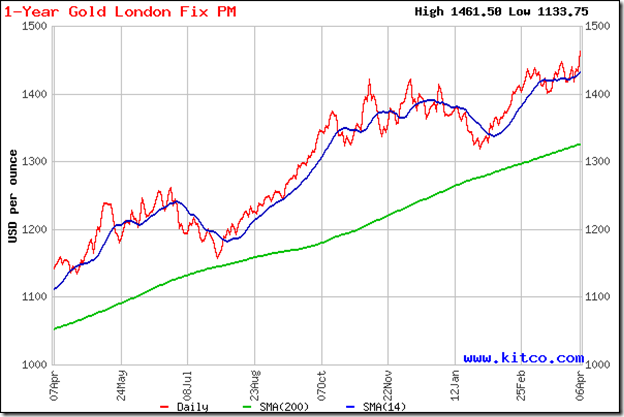
Last month, profit booking caused gold’s price to fall below the rising 14 day SMA and the triple top at 1421. I had expected a drop to the support level of 1400, and advised investors to buy the dip. The chart pattern played out exactly as per expectations.

The upward bounce from the 1400 level reached a new high of 1440, followed by a brief consolidation within a symmetrical triangle pattern. The break out from the triangle touched another new high of 1461.50 in quick time. The yellow metal seems to be on an unstoppable ride. Fasten your seat belts, maintain trailing stop-losses, and enjoy. Buy only on dips below the 14 day SMA.

Silver Chart Pattern

image

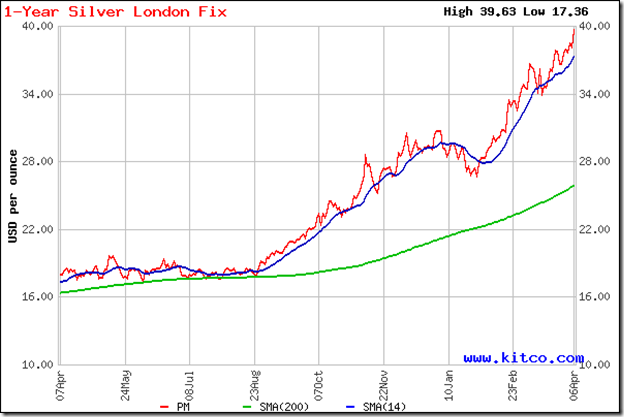
Silver’s gains have been more spectacular. While gold gained nearly 4.4% from its recent low of 1400, silver rose 16.5% from its recent low of 34 to a new high of 39.63. The rise has been too sharp too soon, as can be seen from the rapidly widening gap between the 14 day and 200 day SMAs. Both moving averages are rising, which is the sign of a strong bull market.

A correction down to the rising 14 day SMA, or even lower, can occur at any time. 37 should be a good support level, and an upward bounce can be expected there. Stay invested, and use any dips to add.

Related Posts Plugin for WordPress, Blogger...