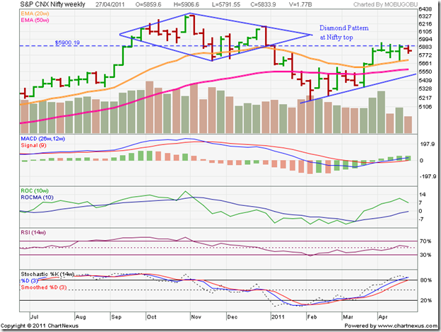
With apologies to the late great William S. for paraphrasing a quote from Macbeth’s soliloquy, it does look like the Nifty 50 index formed a rare ‘diamond pattern’, which is usually a reversal pattern. It can some times be a continuation pattern also.
What are the conditions that are needed to satisfy a diamond reversal pattern? Like all reversal patterns, it should have something to reverse – in other words, it should form at a market top after a prolonged up move. In the case of the Nifty 50 index, this condition has been satisfied.
Like the name, the pattern must be visually diamond-shaped – a initial broadening formation that transforms into a converging symmetrical triangle. A look at the weekly Nifty 50 bar chart confirms this second condition.
Why a weekly chart? The diamond pattern is more clearly defined and easier to spot on a weekly chart. (I did take a look at Nifty’s long-term weekly chart recently, but the pattern wasn’t visible in the closing chart pattern.)
A clearly discernible diamond pattern has been marked on the Nifty 50 chart above. British comic writer Douglas Adams said: “If it looks like a duck and quacks like a duck, we have at least to consider the possibility that we have a small aquatic bird of the family anatidae on our hands.”
We also have to consider the possibility that we have a diamond of the bearish reversal pattern family on our hands. Another condition – that of depleting volumes during the pattern formation – has not really been satisfied. Is there a possibility that this particular diamond may end up shining brightly for the bulls and prove to be a consolidation pattern that was designed to trap the bears? Nothing can be ruled out on chart patterns. (No wonder investors get confused by technical analysis!)
Was the diamond indeed a reversal pattern, in spite of the comparatively higher volumes during its formation? Like the head-and-shoulders reversal pattern, the diamond has measuring implications. The index is expected to fall at least by the same amount (from the break down point) as the difference between the peak and trough of the diamond.
In our case, the high of the week ending Nov 5 ‘10 was 6338 (diamond peak) and the low of the week ending Nov 26 ‘10 was 5690 (diamond trough) giving a difference of 648 points. Interestingly, the break down point from the diamond pattern occurred at 5900 – a support/resistance level. (Now you know why the Nifty is struggling to cross 5900!)
How far did the Nifty fall? 722 points to the low of 5178 in the week ending Feb 11 ‘11 – thereby more than meeting the minimum down side target of 648 points. Does that mean that the Nifty reversal is over and done with? It would appear so from the subsequent pattern formation.
Would readers like to take a shot at analysing the pattern(s) that formed since the break down from the diamond? The technical indicators are suggesting bullish pattern(s) with measuring implications.
There will be no brickbats thrown for incorrect responses, so no need to feel shy about attempting an answer! Logical answers with upside targets will be duly acknowledged. Note that diamond patterns, which are quite rare, hardly ever form at bottoms of chart patterns.
